Interior Motives
We invited more than 60 Maine interior designers to submit their projects for consideration for this year’s Interior Design Issue roundup. When we work on stories like these, we purposely steer clear of using words like “best”—after all, when it comes to spaces, “best” can’t be measured and is entirely too subjective to mean much. Instead, we found that the projects that rose to the top were timeless rather than trendy, inspired and intentional, and further, each offers a glimpse into both the homeowner’s personality and the designer’s philosophy.
1. Designer: Ariana Fischer// Ariana Fischer Interior Design
An Eclectic Attic in Cumberland Foreside
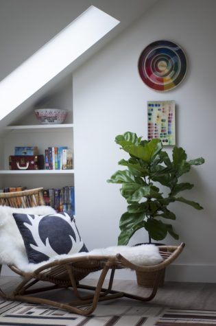
Teenage boys may not be a designer’s typical clientele, but for Ariana Fischer, their lifestyles grounded the design process. Fischer created an attic living area that is both Scandinavian chic and age-appropriate for the two teenagers that live upstairs in their family’s colonial home. “I wanted to reflect their own interests in the space to encourage their natural abilities,” says Fischer of the boys, one of whom is a sculptor and the other, an athlete and academic. A large shelf is converted into an organizational necessity for the sculptor’s materials, while comfortable bamboo chaises are perfect for late-night lounging and gaming. To offset the existing eaves, Fischer situated the room around the natural light, and she chose to embrace the exposed brick chimney rather than cover it up. Comfy, durable materials are functional, yet in their varied textures and with vibrant colors mixed in with masculine grays and browns, they’re fun, too. “Even though it’s an eclectic space, I always try to achieve a sense of balance so that it feels good—relaxing but revitalizing.”
2. Designer: Bronwyn Huffard // Huffard House Interior Design
Comfortable, Classic & Coastal
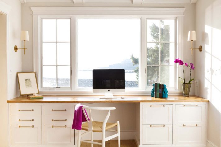
“Classic and casual” doesn’t need to mean boring. Even though designer Bronwyn Huffard needed to maximize comfort and utility for a family of five in this Cape Elizabeth home, she used the challenge as a chance to play with a “clean coastal style” that says “light, comfortable, classic, and not too serious.” In the narrow den, Huffard ordered a custom-made sectional to create a convincing illusion of space, and she oriented the overall design around the phenomenal views of Pond Cove from the den and bedroom windows. Soft shades of gray anchor the decor, while fuchsia and navy accents and contrasting textures serve up touches of unexpected excitement. “I generally stick to neutrals for the big pieces and look for pops of color and pattern in smaller, easier-to-change pieces,” Huffard admits.
3. Designer: Brady-Anne Cushing // Knickerbocker Group
A Fresh Take on Nostalgia
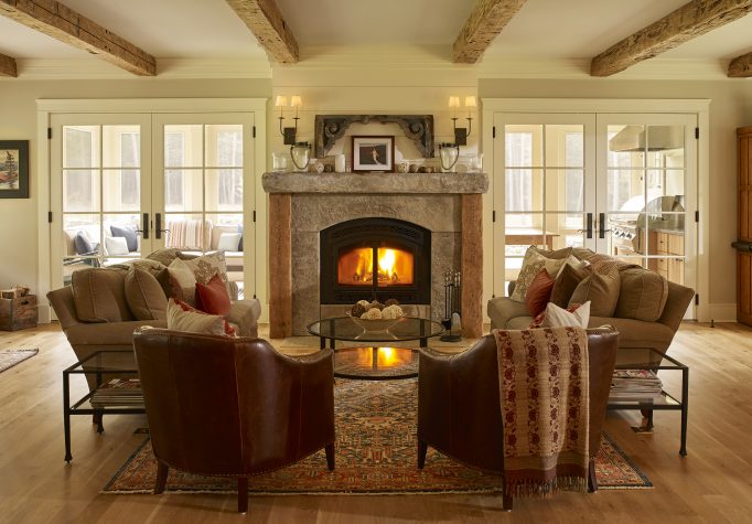
Nostalgia and the need for space factored heavily into the design for a couple and their two young children. Brady-Anne Cushing worked closely with the homeowner to select stylistic elements inspired by well-loved features from the family’s previous home and from the homeowner’s childhood house, such as a rustic wooden bannister and a newel. The antique pine beams that now run across the living room ceiling were recovered from a barn in Friendship, and the vintage transom windows were sourced at Portland Architectural Salvage. The family can easily gather together around the sleek custom fireplace stacked with hand-selected slabs of granite, as barn reds interplay with rich neutrals in the surrounding decor, particularly in the oriental rug. On the other side of the living room wall, the fireplace also provides comfort and style to the outdoor family room and second kitchen. In the winter, glass panels replace the screens, making the space functional all year. As part of the open-concept design, there are fluid boundaries between the living room and dining room, and a transom window separates the living space from the kitchen. Usability and comfort reign supreme in this family home. “I think some of our favorite days are weekends when we wake up, make pancakes, get plants at the nursery, and work and play outside all day with the kids,” says the homeowner.
4. Designer: Emily Ennis Mattei // e4 Interior Design
A Transitional Space With Coastal Flare
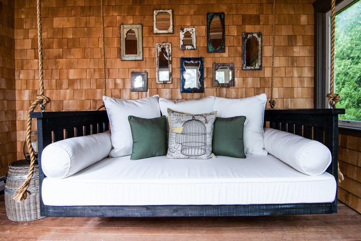
Since the homeowner grew up in a mid-century modern house and now lives full-time in an antique colonial, she craved a transitional weekend home that would give her the best of both worlds. Situated on the edge of Casco Bay, the home provides plenty of room for large family gatherings and comfortable furnishings, including a hanging bed. Ocean views from almost every room ensure that guests (and residents) can spread out to find their solitude. Working with Island Cove Building and Development, designer Emily Ennis Mattei transformed the space with eclectic, nautical details and a bright, modern color spectrum. On the shingled sun porch, a hanging twin-sized bed makes leisure time luxurious, and assorted Asia West mirrors above the bench punch up the space. Works from Art Collector Maine make their mark on various walls, such as an oversize landscape painting by Allen Bunker in the dining room. The homeowners purchased the house without any furnishings and had only a handful of accessories they wanted to incorporate into the design: a hand-painted accent pillow, a small framed water color, and a trio of floor candle sticks. Mattei admits that “one of the biggest challenges was how best to fully furnish the space on budget, while considering good quality and, of course, great design and detailing.”
5. Designers: Rachel Ambrose & Jennifer Connor // Home Remedies
A Luxe Loft That Brings the Outside in
“Old Portland goes global” inside this loft by designers Rachel Ambrose and Jennifer Connor. The peaceful, easy, uncomplicated space was designed with flexibility in mind so it can “be dressed up or down.” “Loft-like spaces are a challenge because of the high ceilings, old brick walls, and industrial elements,” says Ambrose. “The trick is to make these large rooms feel human-sized.” A land-and-sea palette features a rug that evokes the feeling of the sea underfoot, a console with a ’70s vibe (plus ample storage), and a driftwood coffee table base. Pillows made in-house at Home Remedies mixed with sheepskins and spiky ceramics add texture and bring the outside in, while artwork by Sam Cady brings the space to life.
6. Designer: Bonnie Weeman // Hurlbutt Designs
A Lighter Touch in a Seaside Cottage
Bonnie Weeman framed her design of the home around the view of Goose Rocks Beach from the front windows. “The window views are like beautiful paintings,” Weeman says. Like many poignant designs, the style is rooted in memory: specifically, the designer’s memories of growing up within walking distance of the client’s home, where she played, watched the passing boats, and collected seaglass and shells. Weeman discarded the old, heavy decor, which consisted of oriental rugs, floral fabrics, and leather, and replaced it with light, casual materials and colors. Navy and white accent the living and dining rooms, and fresh fabrics, including the blue ikat upholstery on the spool chairs, create an airy, coastal vibe. The blue glass tile backsplash in the kitchen extends the cool color theme into other areas of the house. White sheer draperies with navy embroidered stripes were mounted on rustic rope and metal hardware, permitting the easy flow of light and showcasing the ambient ocean views. In Weeman’s design, the borders between the outside and inside have faded, and “the panoramic views of the ocean and the skyline were brought into the interior of this home.”
7. Designer: Deborah Chatfield // Chatfield Design
A Luxe Library with Comfort in Mind
Deborah Chatfield took inspiration from her clients themselves and their business, Two Ponds Press, which is “devoted to celebrating and reinventing the fine art press.” This, combined with their love of literature “truly defined what this project was about,” says the designer. The library also needed to function as a guesthouse, office space, extra garage space, and a shipping and receiving area. Chatfield’s color palette showcases the book collection and other items that sit on the shelves. “Black seemed a natural fit from the beginning with white walls to showcase art”—most of which are family pieces and pieces from artist Leonard Baskin. The furniture runs the gamut, from Ralph Lauren sofas to Venetian chandeliers and everything in between, allowing the clients to showcase their individual style. Designed by architect Sam Van Dam and built by Cold Mountain Builders, the space also features a clerestory to allow in natural light but not direct light that might harm the book collection. Cabinetmaker Ezra Howell used an aniline water-based dye for clarity, color, and grain accentuation—the perfect solution for the homeowners’ archival book collection. “Listening to my clients and understanding how they live ultimately defined their home,” says Chatfield.
8. Designer: Tyler Karu // Landing Design
A Family Hub of Warmth & Fun
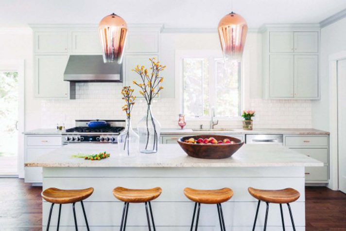
Tyler Karu’s inspiration for this home was the light-hearted, life-loving nature of the family who lives there. “They enjoy their time spent together and time spent entertaining their friends. I wanted their home to be a hub of warmth and fun,” she says. Working for a client with a refined taste that doesn’t take itself too seriously, Karu created a casual, comfortable, and functional vibe, with something unexpected on every surface and around every corner. The biggest design challenge was ensuring that the space, which Karu worked on with builder Justin Fletcher, would be timeless, despite using elements that are current and more contemporary, like copper, for example, which Karu used as the primary metal and driving force for the color palette. “It’s a classic material, but we used it in a way that is modern and unique to this space.” From there, she grounded the space with grays and navy. The minty green kitchen offers just enough punch, allowing it to ground the space as a neutral, and pops of yellow tie it all together. Classic pieces like a tufted leather sofa, built-in window seat, and beautifully crafted inlay cabinetry offset the unexpected and vibrant elements.
9. Designer: Krista Stokes
A Traditional Cottage with a Splash of Industrial Glam
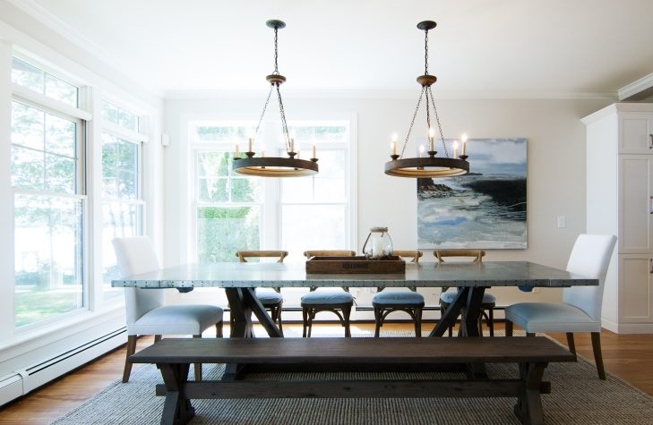
The idea of a “total makeover” doesn’t always sit well with Krista Stokes. “I believe in working with what clients already have—and then enhancing it,” she says. For her, this means “keep what they love, repurpose what they forgot they love, and make a few key strategic splurges.” The house was already brimming with charm, authenticity, and history but needed to accommodate a family of seven. The bluestone bathroom floor was a gift from the homeowner’s parents, who own a mountainside quarry in upstate New York, and the other homeowner hand cut and installed it in a herringbone-pattern. The bedroom accent wall was torn from a barn in Hiram, Maine and installed by the owner. And the splurges? A Restoration Hardware dining table and a Serena and Lily chandelier jazz up a starkly elegant dining room, in which paintings by local Kennebunkport artist Ingunn Milla Joergensen, a friend of the family, also add a splash of serenity. For the palette, Stokes chose a series of neutrals—whites, grays, and browns—punctuated with punches of color and nickel-gap detail to provide a peaceful space that is not immune to evolution. “I believe in pushing clients just outside their comfort zone,” Stokes says, “so I can take them where they were dying to go all along, but can’t quite get to on their own.”
10. Designer: Michele Hayes Zajkowski// Ocean View Designs
A Timeless, Seaside Sanctuary
“The inspiration for the home was the view outside, of Scarborough Beach,” says Michele Hayes Zajkowski, who, working alongside contractor Casco Bay Woodworks, remodeled the sophisticated summerhouse for a longtime Maine couple who often host guests. The interior designer views her role as that of “a confidante” who helps clients tell their story; for these homeowners, this is a story of “old and new,” and of the ocean. Neutral colors in the living room let the natural light take center stage, and since no window treatments were used at the request of the clients, all attention is drawn toward the sweeping seaside panorama. Originally covered in mirrored glass, the updated, custom fireplace with a soapstone surround stretches from floor to ceiling. Cream and blue upholstered chairs complement the colors of the beach, ocean, and morning sky, as do the new antique rug and lamps from Simply Home. Huston and Company crafted a custom dining room table in a driftwood finish, its simplicity accented by a Laurie Fisher abstract piece that hangs nearby and a punch of color in the hot pink chair fabric. “Home is so important to me,” the designer reveals. “It’s our sanctuary, a place where we should feel safe, comfortable and be surrounded by things and people we love.”
11. Designer: Linda Banks // Simply Home & Banks Design Associates
Calm & Collected on the Coast
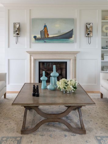
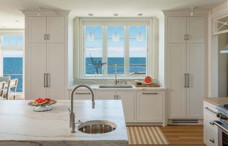
According to Linda Banks, the airy weekend house in Ships Channel “really is perched at the edge of the sea, as if you were on the bow of a ship.” The floor plan runs parallel to the ocean, and each room provides expansive views of the open sea. Since a weekend home is intended as a place to relax and retreat from the world, Banks focused on soft, calming colors, such as white, taupe, and greige, which are found in the upholstery throughout the house, accented with pops of apple green, sky blue, and turquoise. The limited palette and sparse decor make each room “uber restrained and incredibly edited.” To control the high quantities of light from the windows, Banks installed electronic operated roller shades, which block more than 95 percent of UV light infiltration throughout much of the ground floor, and the living room and bedroom features soft linen curtains. Crafted by Tidewater Millwork, the Banks Design kitchen is on full display here with its signature paired cabinets, and Morningstar Stone and Tile constructed the Imperial Danby marble countertop on the island while Distinctive Tile and Design provided the backsplash. Several artifacts come straight from Europe, such as an Italian-made coffee table with a French blue waxed, distressed finish and the off-white Belgian linens that cover the couch. Between the two sconces above the fireplace hangs art by Maine painter David Witbeck. The aesthetic of each room flows into the next and contributes to the meaning and depth of the entire design. “I want the house to feel like a compendium of short stories from one author,” Banks says.
12. Designer: Leandra Fremont-Smith // Leandra Fremont-Smith Interiors
Modern Family
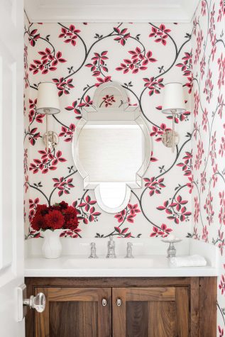
Classic and contemporary touches make this home a gathering space for generations to come. When her children moved away to college, Leandra Fremont-Smith’s client wanted to downsize, without sacrificing the ample space and comfortable atmosphere of a family home. In the gray clapboard colonial in Cape Elizabeth, Fremont-Smith, along with Southworth Builders, opened up the narrow rooms that had limited the natural light. Recognizing the importance of the kitchen as the family hub, especially since her client loves to cook, the designer combined the den and kitchen, creating one seamless space full of light and large enough to accommodate the client’s family. Crisp white walls and cabinets are soft and calming, while Aspen White backsplash tiles offer a delicate contrast. Polished chrome hardware, Lucite barstools, and a golden sunburst chandelier add a hint of contemporary glamour to the classic space. A cozy window seat in the pantry was installed across from a built-in espresso machine, creating the perfect spot to relax and recharge. Farrow and Ball’s Ringwold wallpaper, in a classic vine design with pops of crimson and black, keeps the adjacent powder room fresh and fun. “The result is a sense of comfort and ease fused with energy and light,” says Fremont-Smith. “It’s just the right balance for a modern-day family in a traditional home.”
13. Designer: Nicola Manganello // Nicola’s Home
A Refreshing Scandinavian Style
For Nicola Manganello, this house was a departure from her usual philosophy. “I’m trying to challenge myself in new ways and introduce more contemporary elements into my designs,” says Manganello. “I find it completely refreshing.” Manganello set limits for herself on the amount of clutter, declaring that “less is more,” and assembled carefully chosen pieces that each have meaning and function. A colorful striped rug commands attention in the large living room, strategically placed furnishings enhance its grandeur without adding fussiness, and woven-back armchairs are coastal and contemporary. Clean lines rule the kitchen. Effortless and organized, it includes whitewashed oak cabinets with holes instead of door fixtures to enhance their simplicity, and basket lights focalize the space. In the bathroom, Manganello suspended two wooden nightstands on the wall to fashion a vanity, an innovative and purposeful design, especially since it’s easier to clean. “The best part of my job is the visions that come early and that exist in the end.”
14. Designer: Jan Robinson // EcoHome
An Eco-Friendly Downsize
Purging 20 years of accumulated “treasures” and cutting her living space in half, designer Jan Robinson wanted a simple, well-edited style in her own new energy-efficient home. “The challenge was evaluating everything we owned and deciding how much we loved it and how well it served our needs,” she says. After more than 30 carloads to Goodwill, the Habitat for Humanity ReStore, and to friends and family, Robinson and her husband are living lighter. With a color palette of soft grays and teal with navy blue and lime green accents, art by Paul Horan, tile by Distinctive Tile and Design, and furnishings from her store, EcoHome, Robinson created “something special on the inside of what looks like a ‘cookie-cutter’ condo box.” The house embodies Robinson’s overall design philosophy: use eco-friendly materials as much as possible, choose toxin-free furnishings, and create an energy-efficient home.
