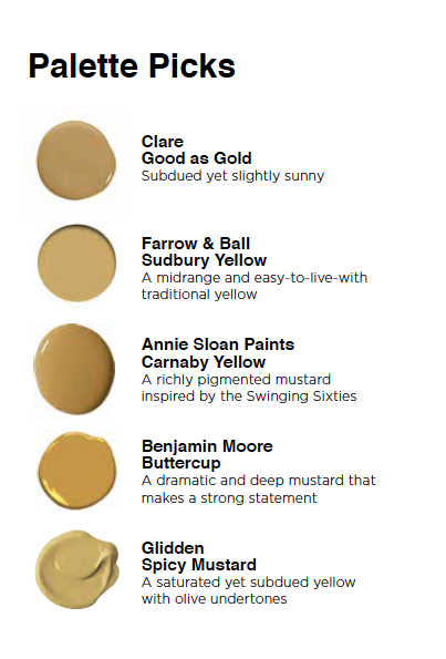
Mustard Yellow is the Warm, Inviting Color You Need
Look to the past for a deep-yet-muted tone that feels fresh year-round


Mustard. Yellow ochre. Goldenrod. Harvest gold. Whatever you call the hue, deep mustardy yellow is the color of fall, and it is beautiful to bring into your home all year-round. “Mustard has got a bit of a bite to it; it’s a little strong, but it’s not a bright, bright yellow,” says Annie Sloan, the founder of Annie Sloan Paints. “People find yellows difficult to use, but a deep yellow makes people feel comfortable; it’s slightly more earthy.”
That earthiness is also what makes mustard yellow feel fresh in places where a pop of primary yellow has almost become cliché, like the front door or a throw pillow. While mustard hues are of the moment, they also have deep historical ties in New England, where homes are often painted in muted, rich yellows both inside and out. Here’s how to use this color in your interiors.
Look for a clean, deep color.
When choosing a mustard paint or fabric, Sloan suggests, “go for one with some life in it. If it looks a little dead on the paint chip, it’s going to look dead on your wall.” Decorators often advise to choose a “dirty” version of a hue to make it more livable, but not in this case: Sloan says you need to be careful it doesn’t look muddy. “It needs to be a clean mustard,” she says.
Pay attention to your lighting.
Mustard hues are particularly responsive to changes in light. “In the shadow, it can look brownish, and electric light can make it go green,” cautions Sloan. So be sure to sample paint before applying it to your walls, and adjust the color temperature of your lightbulbs if your hue looks off come nightfall.
Be precise with purple pairings.
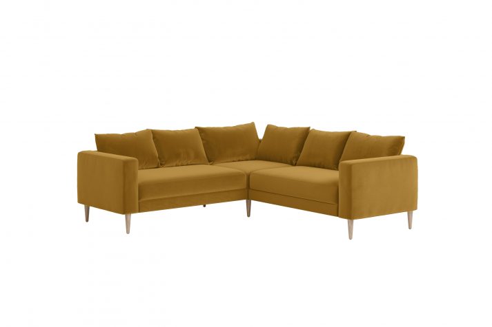
“Purple is yellow’s complementary color, so I would be careful about doing purples with mustard,” says Sloan. However, she says it could be really beautiful with a very lavender hue or a deep aubergine. Kristen Rivoli, the principal of Kristen Rivoli Interior Design in the Boston area, got a lavender-mustard pairing just right in a bedroom where she says a daybed’s luscious lilac velvet felt a little heavy: “I found this wonderful linen pillow with the earth tones of mustard, lavender, and brown floral prints to lift it. The mustard added a wonderful sunny pop, so I added bright velvet mustard pillows on the end to draw the color out more.”
Try other cool hues.
Secondary colors like greens and blues are a safer pairing with mustard, but again, it’s all in the exact combinations. “I love to put it with certain greens, like with olive or even an emeraldy, malachite green,” says Sloan, who also favors mustard with gray-blues or blues with a slightly red undertone. Interior designer Kevin O’Gara of Kevin Francis Design in Atlanta agrees. “For me, the key to using this color is in the balance of warm and cool tones,” he says. Noting that warmer tones have more impact than cooler ones, he suggests letting a blue paint color be the foundation for your space while using mustard as an accent.
Temper a warm palette.
Deep reds like burgundy can pair up with mustard, but Sloan says you’ll need to weave in a cool neutral “to stop it from getting too hot.” You might also want to stay away from any true reds to avoid a ketchup and mustard effect!
You can’t go wrong with neutrals.
All the experts agree that mustard is a natural match for neutral hues. “It looks good with all the grays—very sophisticated and very calming,” says Sloan, who imagines a wall of mustardy paint, like her Carnaby Yellow hue, with gray furniture. Or go darker. “Black and mustard is so good, so sophisticated,” she adds.
Seek balance with white.
Zandy Gammons, lead designer at Miretta Interiors in North Carolina, says to pair mustard with a soft white. “It feels less drastic than a bright white,” she says. Likewise Sloan cautions against using mustard with a true white. “I would suggest having a color in between, if you have white as your neutral,” she says. Look for another neutral like a very pale ochre or a strong creamy color, so it is not just white and yellow.
Use it on furniture.
Mustardy yellows are a slightly unexpected but also historically-appropriate choice for furniture makeovers. Blogger Erin Boyle, the author of the book Simple Matters, painted a vintage wardrobe in Farrow and Ball’s Sudbury Yellow, which she describes as a mid-range hue. “It felt like a nod to the ochres I’d grown up seeing on the cabinetry and floors of old rambly New England farmhouses,” she says.
Look to the past for inspiration.
Boyle’s association with historic homes is spot-on: the Shakers famously painted their trim and cabinetry in a marigold hue. Rivoli used mustard in a Boston townhome to heighten the historical vibe. “We wanted to create warmth, coziness, and a sense of history. This rich paint treatment did the trick,” she says. To get that historic mustard just right, look to paint colors from Benjamin Moore’s Williamsburg collection, based on hues found in Colonial Williamsburg.
Try it in a kitchen.
“We love this color for a bright and bold kitchen: it looks great on cabinets,” says Nicole Gibbons, the founder of Clare, a paint company, who also suggests it can liven up a laundry room, “making chores a bit more enjoyable.” In a recent kitchen design, Cambridge-based architect Leslie Saul opted for soft mustard on the cabinets, noting, “Mustard is a great color to use when layering because it is a warm, almost neutral color that works well with other colors: I paired it with turquoise chairs, a distressed copper hood, and a wonderful natural live-edge wood counter.”
Mustard Misnomers
We commonly refer to the condiment made from mustard seeds as “mustard,” but it is more accurately “prepared mustard” (mustard is a plant). Likewise, the word “mustard” has become so strongly associated with deep-yet-muted yellows that it’s easy to forget that what makes prepared mustard its signature hue is not the mustard seed itself. That rich yellow color actually comes from the turmeric that is added to mustard for additional flavor and color. Yet, the color name seems to be here to stay: in its catalog of 3,500 paint hues, Benjamin Moore has six different colors with “mustard” in their name but not one with the word “turmeric.”
Mustard seeds have been found in the tombs of Egyptian pharaohs.