Midnight Shades
Explore how you can use the darkest shade in your home—without making things look gloomy


Many of us love a room bursting with color, but sometimes we also crave the depth and contrast that black brings to a space. Used sparingly, black can be the finishing touch to a room. Employed in abundance, black has the power to change the entire feeling of a space (hello, enveloping black powder room!).
Black is also a famously versatile shade (think of the proverbial little black dress). It looks as at home in a midcentury modern interior as in a pre-Revolutionary War home. However, despite its flexibility, black is often intimidating to use. “People are afraid of black. I’ll propose it, and my clients will worry it’s too dark or depressing,” says Grant K. Gibson, an interior designer who has recently relocated to Castine. “I think when you pair it with other patterns and colors, black actually balances things out. It grounds a space.”
When using black, the trick is to harness its best qualities and avoid its skewing too austere or gothic. We asked designers and color experts to share their best advice for weaving this midnight hue into your home; here’s how to explore your dark side.
Black and white is always right.
Sue Wadden, director of color marketing at Sherwin-Williams, says that classic black and white feel fresh after the long-running gray trend in recent years. “Gray came out of the recession in 2008; after that it was ten years of gray,” she says. Now Wadden sees homeowners ditching gray in favor of the components of gray: black and white.
But warm it up with wood.
A purely black and white scheme can read cold, but natural elements take away the chilly feeling. “I think it’s lovely to be able to bring a wooden element in with black,” Gibson says, noting he briefly considered a black and white floor for his Castine kitchen, but ended up going with a hickory-hued stained wood instead.
Soften black’s harshness.
To avoid black’s feeling too austere, Chloe Kregling, senior architectural and interior designer at Knickerbocker Group in Boothbay, suggests playing with different tactile qualities in your black elements. “Texture brings black down and makes it feel a little bit more organic,” she says. Think grasscloth wallpaper, wood grain visible through a black stain, black tile with some sheen to the finish, or nubby bouclé fabric.
Surround black with texture.
When working with black, Kregling says, “adjacencies should be all about texture.” For example, in a recent project, Kregling paired black with reclaimed oak and a rough coat of natural plaster on the walls, which she says add layers of texture and warmth.
Be aware of paint sheens.
When it comes to wall color, “sheen is really important,” cautions Wadden. “A little bit of shine in the paint can show every imperfection.” Instead, Wadden encourages a matte or eggshell finish, which she says “looks really beautiful on the wall without highlighting all the dents.” If you’re dying for a lacquered or glossy look, you’ll need to invest time and effort into wall preparation before you paint.
Zero in on your undertones.
While black is often thought of as the absence of color, most black paints have a hint of color in their undertones: blue, green, and even purple (which is one undertone our experts said to avoid). Consider the other elements in your room and match your black to them.
Play up contrast.
If you do opt to use black in a big way, consider contrasting it with lighter-colored elements like curtains and sofas so that it doesn’t end up feeling heavy.
Match it with almost any color.
Black is the ultimate neutral. “Any color can work— absolutely anything,” says Gibson. However, he notes, in Maine he finds himself drawn to colors that would be found in the landscape. Kregling says she leans toward browns, taupe, muted greens, and earthy olive. Wadden suggests mixing blacks with light grays, whites, khaki, and camel. For a bolder pairing, Wadden points to Sherwin-Williams’s Argyle green or a clean teal.
But tread carefully with near blacks.
When creating interior color schemes, think twice about using black with colors that are similar to black, like deep navy or dark green, says Wadden. Black loses its graphic boldness in this context, and too many deep hues can make a room feel dark.
Use black as a backdrop to nature.
“I chose black for my kitchen cabinets so you focus out there on the view of the bay,” says Gibson of the Decora cabinetry at his Castine home. “When you’re sitting at the kitchen dining table, the black kind of recedes.” Knickerbocker’s Kregling echoes this sentiment when describing a recent project that used black. “We were very tuned in to the landscape, so we were working with a black and neutral palette in order to capitalize on the exterior views,” she says.
Try adding tiny touches of black.
Some decorators argue that every room needs at least a touch of black. In his column for the Financial Times, the celebrated English designer Luke Edward Hall recently suggested adding “small touches” of black, saying, “I particularly like black vases and lampshades, especially when lined in gold paper (you don’t get much light from a black shade, naturally, so a bit of gold will create a good glow).”
Weave in black to hide utilitarian elements.
Black often pops up in the workaday parts of our home, like TV screens, oven doors, and other bits of appliances, but your eye will be less likely to zero in on these less-than-lovely black moments if you pepper black throughout the room. Hanging black frames near a TV is an especially effective tactic.
Black Houses Are Back
Scroll through Instagram or a home design magazine and you will notice an awful lot of black exteriors. In the past decade, black has become surprisingly popular. At MH+D we’ve featured eight homes with black exteriors in the past year alone. While black is a current trend, houses have been painted black (or near black) for centuries. Historically, black was often a practical choice. In northern climates like Maine’s, homes were painted dark colors as a budget heating method: a black home will absorb more heat from the sun. Likewise, some traditional methods of preserving and protecting wood naturally result in a blackened look. The Japanese yakisugi process involves charring wood to leave a carbonized layer on one side of the lumber, rendering the wood pest-, fire-, and weather-resistant. The technique dates back to the eighteenth century but is enjoying a resurgence today among high-end architectural practices. In Scandinavia in the nineteenth and early twentieth centuries wood was coated in a combination of tar and linseed oil, which acted as a natural sealant that just happened to be black. Tom Lane, an architect at Portland’s Whitten Architects, used a black stain on a portion of the exterior of the firm’s Loon Lake Retreat (recently honored in the 2021 AIA Maine Design Awards). Lane says he sees today’s interest in dark and black exteriors as part of an ongoing search for equilibrium with the environment. Says Lane, “After spending working hours in a sterile, digital environment, a home with depth, shadow, and patina is a welcomed link back to physical reality and the natural world.”
Vantablack is the world’s darkest material. Absorbing 99.965% of light, it makes any surface it covers look like a void.
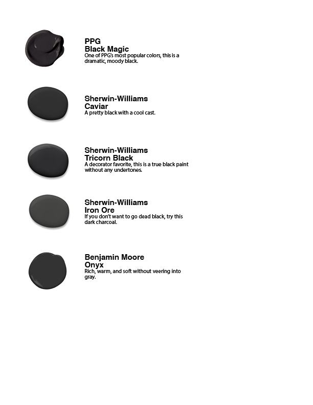
Palette Picks