Dare to Dream
18 Maine Interiors that Inspire Us


Mural Bedroom
FIRM: SAMANTHA S. PAPPAS
DESIGNER: SAMANTHA S. PA PAS
PHOTOGRAPHER: COURTNEY ELIZABETH
LOCATION: YARMOUTH
Samantha S. Pappas draws a lot of inspiration for many of her projects from the outdoors. She seeks to bring the calm of nature into spaces she designs. For this owner’s bedroom, the space was kept soothing and simple. It’s a real place of serenity, a space where you could close the door and completely unwind, as you would in your favorite spot in nature.
The feeling this bedroom radiates is tranquility. The minimalistic design creates this peaceful atmosphere. It is clean and fresh. Pappas wanted a no-fuss feel, but didn’t want it to feel sterile. It was challenging to find the balance between minimalist and inviting. She overcame this by mixing natural and soft colors throughout the room. A custom-painted mural along with warm-toned accents complement the clean aesthetic of the space.
The palette was kept neutral using muted colors to bring a natural ambiance. This really shows in the custom mural, painted by Pappas, which is the focal point of the room. The free-flowing organic mural creates a vibrant yet soothing feeling. Pops of soft color add to the tranquil space without making it too busy.
“I believe the space should reflect my client. I want it to bring them joy,” says Pappas. “I want it to be a space they love to spend time in.” This bedroom needed to be a space of total relaxation. It needed to be a place to escape the busy, sometimes crazy, outside world. It needed to be a place that was warm with character but not overwhelm- ing. This is exactly what the room exudes. It is simple but not boring, and minimalist but interesting.

Greenlawn
FIRM: INTERIORS BY DETAILS
DESIGNER: CONNIE DEDAM
PHOTOGRAPHER: DESTIN SOPER
LOCATION: BAR HARBOR
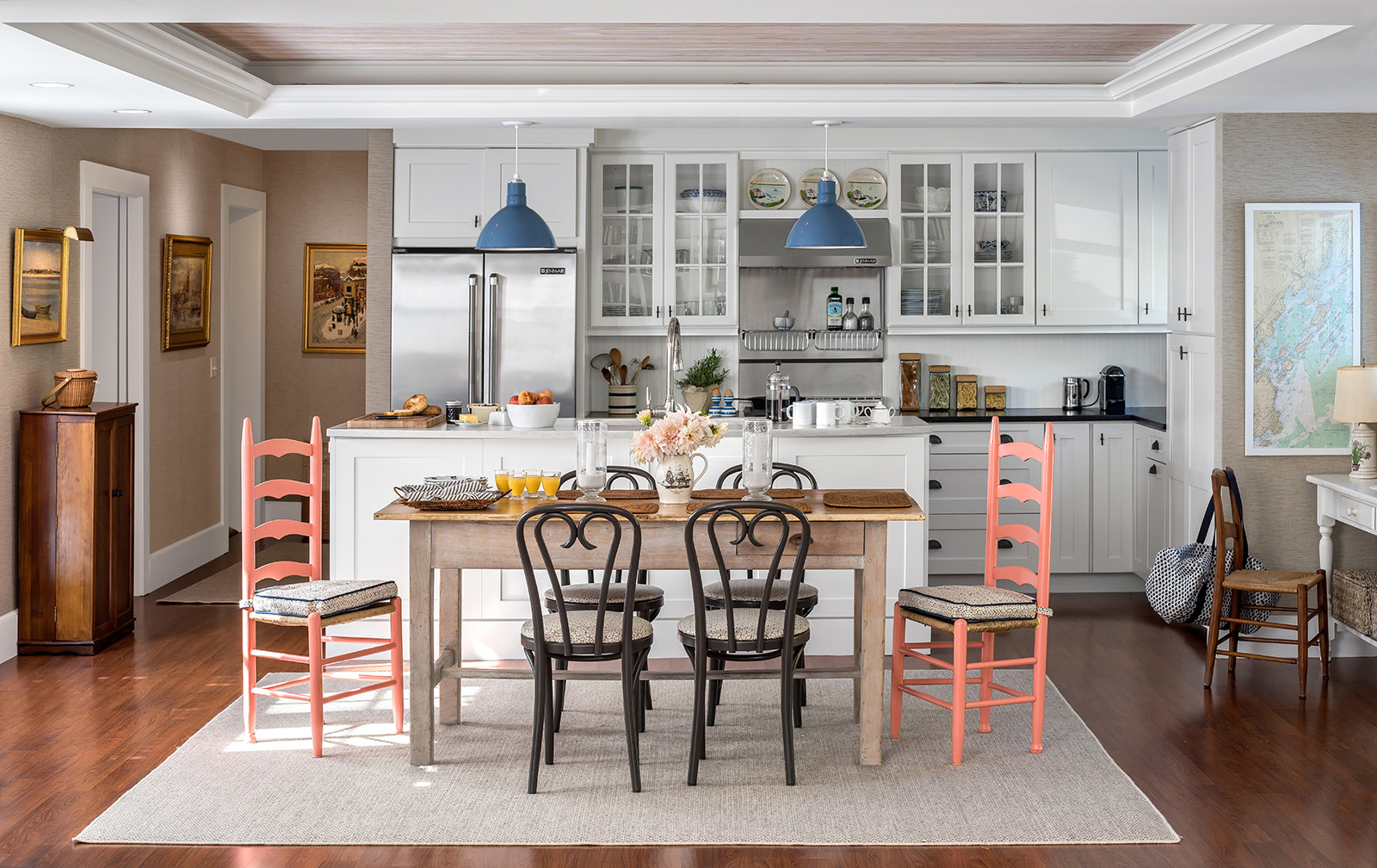
Shingle-style architecture of the late- nineteenth-century inspired the kitchen and pantry design of this complete reno- vation in an 18-room cottage. Inset door– style cabinets of Linen painted maple with antique brass barrel hinges by Wood-Mode Custom Cabinetry are stacked to the ceiling, accessible by a moveable library ladder. Tradi- tional divided lights for glass doors reveal china and glassware. The farm front double sink is custom-made of honed black granite to match the countertops. A cottage-style cutout for the toe kick valances, a beadboard backsplash and ceilings, and corbels beneath the wall cabinets reflect the historical influence. The island design includes corner columns and cottage-style toe kick valances. Appliances are built-in, with match- ing cabinet door panels to repeat the rhythm of the cabinetry. Early twentieth-century style light- ing in both the kitchen and pantry compliments the reproduction of the era. Large east-facing windows fill the kitchen with natural light and offer sweeping views of the bay and islands beyond.
The contractor, A.B. and J.R. Hodgkins, built new foundations to support an elegant kitchen that was formerly an enclosed porch. The orig- inal kitchen was in the basement, with service by dumbwaiter to the pantry next to the formal dining room. The pantry space was opened up by removing the wall between two smaller rooms into one larger. The inset-style cabinets are stacked to the ceiling as in the kitchen. The white china farm front sink in under mounted in polished carrara marble countertops. The back- splash in the pantry is a timeless brick pattern of white subway tile. Thanks to extensive experi- ence, the contractor was able to anticipate final measurements of the kitchen before demolition. Working as a team was essential. The owner is also a visionary in historical restoration and rebuild. His attention to form and color, and his ability to communicate the details, were major factors in creating a rewarding interior project.

Knoll Lea
FIRM: CHAUNCEY BOOTHBY INTERIORS
DESIGNER: CHAUNCEY BOOTHBY
ARCHITECTURAL DESIGNER: CAROL GREGOR DESIGN BUILD
BUILDER: RAINBOW CONSTRUCTION
PHOTOGRAPHER: FRANÇOIS GAGNÉ
LOCATION: SOUTHERN MAINE
This project is the designer’s parents’ summer home, which has been in the family for generations. A wing was renovated to be winterized for year-round living. The space had to be completely gutted, and they wanted the end result to feel old and new at the same time. This was accomplished by incorporating various antiques, heirloom weathered wicker furniture, and vintage tchotchkes, all mixed with fresh contemporary fabrics and colors. As a summer house, the space had to be equipped for lots of foot traffic from grandchildren, houseguests, and the like. It has a look that feels tailored and sophisticated, but nothing is too precious to put your feet up on.
The color palette of corals, browns, and soft blues was the starting point, and both neutrals and strong colors play an important role in creating a layered and lived-in look. Without the grounding shades of taupe and mushroom, this color palette would feel too bright and overwhelming. Chauncey Boothby repainted old, worn wicker furniture in Benjamin Moore’s Stone Brown, and together with a sisal rug in similar tones, the wood of the antique furniture, and the greige in the grass cloth, it creates a beautiful backdrop to allow the brighter colors to sing. The rest of the house was finished in a pickled beadboard. The goal was to create a look that ties in the winterized wing nicely, but in the depth of winter, when the rest of the house has been “put to bed” for the season, this space must feel warm and inviting, not like a summer cottage. In all her projects, Boothby’s design intention is always to modernize a space with contem- porary and up-to-date elements and then layer in pieces to create something that looks like it has been that way forever. “I always want my clients to feel ‘at home’ in their house, and hope I have succeeded in creating a cozy environment with various levels of detail,” says Boothby. For Boothby, it’s those final touches that take a space from feeling like a newly completed showroom to feeling like a room that’s always been there, where you could immediately grab a blanket and curl up with a good book.

Farview
FIRM: BANKS DESIGN | SIMPLY HOME
INTERIOR ARCHITECTURE AND DESIGN: LINDA BANKS, ASID
ARCHITECT: BRUCE BUTLER
PHOTOGRAPHER: FRANÇOIS GAGNÉ
LOCATION: FALMOUTH
Farview is nestled into a hillside perched just above Casco Bay. Rugged outcroppings and distant views spill along the hillside, which is peppered with giant old trees, moss, and stone. The colors of the earth and the woods were an undeniable inspiration for the palette in this home for an active, interesting family from Boston.
The clients were fair minded and incredibly focused decision makers. They respected recommendations and were conscious of the designers’ time. Architect Bruce Butler led the exterior renovations including a new bunk room over the garage and opening up the rear side to the view. Chris Ballard was hired as the contractor. When demolition began, it was discovered that the house had been infested with mice, and every- thing behind the walls, from wiring to insulation, had been eaten to shreds, as had the drywall itself. The house had to be completely gutted, which gave the design team permission to redo every surface.
The vibe of the space is clean. Every finish is family friendly. It’s a compendium of natural textures, various natural wood tones, and moss green, ocean blue, and sky gray mixed with creams. Using these colors was a depar- ture from the classic coastal palette that so many people love, but, says Linda Banks, “It’s uber relaxing, and as we like to say, ‘This house has everything they need and nothing they don’t.’” Printed linens on the chairs sing their own tune, and moss green velvet dining chairs are absolutely dreamy. The penguin artwork over the game table is one of the first pieces the clients bought from Simply Home, adding character and humor to the space. Banks Design | Simply Home has two design mantras: Always create a home that is timeless—in other words, use materials are transportable from decade to decade. And never design two projects to look the same. Banks’s work reflects a simplicity that allows each homeowner or family to make it their own.

A Modern Pop in Cape Elizabeth
FIRM: HUFFARD HOUSE
DESIGNER: BRONWYN HUFFARD
PHOTOGRAPHER: MEREDITH PERDUE
LOCATION: CAPE ELIZABETH
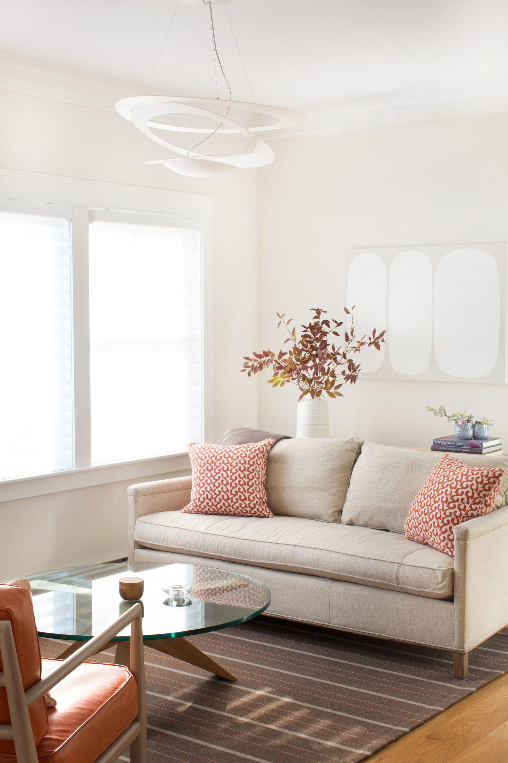
The clients of this Pond Cove home have contemporary taste, appreciate custom details, and are not afraid of color. They came to Huffard House with a blank slate, which made for an exciting project with endless opportunities. The modern light fixture by Artemide in the living room was the first piece specified for the home and set the playful tone throughout. Bronwyn Huffard designed a custom Merida wool rug with an orange stripe as the primary color. The boldness of this saturated color was incorporated in the overall design scheme, including the leather on the two midcentury modern Redford House chairs and the Warhol printed skateboards. The propeller coffee table was made by local furniture and textile company Angela Adams.
Although there are bold pops of color throughout the house and in this room in particular, the goal was to make the space feel balanced, warm, and inviting. This was achieved with a neutral wall color and natural wood finishes. The artwork, including a neutral piece by local artist and friend Laurie Fisher, and the pillows upholstered in fabric from Seemakrish, bring the design together in a cohesive way.
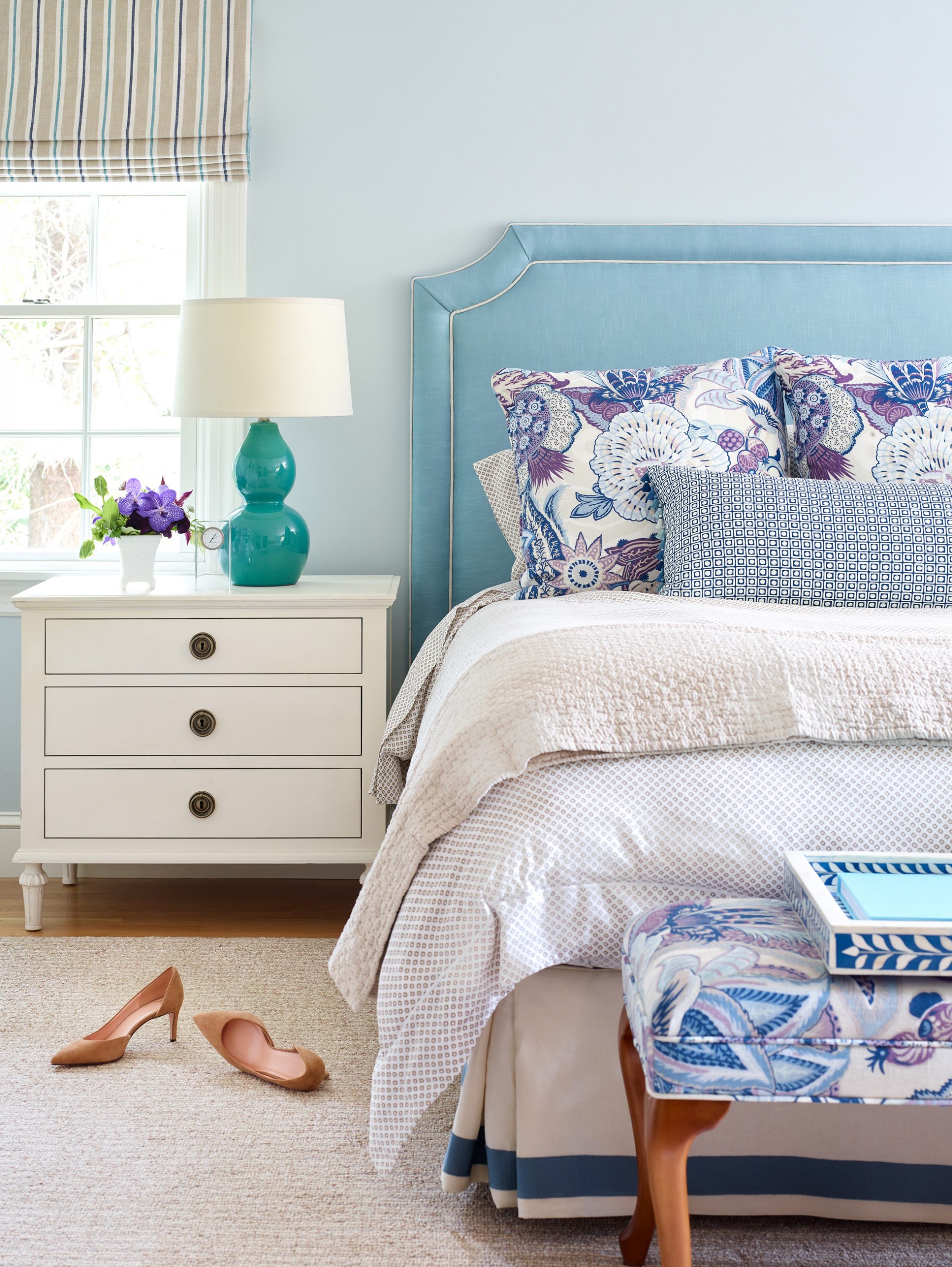

Falmouth Primar Suite Renovation
FIRM: KEELER AND COMPANY
DESIGNER: LAURA PIERCE
PHOTOGRAPHER: JARED KUZIA
LOCATION: FALMOUTH
For this project, the key driver of the design was to improve and increase the use of space. An existing guest room was made into a spacious bedroom with a custom closet and full bath- room. Laura Pierce focused on infusing color throughout the spaces while ensuring that the tradi- tional features were celebrated, too.
The design is comfortable and sophisticated without taking itself too seriously. Pierce wanted the clients to have a space that functions flawlessly and allows them to truly retreat, all while being beautiful. Extra care was taken that each element fit just right. The whole project came down to inches—stealing them here, adding them there—to get the storage the clients need and find a flow that works for everyone. Pierce also spent a lot of time considering the materials. Everything had to be timeless, look tidy, and be easy to clean.
During their first design meeting, Pierce brought a handful of fabrics to get a sense of where the clients wanted to go. The Schumacher on the euro shams and the roman blinds in the bathrooms were instant favor- ites. Rooms were built around the fabrics, pulling in textures and layering finishes so that they feel light and bright but not overly summery for a year-round residence. The trunk, dressers, and painting above the chair were all things the clients already owned that were incorporated into the new layout.
Keeler and Company’s design philosophy is very client specific. Each project is a study in how the clients will live in their space and how they want to feel while they experience it. “I always say we don’t save lives, but we do allow for people to truly be their best selves in their homes,” says Pierce. The bedroom is a restorative place, and Pierce feels grateful to provide clients with a space to soak or relax, to dress and unwind.


Peaks Island Cottage
FIRM: HEIDI LACHAPELLE INTERIORS
DESIGNER: HEIDI LACHAPELLE
ARCHITECT: WHITTEN ARCHITECTS
PHOTOGRAPHER: TRENT BELL
LOCATION: PEAKS ISLAND
The inspiration for the project was the concept of a modern cottage. The clean lines of the architecture were tempered by materials with character: white oak in a matte finish that highlights its grain, white-washed beams, vintage rugs with subtle signs of wear. This, in combination with a desire to bring the outdoors in through a palette of blues, greens, grays, and linens, make the house feel at home in its setting. The biggest challenge was to make each space in the open-floor plan feel defined yet cohesive.
The space feels fresh, clean, and instantly relaxing. Generous and abundant windows give the feeling that you’re immersed in nature. Built-ins throughout provide easy storage to help avoid any clutter. The mix of new and vintage furnishings give the home a casual, comfortable feel. Lachapelle opted for Swed- ish and Danish furniture from the 50s and 60s, such as Bruno Mathsson’s Eva chair in the living room, a green leather Arne Norell safari chair for the main bedroom, and the playful striped Bernt Petersen Rag chairs in the family room. These vintage pieces sit comfortably within the clean and streamlined architecture.
Nailing down the right mix of materials took special consideration. Lachapelle used mostly indoor/ outdoor or performance fabrics for all of the uphol- stery so the client didn’t have to sacrifice form over function. This space is truly family friendly, as nothing is too precious, and sophistication still remains. “They are a young family of five, so we wanted to ensure that everything was livable, and they felt at e se the second they arrived home,” says Lachapelle.


Peaceful in Portland
FIRM: MAINE STREET DESIGN COMPANY
DESIGNERS: MARIE MATSON (HOMEOWNER), BRETT JOHNSON
PHOTOGRAPHER: PETE MORNEAU
LOCATION: PORTLAND
The second level of this four-story townhouse was designed to flow from dining room to living room and kitchen to the bedroom on the third level. The facade of the townhouse is modern, while the furnishings, art, and antiques are of French and English origin with Chinese accents. “The inspiration came from a question that loomed large: ‘How do I make this stuff that I have been collecting for more than 50 years work in this bright new modern setting?’” says homeowner Marie Matson, who found the answer in how freely Europe- ans mix the past with the present. Interior designer Brett Johnson of Maine Street Design Company was hired to help Matson design her dream home. “It’s a symbol of her authentic self from top to bottom. The gray tones used throughout the home stem from her love of the painted gray furniture of the Gustavian era in Sweden in the late 1700s,” says Johnson.
The high ceilings, natural light, and the contempo- rary pendant light above the kitchen island guarantee a vibrant feel throughout the day into the night. On the stair landing and at the back wall of the kitchen are two of the homeowner’s recently acquired works of art. The first is a neon piece, The Good Life, designed by Matson along with her artist son R. J. Matson and created by David Johansen, also known as Neon Dave of Portland. The other is a lithograph from 1956 titled The Woman with the Fish: After Picasso by the studio of Fernand Mourlot of Paris.


Strand
FIRM: MORRISON DESIGN HOUSE
DESIGNER: JENNIFER MORRISON
PHOTOGRAPHER: JEFF ROBERTS
LOCATION: CUMBERLAND
It was important that the kitchen feel like a natural element, and while the house is actually nestled in a wooded lot, designer Jennifer Morrison felt compelled to embrace the sandy tones of Maine’s beaches. Often as you approach the ocean, you get a view of swaying beach grass among all the sand—Morrison wanted this kitchen to feel like that approach. It’s polished without being fussy and is super comfortable. “The clients wanted it to feel like a gathering place for their three kids, and I think we accomplished that,” says Morrison. “The vibe is very much ‘Mom can do her thing while still having her eye on everyone happily plugging away at the table.’”
The ceiling height was 10 feet, but one of the clients is 5’2″, so the kitchen needed to be functional for her. According to Morri- son, there’s no use having a ton of storage if you can’t reach anything. The white oak ladder, which is moveable, adds a stylish design element while ensuring everything is within reach.
The color palette is primarily neutral with a splash of deep green. The contrast helps to break up the neutrality while further cementing the inspiration for the space. The flooring is white oak with an invisible matte finish, and the ladder and table are both original designs of Morrison Design House. The custom cabinetry is by Northe Woodworking and features a hutch on either side of the main elevation. There is also a custom tile backsplash in the Uni Mountain pattern by Fireclay Tile. The chairs at the table are from Restoration Hardware.
This kitchen is a true expression of Morrison Design House, as it represents the firm’s dedication to bespoke cabinetry, features rooted in tradition, and inspiration from the natural world. The design is flexible and responsive to the human experience, ensuring the perfect marriage of style and functionality.

Atlantic House
FIRM: EDITH SMITH INTERIORS
DESIGNER: EDITH SMITH
PHOTOGRAPHER: PETER MORNEAU
LOCATION: WELLS
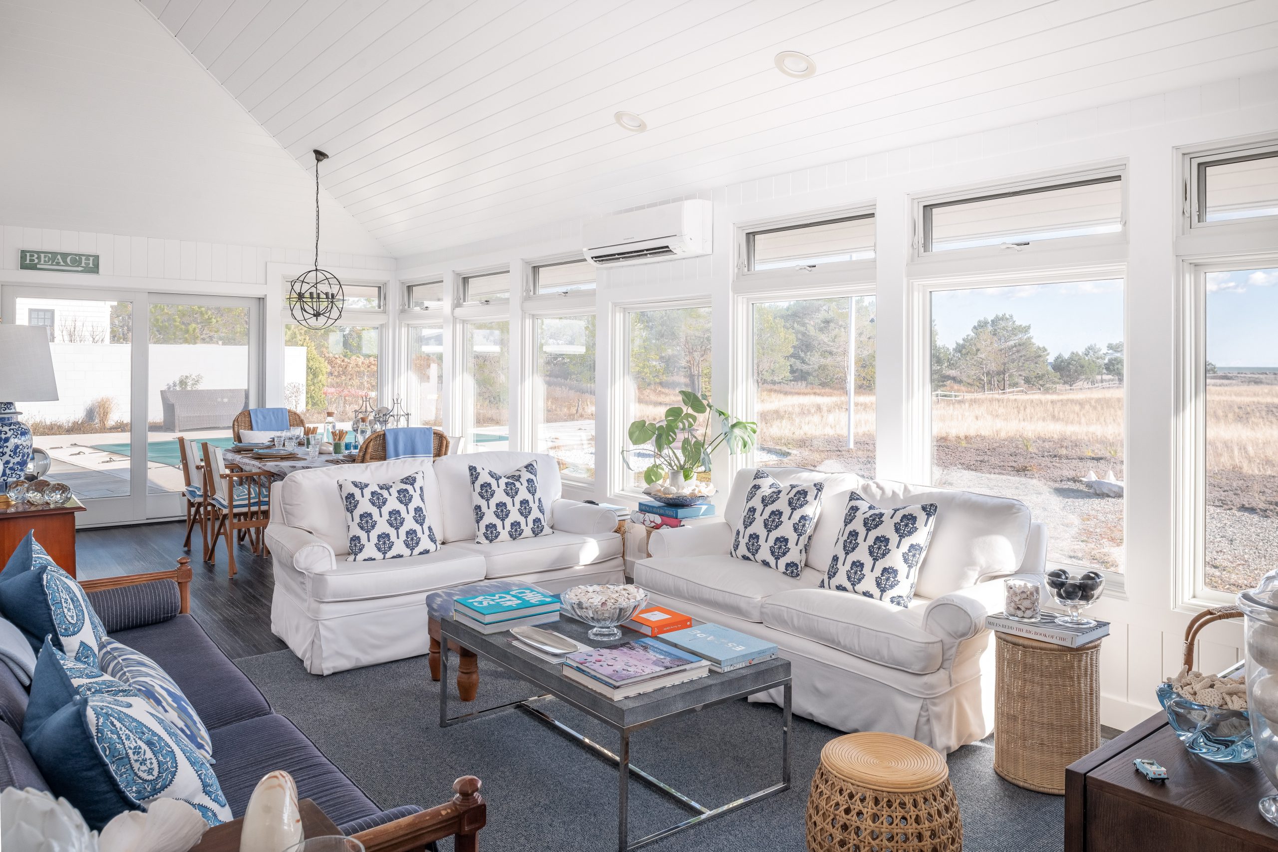
The property is fronted by two acres of sand dunes that gently roll to the white sand beach and ocean beyond. Bought at a foreclosure auction 38 years ago and untouched in as many years, the brief was simple: make the 1,185-square-foot house comfortable for potential year- round living for the couple but functional enough to accommodate visiting adult children and grandchildren. The challenge was to do this without increasing the foot- print or moving any of the structural concrete-block and brick walls, which were essentially all the walls in the house. Walls in the bedrooms and bathrooms were covered in drywall, but the “textured” walls in the common areas were embraced and simply painted white. After much deliberation, the fireplace in the living area was removed to make way for precious wall and closet space. The pool surround and bluestone terrace were redone. New furni- ture, lounges, and a firepit were added to extend the living space outside in the spring, summer, and fall.
Inky black fumed vinyl flooring runs throughout the house to extend the sight lines, and is juxtaposed with crisp white walls and trim. The living area is anchored with a navy and white area rug and an extra-long sofa covered in a navy and white pinstriped denim—the perfect spot for afternoon naps. Two traditional loveseats and a club chair are covered in white Sunbrella, the perfect perfor- mance fabric, and accented with blue and white printed pillows and cashmere throws. Wicker side tables and a rattan ottoman add texture, while the antique dresser and bow-legged table bring history to the space. Classic blue and white lamps add height to the layered tabletops that hold treasured items. In the dining area, the oval table is dressed in an Indian paisley tablecloth and surrounded by wicker host chairs with Turkish throws and director’s chairs. Artwork is limited—the priceless canvas is the view.

Historic Waterfront Home
FIRM: KATIE ROSENFELD AND COMPANY
DESIGNER: KATIE ROSENFELD
PHOTOGRAPHER: READ MCKENDREE
LOCATION: YORK
This home was designed for a longtime client who grew up in Maine but now lives with her young family outside of Boston. Katie Rosen- feld designed their Maine home to be quintes- sentially New England. The space is clean, fresh, and traditional with a heavy dose of nostalgia—think Maine granny chic! The designer used a cheerful palette of citrus colors, warm golds, and corals mixed with lush greens and blues so it wouldn’t look too coastal-Maine but would still feel summery and alive. She also incorporated pattern on pattern, print on print, and vintage oil paintings of ships to emulate a seaside feel, again without seeming overtly coastal. Florals by Schumacher and Pierre Frey, checks, stripes, and lots of wallpaper by Sister Parish were employed to bring layers and warmth to the historical property. “I would describe it more like a country home that happens to be waterfront,” says Katie Rosenfeld. The view speaks for itself, and almost every room has a water view.


Condominium Refresh
FIRM: ENCLAVE INTERIOR DESIGN
DESIGNER: MARIANNE LESKO
PHOTOGRAPHER: PETER MORNEAU
LOCATION: PORTLAND
In every project, the client is the first inspiration, so it is important to understand their personal style and their likes and dislikes. For this project, the client is a stylish individ- ual with her own taste—a minimalist with flair. On the first visit, Marianne Lesko noticed that the client prefers potteryand ceramics with natural, earthy glazes; collections of natural objects such as dried sunflowers; and small, well-placed arrange- ments of shells and stones.
The space had an abundance of natural light from multiple windows along the side of the condominium, which helped to create a comfortable and understated but stylish space that is very warm and inviting. The layout of the furniture and the balance of light, fabrics, and accessories are key to this aesthetic. With very bright light on one side of the narrow space and no windows on the other side, there was the danger of a stark contrast. This was addressed by using light fabrics on the sofa that reflect the light.
It was apparent from the client’s personal taste that the color palette for the fabrics and lighting would be neutral and organic, with splashes of color introduced through accessories. Although the living area carpet has an abstract design, it has the feel of a coastal landscape. A black finish was chosen for the shelf unit to highlight the client’s pottery and stoneware collections. Because the living space is long and narrow, a sectional sofa with a chaise was selected to give the room a sense of division. Local artwork, such as the painting Three Windows Monson by Tessa Greene O’Brien, hangs in the home office.
People need a comfortable place to live but they also need an interesting place to live—a place that reflects their personal style and not just the designer they hired. Lesko’s philosophy has always been to learn what the client needs first and then help them go farther. “Every client’s needs are different, so what I supply as the designer is somewhat different for every project. In the end, a happy client is the real measure of success in any design,” she says.
Bowerbird Design Collective
FIRM: BOWERBIRD DESIGN COLLECTIVE
DESIGNERS: MELANIE SCAMMAN, LAURA ZOULAMIS
PHOTOGRAPHER: LAURYN HOTTENGER LOCATION: MACHIAS
Bowerbird Design Collective took the overall brand narrative and palette that they had designed for Machias Savings Bank’s (MSB) retail branches— the location on Middle Street in Portland being the most recent—and translated it to serve as MSB’s literal showcase. A woven community was the inspi- ration. Machias and downeast Maine have such an amaz- ing, rich, connected community with strong industries in forestry, fishing, and wild blueberries. The logging indus- try helped inspire the narrative of the modern interiors because the building is located on the Machias River. Due to the exposed logging remnants and cribwork that jut out from the riverbank, one can automatically connect to the past of the site.
An abundance of natural light floods the open interiors, which are bold and clean with contrasting patterns that work well with the earthy palette and crisp white walls. Accent colors in orange, teal, and green connect and give the interiors a punch, while stained walnut gives respite. Furnishings are clean, modern, and ergonomic. One piece in particular, designed by Italian designer Magis, provides a sculptural element and sets the tone in the entry lobby. Modern seating provides ample opportunities to meet and greet, while glass walls provide perpetual views through- out the space.
The space, the process, and Bowerbird’s philosophy are congruent. Their design philosophy is holistic: they design for each client’s objectives to specifically meet their needs and their brand image and also to optimize performance, increase productivity, and promote happi- ness. Designers at Bowerbird pride themselves on telling the story of their clients through the spaces they design. “We design with intention, balance, integrity, and respect,” says Melanie Scamman.


The Bayview Hotel
FIRM: FROG HILL DESIGNS
DESIGNER: BETSY STIRES
PHOTOGRAPHER: FRANÇOIS GAGNÈ
LOCATION: BAR HARBOR
When working on this project, Betsy Stires of Frog Hill Designs wanted to capture the essence of the original rusticators who visited Mount Desert Island (MDI) in the late 1800s and early 1900s. Theywere a group of people who loved the natural beauty of MDI but brought their creature comforts with them from home. Although they often lived in “camps,” they brought their silver, china, linens, and libraries with them for their sojourns on the island. Frog Hill Designs honored them with a large photographic portrait in the lobby.
The palette was built around the colors found in nature on MDI: lots of the grays that are found in the bark of trees and many shades of green found in the grass and leaves in the landscape. Because one entire side of the building and all of the guest rooms have water views, Stires treated the vibrant blue of the ocean views through the windows as if it were artwork, the French doors acting as huge picture frames. The natural seascapes are echoed in a beautiful Eric Hopkins painting in the dining room.
While focusing on the durability and timelessness of the design elements, Stires was able to create an inter- esting and inviting space that will stand the test of time. She added a luxurious feel with custom rugs from Stark Carpet, artwork from local Maine artists such as Aaron Mitchell, striking wall coverings with multiple graphic dimensions, and real birch trees and branches. Frog Hill Designs delivered an aesthetic to the Bayview Hotel that is both unique and true to the interiors Stires likes to create.

The Mooring at the Downs
FIRM: GAWRON TURGEON ARCHITECTS
DESIGNERS: REBECCA DILLON, DEIRDRE PIO
ARCHITECT: GAWRON TURGEON ARCHITECTS
PHOTOGRAPHERS: CLAUDIA MURRAY, ONYX OWL TOURS, C.A. SMITH PHOTOGRAPHY
LOCATION: SCARBOROUGH
Designers Rebecca Dillon and Deirdre Pio worked closely with the client, Lynn Peel, to model the laundry room at the Mooring at the Downs after the space at its sister community, the Mooring on Foreside. The client was seeking a larger laundry room to boost comfort and functionality, creating a more relaxing and accessi- ble room for both housemates and care partners. The client had a strong vision for what the room would look like, which was accomplished through placing cheerfully colored cabinets against a crisp white tile wall. With abun- dant storage in a spacious setting, this space is as enjoy- able as it is useful.
This classic, comfortable New England Cape–style dwelling is the culmination of the collaborative efforts of the developer, designers, and contractor, all shar- ing a devotion to the owner’s vision. The overall layout of common and support spaces was designed for easy accessibility to minimize the challenges and anxieties associated with transitioning from home to assisted living. Each of the 12 resident rooms features an en suite bath- room and opens to a beautiful, secure backyard. Every chosen material, finish, and color underwent meticulous evaluation to ensure that the coastal cottage aesthetic was achieved and that the layout and function of the support spaces reinforce the owner’s vision.
The designers were challenged with creating a quaint and familiar, homelike environment while serving the specific needs of those suffering from age-related memory loss. The result is a building that transcends tradi- tional institutional care while maintaining the particular requirements of a fully programmed care facility.
The team worked with a cool-toned color palette to evoke classic coastal style, with nautical accessories and artwork to complete the seaside decor. The soothing feel of the interior is designed to help alleviate stress for both housemates and visiting family members, improving the well-being of all those in the space.


Nathan Clifford Residences
FIRM: ROBIN DAVIS INTERIORS
DESIGNER: ROBIN DAVIS
PHOTOGRAPHER: RHONDA FARNHAM PHOTO
LOCATION: PORTLAND
When Robin Davis was tasked to stage a model unit for the developers of the Nathan Clifford Residences, the site brought back memories of the beloved neighborhood where she had had her first apartment. The strong architecture of the building is an integral piece of the landscape. “How beautiful it was to see something be part of a neighborhood but not over- take it,” says Davis. When she stood in the wide school hall- way, she immediately saw how the space could be an art gallery on its own, showcasing works by artists who could potentially live and/or work in this building. Its uniqueness of style versus the new stuff happening downtown was something Davis enjoyed wrapping her head around and designing for.
Davis wanted to maintain the feeling of grandeur of the soaring ceilings and windows. Formerly painted a harsh yellow, she converted the unit to a soothing Benjamin Moore Gray Tint. Davis leaned into a midcentury modern style, keeping it minimalist and calm. Because of the open floor plan, it was important to delineate specific zones connected to each other through furnishings and style. The original chalkboard and built-in supply closet (which was turned into a pantry) allow past and present to meld beautifully. The smaller of the two bedrooms could be used as an office, but Davis set it up with a daybed for guests or as a reading nook.

Via Vecchia
FIRM: QUILL DESIGN
DESIGNER: WENDY POLSTEIN
BUILDER: NMT WOODWORKING
PHOTOGRAPHER: ANTHONY DIBIASE LOCATION: PORTLAND
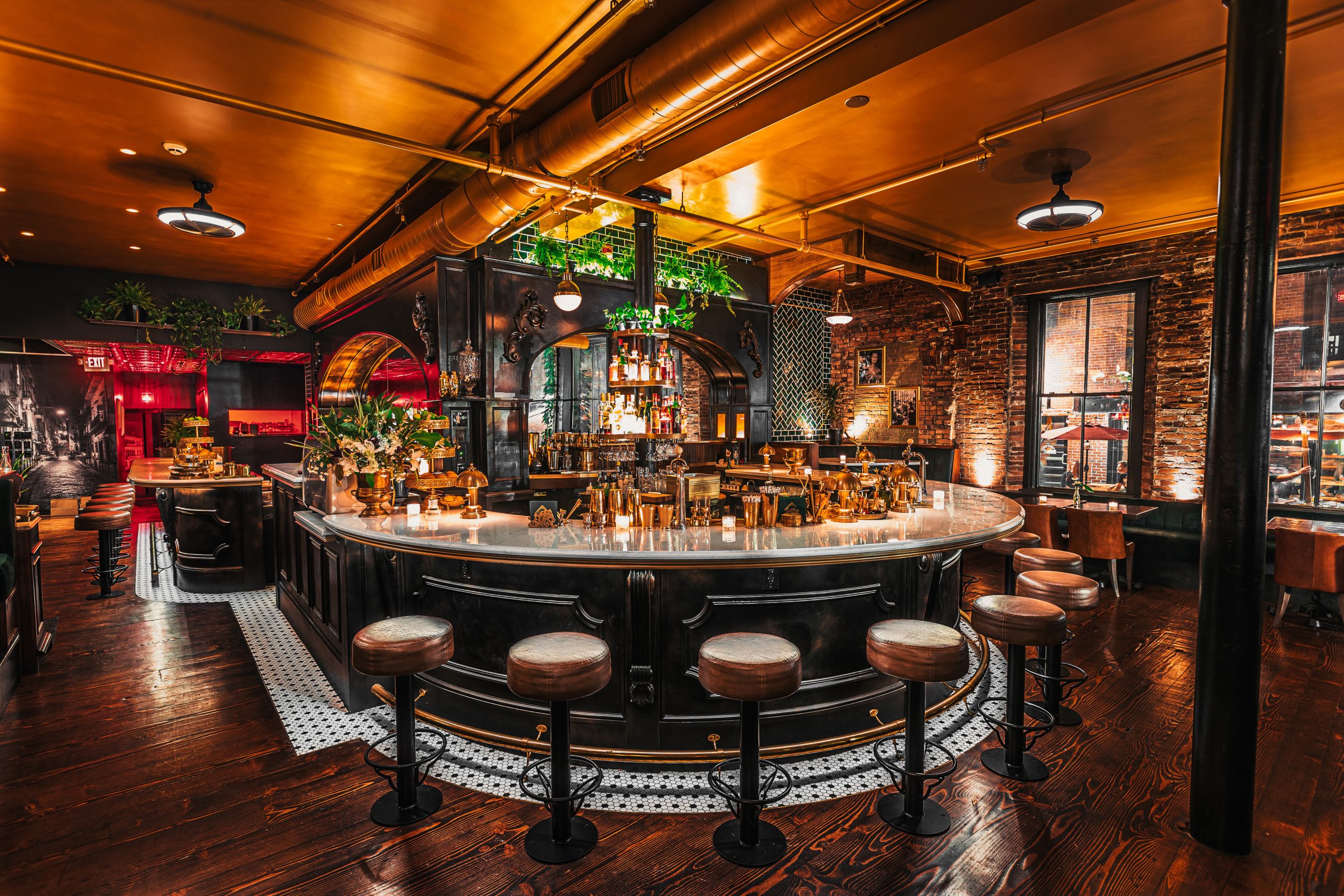
The design team drew inspiration from pre-World War I European bistros. Via Vecchia translates as “the old way”—a perfect name for this 1920s Italian bistro concept that celebrates food, wine, cocktails, gracious design, and the gathering of people. The atmosphere is very social, transporting diners back in time to the crowded streets and cafes of early 1900s Italy. C-shaped booths face the dining room and allow customers to take in the comings and goings of the restaurant. The mood is rich elegance with a touch of glitz, creating a place where you want to celebrate and visit often. The back dining and bar space is slightly hidden and very masculine in tone. Large candelabras, gold beaded curtains, and black and gold velvet seating come together for an inti- mate lounging experience.
Emerald green velvet booths signal the formal part of the restaurant, and black and white mosaic tile wraps around the large U-shaped bar, while dark wood stained floors suggest 100 years of bistro activity. Each of the front windows is highlighted with a large crystal and gold chan- delier. Grand gold mirrors hang above the booths and are angled to allow customers to fully see the space. The back room features eight antique light fixtures rescued from the Waldorf Astoria hotel in New York City. A large iron and crystal chandelier from Union Station in Washington, DC, hangs over the black marble bar. Ivy plants, antique mirrors, and Italianate imagery dot the walls to help tell the story.
The bathrooms are a work of art in and of themselves, and their elegance and attention to detail equal the main spaces, with full tile walls, black marble countertops, gold mirrors, and lights from the Waldorf Astoria. Paul White Tile created complicated and detailed quartz bar tops and bathroom vanities that look like Carrara or black marble.
Wendy Polstein’s philosophy has always been to listen to what her client wants and let this guide the design process, and owner Joshua Miranda had a clear vision for the space and knew what he wanted to achieve. Quill Design’s job was to curate objects and design elements that work toward a cohesive concept.


A Modern Industrial Restaurant Rehab
FIRM: KNICKERBOCKER GROUP
DESIGNERS: JULIEN JALBERT, BRADY-ANNE CUSHING, PASCALE PLÜSS-ZEHM
PHOTOGRAPHER: DARREN SETLOW
LOCATION: WISCASSET
In designing the Water Street Kitchen and Bar in Wiscasset, Knickerbocker Group decided early on to pursue a modern industrial vibe, as the structure has had many uses over the years, including as a carriage house, car repair shop, and fill station in the mid-1900s.
To save on the design budget, the team got creative with sourcing materials, light fixtures, and art. Many items were repurposed or reclaimed, which adds to the overall character of the space and is a subtle nod to the industrial history of the structure. Pieces of antique machinery left from the previous owner were curated as focal points in the space, and the bar top was built from reclaimed pine and walnut from South Portland’s Rousseau Reclaimed Lumber and Flooring. The designers purposely worked with small businesses throughout the project.
The color palette is relatively neutral, with warm wood tones on the bar and tabletops and select pops of oranges and blues for accents. Local artist and metalworker Nate Hicks fabricated three sculptural pieces using reclaimed metal that was either donated or procured from various scrap yards in Maine. Soft textures contributed by hang- ing burlap installed on the ceiling, cozy lounge furniture, and warm lighting entice you to stay and enjoy the space.
Overall, a sense of authenticity was kept intact, and details discovered during the construction process were celebrated: Existing poured concrete floors, dating to when the building served as an auto repair shop, were found underneath the carpet in the bar and lounge area; they were refinished and given a second chance to express their inherent beauty. Several signs that now hang in the space once adorned the front of the building, and they speak to its many uses over the years. The expression “less is more” resonates with this design, as the team prioritized decisions based on their overall impact on the design aesthetic and project as a whole.