Blank Page
FEATURE – September 2012
by Rebecca Falzano | Photography Trent Bell | Styling Janice Dunwoody
A sustainable home for books—and book lovers—on the Pemaquid Peninsula
“We’ll need a place for our books,” homeowners will say, and their architect will respond with a library, maybe some reading nooks, a window seat, proper lighting. But what happens when your clients are two serious bibliophiles? With hundreds, if not thousands, of books? For homeowners Tamara Stock and Robin Moody—both book resellers from the mid-Atlantic—a library simply wasn’t going to cut it. In their house, books would have to coexist throughout, in every room, on every shelf (and there would have to be a lot of shelves), comingling with the other functions of the space.
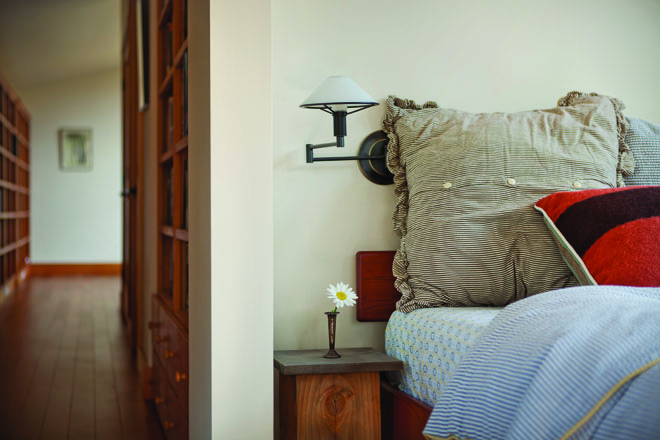
The art and photography books fill out the living room. In the kitchen are the cookbooks, of course, alongside books on travel photography, gardening, architecture, and design. The natural-history collection is in the entryway to the guest room, while the guest room itself is home to the science tomes and young-adult titles. Books about music can be found in the media room. Fiction titles—organized by their original language of publication—live in the exercise room. There’s a small section of history in the upstairs hall, and the office shelves are filled with travel, philosophy, and reference books. And that’s just a third of the homeowners’ collection. “We have taken our favorites,” says Stock.
Stock and Moody have a long history in Maine. They vacationed in a small cottage on the Pemaquid Peninsula for many years, and they loved the area for its proximity to Portland’s airport and the accessibility of both fresh water and salt water. And, of course, they loved Maine Coast Book Shop, the wonderful local bookstore in Damariscotta. After finding a remote 58-acre site on Pemaquid Pond, they sought a LEED-certified architect with experience in sustainable design. They wanted to build a house that would fit into the forested landscape and have as little impact on the environment as possible. For the homeowners, this meant incorporating passive-solar features and superinsulation elements into the design. The name of architect Chris Briley of Green Design Studio in Yarmouth came up during an internet search, and his philosophy on green design resonated with them. The first meeting happened in his office.
“It wasn’t really a design meeting,” recalls Briley, “but we couldn’t help ourselves.” Briley was impressed with the way Stock and Moody talked about materials. “All their discussions were about the space and the site—the light, ventilation, and experience. Almost like the way architects talk about it.” As they were leaving their first on-site meeting, Stock and Moody told Briley they were ready to get started. Briley was caught off guard. Usually, his clients bring a stack of pages ripped from magazines that offer clues to their aesthetic. Moody and Stock had no stack.
You might think that being given carte blanche would be freeing for an architect. Trusting clients and a blank slate—what more could a designer ask for? For Briley, it was everything he needed. Except for, well, maybe a tiny bit more direction.
He spoke up. “Guys,” he said, “I’m about to leave and start drawing. I have no idea what you see here versus what I see here. What’s your aesthetic? What do you want to do?”
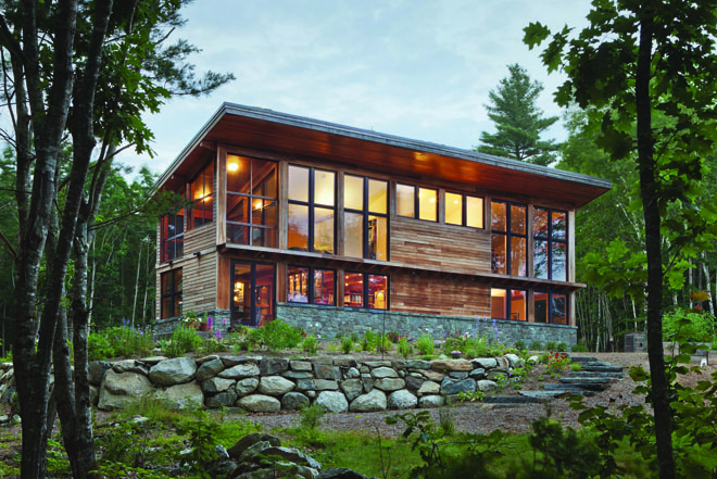
“It was sort of like hopping in to see the hairdresser or barber and saying, ‘Just do whatever,'” he recalls. “You know, that’s terrifying!” Moody thought for a long time and then responded, “I want it to feel like it belongs here. To be a house of wood, stone, and glass.” Stock jumped in, “But, we’re not traditional—we don’t want a farmhouse.” A wave of relief, along with a vision, washed over Briley. “If I had known them better, I’d have hugged them right on the spot.”
Although Moody and Stock have always lived in older homes, and they appreciate their elegance and charm, the couple wanted something different for their place in Maine—something “spare, European, very modern, very green.” Briley was ready.
Not long into the design stage, though, a permitting challenge developed. The town’s shoreline regulations had changed—from a 100-foot setback to a 150-foot setback. While an additional 50 feet might not seem all that consequential, it did mean that Briley had to recalibrate his design. It also meant less dramatic views for the homeowners. Deciding to make the best of it, the team refocused on the newly relocated footprint, and began designing a structure that was slightly pushed back on the site.
Bob Baldwin of Eastern Construction handled the contracting and building. The house was designed as a post-and-beam structure made with connections made of steel plates and pins. “It’s not really the craft of timber framing,” explains Briley, “but it has the character of a timber-frame structure. At first, the builders thought the flitch beam (three-quarter-inch steel plate sandwiched and bolted between wood beams) was overdesigned. Then they saw just how much roof and floor load it needed to support, and they realized it was warranted.”
The timber-frame-inspired design creates open, warm, light-filled spaces throughout the home, and natural materials are expressed in modern ways. Warm wood offset by cool concrete and stone imbues the home with a comforting atmosphere and, combined with the tranquility of the site, makes the home feel like a retreat from the busy world. A symphony of woods—Douglas fir, poplar, bamboo flooring, Baltic birch—has an immediately accessible charm. “There’s an emotional attachment we have to real, natural materials,” says Briley. “We have an innate understanding of them.”
Ample shelving for the book collection creates delineations between rooms, such as the open shelving between the kitchen and living room. On the second level, shelves and drawers act as a railing between the open living room on the lower level and the study and master bedroom on the upper level. The openness of the floor plan, combined with the angled mono-pitch roof rising to the south, creates a sense of continuity and expansiveness. Rather than several small, compartmentalized spaces, the plan is characterized by open spaces and a connected upstairs and downstairs. “Most of the time, it’s just the two of them, so they don’t need an ultra-private separation,” says Briley.
While Stock and Moody enjoy all of the spaces in their home, the kitchen is one of their favorite places to be. Kitchen designer Sarah Steinberg of Steinberg Custom Designs in Cumberland worked with the homeowners on the selection of appliances, materials, and furnishings. In their former home, Stock and Moody enjoyed a U-shaped layout with peninsula, and the couple knew they wanted to recreate this general design (with plenty of storage) in their new home. Yet the abundant windows and beaming presented a challenge, particularly when it came to designing the cabinetry above the peninsula. To avoid creating a visual barrier between rooms, Steinberg came up with a suspended, all-glass wall cabinet that hangs on metal rods without touching the ceiling—as if it is floating in space. “It is completely see-through and presents no obstruction to the visual flow of the space,” she says. The use of natural materials continues with stained birch cabinetry and granite countertops.
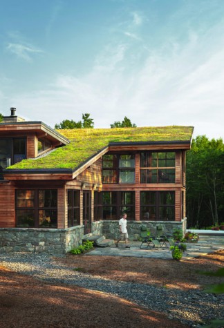
With sustainability high on the wish list, Briley designed the house to use both passive and active strategies to reduce dependence on the utility grid and fossil fuels. One of the greenest elements of the house—literally—is the vegetated roof. Planted with hardy alpine sedums, the roof helps with storm-water management. “It can absorb a one-inch rainstorm without much in the way of runoff,” explains Briley. “This is an increasingly critical issue on these pristine lakes in Maine.” The roof also respires, so the heat gain in the summer is zero, while the north-facing tilt allows the expansive windows on the south façade to balance the windows on the north and west facades, which face the pond.
In addition, a wide overhang on the south façade and a sun-shading technique known as brise soleil protect the home from high-angled summer sun while allowing in low-angled winter sun. The first-floor radiant slab is of polished concrete to provide thermal mass—a critical component of the home’s passive-solar design. For heat, a 90-tube solar-collector array by ReVision Energy provides all of the home’s hot-water needs and approximately 50 percent of the space heating. In extended periods of cold, overcast weather, a high-efficiency gas boiler provides the rest.
It takes a special client to be able to relinquish control and hand over the reins to a designer with only a few requirements. But for Stock and Moody, their trust was well placed. “The house is a joy for us to live in on a daily basis,” says Stock. “It is beautiful, comfortable, easily maintained, and allows the outdoors into our lives even when we are inside.”
A home that can take you to places you’re not. Sounds like a good book.


