High Style
An elevated, window-bright condo in Portland is dressed in sophisticated neutrals, minimalist silhouettes, and big, bold art
A common misconception is that people who hire interior designers have no taste, says Vanessa Helmick, owner of Fiore Home in Portland, when actually they often have very good taste. It’s easy to assume that the people who hire a professional to help furnish and finish their homes do it because they are unable to make a decisions, or are unqualified to choose their own couch or tile or art. But in her years working with clients Helmick has come to see that this is very rarely the case. “People who have great taste tend to hire designers,” she says.
Joe and Ren Paolino are a case in point. Their Portland condo is placed high on India Street at the corner of one of the many new condo buildings that has been erected in recent years. This building, Helmick says, is exceptionally well done. “I didn’t have to do anything to the bathrooms other than find mirrors and change the faucets,” she reveals. “White cabinetry and black hex floors? They were good to go.” The angles are a bit funky, she says, but that adds character. And the floor plan is open and airy (to promote socializing), with big windows that let in natural light from multiple angles (a boon when the winter blues come calling). “The square footage is small,” says Joe. “The bedrooms at our previous place were bigger, but here we have a big living space. We use it a lot.”
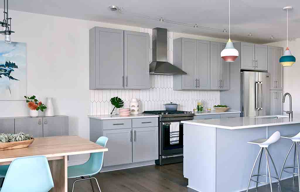
In some ways, this made Helmick’s job easy. She was starting with an interesting floor plan that features a big curved wall, a soaring black iron spiral staircase, and two deck areas. She was also starting with clients who had vision—plus a couple of stylish, colorful pieces from Furniturea they planned to keep. “Early on, Vanessa came into our old place to get a glimpse of what we like and see what our style is,” says Ren. “She could see we were minimalists, and I could tell she was excited to work with a clean slate.” Ren did bring one other element to the design: a trio of Louis Poulsen “Cirque Pendant” lights that now hang from the kitchen’s ceiling. Ren liked the bulbous shape of the lamps. “They were inspired by hot-air balloons, which I thought was fun,” she says, and adds, “and circus colors.” Helmick was thrilled when she saw them. “I knew this would be a fun project,” she recalls.
But before diving in to source chartreuse textiles and teal accents to accompany the Cirque lights, Helmick had to figure out the storage situation. She decided to tackle the condo from a “layout first, style second” perspective. “A lot of people will buy a condo and shove it full of stuff, because they didn’t design it correctly from the beginning,” she warns. Long before they chose the concrete candlestick holders or the watercolor-printed pillow covers and all the other small details that give the house its quirky-yet-calm character, Helmick began working with woodworker Tim Hill to create custom storage. “I think the word minimalist gets over-used, because very few people actually live that way,” she says. “But you can make your home look minimalist by putting in good storage from day one. And that was our focus.”
Helmick has worked with Hill before and praises the craftsman’s precision and skill. She knew he would be a perfect fit for this detail-oriented job: “He is able to give me exactly what I want and deliver on all my designs.” For the Paolinos, she created a floating gray-wash maple cabinet in the kitchen that acts as a sideboard while saving valuable inches that would be lost with a more traditional piece of freestanding furniture. In the owners’ bedroom, Helmick envisioned a large cabinet with continuous grain-matched walnut veneers that could be easily converted from shelving space to a closet with the installation of a rod, should the homeowners ever want the option. She drew up built-ins for around the spiral staircase (the area is now “essentially a really pretty mudroom,” she says) and floating shelves for the recessed space between the fireplace and the living room windows. “I wanted to do a floating walnut mantel and floating walnut shelves in that area so they could display art,” she says. To add extra depth and help bring out the lush brown tones of the wood, Helmick decided to paint the fireplace wall a smoky gray. “When you put that gray under walnut, it looks so rich and pretty,” she says.
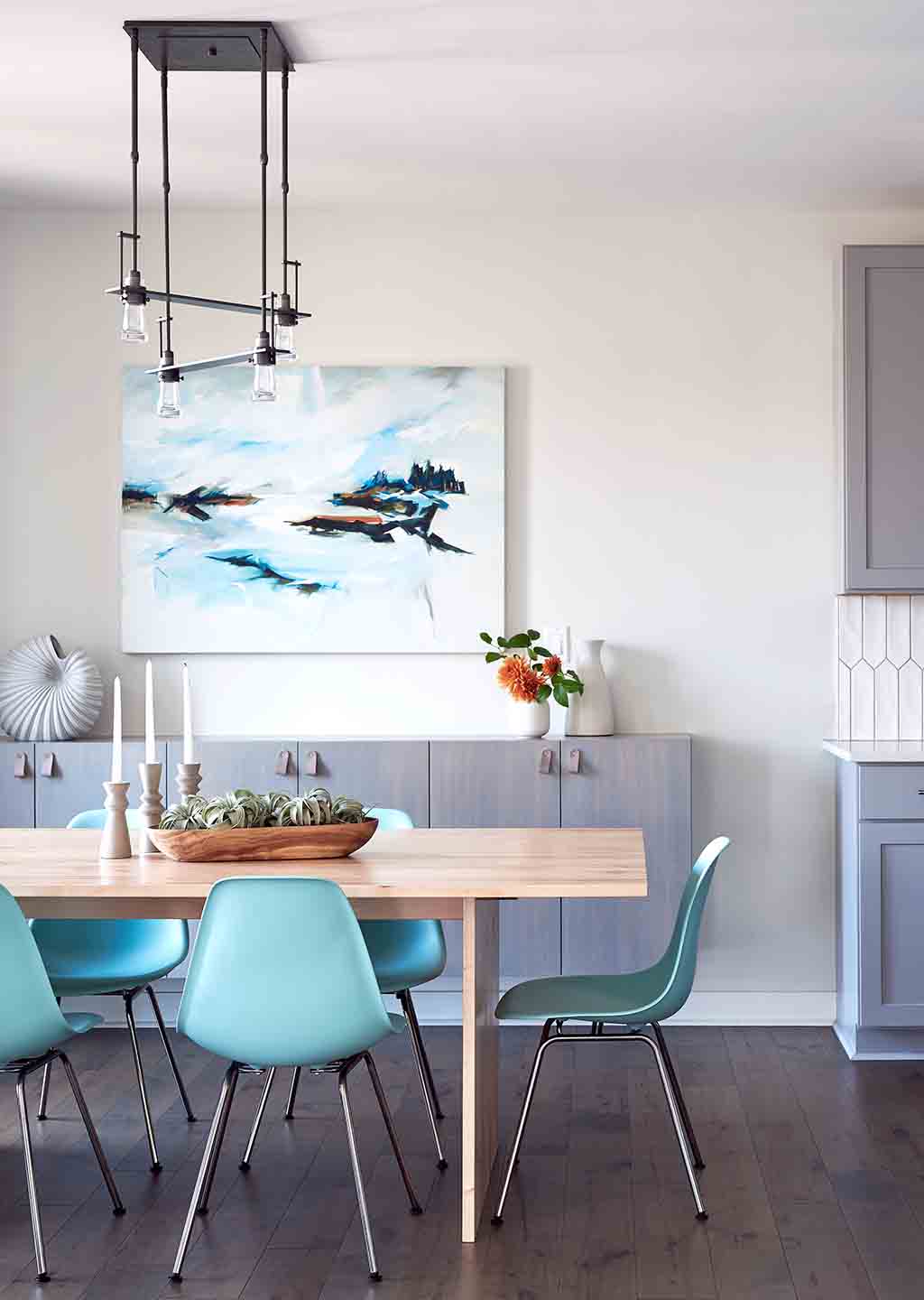
It’s a simple touch, but the gray wall pulls the wide range of neutral tones present in the condo together neatly, like a ribbon on a present. As visitors to the condo move from the entry-way to the open kitchen to the modern dining area to the cozy sitting space, they’re walked through an array of chocolatey browns, slate blue, glossy white, warm tan, and cool taupe. Scattered throughout are moments of brightness, like the aqua Herman Miller dining chairs, which cluster around a wormy maple Chilton Furniture “Hygge” dining table. There’s also the cobalt bedroom set in the owners’ suite, and a grouping of blue-and-green metal outdoor chairs that sit on the first-floor balcony. These punchy cool tones are intentional, says Helmick. “It’s Maine, we’re at the coast, and I knew it would look good forever.”
But even though there are some bold furniture choices in the compact condo, it’s hard to focus on those objects when there’s such big art on offer. Helmick worked with Portland Art Gallery to bring in several paintings by Maine artists for the couple to look over. “We’ve never had beautiful art like this before,” says Ren. “The old place had smaller walls, but here we have the space for different pieces.” Helmick confirms that she only brought “oversized” options. “I wanted to go big or go home,” she says. “Most people aren’t willing to go this big, but it feels right. It gives the space a level of authenticity you wouldn’t otherwise see.”
By working with a local gallery, Helmick was also able to promote Maine painters, a mission that is important to her. While she can’t always buy local—it’s not feasible for every project or every item—she tries to bring business to fellow New England creatives when appropriate. And there’s nothing quite as appropriate as a contemporary Maine landscape placed in a contemporary Portland condo. Above the Chilton dining table and the custom built-in storage, Ren and Joe chose an abstract scene of the coast by William Crosby done in shades of bright white, forest green, and aqua. For above the mantel, they selected a goldenrod and baby blue horizon painting by Ann Sklar. From Ren’s favorite swivel chair, she can see both works clearly. “My eye always ends up on these pictures,” she says. “I love to sit here by the fire and look at the Crosby.” Emma Wilson, director of the Portland Art Gallery, says it was “exciting” to work with Helmick on a “fresh, contemporary” Portland condo. “I could see how they gained confidence through the process,” she says of Ren and Joe, who have since returned to the gallery to see more Maine art. “It was clear that Vanessa had a vision,” says Wilson. “And once I saw the paintings she picked out in the space, I saw she really nailed it. They fit with the palette, tones, and mood.”
When they’re not admiring the original artworks or throwing dinner parties, Joe and Ren often find themselves soaking in the noises of the city below. From their vantage point at the top of the building, they can see much of what goes on in the rapidly changing city. “It’s almost like white noise,” says Joe. “It’s never totally dark and it’s never quite quiet. But you get used to it. It becomes part of your life.” Ren adds that one of the benefits of living in a small space is that it encourages you to go out, see the city, be a part of the world. Sometimes, in the summer, even the smells beckon them down. “The smell of grilling meat will float up from Fore Street, and Two Fat Cats Bakery bakes their pies late at night, and you’ll be out here and suddenly you’ll get a whiff of pie,” she says. “I love being here. I like to open the windows and hear everyone enjoying the neighborhood. I love the buzz of it.”


