Robin’s Egg Dream
Robin’s-egg blue is a welcome dose of springtime in any interior, from a hardworking kitchen to the most soothing bedroom.


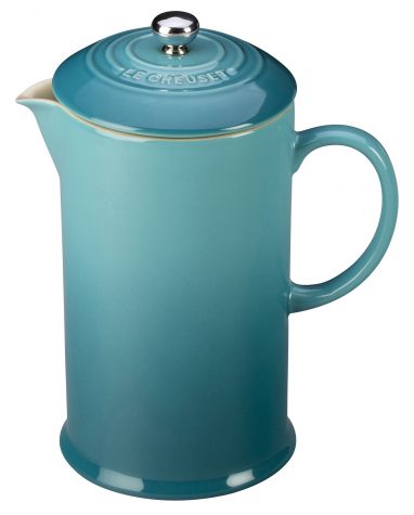


If you have ever stumbled upon a robin’s egg in your garden or the forest, you know the power of this green-blue hue. Spotted in the outdoors, it is a shock of bright color against nature’s greens and browns—a beacon amid the more muted shades. But take that same color indoors and set it against white, and you’ll discover that robin’s egg isn’t quite what it seems: not a pure blue-green at all, it has a muddy undertone—a hint that it is decidedly not man-made.
It’s this balance between vibrant and natural that makes robin’s-egg blue so beguiling. “It has a perfect balance of the calming nature of blue and the nurturing side of green,” says Sue Kim, color marketing manager for Krylon Paints. “When a palette is rooted in nature, it provides comfort,” she says, noting that a restful, restorative home is even more important during times of uncertainty like the last year. Here’s how to bring nature’s most calming shade of turquoise into yours.
Find the right blue for you
If you head to the internet to search for the perfect robin’s egg, you’ll find you’re not the first to try to match this color. Designers and bloggers have puzzled over robin’s egg, going so far as to color-match an actual eggshell to paint chips. However, the goal isn’t to find the exact shade of eggshell blue, rather, it’s to find the right one for your room, says interior designer Laura Pierce, owner of Keeler and Company. Pierce painted her own office in a robin’s-egg hue (Teresa’s Green from Farrow and Ball), which she chose because she wanted something that was cheerful and inspiring, but also calm enough not to distract from the fabric and materials samples she works with every day.
Be wary of paint chips
Blues, including robin’s egg, are notoriously hard to judge from a paint fan deck. When you look at the swatches, you’ll think the blues look pale, but when you put them on the wall, they tend to read very blue. So be sure to sample, and do so on a large area of wall for the most accurate view of a color.
Look for a color you could find in nature
“I find that the colors that are least successful tend to be amped up and less true to nature,” says Pierce. “When you work within that more natural color palette, it gives you an easy ground to build from for furniture, art, and fabrics.” Pierce loves Farrow and Ball’s colors because they are natural looking, with depth and a complex blend of pigments. (She says Benjamin Moore’s Century line is also very good at replicating nature’s palette.)
Pair it with neutral tones
When asked for a foolproof color pairing for robin’s egg, Kim suggests what she calls a grounding color in a mid- to darker tone. “Focus on neutral shades,” says Kim, noting that warmer neutrals are trending right now. “These warm neutrals, including natural woods, provide the grounding mood when paired with nature-inspired blue-green.”
Complement it with green
If you want a colorful room but still want to play it safe, Pierce says that greens and true blues both “play nicely” with robin’s egg, which contains a little bit of both. Kim adds, “Its best friend is green.”
Go bolder—strategically
“Put eggplant next to it or a little Nantucket red, and it’s going to work,” suggests Pierce. Kim points to terra-cotta as a natural complement to robin’s egg, noting that it is an “earthier desert shade” that tempers the vibrant blue. While robin’s-egg blue is a versatile hue, designers warn against using it with truly unnatural colors like neons. Pierce also says she’d caution against painting it with black. “Black is not where I would head first; it’s better paired with browns or gray,” she says.
Have fun with fabrics
Pierce points out that you can find this shade of blue in many different textiles, including the botanical ones in her office. Robin’s-egg blue “ends up being really versatile, when you unify a space around a piece of wallpaper or a fabric,” she says. If another color is in a fabric with robin’s egg, it gives you permission to pull both the colors through the space, she says.
Take it outdoors
A robin’s-egg blue is a natural for outdoor furniture (hello, Adirondack chairs begging for a fresh coat!) and even house trim. There is also a long American tradition, especially in the South, of painting porch ceilings in a pale shade of robin’s-egg blue.
Use it in rooms where you crave renewal
Our minds associate robin’s egg with spring, so this is a color to use in a room where you want to feel revitalized. Kim suggested it might be a choice for a kitchen where a feeling of “connection to the outside world is a refreshing moment in the morning.” Designers Heidi Lachapelle and Katie Judkins used just such a hue in a seaside kitchen they designed. “Blue plays a significant role in our (outdoor) lives, and so it always feels right to bring it indoors as well,” says Lachapelle. “This color felt new and fresh, yet still classic,” says Lachapelle. “Shades of blue never seem to go out of style. Blue is refreshing and renewing, but it is also incredibly calming.”
1873
The year “robin’s-egg blue” was first used as a color name.
Why is a robin’s-egg blue?
The blue color of robins’ and other birds’ eggs is due to the pigment biliverdin, but why are robin eggs the bluest of them all? In a paper published in Behavioral Ecology and Sociobiology scientists demonstrated that the bright blue is an evolutionary advantage. “A male robin will be more diligent in caring for its young if the eggs its mate lays are a brighter shade of blue,” wrote Dr. Bob Montgomerie, a Queen’s University biology professor. In fact, in the experiment, male robins whose nests contained the brightest eggs fed their babies twice as much!
The other famous turquoise
Birds’ eggs are not the only blue package that holds precious contents: Tiffany’s iconic turquoise blue jewelry box is a lighter, brighter spin on robin’s egg. The color is so strongly associated with the brand that the color is trademarked. Pantone, the company that identifies and codifies colors for designers, even eschewed their typical color numbering system and designated Tiffany’s signature hue number 1837, which is the year the store was founded. It is believed that Charles Lewis Tiffany may have chosen this color for his packaging because turquoise jewelry was popular with Victorian brides when Tiffany and Company opened its doors. The company registered the color as a trademark in 1998, but don’t worry: it doesn’t mean you can’t use it in your decor (just don’t paint your jewelry store in this hue and send shoppers home with turquoise boxes!).
“We love to contemplate blue, not because it advances to us, but because it draws us after it.”
—Johann Wolfgang von Goethe
Palette Picks

Benjamin Moore Bird’s Egg
This is a fresh spin on robin’s egg blue that has a bit of visual pop

Valspar Crystal
The truest blue of these hues, use this as an accent color

Benjamin Moore Robin’s Nest
An aqua that leans into green, this is a part of Benjamin Moore’s Classic Colors collection.

Valspar Destiny
A calming eggshell blue, this robin’s egg is great for bedroom walls

Farrow and Ball Teresa’s Green
This color’s rich blue base gets warmth from soft green undertones