At First Blush
Soft pinks are a darling of the design world—joyful yet quiet, versatile yet distinct, pale pink looks beautiful wherever you use it.


Pink has had something of a renaissance in the past five years, after a particular dusty shade of rose was deemed “millennial pink.” This trending pink has popped up everywhere, from hip skin-care packaging to restaurant interiors. It has saturated the home market too: pink upholstery fabric is now a common option through mass catalog retailers. But pale pink is more than just an au courant hue. Designers have long known that a pale pink is a flattering backdrop with chameleon-like properties—a whisperer, not an attention seeker.
Blush is a color that casts a flattering, rosy glow wherever it is used, and decorators will tell you it can be used just about anywhere. The secret is to find the right pink for the room you’re decorating. Blushes have an impressive range, from pale, lavender-like hues to richer, earthier colors that border on terra cotta. Textile designer and decorator Peter Dunham, who is known for his use of pink, says those with the cooler undertones tend to be the ones we view as more feminine pinks, whereas brown-leaning pinks can be almost masculine.
For such a soft hue, blush pink is a surprisingly controversial color that arouses strong opinions, both positive and negative. Fans point to its flattering and versatile properties; critics worry it skews too saccharine. Here at Maine Home + Design, we’re firmly on Team Pink, so perhaps we might persuade a few naysayers to come around to rose pink’s many charms. Here’s how to embrace this blooming color.
Choose pink instead of a neutral
“I like to think of soft pinks as neutrals,” says Rebecca Atwood, a textile designer and the author of Living with Color. Like traditional neutrals, blush pink harmonizes with almost every color on the spectrum. And because there are so many subtly different shades of pink, if one doesn’t work with your chosen color, another will. “It’s an easy color for the walls,” adds Atwood, and with a pale pink background, you can add in other colors gradually.
Avoid plastic-y pinks
Look to nature when choosing pink. “I tend to avoid the commercial-looking pinks—Barbie or Cadillac pink,” says Dunham, noting that if you want something more interesting or, as he deems it, “moodier,” look for a pink that is more complex than watered-down red. With a drop of black and a touch of yellow in the mix, you’ll get a more interesting pink.
TIP: Look down the paint strip to see what the darker versions of the blush pink look like. If you see a pure red, the pink will likely feel like cotton candy on the wall; instead choose a pink whose darker shades lean toward plum, wine, orange-red, or even brown.
Use blush to create a glow-y feeling
Atwood says you can use pale pink to recreate the look of the light just before sunset. “Pink casts a rosy glow and feels warm,” she says. Dunham agrees, noting that the right blush can give a room “an almost candlelight-like color” during the daytime. Use soft pinks anywhere you might normally opt for an off-white or tan to add a glow to your color scheme.
Employ it everywhere
Forget the usual association with little girls’ rooms: pale pink is one of the most versatile colors with which to decorate a room. “People are shy about pink,” says Dunham. “They’ll paint anything blue, but pink is much more fraught with people’s prejudices of being too feminine.” Dunham has used pink in almost every room, including the living room of his own bachelor’s apartment. However, he notes there is one exception: he has yet to paint a little boy’s room pink. His trick to convince men, especially those in New England, that they might like the color? Instead of calling it “pink,” he refers to it as “Nantucket red.”
But let the girls enjoy it too
Don’t worry about pink being too expected in a girl’s bedroom. Samantha S. Pappas, a designer based in Yarmouth, says there’s a reason blush pinks are popular. “Soft pinks in wallpaper, paint, or textiles add a young, soft, whimsical feel without being too childish. It’s a great color to transition from baby to child to adolescent.”
Have fun pairing it with other hues
According to Atwood, you can take blush in many directions; as she says, “It’s easy to come up with ideas because it is such an absorbable color.” She suggests you might pair blush with a dusty purple-blue and a pop of yellow for something cozy yet unexpected, or mix it with rich terra cotta, sand, and a subdued brown for something earthier. “I might add in a deep navy and a red to go more sophisticated,” she says. Another palette she loves: blush, olive green, earthy orange, dusty gray-purple, and charcoal.
Contrast its sweetness
When choosing complementary colors for pinks, do keep contrast in mind. “You need something with a bit of edge,” advises Atwood. That could be a nature-inspired hue; a dark, almost-black color; a bright, bold primary color (like a red), or a midtone that’s an off-hue. “Whatever that secondary color is, you’ll want to find some tonal versions to help bridge the gap,” she says. So a pale blue might be the bridge between blush and navy, or tan could be the bridge between blush and deep brown.
Look to nature for color inspiration
The soft color inside of a shell, the dusty hue of a granite boulder, or the faded petals of a peony on its last gasp: pale pinks are all around us in nature. Pappas says to use those landscape settings as inspiration for color pairings, matching pink with sandy hues and earthy browns and greens. “I wouldn’t pair blush with any super-bright colors,” she adds.
Play with layers to make it sophisticated
A key to making pink seem refined and mature is to add layers of texture and pattern to your room. “A textile is a great place to add pink,” says Pappas. She notes that a soft, luxurious textile like velvet gives blush pink “a little bit of elevation with the playful.” Likewise, a vintage kilim rug, which will often have touches of pink, adds gravitas and character.
Pick pink when you need softness
A hint of blush can lighten up a room that feels heavy, hard, or overly masculine. “It adds a feminine touch to soften up wood tones,” says Pappas, noting that “blush lifts up woods while adding a color with a delicate touch.” Try it as a backdrop to a mahogany dining set or as a foil to a leather chesterfield.
Mix it with pale neutrals for a Scandi-minimal vibe
Weaving pink into a neutral scheme can add welcome warmth to whites and creams. “I love to use blush against light blonde woods to add a subtle pop of color,” says Pappas. She notes that a stone with accents of blush is another great way to add that warmth to a mostly white room.
To start, try just a touch
If you’re new to pink, try using it sparingly. “Use blush as an accent in a light feature, art, or textiles,” says Pappas. In a recent project, Pappas added pink piping to throw pillows for a tiny visual lift.
Sample your pink in all lights
Like neutrals, pale pinks are colors that change throughout the day. A pink that looks rosy in direct morning light can turn almost gray at dusk. Meanwhile, some of designers’ favorite pinks look almost brown or lavender in a tiny swatch. Because of its elusive nature, it is important to paint large samples of pale pink and view them in a variety of lights.
Why Do We Think of Pink as a Feminine Color?
While today we think of pink as a girly hue, this was not always the case, nor is it so in other cultures. Neither was pink’s association with femininity a simple process. In the United States, pale pink, baby blue, and other pastel colors have long been considered juvenile colors, but colors were not used as signifiers of gender until the latter half of the twentieth century. In her book Pink and Blue: Telling the Girls from the Boys in America, Jo B. Paoletti explores the history of these two colors and their relation to gender. Paoletti’s research suggests that pink became more strongly associated with femininity after World War II, but the rigid gender associations of pink and blue were not solidified until the 1980s, when it became more and more common for parents to find out the gender of their unborn children. With knowledge of their future children’s gender in hand, parents were eager to buy gender-specific items for their babies to be. At the same time, brands embraced the pink–blue dichotomy; for example, in 1985 Luvs introduced boy (blue) and girl (pink) diapers. While many assumptions about gender roles have been upturned in the intervening decades, the association between pink and femininity has only grown stronger.
“Pink is a happy color, so it is very easy to bring into people’s homes. People like being happy.”
—Peter Dunham
Palette Picks
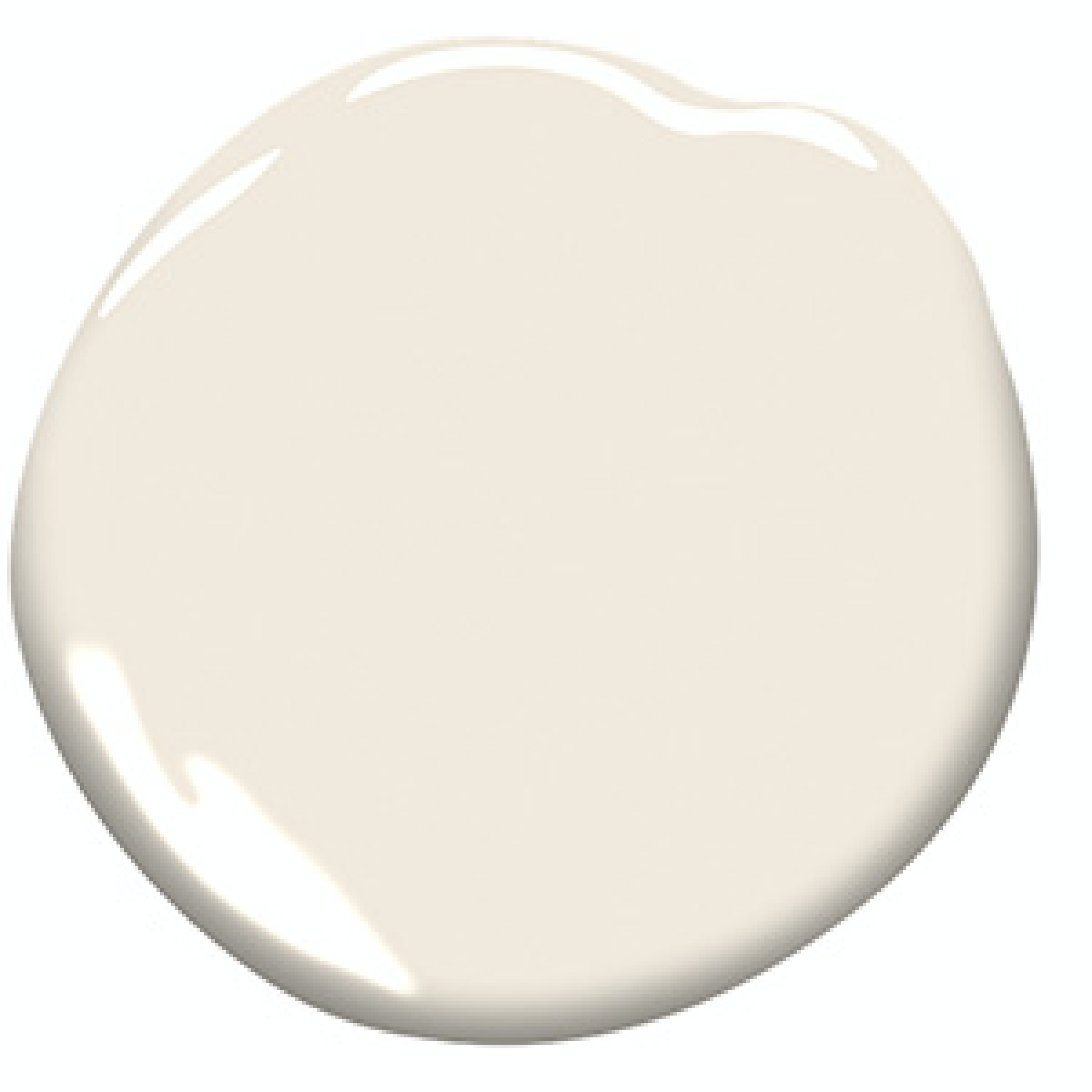
Benjamin Moore Opal
A pretty pink that is warm and not too dramatic.
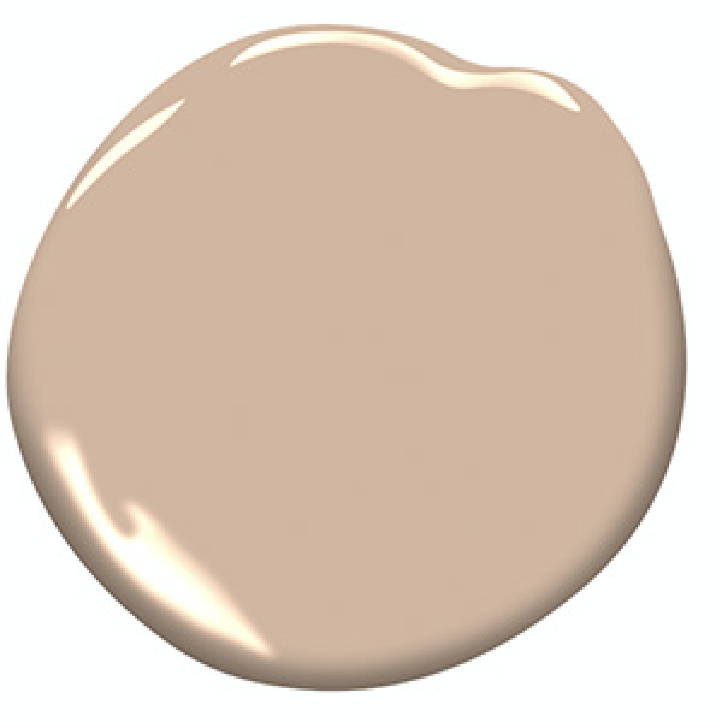
Benjamin Moore San Clemente Rose
Part of a collection of geographically inspired neutrals, this is a deep, romantic hue.

PPG Light Peach
This peachier hue gives the room a bit of a glow.
Farrow & Ball Nancy’s Blushes
If you’re looking to go deeper into pink, this is a beautiful blush.

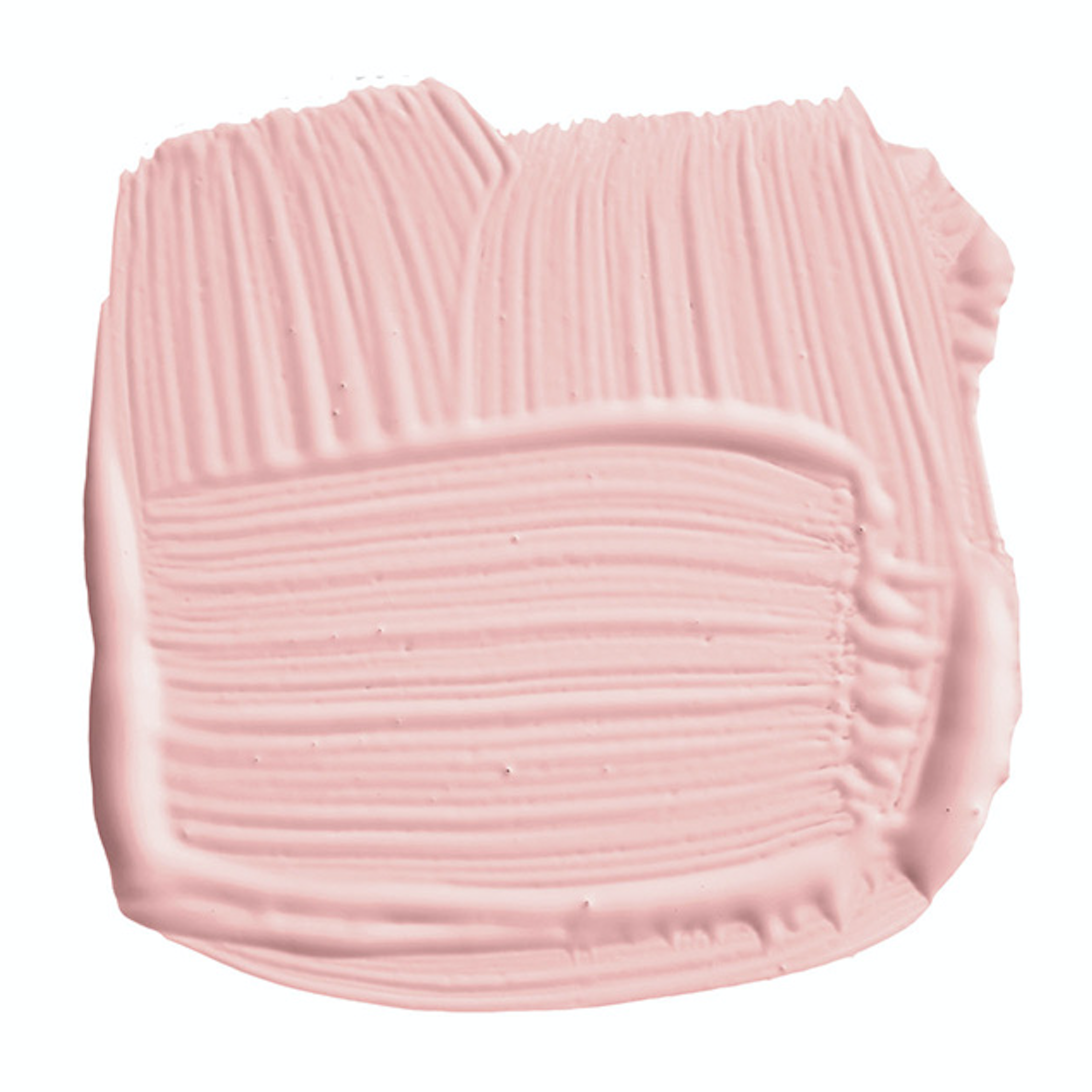
Farrow & Ball Sulking Room Pink
A muted rose with brown undertones, this looks lovely on trim.