Under One Roof
With soaring ceilings, a modern kitchen for congregating, and a pair of private owners’ suites, this Cape Elizabeth contemporary is a family affair.
While the saying may be that three’s a crowd, the very opposite has been true for this family: a father, mother, and adult daughter who are all living together—yes, happily—in their contemporary home in a quiet Cape Elizabeth neighborhood. Previously from Massachusetts, the parents fell in love with the area’s coastal, small-town feel when their daughter, now a surgeon, began her residency in Portland. Fourteen years later, when the parents retired, the three began to look for property near the daughter’s job where they could build a new home. Eventually they narrowed in on a pretty parcel of land tucked away toward the end of a road. In a lucky coincidence, the street name happened to combine the mother’s Chinese zodiac sign and the daughter’s middle name—it seemed an omen that they’d found the right spot.
Back in Massachusetts, the parents had worked with a builder to design their family home. While that house was contemporary in style, it was also multilevel and divided into several rooms, which the family felt impeded flow. This time, with the daughter overseeing the design, the family worked with Russ Doucette of Russ Doucette Custom Home Builders in Scarborough to come up with a plan that feels contemporary but much more open. “I knew what I wanted,” the daughter says. “It was all in my head, and Russ helped to put it on paper.” Adds Doucette, “It was a collaboration among all of us.”
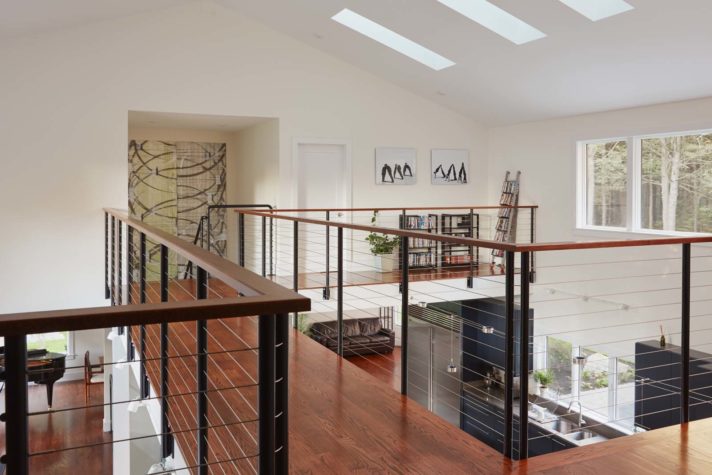
The result is a four-bedroom, three-and-half-bath house with an open floor plan and ample fenestration. That airiness is immediately apparent as soon as one enters the front door, as there is no formal entryway. Rather, visitors are pulled into a spacious living space with soaring cathedral ceilings. Immediately in view are the home’s show-stopping elements: a sleek, linear kitchen and, above it, a catwalk that seems to float, suspended by cables. To the right is a living space with a three-sided gas fireplace, while to the left, tucked behind a modern steel staircase painted white, is a dining area and, off of that a breakfast nook. At either end of the home are the private owners’ suites. On the first floor to the right is the parents’ wing— one of their few requests was for first-floor living—while the daughter’s suite is upstairs and to the left. “The openness gives us a closeness,” says the father, “but we each have our own private quarters.”
In addition to being a surgeon, the daughter is an amateur pastry chef who makes desserts such as satiny- smooth chocolates filled with lemon, yuzu, and cognac, so the kitchen is customized for baking and chocolate making. There is a temperature-controlled pantry where specialty ingredients are stored and a USB port to charge her phone in case she’s on call. While most of the countertops are quartz, a section lowered to working height is topped with marble. “The marble’s good for pastries, and it’s good for tempering chocolate too,” she says.
The color palette of the kitchen, as well as the public spaces, is reduced to black, white, and the occasional splash of red, which is evidenced in the range’s knobs, the kitchen chairs, and the modern ceiling fan. A pared down, minimalist aesthetic is also carried through to the simple trim work, which is painted in a white that’s similar to the color of the walls. “The flat trim gives you that modern, clean look,” says Doucette. “And there’s no crown moulding, so there are sharper edges.”
While the interior of the house is contemporary, it still fits into its more traditional neighborhood. Just a few subtle exterior details hint at what lies inside, such as casement windows rather than the more traditional double-hung as well as the roof’s three-foot overhang. “I showed Russ images of Japanese pagodas, how they have a slanted roofline, so he played off that a little bit,” says the daughter. In addition, on either side of the bright red front door are vertically stacked square transom windows: three on one side, five on the other. (The total number of windows— eight—is a lucky number in Chinese culture.) The homeowners preferred an asymmetrical look rather than one that was more balanced, which they find too traditional and formal.
Leading up to the front door, concrete pavers are surrounded by pea stone, which is punctuated with small clusters of ornamental grasses and ferns. “Driving up, it looks like a consistent textural piece of foliage,” says Keith Stone of Pinnacle Landscape and Design, who did the installation and worked with landscape architect Soren Deniord of Soren Deniord Design Studio on the design. “But individual plants are visible once you get closer, which gives it a graphic look.”
In the back of the home, the patio is divided into two sections, bisected by an herb garden planted with basil, thyme, and rosemary. One section is an outdoor dining area, and the other is a lounge area with a patio shaped like an octagon. “The octagon is considered good luck in Chinese culture,” explains the father, noting its eight sides. Additional landscaping includes planting trees and shrubs such as Japanese maples and rhododendrons, and one more design must: a weeping cherry tree, now framed in a window of the parents’ bedroom. “That’s my dream tree,” says the mother. Just beyond the backyard is another favorite feature: Cape Elizabeth’s Greenbelt, where the family goes for walks in the summer and snowshoes in the winter. (In another bit of fate, the family happened to move in on Chinese New Year.) One of the nice things about the arrangement is the way the family members frequently help each other out. The father clears the driveway in the winter, the daughter cooks dinner for everyone, the mother prepares coffee in the morning. If there had been any doubts about them all being under the same roof, they’ve since been washed away. “We love it here,” says the mother. ”We truly enjoy our new life.”


