Refined Design
“Most people discover this place by getting lost; I did.”
So says the owner of the seaside cottage I’m visiting at Granite Point, situated across from its parallel peninsula, Biddeford Pool. Immediately I feel relieved, since I’m late for our appointment because of getting lost myself.
The owner spends 40 weeks out of the year traveling for work as a lawyer and consultant to businesses. Her home base is Cambridge, Massachusetts. Twenty years ago, she got into her car, drove north for a much-needed reprieve, and discovered Biddeford Pool. After spending several subsequent summers living in at her Biddeford Pool property, she eventually discovered she needed more space to entertain family and friends during the season. It took over three years of looking before she noticed a listing in the window of a real estate office for a 900-square-foot cottage on a picturesque piece of land. Her initial plan was to renovate and expand, but after speaking with Portland architect Caleb Johnson, it was determined that a renovation couldn’t structurally be done (with the exception of keeping the original garage intact). “The design was very much driven by the owner’s vision of the interior and how she intended to use the house,” says Johnson.
“My vision was for something calm, light, quiet, and filled with books—from there the house almost designed itself,” says the owner. When Johnson finished the plans, the home was 2,500 square feet, with two floors and a reading tower. As in many modern homes, an open floor plan was developed to blend the dining room, kitchen, and living room.
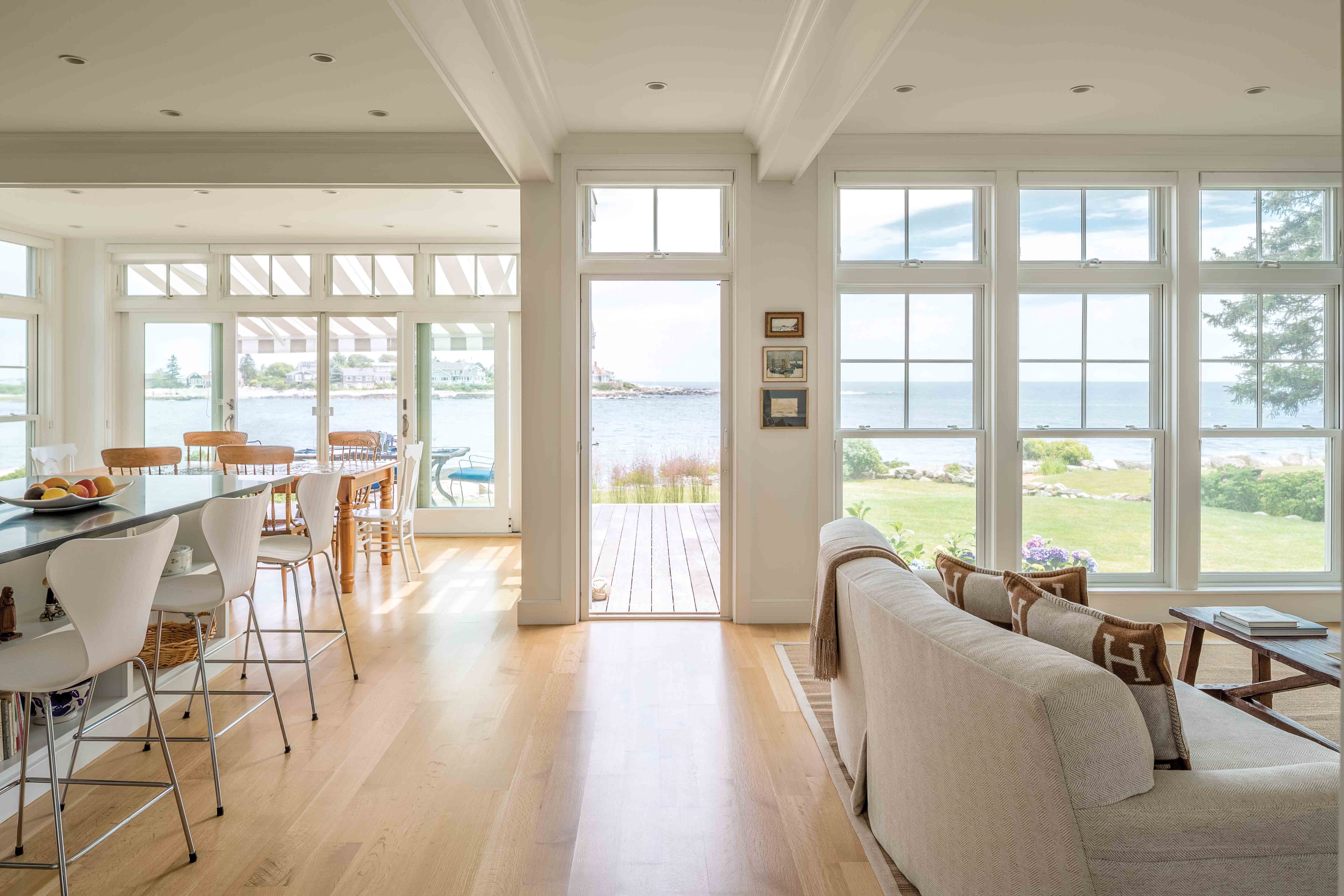
Once the design was set, Shawn Douston of Douston Construction, based out of Arundel, together with Dina Lennon of Sylco Cabinetry in East Waterboro, got to work on executing the owner’s vision. “She wanted to create an environment where she was capitalizing on the location and the view, where she could look out the window and nothing inside would be competing with that view,” says Lennon. When entering the house, all eyes go to the waterfront views visible through floor-to-ceiling windows straight ahead. All the white oak floorboards are positioned to point toward the water.
The interior design could be described as restrained and spare or, more accurately, refined and meaningful. “The decor is like, ‘Don’t look at me too much, look outside,’” remarks interior designer Nestor Santa-Cruz. Santa-Cruz has worked on four other homes for the owner, including the previous Biddeford Pool property. They are friends at this point, and since Santa-Cruz is based out of Washington, D.C., much of their communication takes place via email or phone. “The palette goal was to create interiors where outside natural light comes deep into the interior spaces, while at the same time the inside warmth spills out and merges with the sun and nature’s colors specific to the location of the home,” says Santa-Cruz. The colors for the interiors are a mix of pure white (specifically Benjamin Moore’s Super White), the colors from the rocky coast, and a light touch of blues in selected rooms.
There are minimal furnishings throughout the house. All of the furniture is positioned to take advantage of the best view in the room. “The architecture and the relationship to nature was very important to my client,” explains Santa-Cruz. Not a lot of furniture was purchased, with the exception of a few pieces such as the white Arne Jacobsen Series 7 stools at the kitchen island. “I am a self-proclaimed sentimentalist and traditionalist,” says the owner. It was important to incorporate family art, antiques, and meaningful pieces in a seamless way. “No piece of furniture in the house is precious—it’s all about simple lines,” adds Santa-Cruz. A couch that was in the family for generations and loved by the homeowner’s parents was reupholstered by Claude’s Upholstering in Biddeford. There is a corner of the living room reserved for the owner’s grandfather’s white wooden rocker. One shelf is filled with pieces of pressed orange carnival glass from the owner’s parents. On another shelf sits a stack of medic boxes used by her father during World War II.
Two built-in bookshelves flank the quartz fireplace in the living room. Each bookshelf seamlessly blends a bronze sconce in the middle that was hand selected by the owner. “We all definitely spent quite a bit of time behind the scenes discussing and planning how the sconces were going to work, look good, and be integrated into the cabinetry,” reveals Lennon. Special circular millwork was incorporated that follows the same contour as the back plate of the sconce. Lennon asked the owner several times if she wanted the built-in shelves to incorporate a large flat-screen television like the majority of her clients, but the answer was no. Books are preferred over television in this house, but for occasional viewing they decided to tuck away a small television in the built-in behind a door.
The kitchen is white with honed black granite countertops. The owner loves to cook and have friends over. Cookbooks and kitchen tools lovingly used by the owner’s mother over the years have found a new home here and are hidden away for easy access in the cupboards. “The Shaker-style cabinetry is so versatile and lends itself to both traditional and more contemporary settings—when adorned with satin-nickel bin pulls, a popular favorite on the Maine coast, the cabinetry has a classic timeless feel, with just a hint of old-world vintage,” says Lennon.
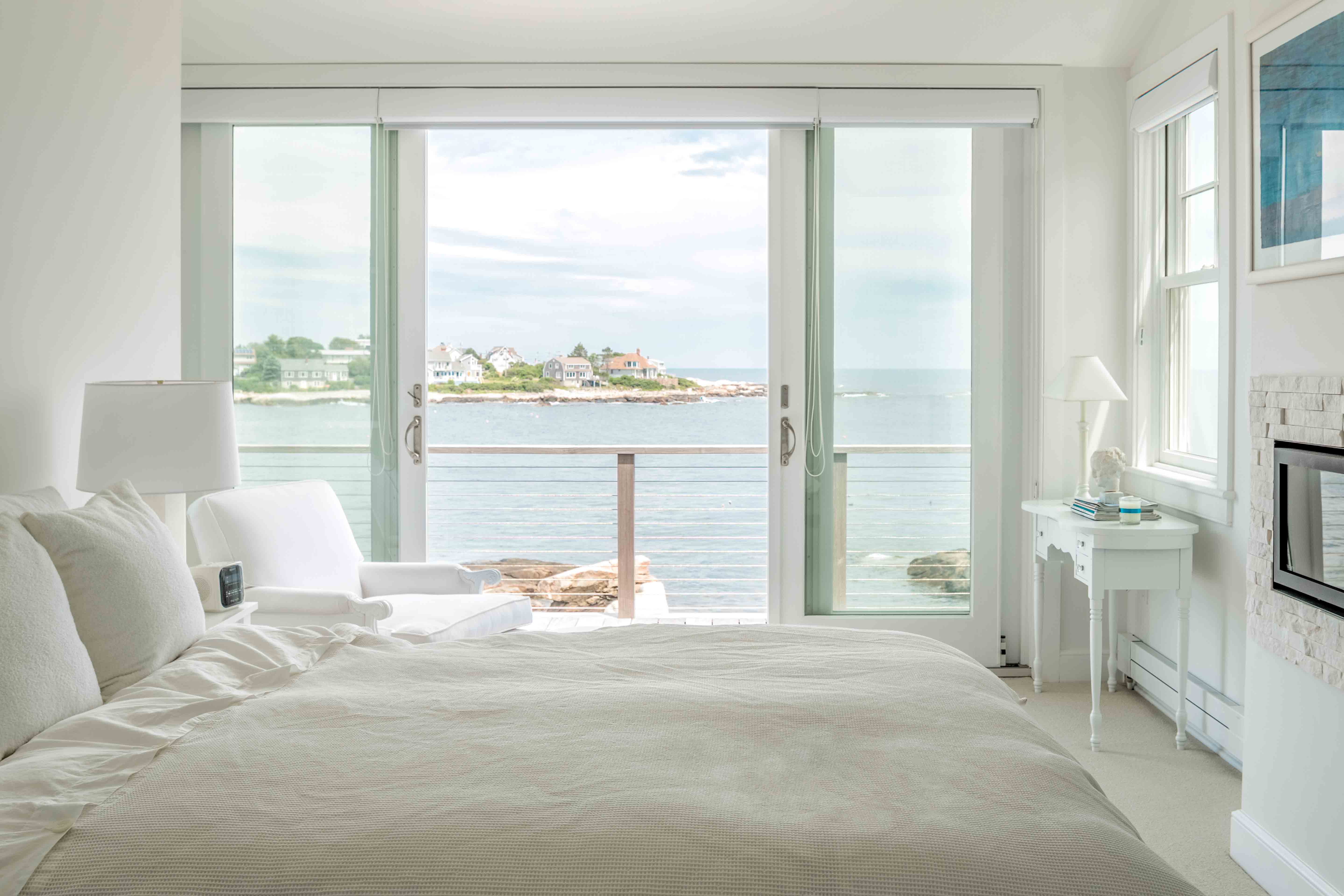
Technology also has a place in the design of the home. Instead of large banks of light switches in certain locations in the home (such as in the entry foyer), the owner installed a state-of-the-art system that has a minimalist grouping of touch-pad buttons to operate internal and external lights. This way the owner can operate all the lights using a small control pad located on the night table in her bedroom. There is also radiant floor heat throughout the home and Runtal radiators in bedrooms (panel-style European design), so the owner and her guests can individually adjust room temperatures for sleeping. Four Regency gas fireplaces—in the living room, office, owner’s bedroom, and owner’s bathroom—operate by remote control.
Quality materials were selected by the owner with the help of Sylco Cabinetry, Douston, and Santa-Cruz. Quartz fireplace surrounds appear in the living room, office, and owner’s bedroom and were sourced by Roma Tile in Watertown, Massachusetts. The owner’s Carrara marble bathroom is an oasis in itself. The tub is situated in just the right location to provide views of the ocean while soaking. Two windows are located in the large walk-in shower, which includes a marble bench and flooring and multiple body sprays.
The house’s element of privacy was a conscious design decision. There are pocket doors throughout the house to separate most of the spaces. The true hidden gem is the reading tower, which one enters through the office and up a staircase. The stairwell to the tower is filled with sentimental collectibles including old fans and typewriters linked to the owner’s family’s past. It is also worth noting that this cupola includes the only trace of “classic” Maine interior design. Occupants of the space get to relax on a navy and white striped bench that overlooks the water and pull out a book of their choice. To give the feeling of being on a boat, the owner selected the work of designer Liz Thurston of Daybreak Workroom, who makes cushions for yachts. There are lift-up hatch doors that have storage below them running the full depth of the benches.
Then there’s the outside. Landscape architect Ted Carter of Buxton helped incorporate the old with the new. A historical cylindrical granite boat mooring left by the previous owners anchors the curved stone wall that frames the bluestone path to the front porch of the house. “I love being in the garden because I feel close to my mother, who had a lovely English garden,” says the owner. “This is a place where family and friends can gather, relax, and fall asleep to the sound of the ocean.”


