Design Alchemy
A house in Sorrento surrounded by water blends seamlessly into the landscape
Shore House, as its owners call it, is a new house with deep roots in history, intimately connected to both time and place. Its architecture reflects the strong vernacular traditions of downeast Maine but in a modern enough way that you know that it is of now, not then. Like so many of the best houses, it is a study in subtle contradictions, some yin and some yang. At once elegant but casual, buttoned-up but laid-back. Inside you’ll find family treasures mixed with auction house finds and up-to-date additions. Throughout, says interior designer Glenn Gissler, it shows the owners’ “appreciation for patina, quirkiness, and the willingness to tolerate less than perfection, giving the house a sophisticated and considered aesthetic with a ‘nothing precious’ vibe.”
It is a quiet retreat for two but near enough to extended family to be a gathering place for many. It is, as the owners spelled out, a house that is comparatively small but, as Gissler puts it, “lives spaciously.” Gissler, who is based in New York, had worked with the homeowners before; their home base is Boulder, Colorado, but they have a pied-a-terre in Manhattan that he designed. The architects—Kay Stevens Rosa and Augusto Rosa of Bar Harbor’s A4 Architects—had not previously worked with the couple but found that their goals and ideas for making the house were perfectly aligned.
First there was the site. The house sits on a spit of land with 270 degrees of shoreline, part of a larger camp that had been in the extended family for some decades, all in a particularly picturesque part of the state. Settled in 1762 and incorporated in 1895, the tiny town of Sorrento is often considered to be one of Maine’s most photogenic spots.
“Sorrento is a little town preciously tucked into the land, with a dancing coastline and amazing views of Mount Desert Island,” says Kay Stevens Rosa. “It has a rare combination of foreground, middle ground, and background, so we knew the house would be all about the view.”
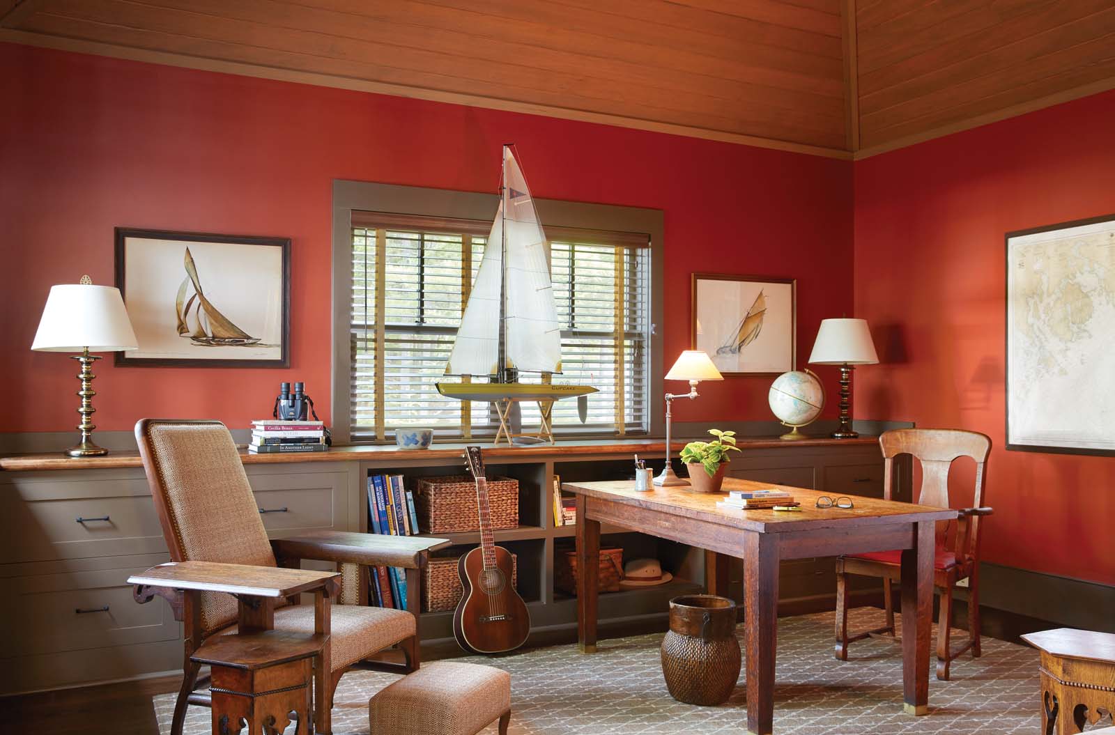
Those sightlines were a prime goal in the architecture. “The desire was to maintain the natural landscape, trees, and ledge outcroppings and to use the interstitial views to arrange interior spaces,” recalls Kay. In the living room, large doors and windows maximize the view of Mount Desert Island; the office looks out to the northwest, where the owners’ boat (a 38-foot Downeast cruiser) is moored. The eat-in kitchen and adjoining screened porch gaze toward Hancock Point, and the owners’ suite—which gets bathed in the morning sun—has what Kay terms “a serene cove view.” Water, water, everywhere.
To clad the 3,500-square-foot house, the Rosas selected bleached white cedar shingles that will eventu- ally turn silver, as well as ebony-stained trim. The cladding and the organically laid stone patio are a clear nod to the historic vernacular architecture of the region, though simplified and modernized. “We feel it is important for a structure to be true to its own time as well as its context and history,” says Kay. Among the hallmarks of A4 Architects’ style are variations in scale, including varied ceiling heights, and the use of curves to accentuate the most important spaces—in this case, the entry porch and the living room.
For the architects, it was important that Shore House would blend into the tree line and be less visible from the water. They preserved view corridors and sought to enhance indoor–outdoor relationships. “The desire was to maintain the natural landscape, trees, and ledge outcrop- pings,” says Kay. “On this site it was important that the house not be too imposing.” A hallmark of A4 Architects’ work is, she says, “the use of texture and color to evoke comfort, warmth, and scale.”
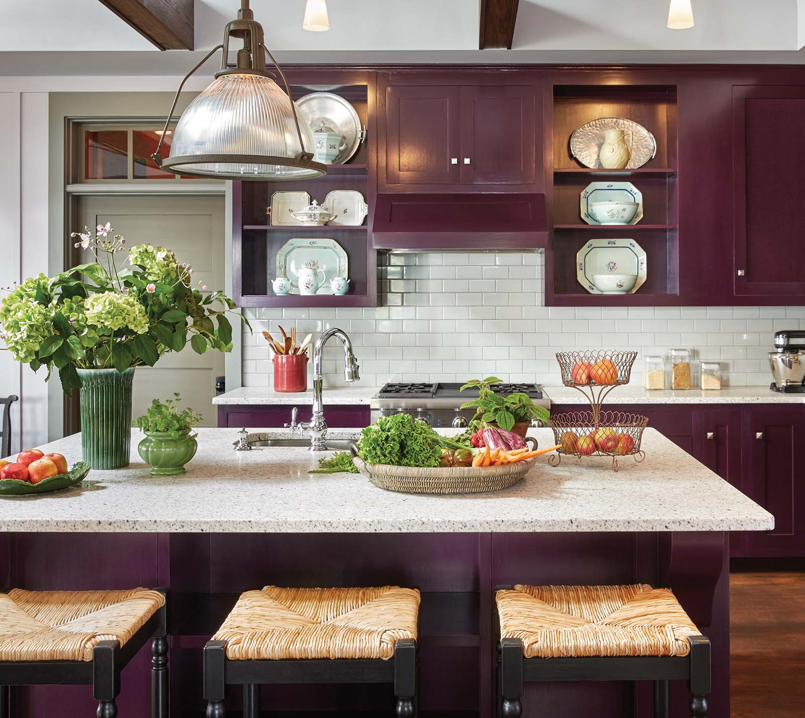
The first floor of the house has a grandly proportioned double-height living room with vaulted ceilings and a tile-clad fireplace. Other rooms include an owners’ bedroom suite, “his and hers” office spaces, and a kitchen—spaces that Kay describes as “gracious yet informal.” A butler’s pantry–inspired bar connects the kitchen and living room, the latter possessing a cozy corner library and TV nook for two. There’s also a multipurpose mud/laundry/gear room, a powder room, and a screened porch. The architects added a loft overlooking the living rooms. It is home to an art studio, an exercise space, and a play area for visiting grandchildren. Although it is, functionally speaking, a one-bedroom house, Kay points out that several rooms, including the art studio and one office, can be used as guest bedrooms as well.
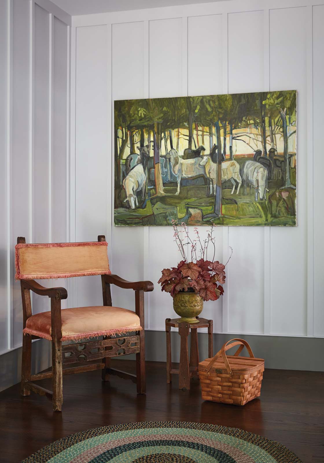
The sense of context inherent in the architecture is carried from the outside in, with random-length oak floors throughout and painted board-and-batten walls. Gissler drew his inspiration for the palette of the upholstery, paint, and window treatments from the hues of the landscape and from an existing rug with soft green and lavender stripes. To that end, one of his first purchases was a small one that set the tone: a grape- and gold-hued William Morris textile (the pattern is Kennet) that is used on accent pillows both on the sectional sofa and the twin velvet wing chairs.
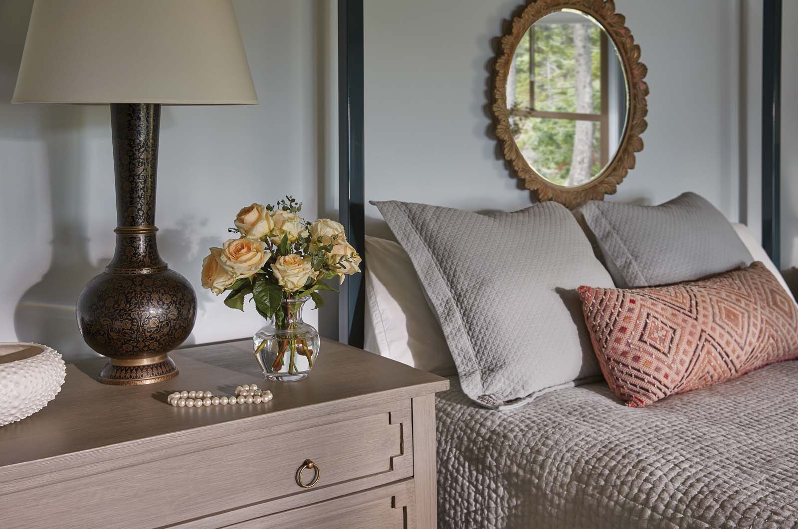
Much of the furniture is American arts and crafts style, or at least from that period just after the turn of the twentieth century. Some of it, says Gissler, came from the original family house on the property, a large Victorian cottage. Other pieces are new, among them the living room sectional sofas and wing chairs, which came from the North Carolina–based Lee Industries, and the modern Gustavian chests in the bedroom, which Gissler sourced from the Texas furniture company Wisteria. “The furnishings and decorations have a solid confidence one might associate with homes at the turn of the twentieth century,” he says.
The floor coverings—including rag, cotton hooked, and sisal rugs—all have what Gissler calls “a summer ease.” To provide a sense of continuity between past and present, Gissler opted for a variety of vintage- styled light fixtures throughout the house. “In places where others might have resorted to recessed lights, we used pendant lights that provide a more pleasing kind of illumination. In some fixtures we used vintage clear Edison light bulbs,” he says. “Absolutely everything is on dimmers to allow for ‘ambiance control.’” A large- scale faux antler chandelier (from CDN Antler Designs) hangs in the living room; other light fixtures come from Rejuvenation and Schoolhouse. Although the new furniture and fixtures reflect the aesthetic spirit of the house, they are very much of their time. “We don’t do fake antiques,” says Gissler.
For the interior designer and architects, the melding of old and new, time and place, formal and casual was the key to finding the perfect balance. It’s a combination of style, substance, and serendipity, along with what Gissler likes to call alchemy—a formula that creates an enchanting home.


