A Clean Slate
On Cumberland Foreside, a couple’s new home reflects a 180-degree shift in their aesthetic
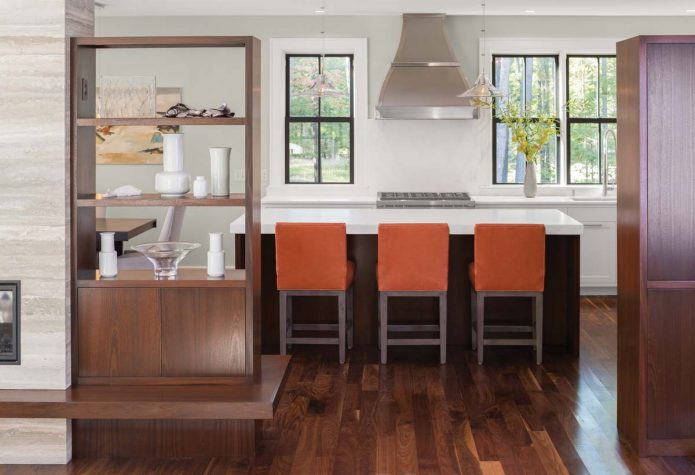
When Jim and Dava Davin moved from their Cumberland Foreside Colonial to their contemporary farmhouse up the road, they took a Kondo-esque approach to packing. Into the moving van went clothing, dishes, a few paintings, and other items that “spark joy” (or at least didn’t impinge upon it). Virtually everything else stayed in the old place, which they sold fully furnished in 2013. “We had a traditional aesthetic when we built the other house,” says Dava, who owns Portside Real Estate Group in Falmouth and Portland. “It had lots of rooms, coffered ceilings, wainscoting, and crown moulding. We also had two little boys and didn’t know yet how we’d want the spaces to flow for our family.” When they decided to start fresh with a more modern, open home, they knew they’d have to part with most of their belongings. “We’ve moved around enough that we don’t get too attached to furnishings,” says Jim, who has worked in the Maine offices of Tyler Technologies for 21 years. “Now, that’s as much as I’ll ever put out,” he adds, nodding toward the living-dining area’s double-sided mahogany shelves dotted with white ceramic and clear glass vases.
Indeed, the new home feels like the physical embodiment of Marie Kondo’s The Life-Changing Magic of Tidying Up. On the kitchen’s pink-veined Bianco Rhino marble countertops, the living room’s walnut-and iron and painted-wood tables, and the floating cherry nightstands and vanities in the owners’ bedroom and bathroom, there is nothing save for the occasional lamp, book, or potted succulent. “And they didn’t just clean up for us,” says Portland interior designer James Light, who signed on for the project at its inception. “I have showed up unannounced and can vouch that they really do live this way.”
The Davins had worked with another well- known designer on their previous home, which, Light says, was a nonissue. “It’s like hairdressers; you go to one person for a while, and when you want a different look, you go somewhere else.” Falmouth architect Kevin Browne conceived the initial design of the home, and Portland builder Michael Monaghan—whom Light and the owners describe as “a hoot,” “a character,” and “opinionated in the best way”—revised and executed the plan.
“I tell you what I think, but ultimately I will do whatever you want,” says Monaghan, who weighed in on, among other things, the bevel- edge baseboard and raised-edge moulding treatments (“they needed something”), the windowed barn-style metal doors that separate the living room and library (“I thought they’d look like a prop, but they ended up cool, like French casements”), and the balustrade on the main staircase. “I was afraid it would look like the O.K. Corral,” says Light of the cattle rail design. “But Michael was willing to build the whole thing and take it out if we didn’t like it,” which did not turn out to be the case. “Varying the widths of the slats kept it from feeling hokey,” says Monaghan.
The big picture was much clearer. “Jim and Dava wanted the spaces to be distinct but connected, so their family could stay connected,” says Light. The library’s sliding metal doors, which Light designed with two- over-two windows to match the exterior glazing and quilted squares modeled after the paneling on the mahogany front door, facilitate this. “We can be in the dining room having a glass of wine and the boys [who are now 11 and 13] can be in the library reading or playing with the dogs, and it works,” says Jim. The see-through bookshelves Light conceived to divide the kitchen-dining and living areas continue the “separate, but not separate, feeling,” he says. Between the units, a gas fireplace chimney faced in sepia-toned vein- cut travertine tiles arranged in a pattern of undulating stripes resembles a massive torn- paper seascape.
The home’s narrow plan, composed of staggered rectangular volumes, and its large south-facing windows and glass doors encourage light to beam through the rooms. The in-and-out arrangement of forms also allowed for wraparound glazing in the first- floor owners’ bedroom, library, and dining area, ushering in more light and “making you feel like you’re immersed in the woods,” says Browne. On the exterior, the massing conjures a farmhouse that has been added onto over time. “We wanted the house to be contemporary but classic, so it would fit in with the Capes and Colonials in this area,” says Dava. A traditional black-and-white palette and window style, combined with more modern eight-inch-wide clapboards, shallow roof overhangs, and unfussy trim, help the home toe the line.
Roof peaks angled this way and that deemphasize the overall volume. On the northern façade, a shed dormer punctuated with a bank of windows pulls as much light as possible into the interior stairwell. Dava’s parents, who stay with the family for four months a year, have a suite on the eastern end of the upstairs, and the kids’ rooms are arranged on either side of a shared south- facing bathroom that features opposing sinks separated by a double-sided mirror suspended from the ceiling. Monaghan outfitted the boys’ closets with cubbies, noting that “they’re never going to put their clothes in drawers.” Beyond the bedrooms, a reading area with bookshelves lined with young adult novels gives way to a kids’ playroom/sewing room for Dava’s mom.
The couple completed the home’s interior design in less time than it takes most people to mosey through a furniture showroom. Light had spent a year consulting with the couple and Monaghan on the finishes and architectural design, so by the time he laid out his picks for paint colors, fabrics, and furnishings—in the form of swatches and photographs—on a nine- foot-long table in his office, “he knew we were going to like it,” says Dava, who signed off on the whole kit and caboodle in an hour. Jim stopped by separately and gave his blessing after half an hour. “It was kind of HGTVish,” says Dava.
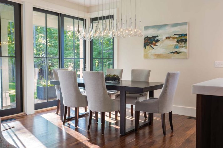
Beige pervades the walls in five shades, creating a look that’s cohesive but not one-note. Like-colored furnishings—ecru wool rugs, sand-toned Belgian linen dining chairs, a gray-taupe Belgian linen sectional in the library, and an oatmeal bedframe of the same material in the owners’ suite—bring depth to the composition. And pops of navy— on the living room’s cotton-velvet sofa and cotton lattice-print armchairs and the quilted leather coffee table in the library—and orange—on the leather kitchen stools, plaid cotton-linen swivel chairs in the dining area, and geometric wallpaper in the powder room—enliven the palette. Like everything else in a modern scheme, color should be used sparingly, says Light, who typically sticks to two complementary shades to provoke “excitement through tension.”
Abstract land- and seascapes by William Crosby and Allen Bunker and a beach scene by Tim Beavis in the library, which the couple brought from their previous house, pick up the khaki, blue, and tangerine tones. “I was delighted to inherit that painting,” says Light, noting its areas of flame-orange illumination. Like the new home, the work is largely unadorned, allowing the viewer to appreciate its core elements: a Rothkoish stacking of beach, trees, and sky, thick brushstrokes feathering in shadows, and spots of sunlight glowing in the sand.


