A Touch of Americana
Inspired by Sister Parish and the historic mansions of Mount Desert Island, a Southwest Harbor summer home gets a refined update
Tom Scheerer was standing in the yellow living room nursing his drink when he overheard a guest ask the homeowner, “how long have your parents had this house?”
The house in question was built in the 1930s. Technically a shingle-style home, the seven- bedroom structure always reminded Scheerer of a Connecticut Colonial. It wasn’t a family heirloom, as the partygoer had assumed, even though it looks old-fashioned yet modern, lived-in yet polished. Scheerer had only recently finished designing the house, updating it for its new owners, who wanted a place that “wouldn’t feel too much like a summer home,” says one of the owners. “We wanted a certain level of comfort. My husband, especially, wanted it to have an inviting atmosphere.” Scheerer, a New York-based architectural and interior designer, had worked with this family several times before. He was pleased (though not entirely surprised) to hear that he hit the nail on the head. He created a space that speaks to the homeowners’ sensibilities, that is refined yet effortless. Overhearing that casual query, he says, was “the ultimate compliment.”
“It has an organic look to it, I think, which is somewhat amazing because it was done in one winter,” explains Scheerer. When he first set eyes on the house in late 2007, it “didn’t feel very Maine-y,” he says, despite its prime location on the shore of Somes Sound. It had white trim and white shutters and no porch for weekend lounging. To make it look more at home in its Acadian surroundings, Scheerer painted the trim and shutters dark green and replaced the windows, also hunter green to match the other accenting elements.
The house didn’t need too much updating—at least, it didn’t need loads of construction work— but it did call for a porch. The owners brought in local architect Roc Caivano to create a long, deep porch that runs the width of the house on the water side. “I knew Roc from our work on the board of the Wendell Gilley Museum,” says one homeowner. “He had actually worked with the previous owner to do renovations in the 1970s.” Caivano was happy to get another chance to improve upon the structure. Because the home- owners didn’t want anything interfering with the natural light that pours into the ocean-facing rooms, Caivano added skylights to the roof of the porch. Steel supports anchor the porch to the ground, and steel brackets attach it to the main structure. “The engineering is so intense,” says the homeowner. Not long after they moved in, there was a terrible storm that toppled a dozen or so pine trees. When the homeowners heard about the damage, they called up the caretaker. “I asked, ‘Is the porch still there?’” one recalls. “But, like Roc said, ‘If there is a storm, the house might go, but the porch will still be standing.’” And it was. (The house, fortunately, was also unharmed.)
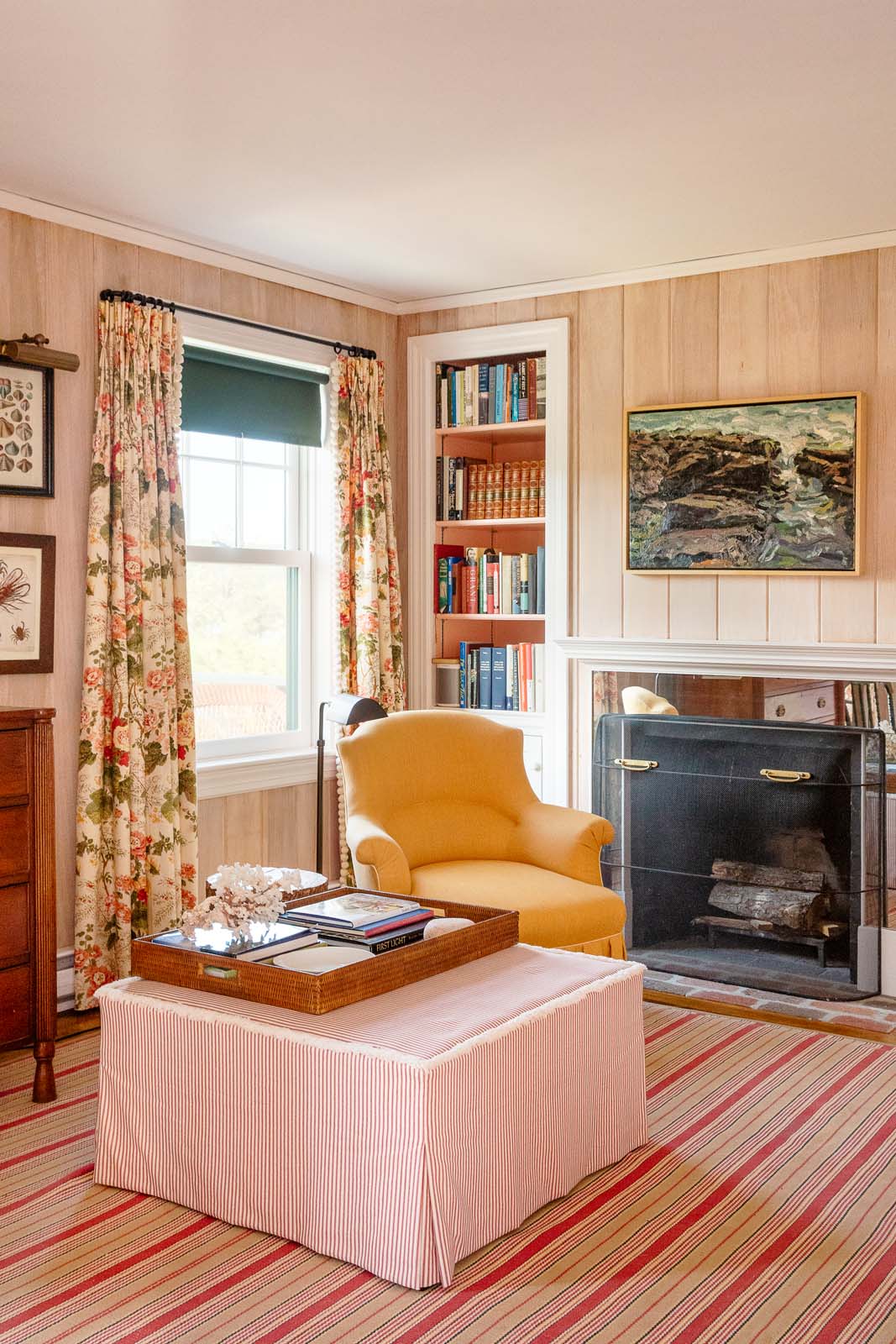
Inside, Scheerer created an environment that is admittedly a bit “dressier” than the typical Maine summer house. He was inspired by the stately summer mansions of nineteenth-century Bar Harbor. “I kept thinking about the houses I remembered from magazine stories I saw in my youth,” he says. “There were these grand decorators who had houses up there, Sister Parish being one of them.” He kept thinking about pictures he’d seen of Parish’s Islesboro house, located in the small town of Dark Harbor. “It had some charming little moments in it,” Scheerer said, “and that’s where my idea for the chintz curtains came from.” The Schumacher Hollyhock chintz curtains hang in the aforementioned yellow living room. Scheerer also commissioned matching chairs made from the same fabric, which look perfectly at home next to the family’s vintage settee (which they brought from their house in Pennsylvania) and the new Windsor rocking chair. “The room needed a bit of woody furniture,” says Scheerer of the dark rocker. “We also bought some Bar Harbor wicker. I use wicker a lot,” he confesses, “even in the city. I think it makes everything feel instantly less formal and more relaxed.”
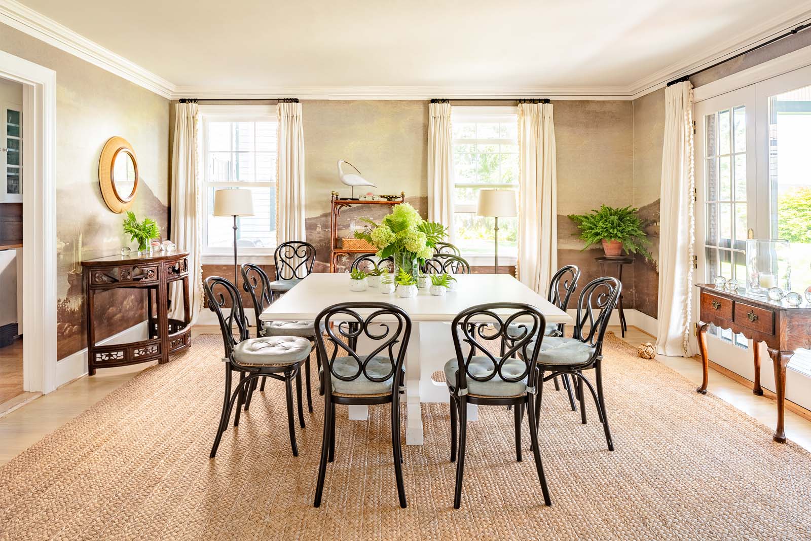
Another reference to the artists and craftsmen of bygone Bar Harbor can be found in the dining room, which is covered in scenic wallpaper that shows moody views of Somes Sound. “This is probably the most interesting feature in the house,” says Scheerer. “I had it made from three different nineteenth-century paintings by Fitz Henry Lane.” He took these various works, which differed in size and color, and had them digitally combined, merged into one seamless panorama. “It has the effect of the hand-painted wallpaper that is found in other houses of that vintage,” he explains. “It’s a touch of Americana.”
In order to make the dining room usable for groups as big as 12 or as small as 3, Scheerer had a square table built to fit the equally square space. “I felt quite strongly that we needed a square table,” he says. “If you have two people, you can sit at the corner quite neatly, but we also had leaves custom made so it can be expanded.” He surrounded the white-painted table with lightweight bentwood chairs, finishing the space with a neutral and durable sisal rug.
Upstairs, Scheerer continued the vintage Americana theme in the boy’s room, which he covered in blue splatter wallpaper and decorated with a framed folk art image of a whale rider, which “seemed Maine appropriate.” Across the back of the four-poster bed (an heirloom that originally belonged to the boy’s great-grandfather), Scheerer draped a Maine state flag. “That was an easy and quick decorator touch which gave it a nautical, almost military feel,” says Scheerer. The space hasn’t changed much since Scheerer first worked on it a decade ago, he says, but then adds, “the ‘boy’ is in college now, so some things do change.”
The girls’ room is similarly unaltered though the girls have grown up as well. Luckily, there’s nothing particularly childish about the space. Instead, Scheerer went for a botanical theme. It’s a smaller room, so he maximized the space by creating a continuous headboard to link the two twin beds, complete with a “teeny little bedside table that fits just between.” He says, “That’s a little trick of mine. I then had it covered by an upholsterer of mine in New York.” The fabric matches the fern prints that Scheerer hung on the wall, as well as the dried ferns preserved behind glass that he found in a local boutique. Two big cork-covered ottomans sit at the end of the beds, giving extra seating space for when friends come over.
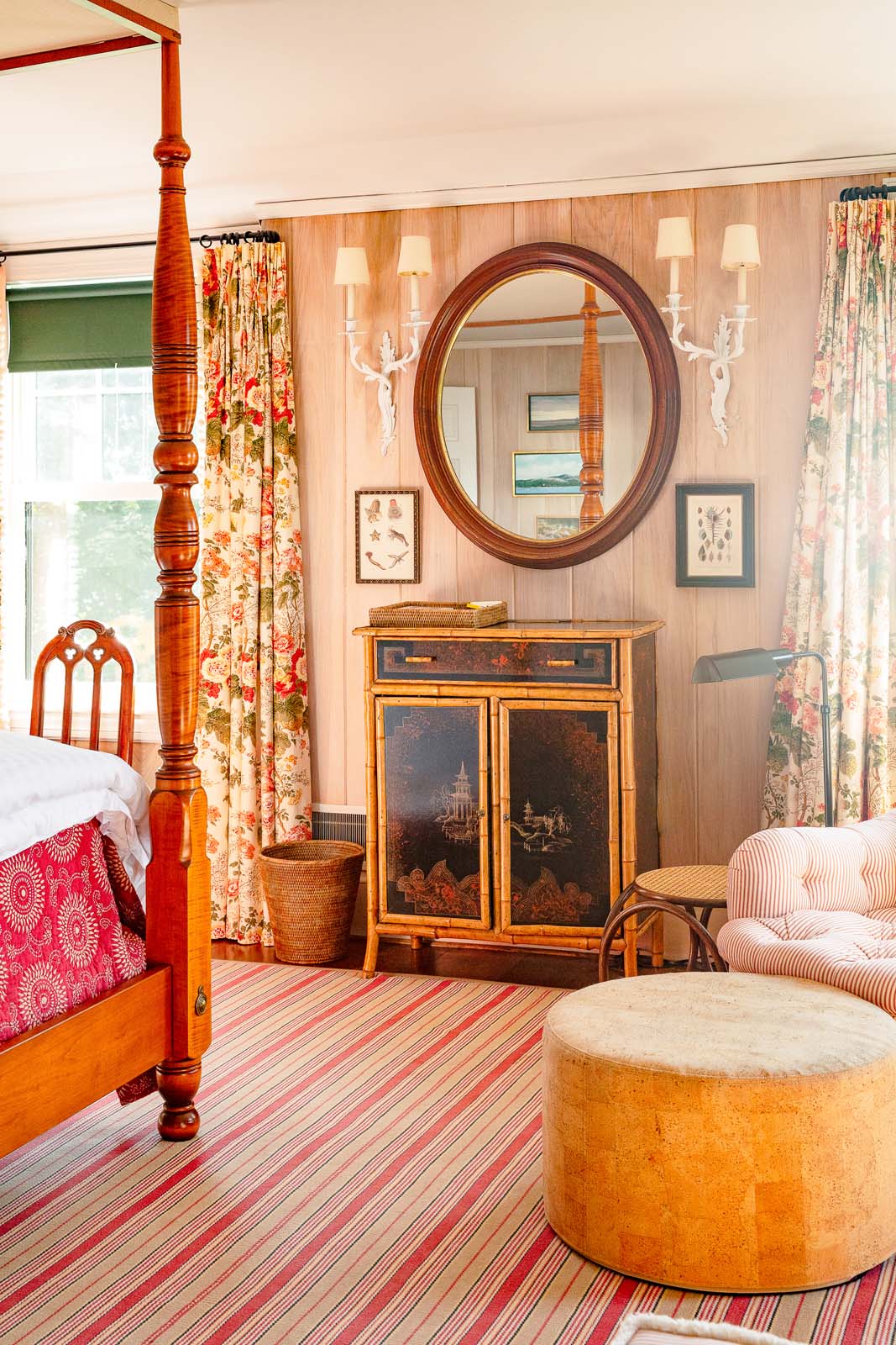
One of the only rooms in the house that was substanially altered is the parents’ bedroom. When the owners purchased the house, the suite was “weirdly, uncomfortably large,” says Scheerer. To make it more inviting, they split the space into two separate rooms: a main bedroom and something Scheerer dubbed the “snoratorium.” This little nook features one bed and a desk. “It’s a place where the snorer can go,” he says. “It’s become a very well-used room.” Both rooms feel old-fashioned but not particularly formal or fussy. “There were very fancy sconces, and we dressed those down with a little white paint,” says Scheerer. He adorned this pink room with an eclectic yet thematic collection of oval-framed mirrors and portraits. There are small seashell prints and pictures of birds. He also used the same chintz as in the living room but in a different, warmer shade. According to the homeowners, this room is one of their favorite places in the entire house, which was somewhat unexpected. They knew they’d love playing cards on the porch, and they expected to enjoy the cozy library downstairs. But, as the kids have grown (and so have their friends), the parents have come to really appreciate their private space. “We can retreat upstairs and sit on our private balcony,” says the mother, somewhat wistfully, as though she’s remembering the feel of the summer breeze as it drifts off Somes Sound. “It’s so nice to have that breathing room.”


