A Builder’s House
What happens when a builder builds his own home? An efficiently constructed house that doesn’t cut any corners on style.
Interviewers love to ask famous chefs what they reminiscent of a refurbished barn or farmhouse,” says cook at home. Their answers are often surprisingly uncomplicated: roast chicken simply prepared, mac and cheese—comfort food that tastes good without a lot of fuss. When Geoff Bowley of Bowley Builders was ready to build his own home in Kennebunkport, he took a similar approach: a contemporary house that was simple, straightforward, and on the small side. In other words, a bit of a departure from the grander, more traditional homes Bowley Builders is known for.
The style of his house may have been different from what Bowley is used to building, but that didn’t stop him from taking bits and pieces of inspiration from his previous projects. He also chose a team he’s worked with before: architect David Graham of Graham Architects and interior designer Krista Stokes, both in Kennebunkport. The site itself was also familiar: a lot in a subdivision where Bowley had built two other homes.
The history of the land drove the team’s vision for the house. The area was once farmland. “One time about 15 or so years ago, I was driving down here and the cows had gotten out and were running across the road,” recalls Graham. “We wanted to design something Bowley. “To make it look as though it had been here for a while, but updated with some contemporary funky elements.”
First, however, Graham had to determine how the house should sit on its sloped site. “The trick was how to situate the house on the hill so that the relationship between the driveway and the garage elevation wasn’t so aggressive that we’d be skating down it in the middle of winter,” says Bowley. While the site was a challenge, it was also a benefit: the hill sets the house back from and above the road, granting the property some privacy and some space from the rest of the subdivision.
As a builder, Bowley was especially conscientious about construction efficiency and affordability. This meant building a house that was easy to frame with simple trims and a straightforward layout, without sacrificing stylistic components. While clean lines were his aesthetic preference, they also served another function: keeping costs down. “It’s easier to build a box than it is to build four boxes with a number of complicated angles. We used a simple trim detail and windows that were mostly the same size. By simplifying things like that, you can save a lot of money,” says Graham.
In addition, the way the home was constructed saved money. Traditionally, homes are built via platform framing, where each floor level is framed as a separate unit or platform. Bowley’s house, however, was built with balloon frame construction, a common technique for building barns, where the wall studs extend from the sill of the first story all the way to the end rafters of the second story. “There is a cost and time savings with this type of construction,” says Graham.
Graham designed the 2,000-square-foot floor plan with family living in mind, to create enough space for Bowley, his fiancé, and five-year-old daughter. To start, Graham placed the main entry in the front corner of the house, rather than creating a traditional front door in the middle. “This informed the rest of the layout,” he says. “We then said, OK, how do you get from the garage to the main living space, and went from there.” The garage is linked to the main house with a half-flight of stairs and a mudroom that steps up to the main entry, and then continues on to the second floor. Off the main entry is a powder room and then, to the right of the stairs, the first floor opens up to the kitchen, dining, and living area. “The stairs work really well in this configuration,” says Graham, “because you’re not climbing a full flight. You get breaks in between and the house is gradually stepped.”
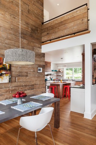
Beyond the entry area, a modern kitchen featuring slate countertops, open shelving, and walnut cabinetry by Derek Preble Cabinetmakers opens up to a two- story-high living and dining area. “The ceiling height is an indulgence in the common space,” says Stokes. “It draws you in.” Instead of a separate formal dining room, the dining area is part of the living area, given its own personality with a two-story reclaimed-wood accent wall. “In keeping with the farmhouse vibe, we used a lot of reclaimed beams throughout the house,” says Bowley.
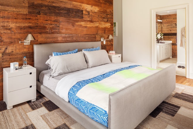
Tucked into the back corner on the first floor is the owners’ suite. Wood features prominently here too: in the bedroom a reclaimed-wood wall separates the sleeping area from a closet without doors, giving the room an open feel while keeping clothes storage hidden. “We got this idea for a ‘headboard’ wall from another project of ours,” says Bowley. “We liked how it opened up the space.”
Upstairs, two bedrooms and a bath are accessible via a hall that looks down on the living area. “The cathedral- ceilinged living area is beautiful, but we had to think very carefully about it because it came at the expense of space on the second floor,” says Bowley.
With his builder hat on, Bowley was thinking about resale value, but as a homeowner, he knew he needed a space he would be excited to come home to at the end of the day. “It’s a challenge to try to express what you want in a house and then also be thinking about what other people want,” he says. Luckily, Bowley had Stokes to help him make interior design decisions that reflect who he is. The two friends share a love of the Beastie Boys, and when they saw Mike Diamond’s Brooklyn brownstone in the New York Times a couple years ago, they immediately filled a Pinterest board. “That eclectic vibe became our style statement,” says Stokes. “It was sophisticated but really laid back.” Borrowing elements from that house, Stokes selected the Flavor Paper Brooklyn Toile wall covering Diamond helped design and the chalkboard paint in the powder room where guests are encouraged to write on the walls. “We liked that it was this classic, old brownstone with these amazing moulding details and old hot- water radiators, but that they layered in more contemporary elements,” says Stokes. Similarly, Stokes sought to add contemporary flourishes throughout Bowley’s home: bold, patterned wallpapers, bright-painted doorjambs, contemporary lighting. “I knew Geoff and his style so well, so it was easy for me to say, ‘You have to get these sconces,’ and he just trusted me. We speak the same language.”
Graham also enjoyed working with a client who is a builder. “With most houses, the challenge is trying to explain to the client different aspects of construction. On this project, I didn’t have to educate anyone. Geoff understood the timelines and the process—and the costs,” says Graham.
Even though Bowley is a seasoned pro, he still found himself falling into pitfalls he sometimes sees his clients fall into. “When you’re designing a house and you can’t physically stand there and look at it you start to get nervous that you’re not putting enough character into it.” At one point, Bowley was second- guessing his living room wall colors, thinking he should do a blue accent wall opposite the reclaimed wood wall. “Krista talked me out of it,” says Bowley. “She told me, ‘No, less is more,’ which is exactly what I tell my clients all the time. When you’re doing it on your own, especially for the first time, even if you build houses for a living, you still get wrapped up in the homeowner part of it.”


