Natural Wonder
A home that communes with the landscape on Littlejohn Island
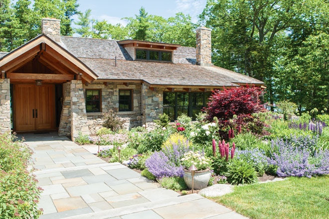
At the end of a long dirt road on Littlejohn Island in Yarmouth, an X marks a pristine spot. Fieldstone walls slice through the wooded waterfront property, then dissipate into the landscape in smooth curves. On the ocean side, the stones form a steeper chiseled slope, echoing the ledge on the beach below. Roof peaks, angled this way and that, crown the masonry, creating the effect of cottages born out of existing rock walls—a pueblo concept with Puritan roots. On either side of the gravel driveway, mortared façades on the garage and freestanding “barn” approximate the kind of gap you might see in the old stone pilings that crisscross the New England countryside.
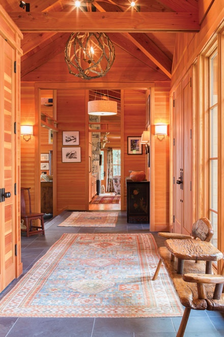
“Obviously, no one is going to confuse what we created with farmers’ walls,” says Boston architect Guy Grassi. “Our idea was to use those native forms to root the home in tradition and downplay its presence, so the structure appears to grow out of the rocky ground.” The cross-shaped walls, which extend through the home with openings here and there for windows and doors, also help organize the floor plan. The axis parallel to the water sets the entry/ utility spaces (front porch, mudroom, laundry room, garage) apart from the living and sleeping quarters, which are separated by the perpendicular stone line. Beyond the fortifications, the house breaks open. From the foyer, you can see through to a panorama of sea and pines captured in floor-to-ceiling windows on the screened porch. Douglas fir framing, which runs through every room, accentuates the roofline. In the adjacent great room, the ceiling soars to 25 feet; 10- to 20-foot-tall windows wrap around three sides of the voluminous space, conjuring an elegant conservatory. “We wanted the house to unfold as you move through, rather than tell you everything when you step out of the car,” says Grassi.
The Boston homeowners landed on Littlejohn by chance. The wife grew up in Houlton and longed to return to her roots, albeit farther down 95. They focused their property search on the Portland suburbs, where two of their close friends, including decorator Lurana Bergson of Lily Bay Interiors in Cumberland, live. In 2008 another friend turned them on to the Littlejohn plot, formerly part of a saltwater farm, and “we knew we had our spot,” says the husband. “It was a chance to live the island life without having to board a boat to get groceries.” When it was time to assemble a design team, the couple largely bypassed the speed dating many homeowners go through, meeting with various prospects to find the right connection. The couple had collaborated with Grassi and Bergson on four previous projects, so they were shoo-ins, as was landscape designer Daune Peckham of Little Compton, Rhode Island, who worked on a home the couple owned there. Friends recommended R.P. Morrison Builders in Windham.
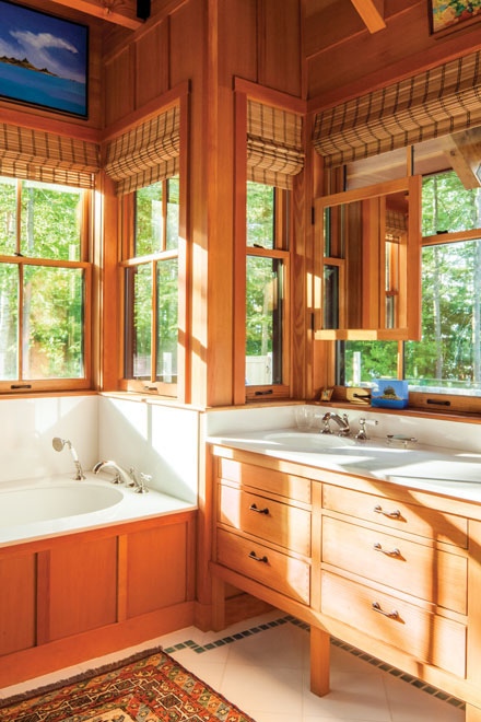
Initially, the couple sought to build a structure in the shingle style, an influence seen in the home’s artful arrangement of cedar-shingled peaks, decorative rafter tails, stone chimneys, and rambling plan, which leaves the impression of a house added on to over time. But the owners also were drawn to the wide-open aspect of post-and-beam construction, a style that pairs easily with wood paneling and massive windows. “Being in the woods, we wanted to emphasize natural materials and glass, versus Sheetrock,” says the wife. Elements of the Arts and Crafts aesthetic, which evolved after the shingle style, are visible in the home’s deep roof overhangs, tapered stone porch columns, recessed paneled kitchen cabinetry, and geometric-patterned door rails, reminiscent of Greene and Greene–style divided lights. “Picking up on these endemic traditions helps weave a new home into its surroundings,” says Grassi, touching on the mantra for the whole project.
“We didn’t want a monument,” says the husband. “More than anything, we wanted the house to feel like part of the land.” To that end, the front of the structure is purposely low-lying, with the mass spread over multiple pavilions. Turning the largest gables sideways, so you see mostly sloped roof, also works to deemphasize the volume. On the ocean-facing façade, Grassi designed cedar pergolas that act like fingers, feathering the building in. Inside, the builder carved the fir walls around the stone that cuts through the structure, underscoring the idea of a house rising out of rock that was already there.
Rather than flatten the site to fit the home, the team opted to sink the structure into the existing hill. It’s two steps down from the driveway to the front door and another two steps from the foyer to the great room. From there, it’s one step up to the seating area off the kitchen and one step down to the waterfront patio. Slate flooring gives way to bluestone on the other side of the long glass wall, further blurring the line between inside and out. Peckham specified bee balm, phlox, Amsonia, Tiarella, and turtlehead for the beds in front of the patio, creating a symphony of color. Closer to the water, she adhered to a “neutral palette,” which in the gardening world of course means mostly green. Native ferns and wood asters, along with bayberry and lowbush blueberry bushes, fill in around the existing trees, enhancing the natural habitat while allowing for slivered views of Casco Bay.
Inside, brick reds and burnt oranges in the home’s antique Oriental carpets bring out the richness of the woodwork. In the great room, sage green and beige patterned upholstery provides subtle contrast while “pulling in the leafiness outside,” says Bergson. (Earth tones also make life with a pair of outdoorsy Italian water dogs easier.) Down cushions on the seating, rendered in generous rolled-arm shapes, keep things comfortable, and playful touches lighten the mood. In the den area off the kitchen, Kravet fabric decorated with Hopi kachina dolls appears on armchairs, pillows, and curtains, which dangle from a rod trimmed with spear finials; a silver papier–mâché deer head gazes out from the fireplace. There’s a stylized seagull motif on the Jenny Lee-Katz fabric bedding in an upstairs guest room. And in the tiny downstairs bar, Cole and Son wallpaper adorned with lanterns and gondolas turns the ceiling into a Grand Canal fantasy. “I like a pop of pattern in a small space,” says Bergson. “You can be more daring because people don’t spend a ton of time there.”
On the other side of the driveway, a freestanding building resembles a modern barn. An asymmetrical window arrangement on the front façade flanked by shed roofs positioned at varying heights simulates the “hodgepodge” you might see on an old farm structure, says Grassi. The sliding cedar door with shutters and a window cutout to control the light inside is another agricultural innovation. But when you enter, you find something more Herreshoff than hayloft: traditional maritime teak and holly floors and a window seat tucked into a hull-shaped nook. Curved vertical supports on the bar conjure the “ship’s knees” inside wooden boats; a glass rack overhead can be raised and lowered with sailboat rigging. “I wanted a place to put guy toys, like a pool table and big TV, that was not in the main living area,” says the wife. (The concept of housing the equipment inside the Holy Grail of “toys” came from Bergson.) “I like outbuildings because I think they make a property more interesting—there are different places to explore.” And at these particular coordinates, myriad treasures to uncover.


