The Remains of the Day
Mount Desert Island’s second annual designer showhouse transforms one of the last vestiges of a Vanderbilt estate.
In the late nineteenth and early twentieth centuries, the glitterati gathered in Bar Harbor—Vanderbilts, Rockefellers, Carnegies, Morgans, Fords, and Astors. The families traveled from cities in the summer to “rusticate” with their yachts, Thoroughbreds, and fashionable friends. One year, Hope Diamond owner Evalyn Walsh McLean sent her children off in a rowboat with a sack of baubles to play with, not realizing she’d tossed the diamond in. Fortunately, the little troupe returned with the treasures, or the 451?2-carat stone “might have ended up at the bottom of Frenchman’s Bay instead of in the Smithsonian,” says Deborah Dyer, curator of the Bar Harbor Historical Society. “These are the types of people who were here.”
Among the island’s estate holders were Dave Hennen Morris and Alice Vanderbilt Shepard Morris, who inherited an 1888 shingle-style cottage on Route 3, known as Bogue Chitto, from Morris’s parents. The couple summered there with their six children and, in 1911, built a two-story carriage house on the waterfront lot. Today, the newer building and pilings from the main home’s stone foundation are all that’s left of the estate. “Most of the mansions here burned in a 1947 fire or were demolished soon after because the families could no longer keep them up,” as was the case with the Morrises, says real estate agent Kim Swan of the Swan Agency Sotheby’s International Realty.
She showed the carriage house property, now part of a subdivision being developed by contractor Brian Shaw and Town Councilor Paul Paradis, for a year before an ah-ha moment happened: with some refurbishing, the former stable/garage/servants’ quarters could become Mount Desert Island’s next designer showhouse.
After putting on a new roof, shingles, and windows, insulating the structure, and converting it into a pair of spacious condos, “I’d say I did a lot more than I planned,” says Shaw, who also worked with Swan on the 2013 Bar Harbor showhouse she produced. Still, he sees the renovations, coupled with the showhouse concept of giving top designers free reign over the rooms, as a two-birds-one-stone solution: the carriage house’s monthlong run last summer raised $13,000 to benefit the Bar Harbor Historical Society, and the upgrades vastly improved the marketability of the property, which was available for purchase at press time. The following pages recap what happened when creative minds came together under one giant gambrel roof to celebrate cutting-edge design—and the mystique of old MDI.
DINING ROOM — SECOND FLOOR
TYLER KARU & CANDACE KARU, LANDING DESIGN & DEVELOPMENT
When Tyler Karu came across New York City lighting designer Lindsey Adelman’s rope-and- glass pendants (photo above) on a blog last year, they instantly went on her Pinterest board. “I had to use them at some point,” she says. Signing on for the showhouse with her mom, Candace, was the perfect opportunity. The fixtures’ mix of materials and rustic-refined look were the impetus for the whole room, which Tyler dubs “a planned juxtaposition.” Gilded wood and burlap Louis XVI–style chairs—call them “stable chic”—surround an oak trestle table with a central steel stripe the team designed with Huston and Company in Kennebunkport. A custom fog-colored floating credenza (photo above) from Portland’s Furniturea offsets the weighty table and grounds a hanging collection of John Derian decoupaged plates. The ocean-themed dishes, which feature images reproduced from vintage prints, pull together the room’s neutral and seaglass shades, and the freeform arrangement references the river in Cape Elizabeth artist Holly Ready’s Summer Marsh. Creating such an effortless-looking display actually took a good deal of effort: “We spent three hours on the installation alone,” says Candace.
HOME OFFICE — FIRST FLOOR
KIM SWAN, THE SWAN AGENCY SOTHEBY’S INTERNATIONAL REALTY
As the owner of three bed-and-breakfasts, Swan is an experienced decorator in her own right. When the showhouse got under way, “I had just finished redoing nine rooms in the Captain Lindsey House in Rockland and thought, ‘I’ll go crazy if I design another bedroom.’” But a home office (photo above) she could handle. She started with the graceful, and ergonomic, cherry Peanut Desk and Owl Chair from Geoffrey Warner Studio in Stonington, then layered on maritime accents, including a knotted rope pendant, Angela Adams’s Ocean rug, and Damariscotta artist John Neville’s oil In the Fog above the armchair. The nautical chart wallpaper, from an eponymous Idaho company, depicts the stretch of Frenchman’s Bay right outside the showhouse.
OWNERS’ BEDROOM & BATH — SECOND FLOOR
BRETT JOHNSON, MAINE STREET DESIGN CO.
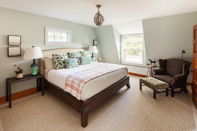
To create a feeling of luxury and spaciousness in a compact bedroom (photo above), Johnson chose substantive furnishings with “plenty of airflow underneath.” The walnut Thomas O’Brien bed, dressed with tucked-in linens and no skirt, features equestrian- like hardware that corresponds to the custom steel end tables and vintage pressed-metal light fixture. A large silk-sisal rug further aggrandizes the space by drawing the eye out to the far edges. The palette of sand and stone shades is intermixed with “lichen blues and greens” on the 1940s glazed porcelain lamps, Robert Allen fabric pillows, and Brunschwig and Fils–upholstered ottoman. Gauzy images by Auburn photographer Tanja Alexia Hollander enhance the sense of ahh. At the foot of the bed, a closet styled with vintage clothing and Louis Vuitton luggage by Pilk Events and Designs in Yarmouth evokes the travelers Johnson had in mind when he was designing.
In the adjoining bathroom, a band of porcelain mosaic floor tile reads like a meandering pebbled path, beckoning you inside. The dappled green, also seen on the wall and shower floor, enlivens the Carrara marble backdrop and “directs the focus away from a ceiling with some odd pitches,” says Johnson. Allen Bunker’s oil Drift Deeper approximates a window with a view on the Route 3 side of the building. Distinctive Tile and Design in Portland supplied and installed the tile for all the bathrooms in the showhouse.
KITCHEN — SECOND FLOOR
EDI HALL, ISLAND INTERIORS
Everything old, or at least old-looking, is new again in Hall’s kitchen (photo above), carved out of what was once a trio of cramped bedrooms. Artist Josh Behrenshouser of Oak Hill Studio in East Orland forged the pendants from a mixture of new steel and discarded saw blades, wire- brushed the material to affect a vintage patina, and fitted the frames with late nineteenth- century-style Edison bulbs. His shelf brackets, crafted from iron pipes, sculptural steel-and- oak stools, and steel island supports underwent similar distressing treatments. The island itself is encased in porcelain tile from Stabler Tile in Blue Hill that resembles reclaimed floorboards and topped with a Pietra del Cardoso stone counter—a soapstone lookalike that is less prone to scratching. Hall chose actual soapstone for the sink, “for authenticity’s sake,” and surrounded it with a delicately grained ash slab from MDI’s Savage Forest Enterprise—a fine furniture look not typically seen in kitchens. “I wanted everything to have an element of surprise, like, Wow, I wouldn’t have thought to do that,” she says. Freshwater Stone in Orland supplied and installed all the stone countertops in the showhouse.
ENTRYWAY, BEDROOM & BATH — SECOND FLOOR
BETSY BARMAT STIRES, FROG HILL DESIGNS
Decorating a guest suite gave Barmat Stires an opportunity “to tell a story” in three parts. The entryway (photo above), with its juxtaposition of Dana Gibson wallpapers, is designed to wow and “get people excited for what’s to come in the other rooms.” An oil by Boothbay artist Brad Betts and a wooden sculpture by Dan Falt of Northeast Harbor celebrate MDI’s picturesque, and pastoral, qualities.
The bedroom (photo above) features the same palette of “water, trees, and clouds,” but in reverse proportions. A Stark rug, slipcovered chairs, and Oomph coffee table fitted with a map of MDI are matched with whitewashed walls and Matouk bedding, creating a serene setting that emphasizes the seascape outside. A walnut secretary and bed by William Evans of Waldoboro and a brass fixture from the Nauset Lantern Shop “ground the room in tradition,” says Barmat Stires, who relied on the Gallery at Somes Sound in Somesville and the Kimball Shop in Northeast Harbor for many of her finds.
The bathroom (photo above) picks up on nautical and natural wood themes hinted at in the other spaces. Builder Richard Bradford of Bernard crafted the mahogany crown molding and mirror and transformed a 1950s sideboard into a yacht-inspired vanity with mahogany beadboard doors and a lacquered reclaimed oak top. On the walls around the Cararra marble shower, rectangular moldings Bradford constructed from lacquered wood scraps conjure the millwork on a boat, as well as French boiserie.
NURSERY — SECOND FLOOR
LORI CHASE, COASTAL INTERIORS
The “itty-bittiness” of this bedroom (photo above) inspired Chase to design a nursery. A 1900s cast-iron crib launched the gender-neutral scheme, which includes a reproduction 1920 rocker from Yesteryear Wicker and “Love You” fabric window treatments from F. Schumacher and Co. A window seat bookended by toy boxes maximizes seating and storage on a gabled wall. While Googling ideas for a butterfly theme, Chase learned about Epidermolysis bullosa (EB), a connective tissue disorder that leaves kids’ skin as fragile as butterfly wings. She dedicated her room to these “butterfly children” and created 500 tissue- paper butterflies—perched on the jute pendant, teddy bear, and in a vase—in their honor. For more information about the condition, visit Debra.org.
LIVING ROOM — SECOND FLOOR
AUGUSTO ROSA, A4 ARCHITECTS
Aphoto Rosa took of his daughter gazing at a museum diorama launched the design of a living space (photo above) that manages to feel both meditative and mirthful. The image’s natural colors were translated into a punchier palette of aqua, coral, and chartreuse, and eclectic furnishings capture the timeless quality of the print. Midcentury Morris chairs and a Lane surfboard coffee table, a reproduction 1960s backless sofa, and end tables with classic, Moroccan-inspired cutouts are layered over a maze-like Angela Adams rug; Chinoiserie “tea can lamps” are modeled after nineteenth- century versions made out of tea canisters. “I’m not going to make a new room look like the 1800s—for me, it’s about preserving the broader historical identity,” says Rosa, who worked with the home’s original Douglas fir floors and pine beadboard and had period-appropriate recessed paneled columns constructed where a wall used to be. A real-life diorama composed of moss and deer figurines inside a zinc-framed glass console table from Crate and Barrel (page 86) bookends the space; beachscapes by Mount Desert Island artist Linda Rowell-Kelley serve as a counterpoint to the room’s woodsy imagery.
GUEST BATH & ENTRY — FIRST FLOOR
JAN ROBINSON, JAN ROBINSON INTERIORS/ECOHOME STUDIO
Robinson went for a big statement in the small bathroom off the home’s main entryway. Orchid-print wallpaper from Jim Thompson Fabrics was the springboard for a glass tile stripe and custom color-block shower curtain in orange, Robinson’s favorite shade. The curtain hangs from a ceiling track, rather than a rod, which would have interrupted the tile work and visually truncated the space. A furniture-like oak vanity from Kitchen Cove Cabinetry and Design in Portland and an “unbathroomy” Arteriors mirror create the look of an elegant dressing room.
LIVING/DINING SPACE — FIRST FLOOR
TERRI SCOTT, T. SCOTT DESIGN
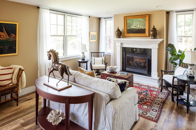
Inspired by the Vanderbilt family’s wanderlust, Scott designed a living space (photo above) around the idea of “world travelers returning home with their treasures.” Among them: Asian-style bamboo armchairs, an antique English trunk and African-influenced rattan bench, Chinese porcelain lamps, a vintage Oriental rug, and a pair of nineteenth-century bronze Burmese urns. A sofa slipcovered in mattress ticking tempers the refinement. “This is not Newport,” where the Vanderbilts owned more opulent homes, says Scott, who sourced many of her furnishings from the Romantic Room in Northeast Harbor, Country Store Antiques, Books, and Wine in Trenton, and Maine Coast Exchange in Seal Harbor. Nautical-themed paintings, including a John Neville oil over the bench, reference the prevailing mode of transportation to and from Bar Harbor, and points overseas, in the Vanderbilts’ time.
KITCHEN — FIRST FLOOR
PAMELA HALL, ELLSWORTH BUILDERS SUPPLY
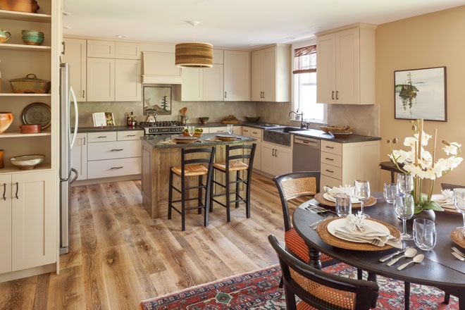
Situated opposite the living-dining area, Hall’s kitchen (photo above) takes its cues from a spot closer to home. A photo the designer snapped of one of her favorite hiking trails, the Carrying Place Inlet in Hancock, was the impetus for the tile mural by Bangor artist Priscilla Moncrieffe, as well as the room’s palette, which includes mushroom-colored cabinetry, sand-toned walls and porcelain tile, and a forest-green Verde island top. Bangor painter Rebecca Krupke’s oil The World of Yesterday mirrors the mural, and ceramics from Hog Bay Pottery in Franklin enliven the earth tones. Oil-rubbed bronze branch cabinet pulls and a corrugated cardboard pendant that Hall says reminds her of tree bark play up the outdoorsy theme. The open space owes its flow to a steady stream of dialogue between the designers, with Hall choosing the paint shades and wire-brushed oak flooring and Terri Scott bringing in bamboo shades and woven stools that complement the pendant and a set of vintage cane-back dining chairs.
OWNERS’ BEDROOM & BATH — FIRST FLOOR
ANNIE KILADJIAN, ANNIE K DESIGNS
For Kiladjian, the Vanderbilts were an entrée into the world of Old Hollywood glamour—the theme of the two rooms she dreamed up. In the bedroom (photo above), a sumptuous tufted headboard is layered over Moroccan- inspired Seabrook wallpaper, “a very Annie thing to do,” she says. “I like to have a big pop that grabs your attention, without overdoing it.” The “greige” palette is another signature that allows for variety—note the range of shades in the wall treatments and furnishings, such as the distressed mahogany dresser and linen armchair from Nicola’s Home in Yarmouth— while having a quieting effect. A constellation of metallic elements, including a 1920s-style beaded chandelier from Lighting New York, and photos of the Vanderbilts Kiladjian found on eBay are the finishing touches.
Limestone floor tile arranged in a chevron pattern provides the biggest “pop” in the bathroom (photo above), with tapestry-like shower panels coming in a close second. Composed of two-inch porcelain tiles arrayed in limestone frames, the installations “bring art into a spot where you wouldn’t expect it,” says Kiladjian. A vanity from Portland’s Kitchen Cove Cabinetry and Design with a crystallized glass counter and clear glass pulls adds elegance while letting the ceramic and stone elements shine.
LANDSCAPE DESIGN
MICHAEL ROGERS & ROBERT KRIEG, COPLON ASSOCIATES LANDSCAPE ARCHITECTURE & PLANNING
Traditional forms serve modern functions in Rogers’s and Krieg’s landscape design (photo above). A car courtyard off the garage, “similar to what the Vanderbilts might have had for harnessing horses,” accommodates difficult automobile maneuvering, says Rogers. On the street-facing side of the courtyard, boulders and river birches frame the entrance “the way a picket fence would on a farm,” adds Krieg. A curved “farm road” leads to another courtyard, designated for parking, off the side entryway. Directing traffic away from the front of the house created a clean backdrop for mostly native plantings, such as hayscented and cinnamon ferns, PeeGee hydrangea, and ninebark. On the rear, water side, the landscape architects incorporated a pink granite fire ring and works from the 2014 Schoodic International Sculpture Symposium.


