Modern Start
FEATURE
A couple trades the traditional design of their past for a contemporary townhouse in York
Interior designer James Light doesn’t direct his clients so much as move them with metaphors.
When Victor Zonana wondered aloud if the wavy-patterned wallpaper in the elevator of the York townhouse he shares with his wife, Mary Linda, should also cover the ceiling, Light joked, “so it looks like a tissue box?” (They left the ceiling alone.) When Light saw the large Jacuzzi tub that had been proposed for their bathroom, he mused that it might resemble “a car wash” in the moderately sized space. (They went with a smaller model.) And when the Zonanas showed him the nightstands they’d chosen for their bedroom, one mattress-height and the other shorter, he warned against using table lamps that would sit at different elevations—a look he likens to “a groovy hairdo that’s shaved on one side and long on the other.” (The couple purchased the adjustable Tolomeo lamps he suggested.) “James was brilliant at figuring out our taste and, with all of his bon mots, helping us implement it,” says Victor. “We had a lot of fun together.”
The Zonanas contacted Simply Home in Falmouth in 2011 after seeing an ad for the company’s work. “We liked the clean lines in the photo we saw and the coastal, but not beachy, sensibility,” says Mary Linda. “James was a perfect fit for the project,” says Linda Banks, owner of Simply Home, where Light was a senior designer at the time. “He had the pulse of our urban- minded clients, and his solution responded beautifully to their vision.” The New York City couple had vacationed in the York- Ogunquit area for nearly 40 years, and their son and daughter, who live with their families in northern California and London respectively, attended Bowdoin College in Brunswick. “We wanted a place where our 10-person family could be together but also have some privacy,” says Mary Linda. “And we’ve always felt at peace in Maine.” Their real estate agent turned them on to the 4,000-square-foot townhouse in a new four-unit development, created by Matt Banow Design in Rollinsford, New Hampshire, when the structure was still being framed—“giving us a tremendous opportunity to customize,” says Victor.
The couple told Light they wanted a contemporary design, an idea he had to reconcile with the images he’d seen of their Manhattan apartment and former weekend home in upstate New York “with the folded quilt and firkin by the fireplace.” “For 10 years I worked at the American Folk Art Museum in Manhattan, and I bought everything they sold there,” says Mary Linda. “We had a folk art house, and our apartment was full of inherited traditional furniture. We liked that for a long time, but we needed a change.”
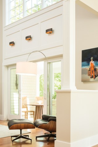
Leaving the layout of the townhouse intact, they began tweaking the interior architecture to suit their modern leanings. Removing the cased doorways that would have defined three passages off the front hall transformed the first floor. Now when you enter, you can see straight through to a soaring wall of windows in the living area, the panes dappled green from the surrounding maples. On a trimless wall at the far end of the hallway, the couple’s other world is captured in a Craig Mooney oil painting of a New York City street. Switching on the spotlight overhead intensifies the shadows on the buildings and sets the cars’ taillights ablaze, making you feel as if you could step into the canvas and hail a cab.
Light designed a wide strip of paneling to go between the sliding glass door in the living room and the ceiling-scraping windows above, marrying the paned components. On the other side of the space, a balcony with a steel and glass balustrade Victor dreamed up balances the windows and sets off a cozy sitting area on the second floor. The couple also reconfigured their bathroom and turned a bank of small windows in their bedroom into a taller triad that frames a fabric headboard and floods the space with light. “Our contractor worked from sketches we drew on a legal pad,” says Mary Linda, referring to Brian Sleeper of Period Design Restoration in York, who enjoyed the challenge. “My specialty has been shingle-style architecture, but I like modern homes,” he says. “People think there are fewer details to pay attention to in a contemporary plan, but the opposite is true—every transition and piece of woodwork has to be even more perfect because it’s so visible.”
The house is designed so the Zonanas, who spend more than six months a year here, can live on the first and second floors. Their daughter and son-in-law also have a suite on the second story, and their teenage grandchildren have their own rooms on the third floor. The lower level, which opens onto a brick patio, is set up for their son and his family, with one bedroom for parents and one for six- and eight-year-old girls, arranged around a spacious den. Light used a dozen different shades of muted gray and beige on the walls throughout the home, creating a look that’s cohesive but not one-note. “I don’t like what I call ‘a roll of Life Savers house,’ where you have the red room, yellow room, and green room,” he says. “You’re comfortable here because there’s nothing jarring—until you get to the powder room.”
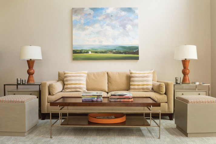
In that tiny space, flame-orange Thibaut wallpaper adorned with stylized cheetahs creates a lit-from-within effect, like fireflies in a cupped palm. “I have a weakness for playful powder rooms,” says Light. “They’re a great place to do something out of the box because you don’t spend a ton of time there.” Still, he says, the vibrant wall covering “talks” to the burnt orange Currey and Company table lamps in the living room, an adjacent Craig Mooney painting of a lobsterman in signature fiery overalls, and the persimmon abstract infinity motif on the Winfield Thybony Design wallpaper in the elevator. “The idea is to have common threads running through the house.”
Bright pinkish-red is another strand that shows up on wooden table lamps from Furniturea in Portland, planted on either side of a granddaughter’s bed and again, three floors down, in the den. There, Light matched the blurred scarlet shapes in Falmouth artist Carrie Lonsdale’s ink-on-canvas work City Walk with slightly more magenta seat cushions on a pair of Saarinen-style tulip armchairs. On a nearby sectional, crimson throw pillows pop against sage green upholstery. “The sage part is key to keeping red and green from looking Christmasy,” says Light.
In more neutral rooms, he juxtaposed materials and motifs to create energy—a distressed cherry dining table from Touchwood UK, for example, with Philippe Starck’s clear polycarbonate Louis Ghost armchairs. In the owners’ bedroom, Colefax and Fowler fabric pillows with a swirling sky blue and gray-green leaf pattern are layered over a Thomas O’Brien cotton headboard, its rows of printed squares resembling paint swatches of the home’s dominant colors. Mary Linda fell in love with the floral Romo material Light used on the pillows in her daughter’s room first, which set the designer on a mission to unearth something she would like better for her suite. (He succeeded with the leaf motif.) “You can’t put your favorite things in the guest room,” he says.
People who work with Light often find that the question “What would James do?” follows them around like a thought bubble. (He once gave out key chains with the acronym WWJD?— created with a different J-name in mind—to employees as a joke.) “Every time I shop, or even put together an outfit, I think of James,” says Mary Linda. “I have a knowledge base now that allows me to come up with a lot of solutions myself.” But if she happens to be in New York’s Gracious Home department store unable to decide on a set of Matouk sheets, as was the case recently, he’s only a phone call away.
