Industrial Chic
An urban loft tucked inside a New England cottage
Free verse or formal: this is your choice as a poet. If you are a poet of space, as architects and designers must be, the choice is normally made for you. Working with few restrictions? Wonderful. Working with many, perhaps tricky, rules and requirements? That can be difficult, but sometimes constraints present a pleasing challenge: What can we do with what we have to work with? In 2010 what developer Peter Wellin of Fish House Realty, architect Mark Mueller, builder Michael Monaghan of Monaghan Woodworks, and interior designer Shannon Richards of Custom House Property and Design (all in Portland) had to work with was a stunning property between a cliff and the water’s edge on Danforth Cove in South Portland. The lot was tight and made even tighter by setback requirements (from the ocean and an existing sewer line) and height restrictions that protected a neighbor’s view. Wind added to the complexity: whatever was built would have to withstand the weather off the water. “Mark and I came up with a design that fulfilled our vision for the site,” says Wellin. “But the angles and shape of the home were very much determined by the building envelope that we could fill.”
All these requirements came in advance of the specific wishes of the homeowners, Wellin and his wife, Pam. In some ways the site’s limitations worked with their desires, which were to downsize and live as efficiently as they reasonably could. They’d previously resided with their three sons in Falmouth, but with their sons grown, they no longer needed so much space. Before Falmouth, the Wellins had actually lived on Danforth Cove—in the 80s, when their family was young—but they had left in pursuit of more room. Still, they’d always loved the Cove and were happy that they found a way to return when a cottage in the neighborhood became available. One surprise of Pam and Peter’s full circle back to the neighborhood is that they bought the cottage from a couple they knew, Barbara Drummond Gilman and E. Jeffrey Gilman. The Gilmans were “like ambassadors to the neighborhood,” Pam says. When the Wellins first moved to Danforth Cove, the Gilmans had had them over for champagne, and the couples stayed friendly.
The cottage had been a wedding present to the Gilmans from Barbara’s parents, Dr. and Mrs. Drummond, who built a larger house on the cliff above. In 2010 the Wellins purchased the cottage from Barbara, who had moved with her husband into “the big house” in the intervening years. Indeed, it was the Gilmans’ view from the “big house” that needed to be preserved as the Wellins began to rebuild after razing the original cottage.
From the road the Wellins’ house looks like a super-stylish New England cottage. It has traditional shingles, low roofs, contemporary fenestration, fir garage doors, and a front entry accented with fir. Although lovely and polished, the exterior offers no clue to what lies inside: a startling space inspired by Peter’s interest in wharf buildings, urban lofts, and West Coast design and by Pam’s knowledge of Maine’s contemporary art scene and her work as a gluten-free baker.
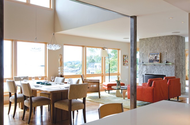
The primary space is an atrium-like living room and dining room with a wall of windows that look directly onto the main ship channel that leads to Portland’s harbor. Adjacent to this central space are a kitchen, a short hall to the master bedroom suite, and a media room. To preserve sight lines, the house is only one story in the section where the master bedroom is located. The garage is also on one level. But above the great room, there is a second floor. Originally there was space for three bedrooms upstairs. Collaboratively, the various players on the project chose to eliminate a third bedroom, allowing for an open area with double-hung windows above the great room. This left space for two compact bedroom suites, a landing with a computer workstation, and an interior balcony overlooking the dining room.
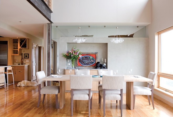
The living/dining room is anchored by two substantial one-of-a-kind pieces. On one end, there is a 20,000-pound granite chimney made from a single piece of stone that was split lengthwise for delivery, lowered by crane into the house, and then rejoined on site. On the other end is a concrete partial wall that separates the dining room from the media room and was formed to include niches for a built-in gas fireplace and entertainment center (on the media side) and for cabinets and artwork (on the dining room side).
Of the overall aesthetic, Peter says, “The commercial influence is reflected in the use of concrete, industrial metal, glass, and stone; the urban element in the spare trim and absence of ornamentation.” Let’s take it one material at a time. Concrete? In addition to the partial wall, there’s the front entryway floor, which is a ground-down concrete. Industrial metal? Some of that is hidden—the house’s framework is steel—but still expressed on the surface through a stainless-steel exterior balcony, steel columns in the dining room, an I-beam below the interior balcony, and stainless-steel balusters and pipes on the interior balcony and staircase. Glass? Windows, of course. Also the powder room sink’s counter and the granite fireplace’s mantel are made of thick pieces of cast glass. As for stone, it is used “as a common theme in the house, tying in the exposed ledge, extensive garden walls, and rocky beach,” Peter says. Outside, the foundation is veneered to suggest the slab-style foundations of wharfside buildings. Single, large rectangles of granite form low walls, and angular granite pavers fit together neatly, jigsaw-puzzle style, for terraces and walkways. The granite pavers extend into the house to surround the granite fireplace and serve as the floor of the “gallery,” which is a short hall with a large commercial glass window on one wall and paintings on the other. (Otherwise there are no real halls in the house, part of the effort to use space efficiently.) The grout lines of the interior pavers align with the grout lines on the exterior pavers, so inside and outside flow together smoothly.
It may not be commercial or urban per se, but wood is an important material for the house as well. Although there are many types of flooring (wool carpet in the master bedroom, limestone in the bathrooms, ceramic tiles in the kitchen, beach stone tiles in the showers), the majority of the house is floored with pre-engineered red birch. Fir is used for the sliding barn door that closes the media room off from the rest of the house. Fir also appears on the underside of the sloped ceiling in the master bedroom and on the ceiling of the upstairs computer workstation. The kitchen’s cabinetry is maple, as are the custom wood and steel night tables and most of the doors in the home. Although fir, maple, and red birch appear elsewhere in the house, occasionally another wood appears, such as the sycamore veneer on the bathroom vanities and the mahogany of the staircase and balcony railing.
Given the creative use of materials throughout, the house needs little decoration. Fittingly, the palette is largely neutral. The one bright block of color is provided by the orange chairs in the living room, an orange that is reflected in a Phil Barter painting of a fish on a platter that is in the art niche in the concrete separator. In the smaller spaces of the house—bedrooms, the gallery, and the stairwell—there is art, however; all of it contemporary, some of it playful, and much of it quite colorful. There is an exuberant fish ladder sculpture by Doug Frati, a fisherman in a red rowboat by John Neville, and a life-sized plywood sculpture of a man with one hand on his hip and the other leaning against a wall by Aaron T. Stephan. At one point, Pam owned an art gallery in Portland, and it is she who knows the backstory of the work hanging on the walls.
Pam is also very much in charge of the kitchen. In her Falmouth home, she had a certified gluten-free kitchen out of which she sold products. Although she has closed that business for the moment, she still actively creates recipes and blogs on her website, Gluten Free Gus. To support this effort, the Wellins’ kitchen is designed for easy accessibility to cookware and also includes a small office area for Pam.
From almost every room in the house, the Wellins have a stunning view, but also something most people don’t have: a visual of where they were 30 years ago. Their old house—their first renovation project in Maine, where they began their family—is just across the cove from their current home. Peter Wellin has developed many houses since then, but he can always see that first home from the space in which his mature family and his mature tastes now live.


