The Big Reveal
On Orr’s Island, clean, classic design with a thrilling twist
Like a package with a shining treasure inside, Gary and Nancy Badger’s Orr’s Island home holds a spectacular surprise. Low lying and beige shingled, with traditional features (shutters, gables), the house is designed to harmonize with the heavily forested site—and a range of tastes. “I wanted to respect our neighbors and not have anyone think, ‘Oh god, look what they put up next door,’” says Nancy. But when you enter, you are transported to a voluminous, barn-shaped space. At one end, a mammoth granite fireplace rises upward, like a primitive skyscraper, to meet the slope of the celestial-blue cathedral ceiling.
The house was inspired by architectural and interior designer Linda Banks’s place in Falmouth. Without realizing it, Nancy had been following Banks’s work for 20 years. “I kept scrapbooks with pictures of rooms I liked,” says Nancy. Among them, a 2000 Traditional Home cover with a photo of Banks’s daughter in the designer’s former Cumberland house, as well as images published in this magazine of Banks’s current home and at least a dozen other spaces she designed. In 2009 Nancy stopped in at Simply Home, Banks’s retail store in Falmouth, and learned of the designer, who also owns Banks Design Associates. A meeting was arranged, and only then did Nancy make the connection: “I showed her my scrapbooks, and it was like, ‘This is meant to be.’”
The next year, Gary and Nancy, whose primary residence is in Houston, stayed overnight at Banks’s home. “We loved the barn-like feel, and before we left Gary said, ‘Build this for me and I’ll be happy,’” says Nancy. “Our house is uniquely ours, but it has the essence of Linda’s house, which we admire so much.” The design and construction took three years—a mere blip when you consider that the couple has owned the property, situated on a steep hill overlooking Long Cove, since the late ’70s. They purchased it when Gary, who hails from Auburn, was serving as a pediatric dentist in the army. “When you’re moving all the time you yearn for a place to settle, and we always figured we’d have a house here,” says Nancy. Over the years, the couple vacationed in the area, but they never got around to building. “Life intervened, until one day our son, who loves Maine, convinced us to get started,” she says.
To make the barn concept livable, Banks created clearly defined spheres for “gathering and retreating.” A wide-open living, dining, kitchen, and loft area composes the expansive central core, which Paul Moutal of Flying Point Construction in Topsham pulled off without any vertical supports by installing a 50-foot-long laminated ridge beam. “It’s the sort of thing you see in a high-rise, but rarely in a residential setting,” he says. To reach the master bedroom and office, you wander down a long front corridor Banks calls “a buffer zone.” The guest rooms and family room are similarly sequestered in the light-filled lower level, built into the side of the hill. “The layout allows you to be in the house with other people and still feel like you’re in your own private world,” says Banks.
Moving through the rooms, you are hard-pressed to place the home in a particular time period. “My goal is always for people to see a house I designed and not be able to tell when it was built; it should look like it’s always been there,” says Banks, who has some signature tricks for taking the shine off new construction. She has an aversion to drywall in large quantity, so many of the walls are covered in tongue-and-groove nickel-gap paneling (named for the nickel-size spaces between planks) custom-made by Tidewater Millwork in Woolwich. Tidewater also crafted the bead-and-cove crown molding, which has a clean, concave profile that lends character to walls and built-ins “without appearing old-fashioned,” says Banks.
Unexpected architectural gems scattered throughout the house add another layer of patina. In the multiuse mudroom (it’s also a laundry room and potting station), early American sidelights with a worn white finish are repurposed as doors on a pair of bright green cabinets. Arched windows from a late-nineteenth-century mill, placed over opposing doorways, let light into a small interior pantry. And in the master bathroom, a Victorian leaded glass window decorated with facet shapes performs the same light-infusing function for a water closet and brings a touch of glamour to the serene space.
Knitting reclaimed pieces into the fabric of a new home “gives it soul,” says Banks, who, with Nancy, unearthed all of the old doors and windows for the project at Portland Architectural Salvage. One particularly auspicious find: a pair of whimsical interior doors, plucked from a Victorian-era theater and painted in shades of moss green with touches of ochre and rust. The palette, also seen in the homeowners’ collection of vintage painted Bavarian furniture they amassed when Gary was stationed overseas, was precisely what the designer and clients had envisioned for the house. The doors were missing their upper panels, so Banks added antique mirrors. Installed at either end of the front hall, which also serves as a gallery for the couple’s antique clocks, the mirrors reverse and visually expand the space, providing intriguing new views.
To unify the rooms, Banks used broad strokes of muted earthy green, ivory, and straw and layered on details in more saturated shades: knotty alder doors with a rich sage aniline-dye finish and, in the master bedroom, a luminous acid-green upholstered bed frame. A fabric headboard embellished with brick-red birds enlivens a downstairs bedroom, and a giant persimmon coffee table anchors the living room seating arrangement. “I believe a house should be like a tapestry with the same colored threads woven throughout to create a cohesive look,” says Banks.
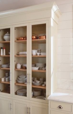
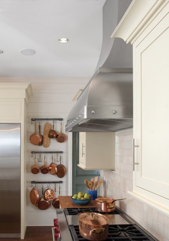
Among her other trademark techniques is using strong architectural features to balance a big communal space. Here, the soaring granite fireplace created by Freshwater Stone in Orland stands opposite a massive entryway trimmed with nine-inch-tall crown molding, with a loft overhead and the kitchen beyond. To keep the kitchen from looking “like a cabinet showroom,” Banks puts in as few cupboards as possible (dry goods go in a walk-in pantry) and varies the sizes and door styles. In the Badgers’ case, a hutch adorned with copper chicken wire displays a collection of whiteware, and a trio of antiqued mirrored upper cabinets, arranged opposite a stretch of windows, reflects the woodsy-watery view.
Banks’s design philosophies melded beautifully with her clients’ own, but there was something Nancy felt the home lacked. “We were working late one night, and I said, ‘We need to have more humor here—we need bugs!’” says Nancy, an avid gardener. The epiphany led to one more of the home’s marvels: wrought-iron deck railings crafted by Tom Welch of Mainely Handrails in Benton, that look unassuming from afar, but as you move closer, you see they are dotted with intricate cast-iron bees, butterflies, and dragonflies that appear to dart and flutter, even in the dead of winter.


