Cape Porpoise Pied A Terre
FEATURE
A rustic-modern house embraces a modest footprint
My early morning fun,” says Marianne Hovivian, “is to put on my sneakers and walk the neighborhood.” In the summer of 2011 the neighborhood she was exploring wasn’t in Manhattan, where she and her husband Ted live, or in Brooklyn, where they have turned an industrial building (the location of their former furniture business) into condominiums, but in the coastal village of Cape Porpoise, part of the town of Kennebunkport. For two decades Marianne and Ted have been visiting the Kennebunks, most often staying in bed-and-breakfasts. In the summer of 2011, however, they were renting a home and casually considering buying. They’d looked around, but nothing available seemed quite right. Then Marianne took a walk, which ended in a run back to the rental. “You have to come and see this,” she said to her husband.
She had found a single-story house for sale. It wasn’t perfect, but the property on which it was located was extraordinary: on a tidal inlet, private, but (she assumed, since it wasn’t a large lot) affordable. Within two weeks, Marianne and Ted had a contract.
Which may not have been a complete surprise to the people who know them; the Hovivians are real estate developers with a good eye. Still, things worked surprisingly smoothly, both before and after the sale.
On visits to Kennebunkport, Marianne had often shopped at Carla’s, a clothing store in town that also has a location on Portland’s Exchange Street. Over time, Marianne had become friends with Carla Perkins, the owner. Perkins’s long-term partner happened to be a Kennebunk architect, Harvey Wells.
“I immediately spoke to him,” says Marianne. “He knew of the property and agreed it was a wonderful location, and that was the beginning of a happy story.”
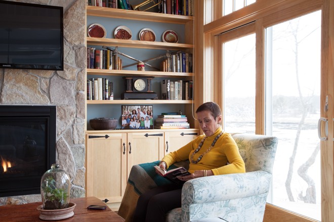
Wells quickly brought on board builder Richard Moody and Sons Construction Co. of Wells and kitchen designer Jeanne Rapone of Yarmouth. If architects, builders, and interior designers sometimes compete over the issue of who does what and who was responsible for what innovative idea, Jon Moody (who led the project), Rapone, and Wells are the opposite: frequent collaborators who are all too eager to acknowledge each other’s efforts. The result is a house that requires some additional collaboration just to describe. Wells says he was stumped when it came time to define the architectural style for the town planning board. Moody is quicker with a description. He says, “It’s a good blend of coastal and traditional design. From the exterior, it’s a traditional dormered Cape with coastal cottage design on the water side.” Inside, things are more complex. “I would classify it as ‘rustic modern.’” “Modern” because of the open plan, ample windows, light colors, white kitchen cabinetry, granite countertops, chrome fixtures, and simple trim detail on windows and doors. “Rustic” because of the significant use of wood. The living room’s walls and cathedral ceiling are entirely clad in V-match pine, custom milled to avoid knots. (“It makes for a cleaner look,” says Moody.) The floors, stair treads, custom hall cabinet, and custom bathroom vanities are of random-width reclaimed walnut. Two living room trusses give the space “that classic cabin feel,” says Moody. The natural stone veneer of the floor-to-ceiling gas fireplace only heightens the effect.
When Wells decides that he does have a name for the home’s style, after all, it derives from the fact that the Hovivians use their home as a second, but not a retirement, home. “I call it Cape Porpoise pied-à-terre,” he jokes, and allows that he is currently designing two other homes in the same “style.”
The big challenge of the space wasn’t, in the end, resolving the home’s various design impulses but working within a limited footprint. “Illusion 101,” says Wells. “Space is not necessarily what it is, but what it is perceived to be. You achieve that by a couple of different means.” The Hovivians wanted one-floor living and a single-car garage, but Wells could work only within 1,600 square feet, the size of the home that once stood on the site. To make things feel more spacious, Wells designed an open-concept plan with cathedral ceilings for the living room and master bathroom, a coffered ceiling to suggest additional height in the dining room/kitchen, a virtual wall of waterside windows, and a deck that reads as an extension of the indoor living space. Because ordinances allowed Wells to add 30 percent vertically to the original square footage and volume, he designed a second floor with two bedrooms and baths for guests. Rapone said that her job also came down to math. What could she do given the tight size of the space, the placement of the windows, the dimensions of the appliances, and basic venting requirements? “I am all about function,” she says. Maximize views, yes. Make sure the cook has plenty of counter space to the left and right, yes, yes. A convenient utensil drawer. Yes, yes, yes.
Although the Hovivians quite clearly embraced Maine talent for their second home, their interior designer was New Yorker Ivan Dolin, with whom they have worked on many projects. “The most interesting story about this house,” Dolin opines, “is that I’ve never been there.” Indeed, he’s never been to Maine, but he managed to work from afar. How did he pull this off? “I knew what their style was like,” he says. “I knew they wanted the Martha’s Vineyard, beachy, country look. Modernist with a little traditional.”
He couldn’t have cyber-managed things through email if not for Ted, he says. Ted knew exactly how to implement Dolin’s suggestions. “I have other clients who won’t buy toilet paper without consulting me about the color; Ted is almost like a wannabe architect.”
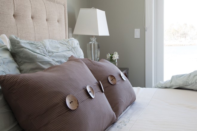
The color scheme for the Hovivians’ house developed from a fabric selected for the living room sofa. In addition, after picking a rug from New York’s ABC Carpet and Home, Dolin dropped to the floor, pulled out paint chips, and had “a little session with himself,” as Marianne puts it. By the time he was through, he had suggestions for paint colors for the walls, trim, and doors, as well as for the furniture. Says Ted of Dolin, “He has a gift for providing detailing.” When Dolin saw shots of the living room with its built-in pine bookcases, he said the bookcase backs shouldn’t be in the same pine that Moody had painstakingly matched to the pine board elsewhere in the room. The backs needed to be painted the same blue as the walls. As for the accompanying cabinets, which had been ordered with touch latches? No, they should have hardware. They needed to look a little older.
The Hovivians acquired furniture, fixtures, materials, and other items from suppliers with whom they work in New York, as well as from Maine shops. New York suppliers include AJ Madison, Arhaus, RBdelaa Lighting, and SMC Stone International. As for Maine: the living room pine is locally sourced through Hancock Lumber, the reclaimed walnut flooring is from New England–based Longleaf Lumber, and much of the furniture is from Americana Workshop in Kennebunk and Antiques on Nine, also in Kennebunk. On the exterior, landscape design and planting was done by Arundel-based Focal Point Contracting.
“We have done development in New York,” says Marianne. “And we know what it is like to get a project done.” Ted elaborates, “Doing business in New York is like going to the dentist. In Maine, it was effortless, what with the caliber of workmanship and the attitude to working.” “This project started in February,” says Marianne, meaning that February was the date when the house that originally occupied the Cape Porpoise site was torn down. “Our house was turned over to us after Labor Day.” She still seems surprised that things happened so quickly. “The ease with which it occurred in Maine makes us breathless.”


