Cottage Industry
Feature
A smallish cottage cleverly designed to feel big in a seaside summer community
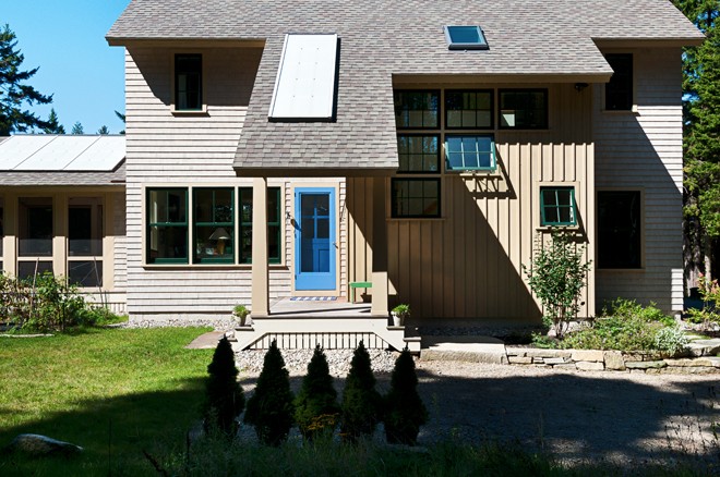
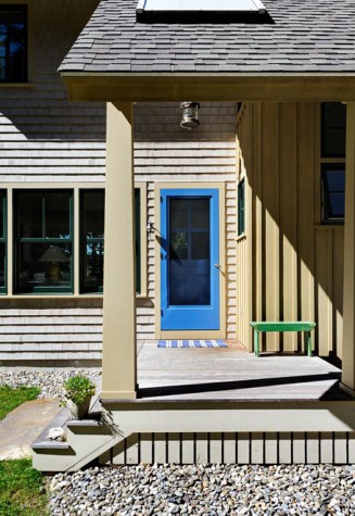
On a point of land that dips into the Atlantic, that takes its shape from coves and inlets and watery nooks, a well-established community goes about its day. Everything that’s happening outdoors—the sounds of kids on water, working boats, seagulls, a breeze through sky-high spruces—is felt inside this cottage. The design is thoughtful in this way, right down to the blue Dutch door that’s open up top, an informal welcome gesture to no one in particular, but to everyone and everything in general. When you live amid such natural beauty, why not let it in?
Especially when your ties to this place date back several decades. Hers go back to when her parents first brought her here at the age of six months, and his, to when his wife brought him here when they were dating. Even before that, though, her family’s roots in Maine extend back six generations. Over the years, she and her husband spent their Augusts here, renting houses all over this point of land when they were first married, and then later when they had children. But finding a rental house grew harder over the years. Couples who had come with young children now had grown children who wanted to continue the tradition of vacationing here. The houses that had always been available were now being rented for extended stays with extended families. After moving from four different rental houses in less than a month, the couple decided enough was enough: it was time to build a place of their own.
It was 15 years ago when they first contacted Rob Whitten of Whitten Architects in Portland. At the time, the market was down, so they decided to hold off on building. When it came time to pick the project back up again a decade and a half later, it was a different project. Their budget was different. They were different, at a different point of their lives. With the benefit of time and experience, they had realized a few things. For starters, they did not want a seasonal house after all, but a four-season house. They also didn’t want a large house that would require a lot of upkeep. What they wanted now was a modestly sized cottage that they could enjoy year-round. “We wanted to spend our time here with fewer responsibilities than we have at home,” says the wife.
Having rented as many houses in the area as they did for as many years as they did, the homeowners had a clear idea of what they were looking for—what worked, and what didn’t. Right off the bat this time around they knew they wanted to take advantage of the views and create a space that brought the outside in. “When I used to come here as a kid, I always loved the woods just as much as the sea, and I love that this site has both,” says the wife. Having enough room for everyone, including their two adult children, was also important—but not so much from a size perspective as a separation perspective. “We wanted everyone to have a place to retreat to—a separation of space—so they could feel removed but remain connected.”
They called Whitten Architects again. Armed with their new, revised wishlist, Whitten and architectural designer Brian Stephens (now with his own firm, Brian Stephens Design) set to work on creating a little house that felt big.
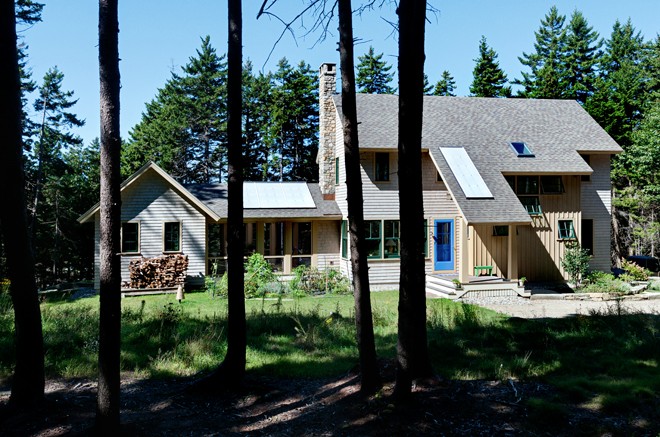
The site was a beauty, but from an architectural perspective, it was also a challenge. Stephens had a restricted building envelope to work with due to waterfront setbacks, limited septic system options, steep slopes, and property access. “There was no place to put the house except right here,” says Whitten. Despite this, the house is perfectly positioned to maximize water views and privacy. “The site’s forms inflict the constraint, but hopefully at the end of the day when you see the house you don’t say, ‘Oh, that must be the setback,’” says Whitten. “I always think it’s important to see the water’s edge if you can,” says Stephens. By raising the grade up two and a half feet, Stephens created a distinct separation from the public space next door and made the hill slope a little farther back so now the house sits on the edge. (This also gave the homeowners a full basement and hid the septic system.)
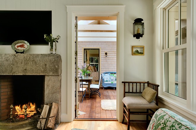
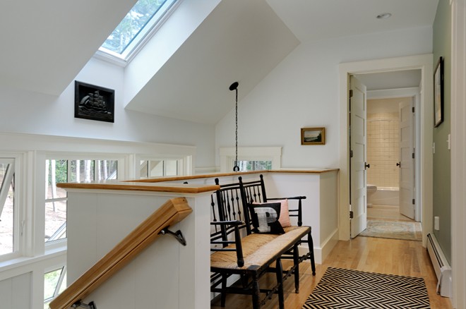
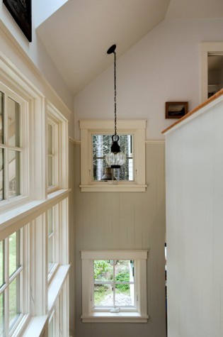
As is typical on a Whitten Architects project, the house unfolds with the sun’s movement from east to west. An open floor plan cleverly fits in all of the homeowners’ requirements in an efficient 2,000-square-foot footprint. “This house was designed in sections many times, just slicing, slicing, slicing, because we were working really hard to get the homeowners everything we could,” says Whitten. Every square inch of space was maximized; even a “porch” off the back of the house is just wide enough for someone to stand. On the first floor, Stephens designed an open living, dining, and kitchen area linked to a master suite by a screened porch with a stone fireplace and translucent Polygal skylights that let the light in. The porch operates like an outdoor living room: “We wanted to make it feel like a tent,” says Whitten. On the upper level, three modestly sized bedrooms share two baths, with the option of closing off one to make it en-suite. “We really were squeezing in here,” says Whitten. “But in a gentle way. We included shared baths in the plan and we tried to get light in two directions in every room to make the space feel airy.”
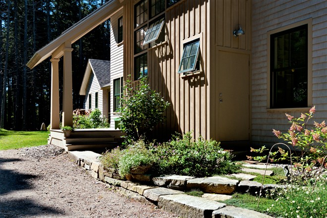
The home’s materials are low maintenance and high performance: board walls and wood ceilings on the first floor, custom cabinets and built-ins, soapstone counters, recycled granite fireplace facing, red birch flooring. “Our motto was keep it simple, keep it cottage,” says Whitten. Builder Bob Stevens of R.W. Stevens in Phippsburg, whose artistry stems in part from his art studies, used simple forms and local materials. Out of this woodworking shop he created custom built-ins and cabinetry. “Bob told us not to spend money on things we can’t touch,” says the wife. He sourced the granite for a fireplace made by mason Stephen Mosher and crafted a cedar support in the living room. Details such as two-over-one windows with vertical mullions add to the cottage feel. “There’s a very spare, very Yankee quality to them,” says Whitten.
The homeowner co-owns a home decor store in Massachusetts with several of her friends, so when it came time for the decorating, she was full of ideas—and accessories. “She would show up to meetings with bags full of treasures,” recalls Whitten. “Lights, accessories, you name it, and she’d say, ‘We have to find a home for this.’ She had porch lights before we even had a porch built.” “I always knew one day I’d have a house in Maine,” says the homeowner, “So I just kept collecting things.” Part of it is in her blood, as her grandmother was an interior designer. “Throughout the project, I wished she was alive to talk to. I channeled her.”
Perhaps fortuitously, much of the furniture—the dining table, living room sofa, and chairs—are antiques from her husband’s parents’ house in Boston, all of it of a smaller scale, a perfect fit for the smaller footprint. “If this was a chair made today, it’d be huge,” says Whitten. “The smaller-proportioned furniture is part of the cottage charm.”
Just as the homeowners’ vision benefitted from the passing of time, so, too, did the house. “I think you have to live in a place to really get to know it over time, and then you can make better decisions about it, rather than getting in there and rushing to make a ton of changes all at once,” says the homeowner. “It’s like eating a wonderful meal in ten minutes,” says Whitten.
With decades of summers in Maine, and 15 years between the start and end of this project, this process was savored bite by bite.


