Ground Rules
FEATURE-October 2011
By Rebecca Falzano Photography by Trent Bell Styling by Janice Dunwoody
A dramatic design on Mount Desert Island takes its cues from the topography—and the camps that came before it.
She has been coming to this lakeside camp facing the mountains of Acadia National Park for more than half a century, since her European parents purchased a few acres in 1949 and built a rustic two-room cabin with the help of one of the area’s first modernist designers. “The site reminded my parents of the Russian and Baltic woods,” she says. “The lakes and mountains of their childhoods.”
With her husband and their two children, the family summered at the camp (“We called it our mother’s dacha”) or at another even smaller place they bought on a nearby pond—an ice fisherman’s shack on an island that’s about a third of an acre. “We knew about living simply,” she says.
On a piece of land that has been in her family for 62 years, just up from the old camp, there is a particularly beautiful spot: an elevated, sloping site speckled with tall beech trees fronting a spring-fed pond and a gentle cove with long views that draw the eye to the mountains ringing the far shore. Here is where another camp would go, a place where she and her husband, now retired, could spread out when their children and grandchildren come to visit, as they had decades before, when they were the children and grandchildren.
“Our aims were fairly modest: a low-maintenance, rustic space with a guest room, some creature comforts such as bug-proof screens and walls, better lighting and plumbing, and more insulation than the old porous camps provided,” recalls the wife. The couple chose local designer George Gekas of George Gekas Design for his interest in small houses and green design, and for his experience building on tricky sites.
“I remember being contacted because of something I said about welcoming challenging sites,” says Gekas. “Little did I know just how challenging it would become.” Gekas set out to create a design that would merge the couple’s connection to the site in the past, present, and future. The design would imbue a sense of privacy within and without, capture views wherever possible, provide a safe and healthy environment, and convey a relaxed summer-camp atmosphere—“no fussing allowed.”
But first there were zoning restrictions to contend with. Once it was determined that a second home on the property could be built—albeit by conforming to severely restricted shoreland zoning and setback requirements, not to mention the physical limitations imposed by the extreme topography—the ground rules were set. “The driving force for the general shape was the allowed footprint; every inch available was taken into consideration,” explains Gekas.
Solutions rooted in the regional architectural vernacular would not work here—the uniqueness of the site called for something different. “I’m quite sure the owners weren’t expecting such a radical departure from what we envision as the typical lakeside summer camp,” says Gekas. Fortunately, though, the very first sketch, expressed in minimal but strong lines, captured their imagination. “Now all I had to do was make those lines work,” says Gekas.
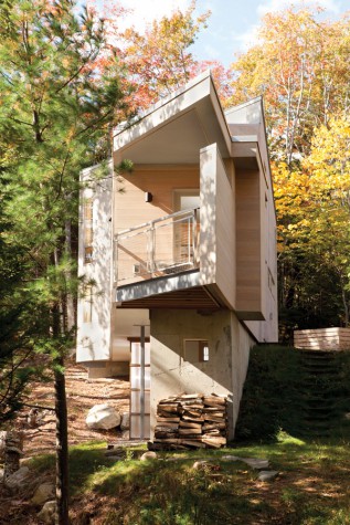
When they came to life, the lines, it turns out, worked extraordinarily well. The resulting structure is a compact three-story, 1,300-square-foot triangle that is tall, narrow, and chiseled to a point. The tree-house-like structure and its walls of windows showcase the lake and mountains and feature hidden corners for storage, several terraces for gazing, and unexpected spaces at every turn. The site is close enough to allow the grandchildren to run up from the old camp yet discrete enough to offer privacy to everyone who shares the property. Working with the right builder—one who would not balk at the challenge but help tackle it—was key. Gekas chose Keith Higgins of EL Higgins & Sons for the construction.
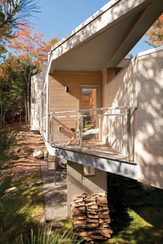
On approach, the one-and-a-half-story building seems purposely unadorned. The minimal use of windows indicates a concern for privacy, but a scattering of portals suggests something else is in store. The entryway alcove is recessed and set at precisely 22.5 degrees—a common theme throughout the design. (“Four of them will get you 90 degrees,” says Gekas. “Everything has a purpose.”) From the exterior, the lines are dramatic, another cue taken from the topography. “Some have said it reminds them of a boat. I think of it more like a spaceship temporarily marooned, one that could take off at any minute,” says Gekas.
Past the entryway is an open, flowing kitchen, dining, and living area with views of the pond and mountains that are framed by a continuous ribbon of floor-to-ceiling windows. Branching off to the left are a master bedroom with private balcony and bathroom and a spiral steel staircase to the ground level below. To the right is a winding staircase (again, set at 22.5 degrees) that connects to the third level above. The ground floor provides additional amenities: a bathroom, laundry, utility room, extra storage, a patio, and direct access to the pond. The third level offers a sleeping and play loft for children, a small bathroom, and an additional guest bedroom with a sliding glass wall that opens to the roof deck, where friends and family can sleep out under the stars.
The roof deck and bedroom balcony on the main level are shielded from the road by privacy walls that work in tandem with the structure. To open up the interior and allow the building to hover and project on its vertical and linear lines required a network of industrial steel girders to form the backbone from which everything else projects. “I have an affinity for bridges and structures that defy gravity,” says Gekas, “and I wanted the exposed steel beams to play a role in contrasting and complementing other textures and finishes, such as wood, glass, and concrete.” This required collaboration with an engineer, so Gekas worked with Dennis Riley, PE, of Red Spruce Architectural Engineers and Designers based in Northeast Harbor.
As for the homeowners, after spending winters in a sprawling Victorian (Oriental rugs, upholstered furniture, walls of books), they had a lot to think about when it came time to design the decor. “Immediately, I knew I didn’t want the interior to compete with the views,” says the wife. Before they began furnishing the house, they spent the first summer sitting on garden furniture. Except for a “really comfortable” couch, she chose simple modernist items: a few pieces from Ikea’s birch sauna line, some Breuer chairs, a slate and wood table (made by a brother-in-law who is a woodworker), and a desk built into the bedroom’s narrowing point. Nothing too “fancy,” and all reflecting the natural tones of forest, stone, and water that surround the house. “Occupying this boat-like space makes us reluctant to contemplate even hints of city clutter,” she says. “We still live in what we can describe as a simple lakeside camp.”
“It may look like a boat or even a beautiful modernist folly in shape,” says the wife, “but it sits, exactly, on its legal triangular footprint of a site, perched high over national-park views.”
And, just as the homeowners wanted, close to the footprints of grandchildren.


