East Meets West
FEATURE-June 2011
by Debra Spark | Photography Trent Bell
A Convergence of Design on Rockport Harbor
Interior designer Jeffrey Doherty fell in love with New England in the early 2000s. At the time, he lived in California, but he was working on a large interior-design project in Boston and on Nantucket. A friend told him, “If you like New England, you’ll love Maine.” So Doherty came for a visit. On a whim, he bought a piece of property on Rockport Harbor, just behind the Center for Maine Contemporary Art. His intention—at least initially—was to renovate the existing home. Only there were problems. There was moisture. There was mold. There was a river that sluiced through the basement whenever it rained. When Doherty took his Rockport neighbor Bob Cole of R.E. Cole Builders through the home, he ended his tour by saying, “Or we could tear it down.”
Cole said, “Go with that.”
Doherty had initially heard of Cole by word of mouth. (Cole now operates out of Sandwich, Massachusetts.) Cole introduced Doherty to architect Eric Allyn of Houses & Cottages in Rockland. Allyn says, once he and Doherty decided they were going to build rather than renovate, “Our eyes opened wide, and we realized we could do something really interesting.” Doherty’s predilections were for a Craftsman-style home, and Allyn says he saw how he could mix the Arts and Crafts and shingle styles to create a home with “a certain appropriateness for Maine.”
Not everyone agreed, however, that the planned structure would be appropriate for Maine. “From the moment we began construction, this house was extremely controversial,” Allyn says. At least some people in town saw the original home, which dated from the 1850s, as a building that should be saved. Others simply felt that the proposed design wasn’t in keeping with other houses on the harbor. “I got anonymous hate mail,” Allyn says. “Messages accusing me of being greedy.” One day, he arrived at the worksite to find a sign that read, “Chinese restaurant opening soon,” this missive being a reference (one presumes) to the architectural forms of the house, which are not in fact Chinese, though Arts and Crafts style was influenced by Japanese architecture.
“It did create controversy,” agrees Tom Ford, director of planning and community development for the Town of Rockport. “A lot of people were used to seeing this,” he holds up a Polaroid of a Cape with a central chimney. “And they were replacing it with a more unique architectural design.”
Like many Arts and Crafts–style homes, the Doherty house features horizontal lines, multiple volumes, mixed materials, and varied rooflines. Allyn enhanced the design with contemporary twists and additional forms. From the street side, black trim, rows of windows, and low roofs emphasize the horizontal. As one moves around the red-cedar-shingled structure and toward the water, the forms grow increasingly complex and come to include a second-story mahogany box (which accommodates the master bedroom’s shower), black panels, and three triangular bays that swing from the home at a fifteen-degree angle. “The forms evolve and unfold as you look,” Allyn says. The house “opens like a flower.”
Allyn and Doherty worked closely on every aspect of the house. One of their initial decisions was to site the house diagonally on the lot to take advantage of the harbor views. Another early decision was to create a design that would allow Doherty to live entirely on one floor should he choose. Perhaps counterintuitively, the second floor is the “daily life” floor. It has a den, attached bath, and adjacent breakfast nook on one end, and a modestly sized master bedroom suite on the other. The two ends are joined by what Allyn calls a “glass bridge.” It is a large open hallway lined with windows on both the harbor and street sides. (From the street, you can actually see the sky over the harbor through the windows.) The hallway doesn’t just join the two distinct parts of the house, however; it functions as an office and sitting area. The harbor-facing wall has a built-in bookshelf, workstation, window seat, and display area, and the view is perhaps the best of the home’s many terrific views. “What is fun about it,” Doherty says, as he stands behind his office chair, “is that it’s like standing on the deck of a ship. It feels like you are at the helm.”
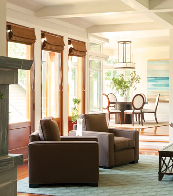
The downstairs is the home’s entertaining space, and it in- cludes a foyer, large open living room, dining room, and kitch- en. Unlike the single, open space that is typical of so many contemporary homes, the spaces are discrete but connected, each one curving into the next. Five mahogany doors sepa- rate the living room from a grass terrace. These doors visually flow into a series of windows, including an inverted corner window, that wrap around the dining room before stopping at a wall with a large seascape painting.
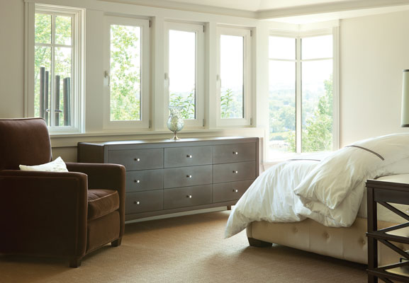
The architecture isn’t the only impressive aspect of the Doherty home. “This is the most beautiful house that has ever been carried out in my studio in terms of interiors,” Allyn says. While Allyn designed the home’s built-ins and casework, Doherty orchestrated the selection of materials, finishes, and hardware. However, Doherty didn’t just choose items for the home—although he certainly did that—he also either designed the furniture and had it custom-made or tweaked the design of commercially available pieces. Among the things he chose for the home were Statuario marble for the kitchen and bathroom countertops, stacked fieldstone for the kitchen backsplash, and a Boyd ceiling pendant for the dining room.
The living room has a two-sided stone fireplace, with detailing that incorporates the same 15-degree angle that Allyn repeated throughout the house. The fireplace is made of bluestone with a Norumbega post, raised hearth, and mantle as well as black-slate accents. Doherty likes how mahogany contrasts with bluestone, so he chose eight-inch- wide mahogany planks for the ground-level flooring, then picked mahogany for the kitchen cabinetry and upstairs built- ins. Since Allyn and Doherty’s tastes so often went hand-in- hand, mahogany became a significant material for the outside of the house as well.
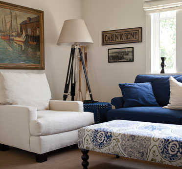
Because the house is on the water, Doherty wanted to take “a nautical approach” to the interior, which is decorated with paintings of ships and harbors, a model ship, a cruise-line advertisement from the 1920s, a Japanese fish float, an antique nautical compass, and other seafarers’ items.
Doherty is also responsible for the landscaping. A designer friend of his once said, “I hate a riot of color in a garden.” She preferred things brilliant but simple. Doherty stole this idea, he says, by only planting in one color. When in full bloom, his garden is “basically green with white accents.” He used foundation stone from the original house for a fire pit of his own design and for the stepping-stones in his front walk.
As for the initial brouhaha about the house, neither Doherty nor Allyn sense any ongoing disdain from the community. The home is on a quiet road, with pedestrian traffic that includes both neighbors and visitors to the Center for Maine Contemporary Art. Now, Doherty says, “If I’m outside in the yard, three or four people stop every day to admire the house.”


