Show House Style
SHOWCASE-October 2011
By Rebecca Falzano
Photographs by Irvin Serrano
TRANSFORMATION IN YORK: The 22nd Annual Decorator Show House
Every summer, a set of designers descend on a historic home in York and make magic happen. As a major fundraising event for the Museums of Old York, the annual decorator show house features the talent of more than a dozen designers and decorators with one goal in mind: to take a historic house and transform it into a showplace, room by room, using their own unique interpretations to honor the home’s provenance.
And transform it they did.
This year’s canvas (which was anything but blank) was Emerson House, a Georgian-style manse that has been a York landmark since 1719. According to the Museums of Old York, the house occupies the site of the Norton Garrison, one of the few buildings remaining in the village after the 1692 Candlemas Raid by French-allied Native Americans. The building is said to have been used as Woodbridge Tavern, a place for travelers to seek refreshment and lodging and a place of entertainment for the Sons of Liberty. The house may even host remnants of the tavern inside its walls today. Designers had their work cut out for them with the historic interiors: pine paneling, low ceilings, old wood doors, and five fireplaces provided an inspiring yet challenging backdrop for the designs, which debuted on July 16.
Here are some of the highlights.
1. A large seascape by artist Wendy Turner inspired the design of the living room (previous page and left) by Marcye Philbrook of Marcye Philbrook Design Studio. With its minimalist style, the painting inspired the room’s clean lines, minimal patterns, and texture. Philbrook looked to the colors of the seashore for her palette: sunny green walls for sea grass, ivory for sea foam and soft white clouds, the soft blue for the misty sky and silvery water reflections, jute for sand, and hay and gold for glints of sunlight. The sheerness of the drapes, the coarseness of the rug, and the reflective balls are also reminiscent of the beach.
2. The couloir et d’escalier (French for “hallway and stair”) is a striking passageway comprising a second-floor landing, a stairway, and a first-floor landing. Amanda Colosi for Diane Hughes Interiors was inspired by jewel tones. Her engaging color palette included rhubarb, paprika, violet, and chartreuse, with grounding neutrals of beige and white, pictured here. The textured wall covering is by Kravet.
3. Using modern colors and sturdy handcrafted furniture by Thos. Moser, Anne Cowenhoven of Accent and Design transformed the family room into a bright and colorful space fit for an active family. Artwork from the George Marshall Store Gallery, accessories from Simon Pearce, and lighting by Cranberry Hill Lighting finish.
4. Frank Hodge of F.D. Hodge Interiors and custom cabinetmakers Bob and Sue LeClair of Shore-Built Woodworking collaborated on the design of the library. Their shared goal was to make the space multifunctional, a place to sit and read a book or spend a few leisurely hours on the daybed reading the Sunday paper. The color scheme was derived from an eighteenthcentury painting of an English gentleman. Rich hues of chocolate, cream, and blues weave a luxurious palette, creating a relaxing and restful space. A fireplace wall is flanked by a pair of parsons-style bookcases, and the daybed doubles as a place to store books.
5. The home office by Mary O’Neill Interior Design was outfitted with cherry furnishings from Huston and Company in Kennebunkport. A prism coffee table sits between two chairs from Schumacher upholstered in gray mohair velvet. The custom-made linen curtains are hung from silver rods with square crystal finials. A soft blue-green on the walls and ceiling makes a marked contrast with the dark woodwork, beams, and trim.
6. With its close proximity to the living and family rooms, the home’s second kitchen called for a design that would encourage entertaining. The family bistro designed by Valerie Jorgensen of V. Jorgensen Design offers an in-home cafe experience for family and friends. Wanting to keep the vibe casually sophisticated, Jorgensen found her inspiration in driftwood and rustic tones. Simple twentieth-century flat-front cabinetry was painted, rustic wooden parquet floor tiles were used to cap the island, and painted canvas acts as a “slipcover” for the laminate countertops.
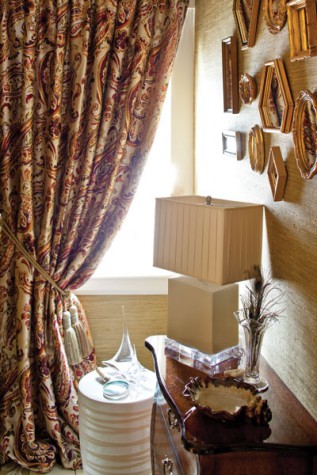
7. The second floor landing continues the mix of old and new begun in the foyer. Patricia Finn of Finn-Martens Design selected classic grasscloth with a metallic background and Asian accents to lend a modern air to the space.
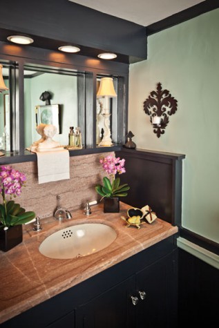
8. This compact guest bath by Elaine Jackson of Diane Hughes Interiors features a soothing combination of black and sea-foam green and a beautiful vanity.
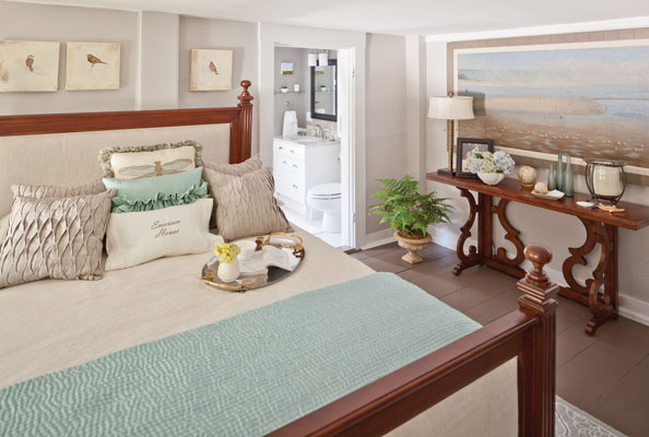
9. The master bedroom was inspired by a new line of fabrics from American Traditions—as well as a hickory chair, carved chest, and bed. Designer Barbara Vaughn set out to reinvent her own bedroom using all of her favorite design elements, patterns, ethnic fabrics, and metallics set against an aqua palette. Vaughn faced the challenge of working around three windows and four doors in a compact 16-by-16-foot space. All furniture, rugs, fabric, and accessories are from American Traditions.
10. On the terrace, Bridget Bleckmann of Penumbra Textile and Renee Carman of Mandeville Canyon Designs teamed up to create a modern extension of living space outdoors. The pair used bright, bold, festive summer colors for the dining and casual entertaining areas on the patio.
11. After walking the property with the homeowner and reviewing old photos, Kevin Barrett of Straw Hat Lawn Care was inspired to partially restore the home’s original landscaping. His landscape plan incorporated plants and shrubs identified from pictures of the property along with updated, manageable, zone-hardy plants that would enhance the main entrance of the home. Brick walkways were carefully restored, and the stone and walkway restoration materials were supplied by Gagne & Son. As an added focal point, Barrett incorporated a pond and waterfall into the natural slope of the hillside next to the original tavern entrance. The waterfall includes glass artwork from Fisher Designs, by a local artisan from Cape Neddick.


