Vivid Landscapes

Mary Brooking grew up in Cleveland, Ohio, and moved to Maine in 1997. She currently lives in Westbrook. She earned a bachelor of arts degree in fine art with a concentration in painting from Hiram College in 1978 and established a career as a magazine designer before becoming a painter. Brooking teaches painting classes in Westbrook at Continuum for Creativity, which is also a gallery and performance venue. Her work can be seen at Yarmouth Frame and Gallery, EcoHome Studio in Portland, and Art 3 Gallery in Manchester, New Hampshire. She is a member of Saccarappa Art Collective in Westbrook.

Every Morning a Revolution, 2014, acrylic on cradled panel, 12” x 12”

Primarily self-taught, Hallett began painting in 1981 and devoted himself to art full-time after his retirement from teaching in 2006. L.L.Bean recently acquired one of his paintings, which will be featured on the cover of one of its 2016 catalogs. He is represented by Gifts at 136 Gallery in Damariscotta, Yarmouth Frame and Gallery, A Little Mad Gallery in Bar Harbor, Lincolnville Fine Art Gallery, and Art Collector Maine.
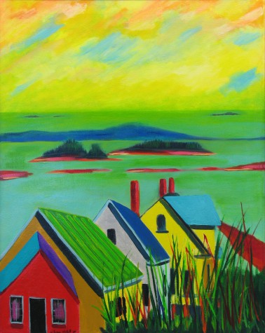
Stonington from Road, 2013, acrylic on canvas, 36” x 24”

Porteous began her painting career 14 years ago, and has participated in exhibitions at venues such as Elizabeth Moss Galleries in Falmouth, Thos. Moser Showroom in Freeport, Maine Audubon in Falmouth, and Waynflete School in Portland. In developing her career, Porteous credits her studies with Janet Manyan and participation in live auctions at Maine College of Art as particularly influential. In 2013 Porteous was commissioned by L.L.Bean to create a painting for its collection, which was also featured on the cover of the summer catalog. Earlier this year she spent a month as artist in residence at the Studios of Key West. She is represented by Elizabeth Moss Galleries.

View from the Castle, 2013, oil on canvas, 20” x 24”
The Canvas – July 2015
by Jamie Thompson
Mary Brooking, William Hallett, and Phoebe Porteous bring natural landscapes to life with bold, vivid color. Favoring hues that provoke an emotional response, these artists make paintings that celebrate color in all its combinations, especially the unexpected ones.
Mary Brooking
A self-described “expressionist landscape” painter, Brooking builds “compositions based on the colors I see in nature, and also those I sense working beneath the surface.” Her landscapes, inspired by Maine’s natural beauty, pulsate with vivid hues and vigorous brushstrokes. Brooking mixes her colors “from a bare minimum of commercially mixed primaries with black and white. I find hand-mixed colors to be far richer and deeper than factory-made ones.” Brooking occasionally experiments with different media, but her primary medium is acrylic. In her painting classes, Brooking shares techniques with her students, encouraging them to freely explore art, and to trust their instincts. “My formal education taught me to see objectively and to question intelligently, as well as how to handle a brush, but I feel that all artists are fundamentally self-taught based on chosen influences and the evolution of their personal style,” she explains.
Awash in shades of pink, red, and orange, Every Morning a Revolution’s otherworldly color scheme lends intensity to the sunrise scene. But Brooking’s soft brushstrokes balance the striking colors with rawness, and a sense of naturalism. She describes the process of painting Every Morning a Revolution as “nearly completely subconscious.” She usually gets ideas for subjects “on the fly,” noting that “inspiration might last only a split second. Mentally, I start mixing paint and forming compositions and borders. The actual painting emerges later.” Sometimes she will rethink elements of a piece, but says that Every Morning a Revolution burst forth without much ceremony. The spontaneous process of creation mirrored the inspiration behind the piece: “not a gentle turning toward a new day, but quite a revolutionary act,” says Brooking.
William Hallett
Having spent his childhood in Mexico City, Hallett became “drawn to saturated color and its uninhibited use.” “Later I was drawn to a different kind of beauty, that of coastal Maine, and so my painting reflects a coming together of Latin culture and the natural beauty of coastal Maine.” The common denominator is color. “The infinite varieties of possible color combinations are what stimulates me the most, certainly more than graphic design,” Hallett explains. “In short, color is pleasure.” He displays ingenuity and gusto in eschewing conventional use of color. Unexpected hues are placed together on the canvas, but the effect is not jarring; rather it is a pleasant surprise, a jolt of energy. “I go in the direction that my eyes indicate, trusting my eyes, without premeditation,” says Hallett. “I find that my reaction to color is essentially visceral.” His emotional, reflexive process encourages the viewer to experience his work in the same way.
Stonington from Road exemplifies Hallett’s flair for the unexpected. Its acid yellows and lime greens may at first glance denote a blindingly sunny day, when in fact, the scene depicts a cloudy day. Using these colors in tandem, Hallett has created a sense of atmosphere to convey an “unstable and moody light” that mimics the claustrophobic feeling of an overcast sky. The top third of the piece is devoted to the sky, rendered in soft, expressive strokes, while a little more definition is introduced in the water, dotted by small islands. Finally, angular houses form the foundation of the composition, bringing in a geometric note. But the angles are softened and slightly off-kilter, in keeping with Hallett’s relaxed style.
Phoebe Porteous
The landscapes of coastal Maine, from rugged to serene, are of paramount importance to Porteous’s work. The inspiration she derives from the coast compels her “to take a risk in my work.” To gather subjects for her paintings, Porteous wanders along the coast, making sketches and taking photographs for reference. “When I’m in the studio, I spend a lot of time fiddling around,” she says. “I take out the sketches, sort through the pictures, convinced I’ll find something I’ve missed, sketch again, and finally mix some paint.” Porteous’s palette “goes back to taking a risk.” “On a good day, I can push the colors into a direct and believable painting.” Her bold color choices lend her art depth and reality, balancing representation with imagination.
View from the Castle offers a bird’s-eye view of the harbor in South Freeport from a stone tower that is the sole remainder of Casco Castle, a resort that burned down in 1914. The aerial perspective is one that Porteous relishes. She recalls taking flight with her father in the seaplane they used to have when she was growing up: “There was so much noise and jostling before actually lifting off that I was always amazed at how things settled into place once airborne.” Porteous evokes that same feeling of tranquility in View from the Castle. Deep sapphire blue water dominates the piece. The cool hue is punctuated by reds and greens, which add warmth and dimension. A strip of sky at the top of the painting corresponds to a strip of foliage at the bottom, framing the composition. Two trees in the foreground lend balance and a note of symmetry, their tops pointing toward an island in the middle of the harbor. The result is a painting executed with great technical skill, but that also resonates on an emotional level.