Magazine

Eider Investments Crafts a Perfectly Perched Cottage on Prouts Neck

A few winters ago, at the time of year when whipping winds send ice crystals into every crevasse, from keyholes to tree bark, a gentleman appeared at a site on the southern coast of Maine, the location of his future home.

He was there to meet an architectural designer to figure out how high the house should sit in order to capture the best views. He was there in dress shoes, having come straight from work in Boston, but that didn’t stop him. He instinctively jumped atop the railing of a frozen wooden deck and peered out, balancing as he took in Saco Bay, Richmond Island, and beyond.

“I was watching him, just scared to death he would slip,” admits his designer, Trevor Watson. “But it worked—that’s how we ended up setting the elevation.”

Watson, who at the time was the design lead for Eider Investments, a design-build-maintain company based out of Prouts Neck, knew that this element of the project was critical to get right. (He now holds a similar position at Knickerbocker Group.) Even for an Eider house—and there are many—this one’s location is exceptional: the eastern coast of the peninsula, with both bay and ocean views as well as frontage to protected wetlands. With three rewarding exposures on an already coveted slice of waterfront, it felt crucial to maximize the benefits of the rarified location with the enjoyment of a future family home. The site is among the rarest and most sought-after slices of the eastern seaboard—no pressure!

Watson was soon joined by interior designer Leandra Fremont-Smith and noted landscape design firm Mitchell and Associates, charged with shaping the outdoor spaces as well as protecting the adjacent wetlands. Together, the team launched into the rapid-fire design and construction schedule necessary for a summer cottage that ultimately would allow one Boston-area family to slow way down.

The collaboration yielded Spindrift, a stately shingled home with contemporary design sensibilities and modern conveniences—an underground garage, for example. On Prouts, with its rich artistic and architectural heritage, there’s a high bar for residential elegance, and the team took on the task hungrily. But there was a step before that: navigating the famously challenging bylaws of the Prouts Neck community.

In order to partake in the rich offerings of the peninsula—there are four private clubs (one boating, one bathing, and two tennis) for its roughly 200 families—it’s prudent to adhere to the community association’s guidelines, which include no major building during the high season. “And June 15 comes around quickly,” says Watson. That means no hauling of lumber or windows, no flatbed trucks, and no major disturbances for a quarter of the year. “But the truth is, those rules are less about noise and inconvenience and more about the kids,” explains Watson. Indeed, like other special communities in coastal Maine, Prouts Neck is a place where children roam freely, on bare feet and on bikes, moving from beach to club and back home again.

The architectural designer’s first assignment was working with the homeowner to determine what the flavor of the home would be. “With a coastal cottage like this, you have two options,” Watson explains. “There’s the subdued elegance of John Calvin Stevens, Maine’s most famous architect, or the more whimsical Emersonian architecture prevalent in Bar Harbor. The style of Stevens is more muted, which is appropriate for Prouts Neck.” Stevens designed an estimated 18 houses here, and each offers an invitation to enjoy the lush and craggy New England landscape from inside and out, via broad porches and banks of windows. Unsurprisingly, Stevens was also a landscape painter and a crony of Winslow Homer. (In the 1880s Stevens designed the painter’s still-standing home studio as well as houses for the artist’s two brothers; payment for at least one house came in the form of a painting.)

An embracing of the landscape was paramount in the planning of Spindrift. In laying out the outdoor living room, porches, picture windows, and primary-suite deck, Watson heeded the path of the sun as it arches over the south side of the property and then sets over the front door. When you come through the front door you’re given the best view in the house: a sweep of the beaches and out to Richmond Island. “These houses are showpieces— they’re works of art—and you want people to feel amazed,” adds the designer.

Alongside highlighting the site’s best exposures, the design team also minimized its challenges. Smartly, the wall closest to a neighbor isn’t an expanse of windows but a handsome shingled exterior opposite a gas fireplace inside, thereby preserving both comfort and privacy.

Many interior layout decisions were made in chorus with Fremont-Smith, a Yarmouth-based interior designer with projects from South Florida to Northeast Harbor. Fremont-Smith was handed an unusual-for-her challenge: her able partners—color and pattern—weren’t welcome on this jobsite. Her portfolio points to a body of work that reconciles Northeast prudence with a joie de vivre typically seen closer to the Tropic of Capricorn. But this project, with its warm, collaborative team (both homeowners and professionals), pushed her to channel her creativity down a new, more subdued path.

In the absence of vibrant hues, Fremont-Smith turned to texture and contrast to imbue the home with warmth and character. The floor stain, a shade of walnut that the interior designer describes as the palest of the darker hues, plays a critical role in grounding diaphanous paint colors, and a grasscloth wallcovering in the den adds depth in a way that paint can’t. Chevron-pattern shiplap creates an expansive entryway ceiling that adds interest and integrity the second you cross the threshold. “This project taught me a lot about playing with neutrals,” she says.

“I thought a lot about the winter and how, even if there isn’t color, to still make it feel warmed up,” says Fremont- Smith. Her team landed on a spectrum of whites and creams in keeping with the client’s request for tranquility and timelessness. “Still, I shy away from beige and gray,” Fremont-Smith explains. “Especially in cooler light, it can look dingy.” Instead, a chalky off-white—Slipper Satin from Farrow and Ball—fit the bill. “It had never been my go-to color, but in the sun-filled parts of the house, it felt right.”

Look closely, though, and her firm’s signature hallmarks are still there: thoughtful trims on the upholstery, a handful of personality-full printed textiles on window treatments and cushions, dashes of unexpected color like the pale orchid powder-room vanity, and a brass lighting scheme that adds a cheerful glint throughout the home.

The kicker is, those decorating final touches happened at the onset of peak season, past the date that a box truck could make a few efficient trips for an all-at-once installation. Instead, Fremont-Smith and her team repacked dozens of items and sent them off to Prouts Neck, piecemeal, in passenger cars. And as those cars, slowed to the requisite pokey (and safe) 25 miles per hour, made their deliveries to this elegant rock, kids were already playing outside in bare feet and on bikes. In time, two more would join: new neighbors from a perfectly perched house called Spindrift.

There’s Room for Everyone in This 3-Story Biddeford Build

*Names have been changed to protect the clients’ anonymity.

It was easy, explains Mary Bridger, for the extended family to gather at a rental home when the kids were young, and the grandkids nonexistent. “We started coming to Maine around 15 years ago,” she says. “We did Ogunquit, Prouts Neck, and Biddeford Pool. We were familiar with the area, but we hadn’t thought about building a summer home.” Back then, they were able to put aside two weeks a year, wrangle the schedules, and get everyone in the same place. But, as her kids grew older and their lives grew more complicated, the task became near impossible. “The concept of two weeks together just fell apart,” she says. “We realized that we needed a place where people could come and go when they wanted.”

For the Bridgers, the idea of doing a new build was daunting. Their house in Concord, Massachusetts, was old and needed only occasional fixing and renovations. “We thought we would just buy something. But we couldn’t find a place big enough or situated correctly,” says Paul Bridger. Over the years, the couple had noticed a piece of land for sale in Biddeford right by the water. They rode by it on their bicycles, but for a long time they didn’t bother to inquire. It’s common, explained Paul, for lots like this to sit idle. “There are so many various easements on properties,” he says. “Being close to the marsh, you can’t put in a septic.”

Yet the desire to reinstate the annual family tradition grew stronger, so they started looking for solutions. With a bit of finagling, they were able to convince the neighbors to agree to stop pumping their waste through the lot. “I got together with all the interested parties and told them, ‘How about I build you a new septic system,’” Paul recalls. “It was the key to unlocking the land so we could build a sizable house. We have seven grandchildren, and six of them are boys. It’s very active.”

Designed by architect Jessica Jolin at Mobile Studio Design and constructed by Bowley Builders, the Bridgers’ Granite Point vacation home was made to suit their wild and crazy summer schedules and their wild and crazy young relatives. “They came to us with the mission of building a home that all families could enjoy at the same time for many years together, in a style that multiple generations could appreciate,” says Jolin. “They wanted a timeless coastal feel, natural materials, and pockets of space where they could be either social or private, both inside and outside.” The early drawings were for two-story structures, but as the process progressed Jolin realized she could squeeze in a third story, which became the kids’ space. Three en suite groupings make up the second story, and the first floor contains the communal areas (kitchen, sunroom, living room) and the owners’ suite. “It’s designed so people can be at the beach, or be on vacation, while other people are working.” Jolin adds, “It’s one of the larger houses we’ve ever designed.”

It feels big, but it doesn’t feel too big, say Paul and Mary, thanks to the thoughtful layout and impeccable construction. “The number one priority was ample space,” says Jolin, “but we were also able to splurge on some material selections.” On the exterior, Jolin opted for cedar shingles to “integrate seamlessly into the vernacular of the neighborhood.” Because of the site ordinance and setbacks—the Shoreland Overlay Zone line runs through the property, meaning the front and back of the house had to abide by separate sets of rules—Jolin and her team had to be precise about what went where. “Calculations were completed down to the individual bluestone stepping stones,” she says. Because the parcel of land was a corner lot, every side of the house needed to appear equally presentable. “It’s a busy little neighborhood, and we had to be conscious of that,” says Geoffrey Bowley. “The house is not tucked back on a five-acre parcel out in the woods. You have to be conscientious about that with your mechanics and your utilities. There’s no back of the house to hide things. Just about every side is observable.” To welcome visitors, Jolin created a side porch and entrance that opens into the “sand room,” which the Bridgers can use for everyday comings and goings. Located next to the laundry room (so guests can grab towels easily) and an outdoor shower (for kids to rinse off their sandy feet), this practical addition helps keep cleaning to a minimum.

In addition to the side porch entry, the house has a street-facing entrance and a water-facing door. This final portal is located underneath the standout feature of the exterior: a dramatic, curved second-story deck that overlooks the ocean. “The builders really embraced the execution there,” says Jolin. The deck features carved mahogany railings that sit atop a wall that is half cedar shingles and half cable railing, so that “the people from the street can’t tell what color your flip-flops are, but you can still see out to the ocean.” For Bowley’s crew, this element was a welcome challenge. “Anytime you build anything where you are trying to take a straight piece of wood and develop a curve, it gets tricky. That goes for any home,” Bowley says. “In this instance, we took larger pieces and then cut the curve into them.” To create continuity, the front door is also made from mahogany, subtly contrasting with the cool-toned shingles and the white trim. For the patios and walkways, landscape architect David Maynes chose bluestone, which he calls “a good budget option.” He says, “We floated paving and larger plantings so that it felt more like a ledge. We didn’t want it to feel like a paved walkway, but an organic ledge. We were conscious of being cost effective.” Surrounded by native grasses and successional plantings, the house looks at home on the peninsula, and not too polished.

Of course, this was the intention. “Informal” was one of the keywords the homeowners gave to their team of architects and craftspeople at the beginning of the process. This is particularly evident inside, where stone, wood, and simple forms dominate. The overall look is classic coastal with a modern twist, as evidenced by the stacked stone fireplace and the shiplap on the staircase. The couple was “prodded” to go in a streamlined and contemporary direction when it came to lighting and cabinet fixtures. “We’re both in our mid-70s, and we’ve lived in the same house in Concord for 45 years,” says Mary. “It took a little time to get used to the modern choices.” But, Paul adds, they’re glad they were flexible. “I like how the first floor feels Zen-like,” he says. As the house ascends, each floor gets more casual than the last. The second-floor bedrooms all feature white oak flooring and walnut furniture. A kitchenette allows guests to cook their own meals after hours, and the deck has proved a great success during family gatherings. The third floor is where the grandkids go to play and, Paul jokes, is “all designed around Ping-Pong.”

“We didn’t want anything frou frou,” says Mary. With smart appliances (controlled by both the homeowners and their son), the Maine house is “low-maintenance, easy, and secure.” So far, it’s held up beautifully to the winter storms, and their grandkids have no complaints about spending their summers by the Atlantic. “We knew we were building a house in a good location, but for me, the joy is about having a lot of family here, together, in this big open space,” says Paul. “And being in this neighborhood. It’s a very friendly, relaxed neighborhood, and we love walking around. On the family side, and on the local side, those are joyful things.”

A Dramatic Renovation Turns This Existing House into a Dream Home

When a New York couple decided to move to Maine in 2019, they dreamed of building a home exactly suited to their family. They had spent nearly 25 years making spaces their own in Manhattan and East Hampton, as well as drawing inspiration from their European travels, and they knew what they liked. But the building process was going to take time, and they were ready to move. “It was a conscious decision to leave the lifestyle in New York City,” says the wife. “We wanted to be near family, and have a more autonomous life, where we could own our businesses.” The husband came upon a home for sale with a lot going for it—especially its quiet, private location in an elegant neighborhood on the southern coast. It wasn’t perfect. “I didn’t like the interior,” he says, but that didn’t stand in the way: the home was soon theirs, and they began planning a renovation immediately.

The couple hired Chris Herlihy of Polestar Design to carry out the renovation. Herlihy had been project manager when the home was built, so was deeply familiar with every detail of the design. The home was unusually primed for renovation, says Herlihy. The original owners, he says, “had a dream, an ecological vision, and a budget, but the three did not align. I recommended that they move forward with the design of the dream and then scale or phase the project to meet the budget. When the design was complete, the family realized that they could have everything they wanted if they scaled back the interior finishes and left a couple of spaces completely unfinished. This was done without compromising the ecological vision and the use of durable materials on the exterior of the building.”

That meant there was space ready for reconfiguring, like an unfinished area above the garage, and lots of potential for upgrading the interior finishes. The new owners, with the help of Polestar Design, set about remaking the space into one they would love, with elevated finishes, lots of light, and a flow that suited their family. “We needed to make Maine our home, and part of that was customizing the house,” says the wife. “It was such a drastic change. We had the need to nest, because it was the next chapter in our lives. It was about really making it feel right for us.”

The kitchen, at the center of the family’s life, was a priority. “We love to cook,” says the husband. “For us, preparing meals together is an expression of love, a special time to connect with our family.” The original kitchen was large, with a convenient butler’s pantry, but they didn’t like the aesthetic—it had knotty pine floors and faux-brick features, rather than the clean, elegant look the couple preferred. The couple took the opportunity to create a kitchen exactly suited to the way they would use it. They had new cabinets custom designed specifically for their collection of cookware. “The detail within the cabinets is more important than the cabinets themselves,” says the wife. “They are really well thought out for ideal cooking conditions.” A large butler’s pantry was redone, with a wall oven (adjusted to the wife’s height), a second dishwasher, and customized open shelving that allows easy access to two stand mixers—one is reserved for bread making—and a variety of pots, pans, and platters.

The connection between the kitchen and dining area was opened up, and a small island was replaced with an oversized one, designed by the husband to incorporate plenty of storage. “There’s no dead space,” he points out, opening a touch-latch cabinet door. It’s topped with a spectacular 2-inch-thick slab of marble. “We pored over dozens of high-resolution pictures from a quarry in Carrara,” he says. “Finally, we found the perfect veining.” Once selected, the 2,000-pound slab was shipped from Italy, finished by the Paul White Company in Portland, and carefully moved into the house. “I couldn’t be here,” says the wife. “It was nerve-racking!”

Additional significant changes were made to the second-floor bedrooms and baths. The owners wanted their bedroom to be a true suite, with a sitting area, sleeping space, dual walk-in closets, and a spacious bath. They removed a small office to enlarge the space, replaced small windows with much larger ones, and added a fireplace, which they elevated so that it could be enjoyed from the bed during bedtime stories. The flow of the children’s bedrooms and bathroom was also changed: the rooms were widened, closets were added, and the rooms were joined through a shared bathroom. “We know the girls need to grow into their spaces,” says the wife. “Entering into the bathroom from the hallway—that wasn’t going to work.” A guest suite was added over the garage, and a space in the eaves became a playroom where the girls can freely strew their dolls and toys. “I’m pretty tidy,” says the wife, “but in here, it’s their space. They can make a mess and blare their records.”

With the exception of new and enlarged windows, the home’s modern-farmhouse exterior was left mainly untouched. The landscape, however, was a different story. “It was a sea of asphalt, a pretty harsh arrival,” says landscape architect Josh Tompkins. There was little division between the driveway and the house, so delivery trucks “felt like they were coming into the room,” says the wife. The homeowners envisioned something like a European motor court, with crushed stone instead of asphalt and a more inviting entrance. Working within the constrained space, Tompkins created a “graceful” loop driveway with a sizable island in the middle, enabling several deciduous trees to be planted. The addition of trees, says Tompkins, softens the building’s facade and smooths the transition between architecture and landscape. They also offer a more abstract benefit: “The seasonality of trees can bring that fourth dimension: change over time,” he says. “If you bring them front and center, they can really add some mystery. Putting them close to where you’re coming and going from the house lets you appreciate that sense of change.”

The family moved into the home at the end of 2019, and within a few months their choice of renovation instead of new construction looked prescient. “When we left New York, it was so hard to leave,” says the husband. “We had friends from all over the world. Within a year, they had all left because of COVID.” While their quieter, slower life took some getting used to, the family came to appreciate it. The girls watched a family of foxes grow up in the yard and listened to owl calls at night. “It became a sanctuary for us,” says the husband. “Homeschooling during COVID in this setting was a wonderful experience,” recalls the wife. “We would frontload the instructional time, and then in the afternoons, we would do art projects and spend time outside. It really felt like our home. We still love the energy of the city, but this is absolutely where we want to raise our children.”

These Grilled Chicken Skewers Are a New Summer Staple

This three-part recipe turns your classic grill night up a notch with a creamy avocado mousse, tangy pickled onions, and a sticky harissa yuzu glaze that adds a sweet and spicy touch to easy-to-grill chicken skewers. “I love grilling in the summer,” says Mimi Weissenborn, executive chef at Sur Lie in Portland and Gather in Yarmouth. “It’s not just about the culinary experience, but more about the gathering of the people you love and sharing delicious food with them.”

Serves 4

INGREDIENTS
5 ripe avocados
Juice from 2 lemons
2 tablespoons extra-virgin olive oil
Salt to taste

INSTRUCTIONS
1. Remove the avocado flesh from the skin.
2. Place the avocado flesh into a blender with the lemon juice and olive oil. Blend until smooth. Add salt to taste.

INGREDIENTS
1 cup water
1 cup vinegar
1 tablespoon sugar
1 teaspoon salt
1 tablespoon pickling spice
1 whole red onion, diced

INSTRUCTIONS
1. Put all the ingredients except the onion into a pot and bring to a simmer.
2. Let the sugar and salt dissolve.
3. Remove the pot from the heat. Allow the liquid to cool to room temperature.
4. Add the diced red onion and allow to pickle for a minimum of 4 hours.

NOTE: It’s okay to leave the onion in the pickling brine for longer!

INGREDIENTS
3 tablespoons harissa
1/4 cup plus 2 tablespoons yuzu juice (or substitute lime juice)
2 tablespoons dark brown sugar

INSTRUCTIONS
Place all the ingredients into a small pot and simmer until the brown sugar is dissolved.

INGREDIENTS
2 pounds raw chicken thighs, cubed
2 cups tamari
1 tablespoon garam masala
1 bunch cilantro or microgreens, chopped, for garnish

DIRECTIONS
1. In a large bowl, whisk the tamari with the garam masala to create a marinade.
2. Place the cubed chicken thighs into the marinade and marinate for 10 minutes.
3. Place the marinated chicken cubes onto 4 skewers and grill to an internal temperature of 160°F.

Smear some avocado mousse directly onto each plate. Place a chicken skewer on top of the mousse and brush with the harissa yuzu glaze. Place pickled red onion on top of the chicken skewer. Garnish with chopped cilantro or microgreens.

Design Wire July 2024

Founded by Donna Dwyer in 1998, MY PLACE TEEN CENTER (MPTC) is a southern Maine nonprofit organization that offers free year-round afterschool programs, academic assistance, and nutritious meals for youth ages 10 to 18. MPTC, known for the vibrant red doors at the entrance to its Westbrook location (they’re even incorporated into the group’s logo), is partnering with JIM GODBOUT, president of Jim Godbout Plumbing and Heating; GUY GAGNON, executive director of the Biddeford Housing Authority; and an army of volunteers to restore the former ST. ANDRE’S CHURCH in Biddeford and transform it into the organization’s second home. Built in the late 1800s, the Romanesque Revival–style church has been unoccupied for more than a decade. Initial repairs began with updating the church’s brick facade, removing pigeons who had made the abandoned building their home, converting the structure’s heat source from oil to natural gas and heat pumps, and more recently, adding radiant-heat flooring to the 10,000-square foot building.


Maine’s favorite outdoor retailer L.L.BEAN dropped a limited edition summer collaboration with swimwear company SUMMERSALT to prove they’re experts not just when it comes to the cold. Each item in the playful L.L.Bean x Summersalt collection, which includes swimsuits for women, men, and children along with cover-ups and accessories, was codesigned with Summersalt’s data-backed fit and L.L.Bean’s legendary outdoor expertise in mind. The collection is available in four colorways (blue, teal, pink, and black and white) as well as four limited edition prints (watercolor floral, mixed gingham, and two shades of batik) created exclusively for the collab. Available online from both retailers and in select L.L.Bean stores, the collection includes summer-ready gear like hats, beach towels, sandals, a water bottle, and even a dual branded, inflatable stand-up paddleboard.


Dutch beer maker HEINEKEN and Boston-based streetwear brand BODEGA worked together on the BORING PHONE, a no-frills cellular device meant to “help people discover there is more to their social life when there is less on their phone.” According to new research commissioned by Heineken, 90 percent of Zillenials in the United States and United Kingdom admit to doom-scrolling while socializing with friends and family. The Boring Phone aims to change this behavior by taking things back to basics: the transparent device (a callback to early mobile phone design) lacks apps, a touchscreen, internet access, maps, push notifications, and social media—it can, however, send and receive texts and phone calls and capture low-quality photos with a 0.3 megapixel camera. A limited run of 5,000 reduced-tech “dumb phones” produced by HUMAN MOBILE DEVICES was created for Milan Design Week, and a handful of devices will be given away to fans around the world. For those who can’t get their hands on a Boring Phone, a new app called the Boring Mode, launched last month, renders typical smartphones boring.


Linoleum may be the trendy material of the future—not just a relic from the past—thanks to anew type of endlessly remoldable tile created by Dutch designer CHRISTIEN MEINDERTSMA for British industrial design company DZEK. Unlike traditional linoleum, the biodegradable FLAXWOOD tile, made of linseed oil, pine resin, wood dust (a byproduct from furniture and woodworking companies), and chalk, requires no backing, uses far less energy in its mold-and-pressure-press production process, and is made without fossil-derived coatings and pigments. Honey-colored Flaxwood cures to a solid texture but can be kneaded and remolded like playdough. “If we are serious about lowering architecture’s carbon footprint, then building materials have a big role to play,” says Dzek founder BRENT DZEKCIORIUS, who hopes to eventually produce tiles from local, fully traceable materials, including fast-growth plants like cattail and reed, along with wood dust from different species of trees for aesthetic interest. “We are trying to un-design what has been done, and to reset the material language for a renewable twenty-first century,” he adds.


A team of Mainers led by Amy VanHaren, founder and CEO of PUMPSPOTTING, is renovating a school bus nicknamed the BREAST EXPRESS into a mobile lactation lounge before embarking on a 13-city road trip to deliver vital support and delight to mothers and families in the early stages of parenthood. Inspired by 1960s and 1970s tour buses and paired with a modern and feminine aesthetic, the bus conversion is a collaboration between Becky and Will Turek of CORNERSTONE CONVERSIONS and Holly Curtis of KIT SUPPLY AND CO. According to Curtis, “We want the bus to feel like a joyful oasis that invites new mothers to exhale the mess and the stress of those early days. Bold color, light wood finishes, and soft, luxurious upholstery will come together for a space that feels relaxed, refined, and like a small haven for you to get the care and connection you deserve. And yes, the bus is covered in boobs!” VanHaren reiterates the importance of Pumpspotting’s third national tour and its second iteration of the Breast Express (the first vehicle, pictured above, was an RV that had already been renovated into a home). “With maternal health rates at a low and two-thirds of parents reporting feeling lonely and burned out, it couldn’t be a more vital time for us to be coming together with communities across the country to bring Pumpspotting’s support system back on the road,” she says. “Moms leave the Breast Express feeling lighter, more connected, and better able to feed their families in their chosen ways. We’re really proud of that impact.”


In an effort to reduce waste from the Aomori Prefecture’s expanded production of apples, SOZAI CENTER (a Japanese studio founded by SHOTARO OSHIMA), in collaboration with KOMORU CORPORATION and M&T, designed a washable, scratch-resistant textile made from pomace (the stems, seeds, core, and flesh of the fruit) mixed with bioplastics. Called the ADAM SHEET, the translucent, speckled biomaterial does not include artificial coloring and can, therefore, vary in hue based on the moisture and sugar content of the season’s apples. Measuring 0.6 mm thick, Adam is easy to maintain and can be wiped clean with water or a neutral detergent. Crossbody pouches and card cases made from Adam are available online; in the future, Oshima hopes to incorporate the textile into fashion, furniture, and interior design.


PHOTOS: ADRIÀ GOULA, COURTESY OF PATI NUNEZ AGENCY

A thesis project developed by students and researchers in the masters’ program in Advanced Ecological Buildings and Biocities at the INSTITUTE FOR ADVANCED ARCHITECTURE OF CATALONIA offers a new vision for eco-friendly mobile living. The MO.CA, or Mobile Catalyst, is a self-sufficient dwelling-on-wheels for two, boasting all the domestic essentials with a minimal impact on the environment. Built from dowel-laminated timber at VALLDAURA LABS in Barcelona’s Natural Park of Collserola, MO.CA consists of two anchoring “toolboxes” that initiate activities in the central “reaction chamber.” The Utility Toolbox, located toward the front of the trailer, contains a kitchen (with a sink, refrigerator, one-burner stove, and drawers), shower area, waterless humus toilet, sleeping shelves, and a utility cabinet for electrical and water systems (the unit is solar-powered and can run for 24 hours without recharging). The Activity Toolbox contains collapsible furniture along with moveable ladders and doors. An outer layer of water-resistant cotton fabric on a mechanical pulley and a set of glass doors on each side of the dwelling allow the space to adapt to pleasant or poor weather conditions. Beyond acting as a residential unit, MO.CA can be used for exhibitions, concerts, office work, and as a library or meeting place.


Brewer general contractor NICKERSON AND O’DAY is putting the final touches on the exterior of the $8 million PENOBSCOT NATION COMMUNITY CENTER on Indian Island before moving on to complete the building’s interior. In the spring, community members were invited to a topping-off ceremony and were given a unique opportunity to sign the final sheets of plywood before they were attached to the roof. Construction on the community center, which will house the PENOBSCOT NATION MUSEUM and act as headquarters for the tribal court system, finance and administration offices, and tribal council, began in August 2023 after six years of planning. The new building is expected to open this fall.

Sights and Sounds from the 2024 Architalx Lecture Series

For over 30 years, architects and designers from around the world have been traveling to Portland to present at Architalx. Held at Aura in Portland’s Old Port, the spring 2024 lecture series, sponsored by Marvin Design Gallery by Eldredge Lumber, featured a well-rounded collection of speakers from both the architecture and landscape architecture communities. Audiences learned about the urban landscape and its role in climate change from Martha Schwartz of Martha Schwartz Partners, discovered how unconventional practices can shape culture with Hilary Sample of MOS Architects, reconsidered site specificity with Jeffrey Day of Actual Architecture Company, and heard from Lindsay Wikstrom of Mattaforma on improving the health of the forest, building occupants, and everyone in between.

“Coinciding with the lunar eclipse and book-ended by Martha Schwartz’s call to vigorously address climate change and Lindsey Wikstrom’s advocacy for the adoption of mass timber construction, the 36th season of Architalx was notable for reaching new benchmarks in attendance and for an unparalleled growth in financial support from our generous community sponsors. We are already looking forward to next season with another slate of dynamic and diverse speakers.”

—Steve Hoffman, president of Architalx

The History of the Classic Lawn Chair

It’s a classic American design. A recent MH+D cover shows a family happily barbequing and sitting on a set of classic webbed lawn chairs. There’s a comforting feeling that sweeps over many of us when we see these retro chairs. Memories are conjured up of fleeting summer days sipping ice-cold lemonade, playing in the sprinklers, and watching the fireworks on the Fourth of July, drenched in bug spray.

After World War II, plastic webbed lawn chairs began popping up in yards throughout U.S. suburbs. The chairs were made using aluminum, which had previously been used for the structural framing of airplanes during the war. The chair’s minimal construction drew on the pared down, functional aesthetic embraced by the Bauhaus design school. Even better, the chairs could be affordably produced.

WWII veteran turned inventor Frederic Arnold filed a patent for his lawn chair design in 1956. His patent description reads, “Folding chairs with flexible coverings for the seat or back elements having a frame made of metal with legs pivotably connected to seat or underframe.” Most of the companies that produced these folding chairs bought their seat’s plastic webbing from Waltrich Plastic located in Walthourville, Georgia. So how was Waltrich making this webbing? They loaded plastic pellets in a hopper and mixed them with UV-resistant polypropylene monofilament to create a thick yarn. Next, a large loom would weave the plastic yarn into a colorful webbing. This webbing was not only durable but fade-resistant and easy to wipe down; paired with an aluminum frame that didn’t hold heat like other metals, it became a classic in the 1960s and 1970s. Eventually, like most furniture, knockoffs were made overseas, and stateside production stopped.

In 2010, the family that owned Waltrich Plastic, Gary Pokrandt and his son Andrew, launched Lawn Chair USA. Why? Their plastic company was frequently getting requests to purchase the backstock of webbing stored in their warehouse from years past. The Pokrandts thought it might be time to return the classic webbed lawn chairs to the U.S. market. They tracked down their family’s previous clients and asked to purchase their old equipment. The clients agreed, and the Pokrandts opened a factory in Ft. Pierce, Florida. Today, the tight-knit staff makes every chair by hand using their own materials, with the exception of the aluminum tubes, which are made by a different company in Alabama. Each chair weighs in at just 4.2 pounds—easy to carry—and has a weight capacity of 225 pounds. The company recently caught the attention of MoMA Design Store home buyer Annie Auchincloss. Lawn Chair USA and MoMA now have an exclusive line of chairs for sale. Sales only seem to be going up for this lightweight, durable, rust-resistant chair.

This “Life Room” Combines a Kitchen, Breakfast Niche, Bar, and Family Room

In the introduction to New England Coastal: Homes That Tell a Story (Monacelli, 2024), Massachusetts-based architect Mark Hutker tells the tale of his early-career encounter with author Judy Blume, who selected his firm, Hutker Architects, to design her family home on Martha’s Vineyard. Hutker recalls how he was thrilled to finally collaborate with a fellow creative after working on countless homes for lawyers and doctors, during which it became painfully clear that he and his client were not on the same page. As the pair continued their conversation over coffee, Blume detailed the experiences she was looking forward to having in her new home: family and friends gathered around the dinner table, Sunday brunch before guests returned to their respective houses, every meal occurring in a memorable spot on the property. “In the stories she told about her house-to-be, she related what she dreamed might happen there rather than how big it must look, or how the rooms must be arranged,” Hutker writes. “Judy was imagining the home, allowing the idea of how the home would be used, rather than a specified list of design options, to convey the story of what it could be.” The architect took his discussion with Blume to heart and implemented a new system for his firm to understand the narrative of each design project: Hutker now asks clients to write a series of “diary entries” describing the perfect day in their new home.

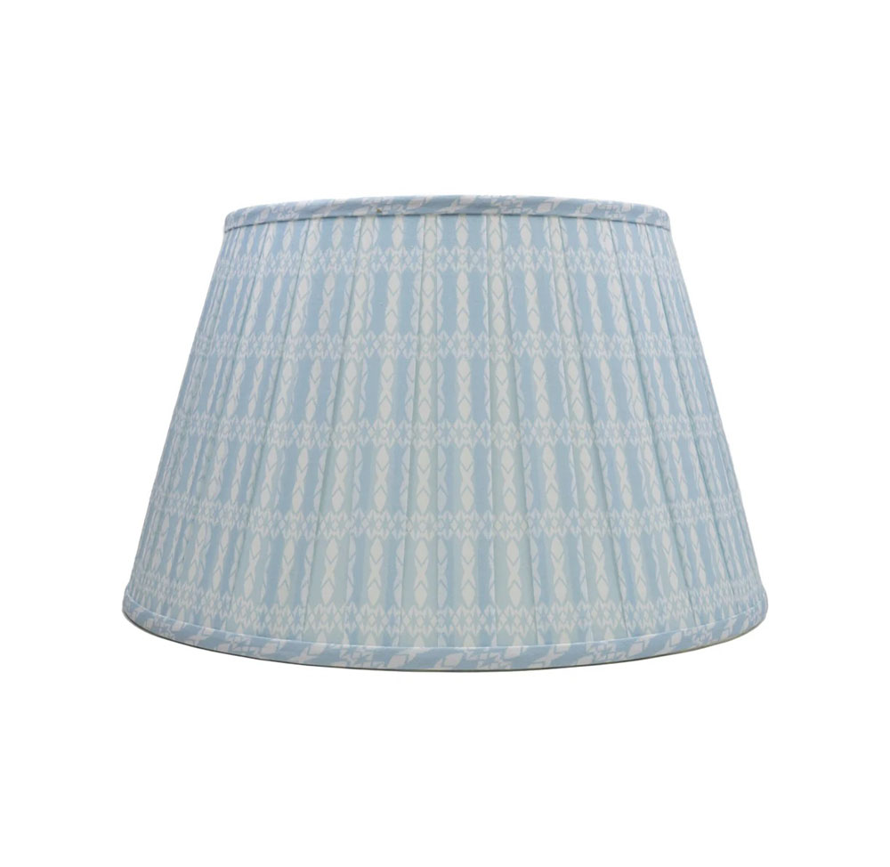
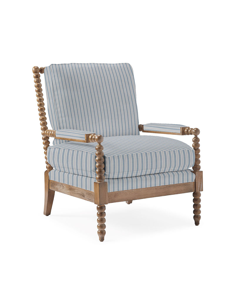
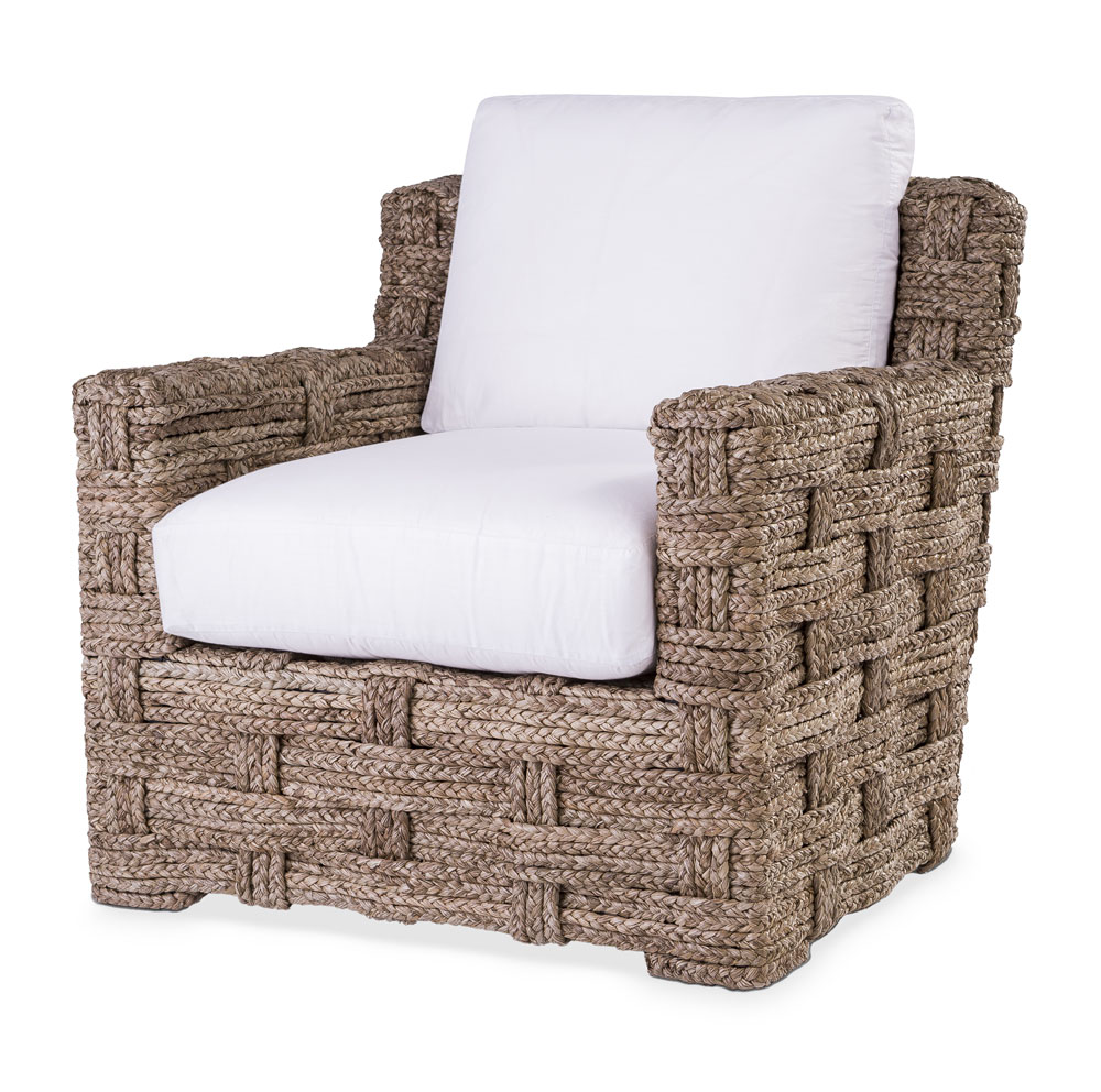
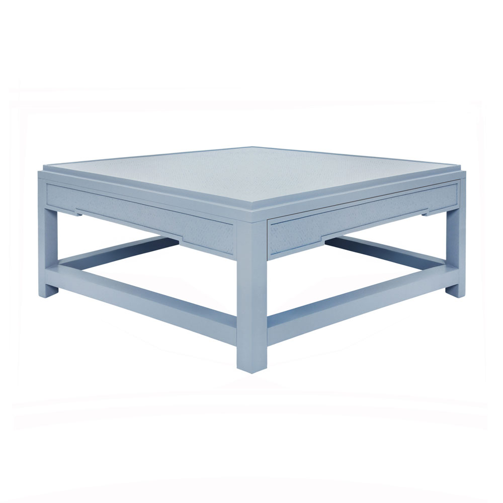
The cheerful breakfast nook pictured here, with its built-in banquette and mismatched chairs, is part of the “life room” at a residence called Big Bluff, also located on Martha’s Vineyard, in a neighborhood of waterfront shingle-style and Victorian homes Hutker calls “the Gray Ladies.” When a family who summers on the island decided to tear down the original structure and carefully design a new one, they envisioned a large space that would combine the kitchen and breakfast niche with a bar and family room. Vintage pieces from the original home mix with newer items in a classic mash-up of New England coastal design featuring subtle nautical motifs; rustic natural materials; a traditional red, white, and blue palette; and a plethora of different patterns and textures. “All told,” explains Hutker, “the goal is never to depart too radically from how the rooms would have felt back in the early 1900s.” Draw inspiration from the present-day iteration of Big Bluff, and add a touch of New England coastal charm to your home with these nine finds.

Ocotillo Shines Bright in Portland’s West End

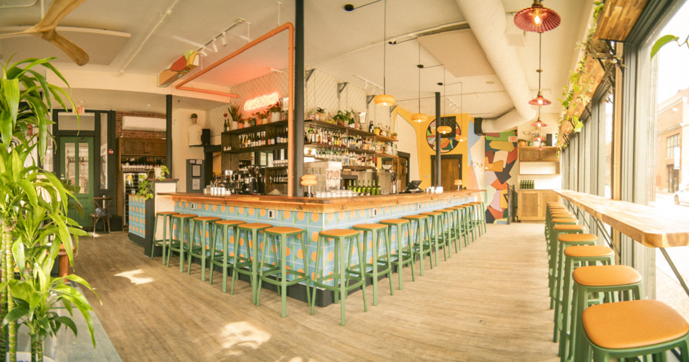
“We see Ocotillo as a sibling restaurant to Terlingua, and we’ve done a lot to build that brand over the years through our use of materiality, space, light, and color. We drew some inspiration from the space itself, formerly occupied by a cocktail bar called the Danforth, which was beautiful and intimate but intentionally dark. To lighten it up, we brought in some of the warm color palettes we’ve used at Terlingua and updated them to fit the space: bright oranges, peach tones, and crisp whites. One of the things we do well at Terlingua is our incorporation of the outdoors, so we worked with Plant Office to design and install a collection of plants at Ocotillo that we’re excited to see develop over the years to come.

When considering how to lighten up the space, we decided to add some clear, domed skylights in various sizes, which create interior shafts of light and shadow. The restaurant is divided into three spaces—the bar area, the main dining space, and a banquette section—and when you’re walking through, everything is connected by the light. It really draws you from space to space.

As we began setting up the space, we found some discrepancies between the seat height and the table heights in different areas of the restaurant. It’s not something most customers would notice, but we chose to replace all the table bases for a better experience. I’ve worked with Victor Plourde in the past, and he helped us build semi-industrial steel bases with a large plate on the floor connected by an exposed steel tube to another plate on the table’s underside. The custom bases are super heavy, so they anchor the tables, but they also allow for extra freedom of movement that you don’t get with traditional tables that have spider bases.

One of the areas we have yet to explore is the outdoor patio, which we’re in the process of painting. The patio had an existing standing-seam metal roof, but we took the paneling down and replaced it with polycarbonate panels to let more light in. Because we’re a brunch restaurant, we’re only operating in daytime hours, so bringing in light and a sense of airiness was essential.

It’s important for us to acknowledge all the hard work the previous owners put into the space—we had such a great base to work from. With the addition of skylights and paint, plus some material touches like the table bases and light fixtures, we could easily make it our own.”

–Pliny Reynolds, co-owner of Ocotillo and Terlingua

Trending Terracotta is Warming Inside and Out

Color trends tend to be cyclical, with particular hues rotating in and out of popularity. The last few years have seen a turn toward earthy hues like browns, khakis, and subdued shades of orange, including terracotta. A beguiling shade of orange-brown, terracotta has been popping up in many home brands’ collections this year, making it a natural choice for our Living Color column.

Terracotta’s current moment in the spotlight doesn’t surprise Natalie Papier, an artist and interior designer based in Charlotte, North Carolina, and the creator behind Home Ec: “The beauty of terracotta is that it is limitless: it almost reads as a neutral,” says Papier. “I have not seen any color that doesn’t work with it.”

Papier suggests using the color anywhere you want serenity or a cozy feeling: a bedroom, a living room, or even a bathroom. “It’s a very transitional color for a lot of spaces, but if you’re not looking for bold energy, it’s a perfect warm color,” she says, noting it works really well in small spaces. For those inspired to try this of-the-moment orange, Papier and three other interior designers offer tips and tricks for working with this color.

Add glow to a room.

“I always love a painted ceiling, but in dining and living rooms in particular, a terracotta ceiling just casts such a nice warm, rosy glow,” says Papier, who painted her living/dining room ceiling in this hue four years ago. “It feels very warm, comforting, and natural where it’s not in your face,” she adds. Papier notes that, because the ceiling doesn’t get all the light that your walls do, paint stays pretty true to color overhead.

Get the color right.

Papier and the other experts we spoke with encourage homeowners to sample paint colors before committing. Papier says to try some slightly bolder shades of terracotta than you might initially be drawn to. “You have to pick a shade that’s a little bit deeper with terracotta because it can run too orange or too peach. If you want that warmth, you’re going to have to go with a little bit more depth.”

Play it up with white or black.

Papier likes to pair terracotta with both white and black. “I think it is more impactful to show off its true color,” she says. “Crisp white gives it that balance of a kind of negative space for warmth—it feels a little bit more modern and intentional.” She adds that, when it’s balanced with “some graphic black and white, you have this really warm space, and then you have this crisp, modern, clean element in the space, too.”

Try it with pure colors.

However, pairings for terracotta are not limited to neutrals.“When you take that terracotta color and layer different colors on it, you’re getting a fresh take on it,” Papier says. When combining terracotta with other hues, Papier suggests contrasting it with colors that feel more color forward. “If you have another muddied color, it can fall a little flat,” she cautions.

Pair it with blue.

“Pairing terracotta with blue is as classic and timeless as the earth and sky,” says Bronwyn McCarthy Huffard, principal and lead designer of Portland’s Huffard House. They are also the colors of earth and water: Annie Downing of Annie DowningInteriors in Austin, Texas, paired terracotta in a bathroom located directly off the pool but also accessible from the interior hallway. “We loved this Moroccan tile, and the combination of the blue tile and the warm terracotta felt like the perfect combination of cool and warm tones,” says Downing.

Create depth.

In a recent project, Huffard painted the backs of a client’s built-in bookcases with Farrow and Ball’s Picture Gallery Red, a deep shade of terracotta to add “warmth and earthy character to the space.” The effect is subtle but impactful. As Huffard says, “It is a welcoming, grounding accent that invites connection with the space and helps set off the other colors chosen in furnishings and art.”

Swap it out for girly pink.

When Bethany Adams of Bethany Adams Interiors in Louisville, Kentucky, had clients ask her for a color palette that would appeal to their daughter without being too “girly,” Adams turned to terracotta. “It’s the perfect color to use because it is fresh, fun, and feminine without the fussiness and frilliness of a traditional pink girl’s room,” says Adams.

Ground it in a pattern.

Adams likes to pull terracotta from a wallpaper or a printed fabric. “Anchoring the terracotta with dark green, beige, flax, and delicate doses of pink—all found in the wallpaper—brings more depth and playfulness to the room,” says Adams of the girl’s room she designed with terracotta accents.

Use it in rooms with brick.

Huffard notes that terra-cotta is a natural complement to a room with brick elements, like a fireplace or floor. “Terracotta will bring a sense of cohesiveness to the room without being boring,” she says.

Bring it outdoors.

Terracotta is naturally at home outside. A collection of terracotta pots adds a Mediterranean vibe to any porch or patio, while earthy-orange cushions offer a splash of color that is effortless outdoors, blending easily with wood furnishings, brick elements, and many plants. It’s also trending in the marketplace: West Elm, Blu Dot, Neighbor, and CB2 all have terracotta in their 2024 outdoor furnishing collections.

Terracotta, More Than Just Pots

Terracotta, the color, gets its name from terracotta, the material, whose name is an Italian term that means “baked earth.” When people hear the phrase terracotta, they often think of vessels, particularly clay pots, but terracotta can be any type of fired clay. Terracotta also has a long history in architecture, including roofing, floor tiles, facing, and ornamentation.

Terracotta has been used in architecture across the globe since ancient times. In more recent history, terracotta enjoyed something of a revival in the late nineteenth century. After being used decoratively, terracotta became a practical choice for building exteriors because it was a lightweight, fireproof material that could sheath the new steel-frame buildings: The Flatiron Building in New York and the Wrigley Building in Chicago, for example, both feature terracotta cladding.

In Architect magazine, Mike Jackson explains terracotta’s next chapter in architecture: “Architectural terracotta evolved with the stylistic changes in America in the 1930s. Traditional ornamental styles gave way to more geometric shapes rather than symbolic motifs. Flat terracotta panels with contrasting graphic designs allowed a traditional material to compete with then-new materials such as structural glass and porcelain enamel.”

In contemporary times, renowned architect Renzo Piano gave the material a boost when he began working on largescale terracotta projects in the late 1900s, including Berlin’s Potsdamer Square, which has a modernist, curved terracotta facade. Today, architects are giving terracotta cladding another look because of its minimal environmental impact: natural, recyclable, and often locally sourced, terracotta has a relatively low carbon footprint. Here in Maine, the architectural firm LEVER has designed a new wing for the Portland Museum of Art that will feature natural and regional materials, including Maine-sourced terracotta.

Palette Picks

Maine Home + Design

Stay in touch!

Join our email list to stay updated on all things Maine; food & drink, events & festivals, home & garden and much more!

X