September, 2025 | By: Becca Abramson | Photography: Trent Bell
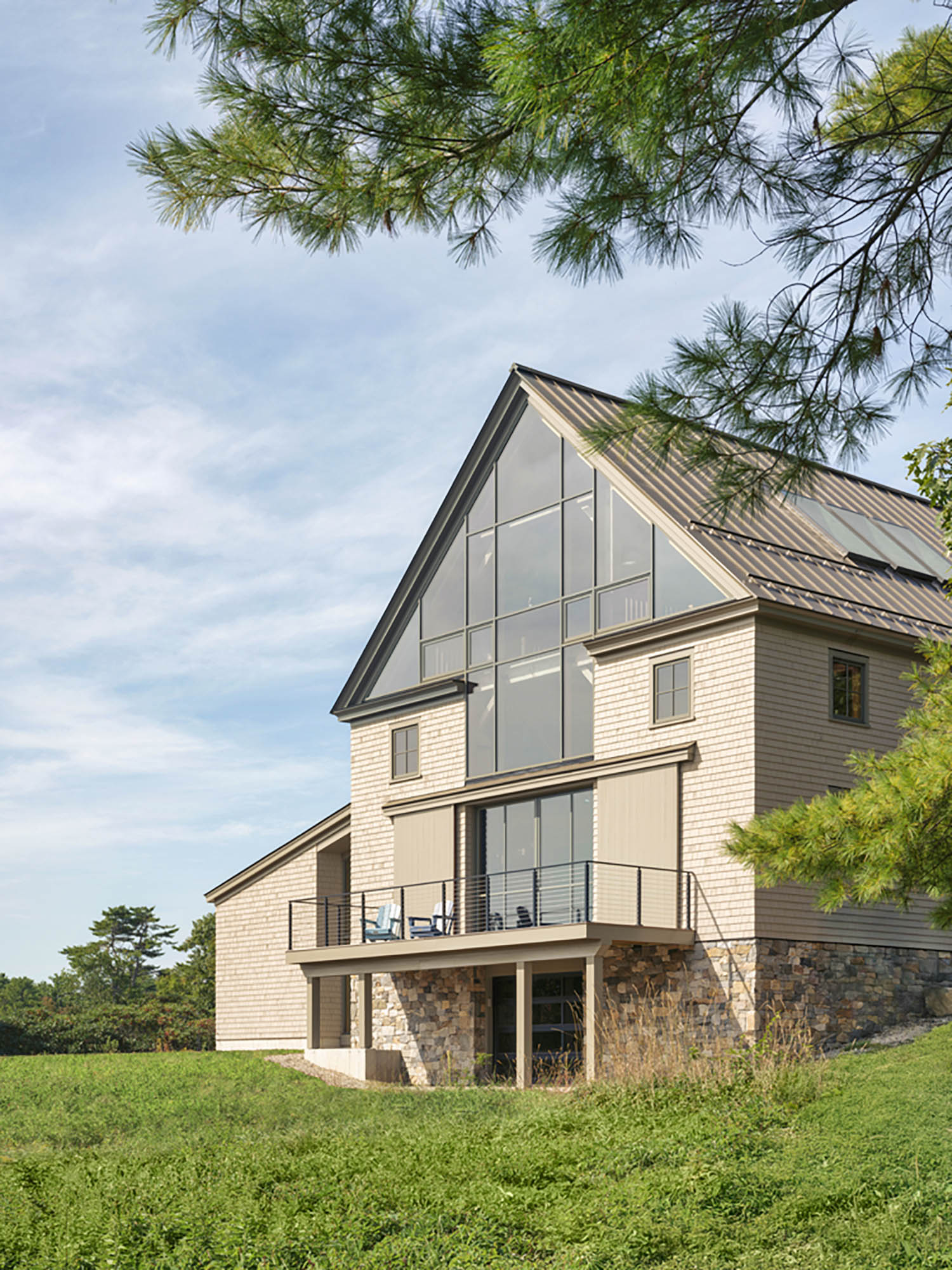
Inspired by a nearby historic barn that offers views straight through to the water, the Sea View Barn was created with both transparency and tradition in mind. Designed by Peter Anderson at Houses and Barns by John Libby, the structure was conceived as an entertainment barn, meant to be a flexible gathering space that will one day connect to a yet-to-be-built intimate house on a sloping coastal site.
“The client approached us with a unique brief,” says Anderson of the project. “The owner had purchased an incredible property with a long waterfront, an old farm field, and the remains of an eighteenth-century farmhouse. The goal was to create something that would appear to have always been there while offering visual transparency and maximizing the views to the water.” Anderson’s dual-natured design feels historically appropriate while embracing waterfront views: the road-facing gable is clad in traditional cedar shingles with veneer stone at the foundation walls, while the east-facing water side features an expansive multistory timber curtain wall of Douglas fir coordinated with the hand-cut timber frame structure inside (the interior is primarily finished in eastern white pine).
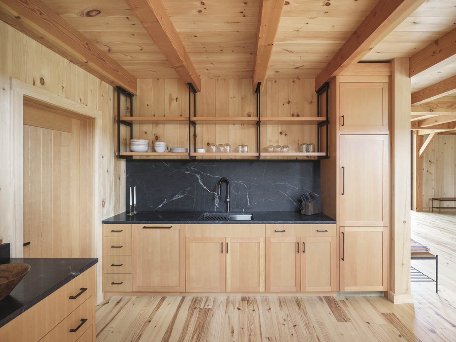
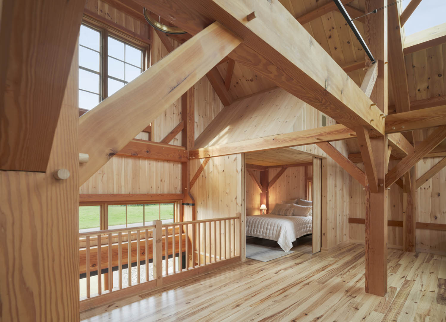
Floating shelves and a custom-designed metal rack system add a modern touch to the kitchenette.Anderson created white pine ”mini barns” to produce private sleeping quarters throughout the barn’s generally open-concept design.Pocket doors that allow a clear view from one side of the barn to the other necessitated a unique timber solution and spring-loaded system to keep the structural posts tight.
The barn’s original program included an open main floor for entertaining, a kitchenette, and a three quarter bath. Upstairs, an open studio space would accommodate art making, media, and office zones. As construction unfolded, the design evolved. “When it became clear that the house-building phase of the project was several years in the future, we had to pivot,” says Anderson. “We suddenly had to accommodate sleeping rooms, which weren’t in the original program. It presented quite a challenge: how to subdivide a large, second-floor space open to the roof above without creating redundant loft spaces.” Anderson came up with a solution he refers to as the “mini barns”—small gable forms tucked into the corners of the second floor that act as bedrooms. Sheathed in white pine and accessed via sliding barn doors, they blend in with the surrounding materials and echo the larger structure.
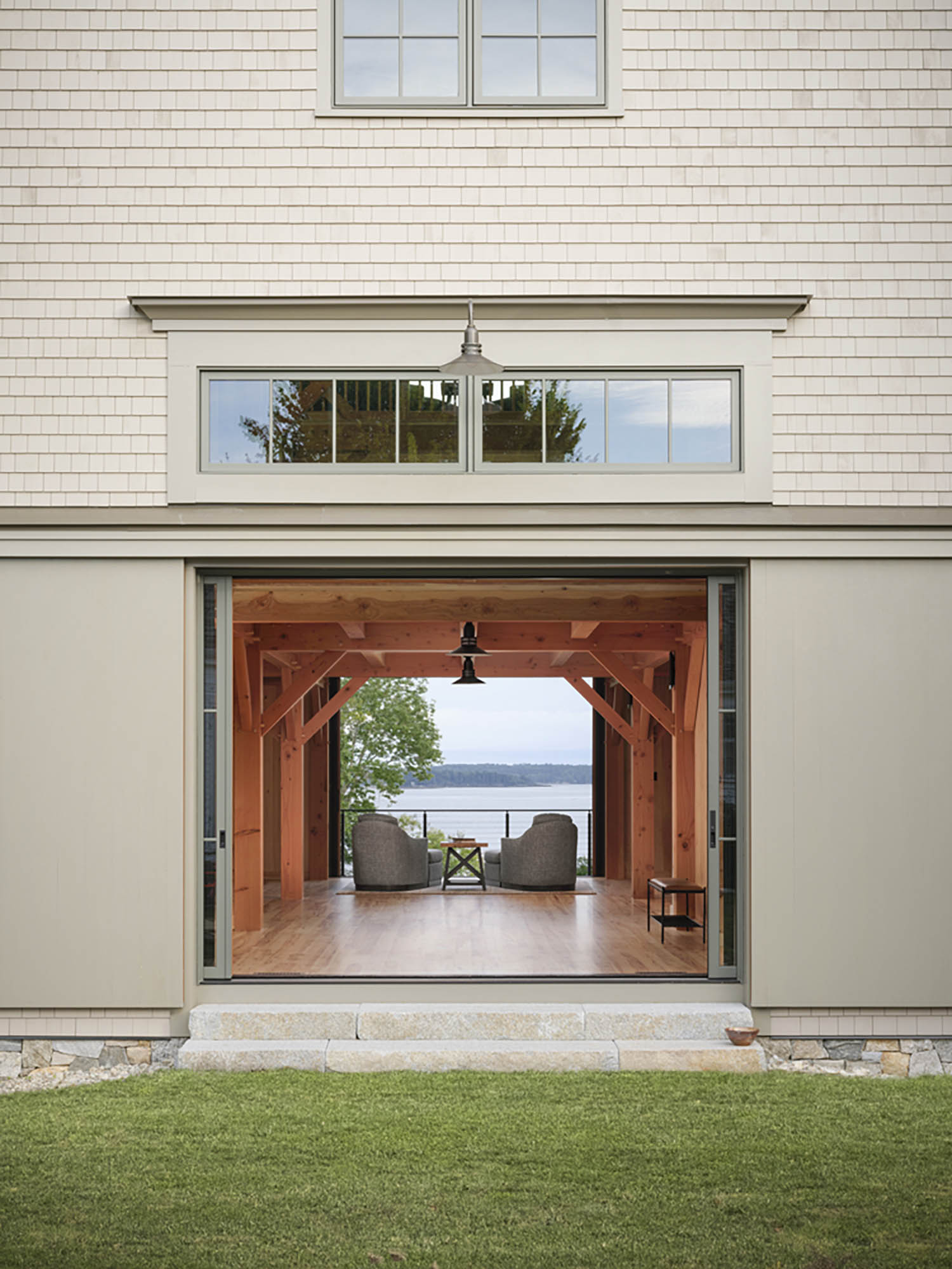
Other signature elements include oversized sliding pocket doors on both gable ends that disappear into the walls, allowing uninterrupted views through the space. That detail required a creative structural solution involving nested posts and spring-loaded systems to preserve the integrity of the timber frame. Steel details at the loft stair and a custom shelving system in the kitchenette add a contemporary edge to the hand-cut, traditionally joined frame.
As the project grew to include a mudroom and garage—connected by a stair clad in glass that reveals the original barn’s exterior siding—the layering of time became an integral part of the story. “We wanted it to look like it had been added to over time,” explains Lee Proscia, president of Houses and Barns by John Libby. “That was part of the charm.” Blending heritage with innovation, the Sea View Barn is a testament to the company’s signature approach: honoring Maine’s architectural past while creating structures designed for the way people live today.
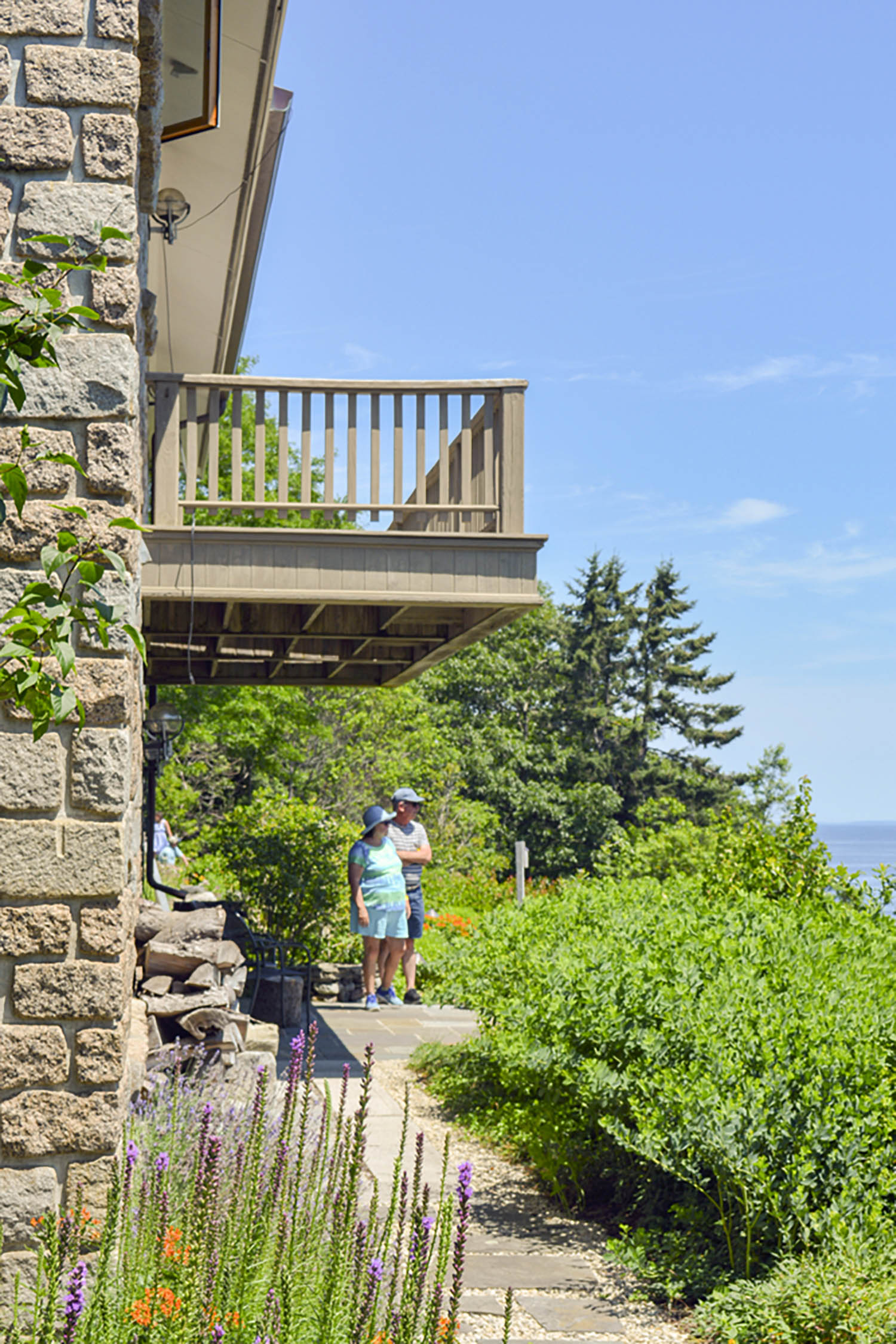
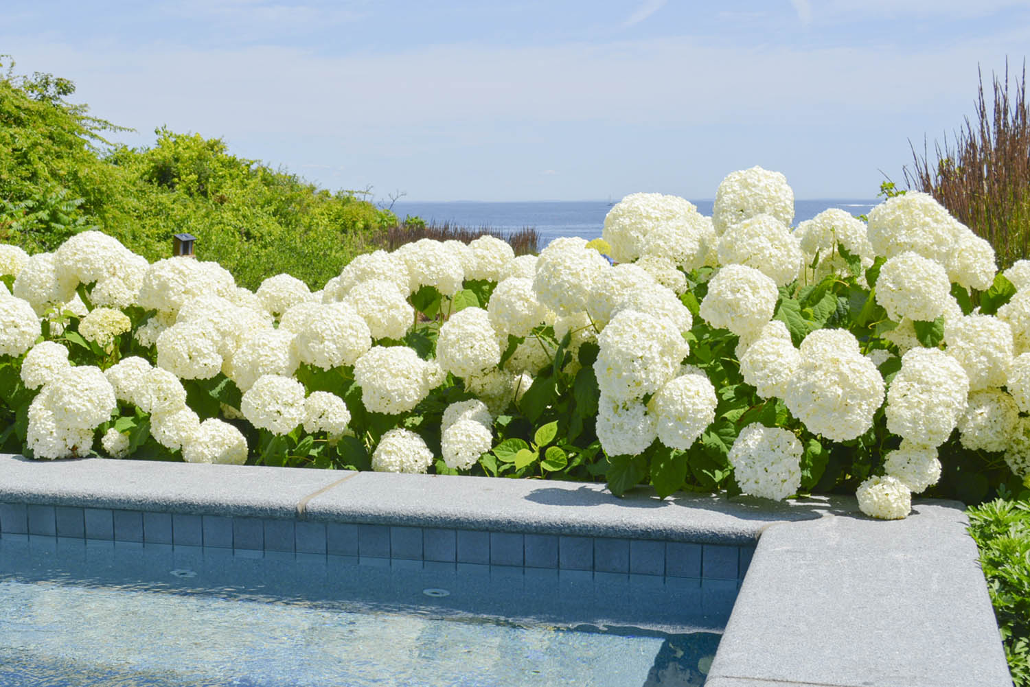
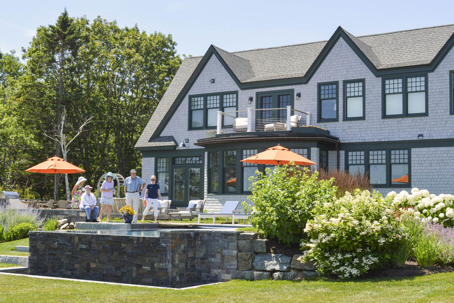
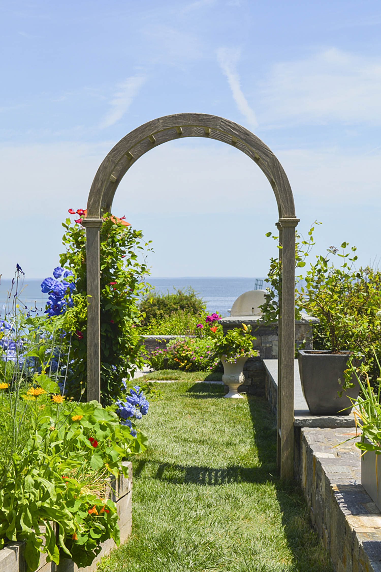
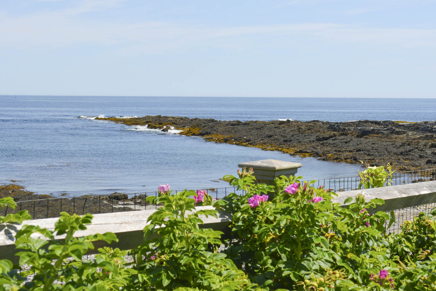
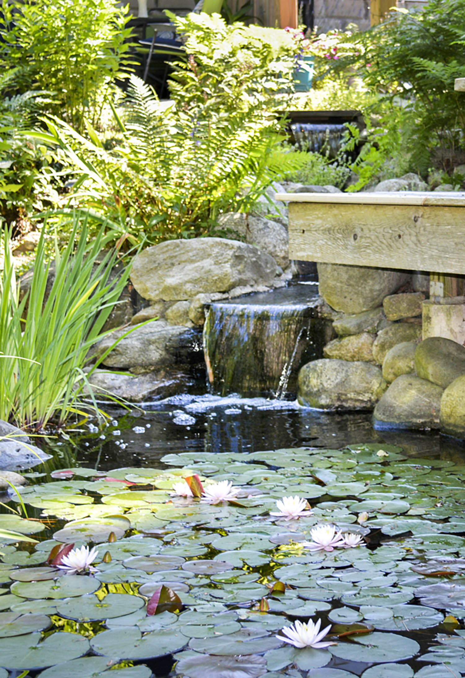
On a sunny and warm Saturday in July, the Friends of Fort Williams Park hosted their Cape Elizabeth Garden Tour during which eight homeowners graciously opened their private gardens for guests to explore. Each garden on the tour boasted unique characteristics, with one garden showcasing over 270 species of plants and others featuring handcrafted sculptures and wooden carvings. The garden tour is the park’s largest fundraiser of the year. Proceeds benefit the organization’s Ecology Project, which aims to cultivate and nurture various types of horticulture at Fort Williams Park, while allowing the community to benefit from the use of the land. Thanks to the Friends of Fort Williams Park and local homeowners, the day was filled with beautiful flowers, unique architecture, and warm hospitality.
“The 2025 Cape Elizabeth Garden Tour was a chance to explore a variety of awe-inspiring gardens, thanks to the generosity of local homeowners. With strong support from the community, the event helps fund important ecological work at Fort Williams Park. It was truly a perfect Maine day.”
—Jennifer Scarpitti-Nelson, executive director, Friends of Fort Williams Park
September, 2025 | By: Danielle Devine | Photography: Di Tao
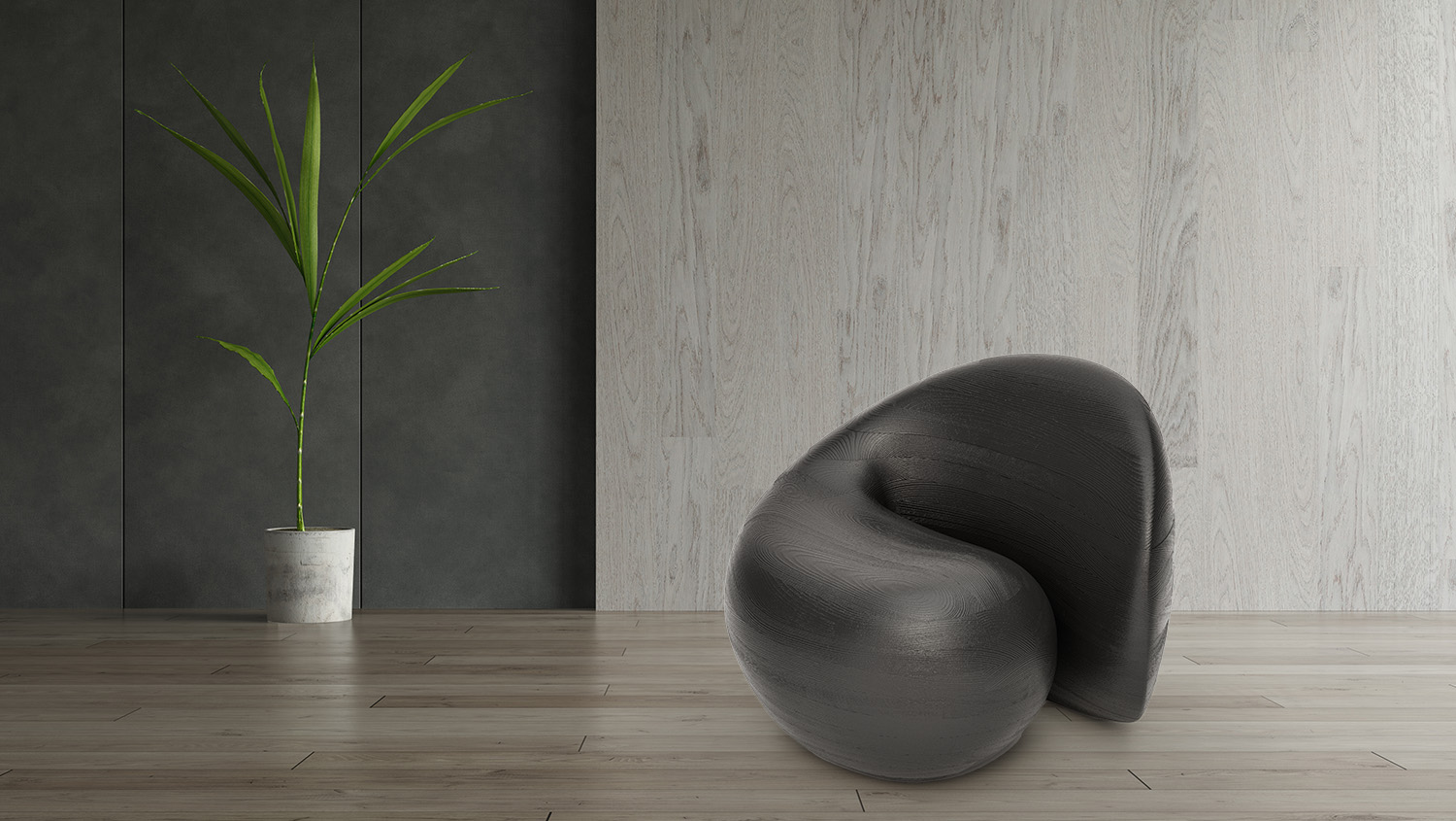
There’s a family of beavers who live in the pond behind the cottage of designers Di Tao and Bob Dodd in the scenic Kawartha Highlands of Ontario, Canada, a few hours northeast of Toronto. It was while watching the beaver family’s movements that the duo came up with the design of their Beaver Tail Chair, a sculptural piece that captures the beauty and function of the animal’s iconic tail.
Beavers slap their tails against the water’s surface to warn their colony that danger is approaching; when they hear this warning, they can stay underwater for up to 15 minutes. The Beaver Tail Chair is composed of 16 layers of stack-laminated wood carefully selected and hand shaped by the artisans to produce sweeping curves that mimic the shape of a beaver. Stack lamination is a woodworking technique where multiple thin pieces of wood are glued together in layers to form a thicker, solid mass. The designers say this approach allows them to create flowing, sculptural forms that would be challenging or wasteful to carve from a single block of wood. Although the chair is made entirely of wood, the interior of each chair is carefully carved out to create a hollow space, which helps keep its weight to around 120 pounds.
“It is more than just a seating option; this chair offers a unique tactile experience, inviting you to touch and feel the flowing surface of the wood,” reveal Tao and Dodd. “Its sculptural design and organic wood grain allow it to blend seamlessly into any setting, whether it’s an artist’s studio, a cozy reading nook, or a modern living room.” It’s fitting that the chair was inspired by creatures that build, design, and maintain intricate lodges and dams out of wood on a daily basis.
Partners in life and design, Tao and Dodd founded their studio, Objects and Ideas, in 2015 to craft functional, artful furniture and lighting. Their combined backgrounds in industrial design and digital engineering drive a distinctive approach rooted in form and precision. Each Beaver Tail Chair is unique and takes over 140 hours to build, from stacking the volume to carving, grinding, sanding, and finishing. The chairs are made to order by Objects and Ideas and currently sell for $15,400.
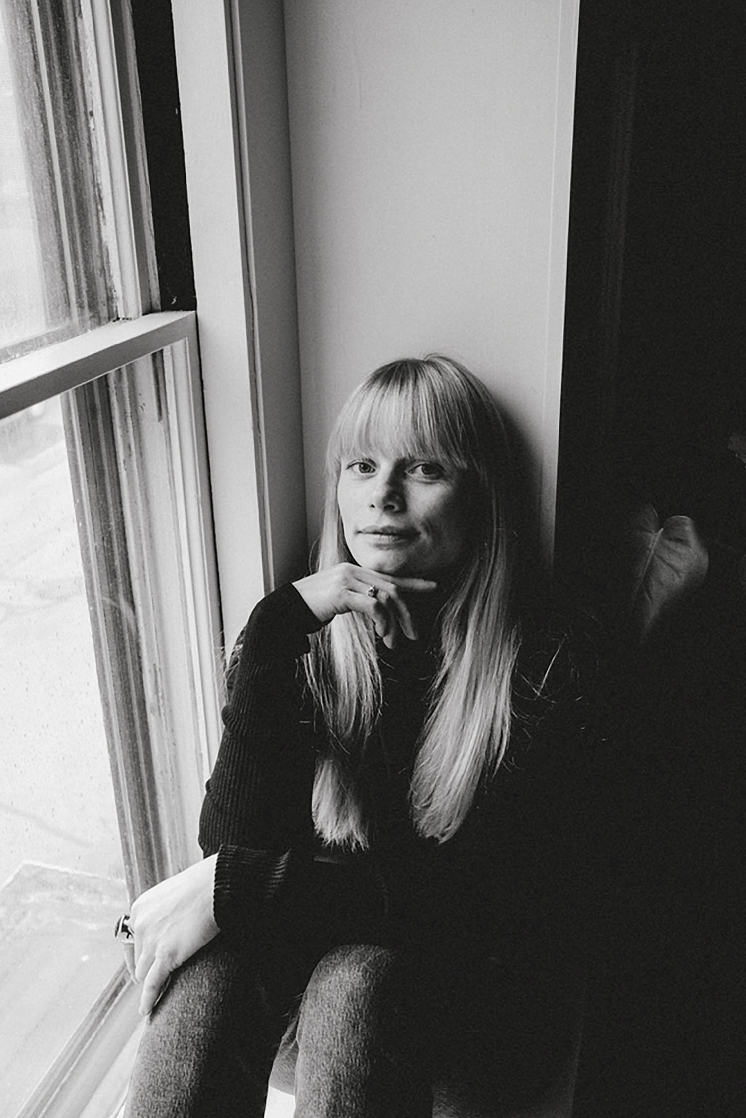
My perfect Maine day is in the low 70s with no humidity (a dream!) and starts with going for a long morning run from the West End to the Eastern Prom. After that, I’d pack a picnic lunch and head to a park overlooking the water with friends, then off to a nice trail for a walk or a boat ride on Casco Bay. Before dinner, I’d go out to grab a glass of wine with a buddy at Friends and Family, then come back to my little patio to grill dinner and read until bedtime.
How would you describe your aesthetic in three words?
Timeless, soulful, authentic.
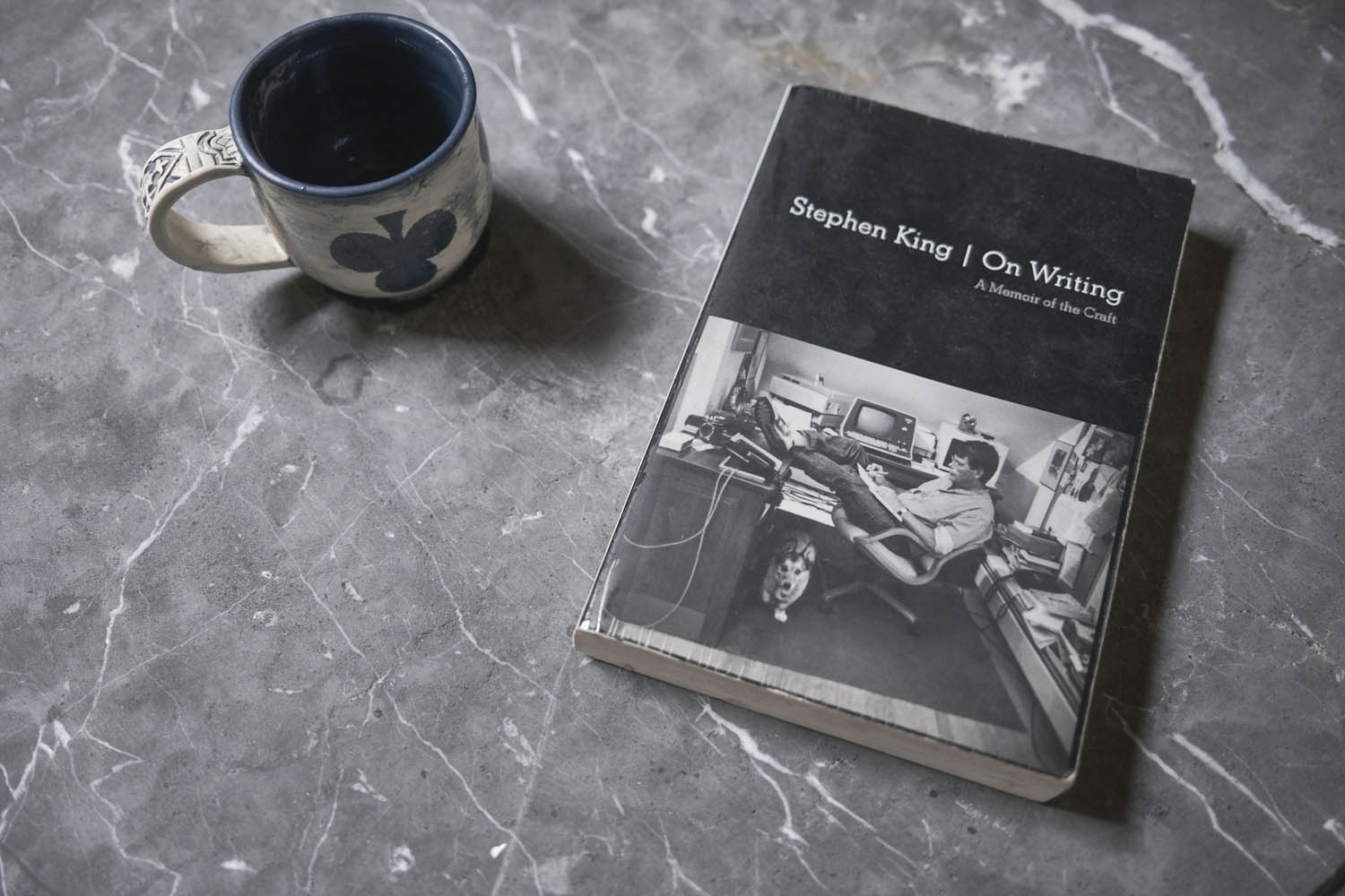
One book everyone who appreciates art and design should read?
It’s not necessarily about art and design, but it is about the creative process: On Writing by Stephen King, which is a memoir about the craft of writing.
What elements do you look for when you frame a photo?
I look for what I need to tell a story. I want the photo to feel intimate, full of life, and pleasing to the eye—not too much to overwhelm, but not too little to leave someone wanting more. Framing is so natural to me that I rarely need to think about it.
How important is light to you?
It’s everything. Whether natural or made by me, it helps amplify the story I’m trying to tell.
Five things you can’t live without?
Books, espresso, music, nature, art.
Photos: Erin Little
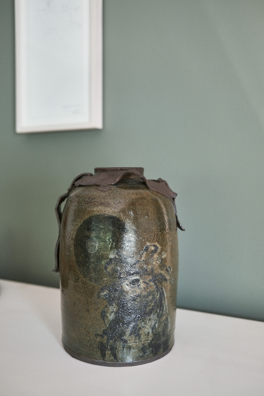
Favorite local maker?
I love Jose Gouveia’s pottery and Cat Bates’s jewelry.
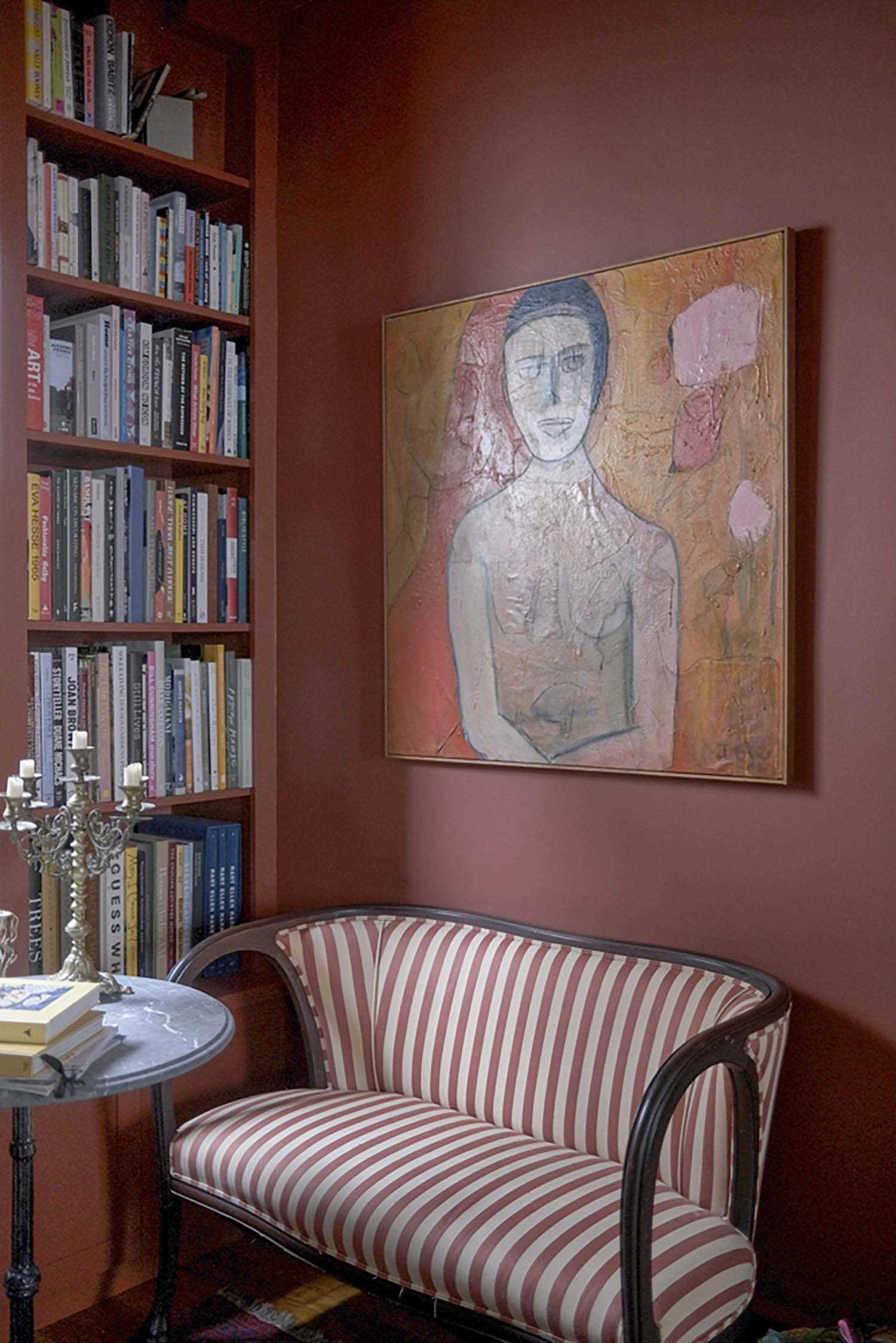
One piece of furniture, art, or decor in your space that tells a story?
The first piece of art I invested in hangs in my library. It’s a large abstract portrait of a woman painted by a Dutch artist named Jan Ter Weele. He used to walk past my apartment every day. We eventually became friends, and he invited me to his studio, where I found the piece and fell in love. He was in his late 80s, and we would go to art openings and lunches, or hang out listening to jazz and talking about everything. He recently passed, and now I have quite a few of his pieces. They make me smile, and I feel grateful for the time I had with him.
Name one artist you admire and why.
François Halard is a constant source of photographic inspiration for me. I love his relaxed approach, his use of light, his subject matter, and the way he lives his life. It would be a dream to assist him on a shoot!
September, 2025 | By: Becca Abramson | Photography: Douglas Friedman
Photo: Douglas Friedman
Superstar designer Tommy Hilfiger and his partner, Dee, have decorated and designed a broad portfolio of residences over the years, including a duplex penthouse at the Plaza in Manhattan; a baronial mansion in Greenwich, Connecticut; homes in Miami and Palm Beach; and even a 203-foot superyacht named Flag. In Hilfiger Homes (Vendome, 2025), writer James Reginato explores the stories behind seven of the couple’s past and present properties, focusing on both the aesthetic choices that make them unique and the minor details that weave them all together. The couple gives plenty of credit to their spectacular team, including interior designers Cindy Rinfret, Martyn Lawrence Bullard, and Chahan Minassian. “Each [home] has been a labor of love,” explains Tommy in the book’s introduction. “It’s been fun to collaborate on all these projects. For us, it’s not just about living in these spaces, but about bringing a vision to life and honoring the history and character of each property.”
Tommy’s iconic brand celebrated 40 years of American fashion in 2025. Because both he and Dee live in the fashion world, they’re accustomed to designing multiple collections each year, which translates to frequent changes in their interior spaces. “They want constantly to be inspired, reinvented. They just want to do it better next time,” says Bullard, known across the industry as the designer to the stars. Rinfret, who worked on the couple’s Round Hill property and has been defining the classic Greenwich style for 30 years, says of the Hilfigers, “Their attitude is: Life is not a dress rehearsal. Everything needs to be beautiful. So, it’s ‘Let’s do it.’ It’s not just decoration. Their houses have meaning. This is designing for life.”
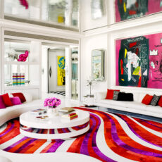
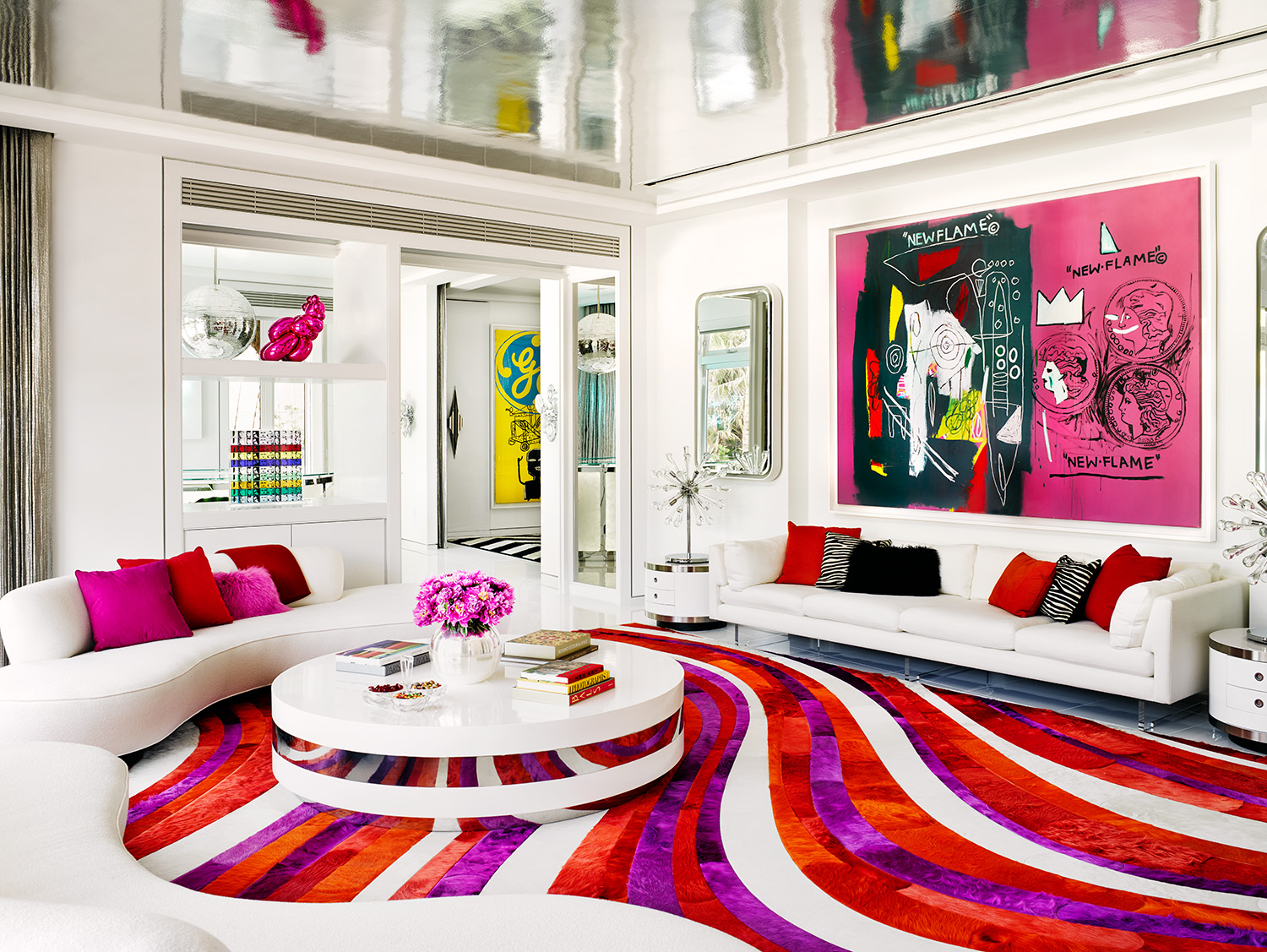
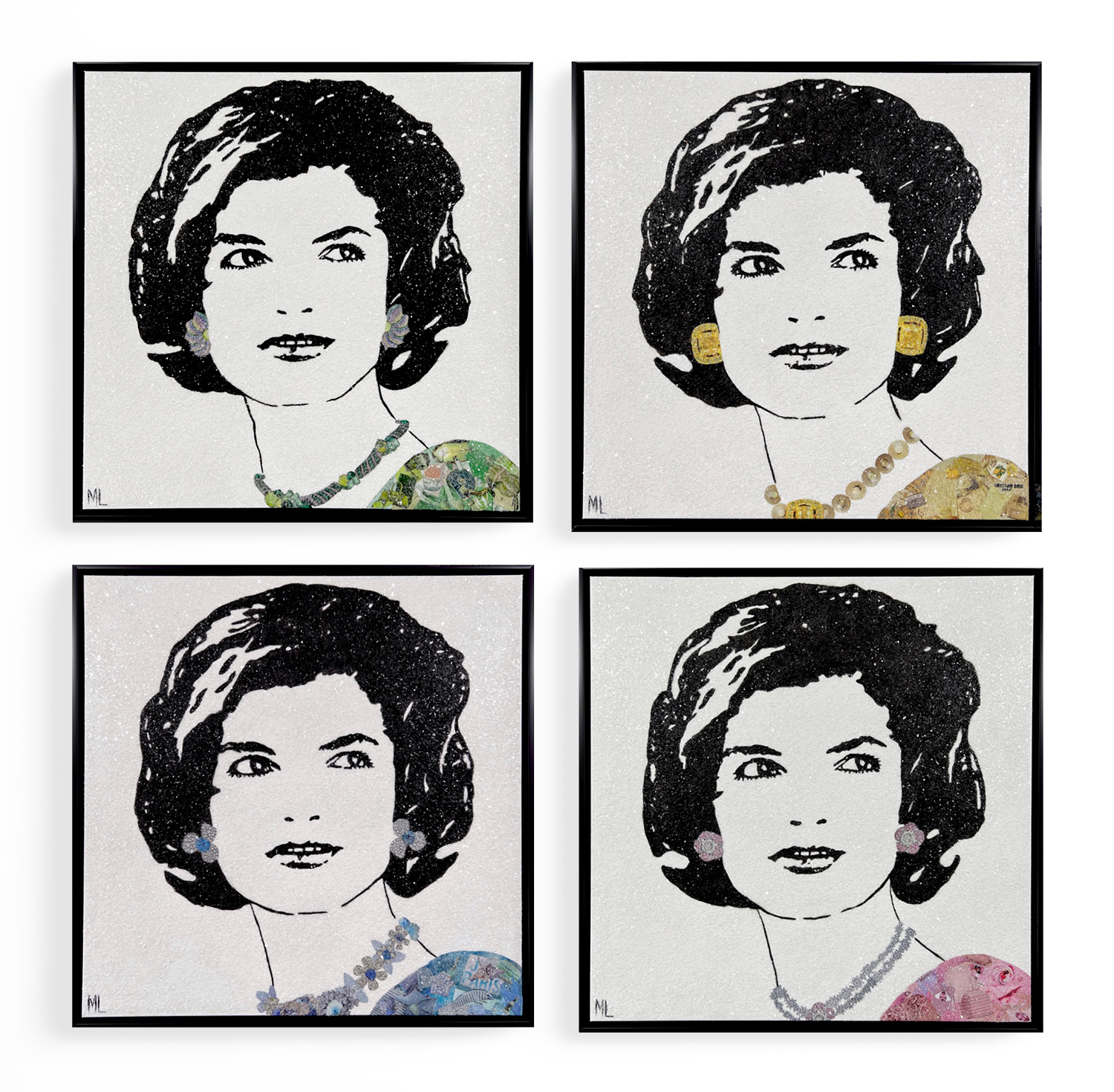
Inspired by Austin Powers, Tommy and Dee’s Miami beach house, Villa Deniz, is full of bright colors, pop art, and “’70s disco madness.” Designed by Bullard, the home is part art gallery; each room displays an iconic piece of work from the Hilfigers’ collection that informed the design of the space. In the living room, pictured here, hangs New Flame (1985), a jumbo, purple- and orange-hued collaboration between Andy Warhol and Jean-Michel Basquiat. “Clearly, no holds were barred in creating this bold and dramatic design statement,” writes Reginato. “One of the most photographed houses of the decade, [Villa Deniz] graced the covers of some 30 magazines worldwide.” Join in on the fun and create your own crazy, colorful space with these nine finds.
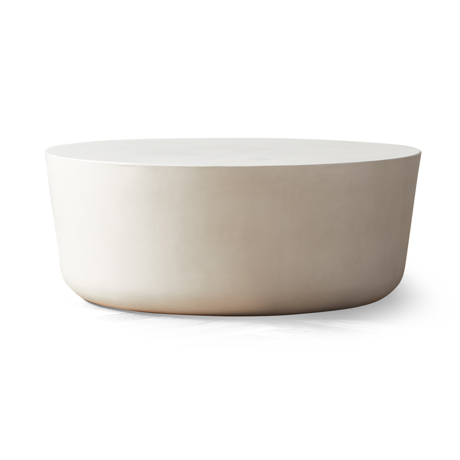
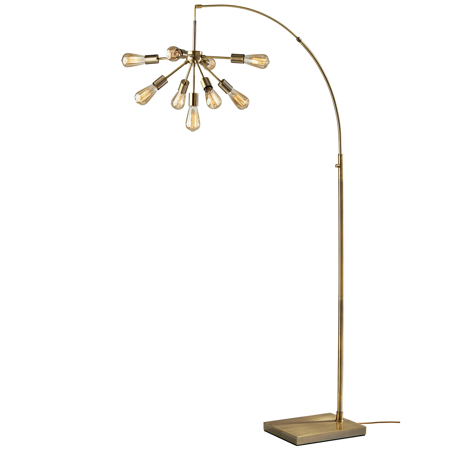
CHUBBY CHROME MIRROR Lazaro Living // hklivingusa.comJACKIE FOUR SEASONS BY MARIA LAURA RIBEIRO KW Contemporary Art // kwcontemporaryart.com8” DISCO BALL CalCastleCraft // etsy.comRED SILK VELVET CARRÈ CUSHION l’Opificio // artemest.comSERPENTINE SOFA Vladimir Kagan // hollyhunt.comPÉTANQUE SILVER-PLATED VASE Puiforcat // abask.comDOM PÉRIGNON BALLOON VENUS BY JEFF KOONS 1stDibs // 1stdibs.comCAP IVORY CEMENT COFFEE TABLE CB2 // cb2.comSPUTNIK ARC FLOOR LAMP Adesso Corp. // lightology.com
September, 2025 | By: As told to Becca Abramson | Photography: John Bellenis
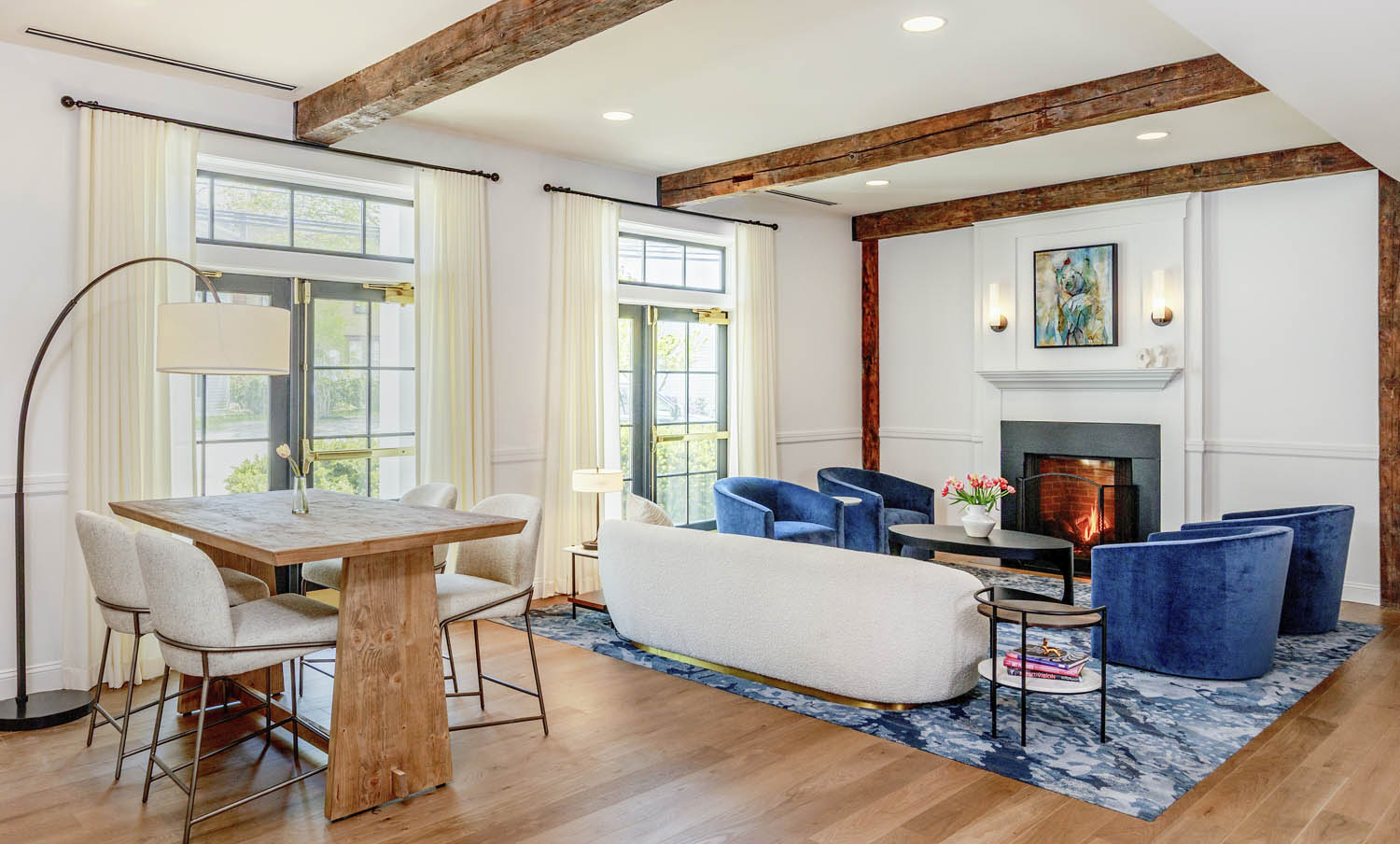
The freshly renovated Brunswick Hotel, nestled in the heart of town, exemplifies a masterful blend of traditional style and New England charm. Throughout the building, the architecture and interior design work together to foster a deep connection to the midcoast region’s rich history and coastal beauty. The boutique hotel’s communal spaces, particularly the lobby at the entrance, are warm, inviting, and thoughtfully curated, with cozy clusters of plush seating that encourage intimate conversations and reflections by the fireplace. Gold accents and natural materials, including exposed wood beams, evoke the comforting glow of Maine’s landscape, while soft fabrics and rugs in compelling shades of blue are reflective of the Androscoggin River just down Maine Street. Overall, the space creates a serene ambiance that grounds guests in the natural environment.
“Bowdoin College is merely steps away, and an elegant art gallery celebrating the school’s distinguished alumni, from poet Henry Wadsworth Longfellow to Civil War hero Joshua Chamberlain to Ruthie Davis, footwear fashion designer to the stars, further anchors the hotel in its academic and cultural legacy. The entire building embodies a distinctive sense of place rooted in history, community, and natural beauty. Whether guests are arriving for leisure or retreating into solitude, the Brunswick Hotel is an elegant sanctuary that offers a warm refuge celebrating contemporary comfort and the serenity of midcoast Maine.”
—Jacqueline McGee, principal and director of design at Ealain Studio
September, 2025 | By: Alyssa Bird | Photography: Jeff Roberts
After spending more than four decades in New York City, Janice and Bruce Richter felt like they were taking a huge leap of faith when they relocated to Maine. They first became acquainted with the Blue Hill peninsula and Deer Isle about 20 years ago, when Bruce began taking summer classes at the WoodenBoat School and the Haystack Mountain School of Crafts. (He now teaches at the WoodenBoat School.) They found themselves staying a little longer each time they visited, and a few years ago the timing finally felt right. Although they thoroughly enjoyed the city and industrial loft living, Bruce, who had spent his career in advertising, and Janice, who worked in the fashion industry as a creative director, were craving the space to focus on their current passions. Bruce was in need of a woodworking shop, while Janice required studio space to create her digital artworks—many of which are inspired by nearby granite quarries. “I started to see things differently here,” notes Janice. “It’s an eye-opening place.”
The couple began searching for homes in Blue Hill, and they eventually settled on an in-town property within walking distance of everything that still offers a sense of privacy. “I had initially dismissed the listing when I saw it online because the house wasn’t quite right,” says Bruce of the original, dated 1970s ranch. However, once Bruce visited the site with architect Matthew Elliott, he was swayed. “I told Bruce that we needed to consider taking the structure down and reusing just the foundation,” says Elliott. “By the time we changed rooflines and made all the improvements, it would just be more cost effective.” But more important, it gave the architects and the homeowners an opportunity to dream.
“Luckily, the footprint, which is basically a large rectangle, is exactly what we imagined,” says Janice of the (mostly) single-level plan. (There’s a guest room on the lower level.) “We wanted to bring that industrial loft language here and create something contemporary, monastic, and a little rough.” Still, it was important to the couple that the exterior evoke “a proper sense of place,” explains Bruce. “When you think of Maine, you think of old fishing shacks and rambling farmhouses. This is a modern take.” To satisfy their affinity for open, airy spaces, the architects designed the three-bedroom house around a large great room that combines the kitchen, dining, and living areas. Featuring a 21-foot-tall cathedral ceiling with metal trusses, the room is flooded with light courtesy of a wall of windows on the southern exposure as well as clerestory windows on both sides that allow in northern and southern light. “It makes a huge difference when you can bring in light from more than one direction,” says Elliott. “The conditions are always evolving, and it lends a different character to the room depending on the hour and the time of year. The clerestory windows also help break up the large space and help give it a human scale.”
While the great room is the hub of the home, the Richters’ respective creative spaces compete for top billing. Bruce’s is located in the former garage and features tall ceilings to accommodate large expanses of wood; Janice’s is a more intimate space off the great room that’s filled with custom storage and plenty of natural light. “Organization is a necessity for Janice,” notes Elliott. In addition to cabinets for folio storage, there’s a desk as well as a taller counter where the artist can stand. “The studio has a sense of calm,” continues the architect. Bruce’s shop, in comparison, is “less about the light and more about volume and space.” Also on the main level is the primary suite, a screened porch, and an office that serves double duty as a guest bedroom thanks to the addition of a Murphy bed. “When the bed is tucked into place there’s a sitting area that occupies the space,” says Elliott. “We always try to talk clients into building less and employing multipurpose spaces instead. Murphy beds are often a great solution.” And this one has a fun twist courtesy of the homeowners. Instead of a traditional handle, the Richters had the idea to source a meat hook—a nod to their time living in the city’s Meatpacking District—to lower the bed.
Indeed, no detail was too small for the Richters. “Materiality is essential to them,” notes Elliott. “The goal was to integrate everything they like, from granite to rusted metal.” In fact, the rusted-metal front door was a subject of much discussion. “The clients found a liquid product that causes rust, so we tried many different coatings and compared samples,” explains builder Peter Woodward. “It took about eight coats over a couple of days to create the desired rust level.” The same goes for the roasted-oak details—found on the island, living room television cabinetry, and stairs—which saw 20 different stain samples before the team nailed down the perfect finish. As a counterpoint to the roasted oak, dark gray touches can be found throughout, from the kitchen cabinetry to the large-format tile seen on the fireplace surround and in the primary bath shower. Meanwhile, polished concrete floors lean into the industrial language. “We wanted a contrast between light and dark,” says architect Sarah Elliott of the restrained palette. “And we chose textured materials that feel alive. The concrete, for example, is quite varied rather than appearing too uniform.” Careful attention was also paid to ensure that wood grain would be visible through all the finishes. “Whether it’s wood or concrete,” she continues, “the materials feel like what they are.”
One of the most beloved material selections can actually be found both inside and out. Born out of a technical need to resolve the site’s changes in topography, the team collaborated on an idea to install a row of granite blocks running from the front, continuing inside the house to serve as the hearth, and out the back. Consisting of scrap pieces from a nearby quarry, the “granite rift,” as the team refers to it, bifurcates the site. “The property is unique in that it has two ecologies,” explains landscape architect David Maynes. “There’s a woodland area on one side, and the other is more arid with rugged, drought-tolerant plants and a meadow.” This rift also helps define specific site functions, allowing for a parking court and an entry sequence as well as a firepit facing the woods. “Janice had created granite rubbings while walking around abandoned quarries on Deer Isle,” notes Maynes. “The origin of this rift idea came from her love of that landscape.” The blocks can be seen from Janice’s studio, providing a constant source of inspiration. “It’s like I have my own little granite quarry,” says Janice.
With a property that’s so tailored to both their needs, the couple hasn’t looked back. “Leaving New York was a big change after so many years, and we were worried that we’d get up here and realize we’d made a mistake,” says Bruce. “But we haven’t been motivated to go back and visit the city yet. We have a home we love, and we don’t feel the need to leave.”
September, 2025 | By: Katy Kelleher | Photography: Brian Vanden Brink & Sean Litchfield
The family had been visiting the clear, cold, twisting waters of Western Maine for over 100 years. The first lake house on the property was built in 1902, and they called it the North House. Over the decades the property lines changed as the family sold off pieces of the land, and eventually the North House itself was sold. (“South House blew down in a storm a long time ago,” the homeowner clarifies.) However, they retained 300 acres and continued to return to Kezar. “We had a house built here in the 1980s,” says the homeowner, “but our family eventually outgrew it.” That’s when they decided to build the “next generation North House”—a new camp for a new era.
Designed by architect John Cole, built by Anthony Giovanni of MWV Fine Homes, and with interior design by Jennifer Morrison of Morrison Design House, the 3,500-square-foot structure is a tribute to Kezar Lake’s long history as a summer destination. For centuries, well-heeled Bostonians and New Yorkers have been making the annual pilgrimage to Lovell, visiting their cottages and camps for a taste of Vacationland. During the late 1800s and early 1900s, Kezar was a hot spot for tourists, a place to go and escape the hustle and bustle of city life. “This is a contemporary interpretation of a traditional Maine camp,” explains Cole. “It’s certainly a little bigger than a camp would be, but the gable structure is familiar, as is the wraparound porch.” Yet the biggest deviation from convention is the first thing one sees upon approach. “I’d been playing with the idea for years, and this is certainly the grandest version of it,” says Cole of the three-story rectangular tower, which rises above the back of the home. “It’s the last house down a long dirt road. You come over a slight rise, and you can’t quite see the house, but you can see the top of the tower,” he says. “I’d say my style is quite traditional, but I’m always looking for ways to add a bit of whimsy, a little contemporary twist.”
But the tower isn’t just a welcoming beacon for visitors—it has practical use too. Like the camps of yesteryear, this house doesn’t have central air or fancy heated floors. It’s a true three-season camp, complete with multiple fireplaces and big, airy windows. When it’s high summer and the weather threatens to turn stifling, the tower becomes “basically a chimney,” Cole explains. “With the windows on the top floor open in the summer, it draws cool air from the lakeside in and up.” Since the North House is located on a rather wooded lot, the tower also helps brighten the driveway-facing side of the building. “It backlights the interior,” Cole says. “As often occurs in a lakefront property, you want as much glass as you can get on the water side. If you don’t balance that light with something on the other side, you get a cave effect. The big windows in the tower draw south and western light through the house.” For the builder, the tower presented a slight challenge, as did the rough seasonal-use roads. “We had to think outside the box,” Giovanni says. “Certain features we built in our shop, took apart, and then reassembled on-site, including the tower roof.” This allowed them to perform detailed work in a controlled environment, which ultimately contributed to the home’s elevated craftsmanship. “You see all the joinery,” he says. “It’s not hidden behind drywall. That’s what makes it look so good.”
Fortunately, both Cole and Giovanni enjoy working with myriad woods, and this house showcases their appreciation for the material, from the pine walls to the reclaimed oak floors and the exposed Douglas fir beams. “In this day and age, a lot of people are using synthetic and low-maintenance materials, which are nice for longevity and maintenance, but they’re not that fun to work with. Having all wood was a nice change of pace,” says Giovanni. “Almost every room has some sort of built-in, which takes it to the next level. Everything is built to fit and maximize the usable space in the camp.” This was per the request of the homeowner, who didn’t want the structure to sprawl too large. “We wanted it to have, as the original house did, a real cabin vibe,” she says. “We wanted the interior to have beautiful woodwork, a more refined version of the original cabin, which was very rustic.” In addition to the smart, space-saving compartments, Giovanni’s team also paid close attention to the grain of the wood, creating pine sheathing on the walls that appears to run behind the beams without stopping and book-matched vertical siding behind the owners’ suite headboard. “Most people wouldn’t even think about it,” says Cole, “But these are very difficult things to do.”
In addition to the four bedrooms and two bunk rooms, the home also features an open living space that spills into the kitchen and dining areas. The North House was designed for summer living, with ample family space and no television room. “The dining table was a bit of an afterthought,” admits the homeowner. “We really wanted a big kitchen. We entertain a lot, we eat together, we’re a very close-knit family. We have an enormous wraparound porch with a table outside, and it has to be very cold for our family not to be eating outside.” When a chill does hit, the wood-burning fireplace comes in handy, and when the mosquitoes are too fierce, the family congregates on the screened porch to toast s’mores over the fire. “We still feel like we’re around a campfire,” the homeowner says.
Of course, with any lake house, access to the water is paramount. This particular camp sits high on a ledge over Kezar, and since they couldn’t take down any more trees, Emma Kelly of Emma Kelly Landscape had her work cut out for her. “It was tricky,” she says. “They wanted to create a sense of immediacy with the water, so it became about finding a few moments to perch with the hardscape and create a middle ground between the home, the porches, and getting down to the water.” Using boulders from the site and regional flat stone, Kelly made an attractive and stable meandering route. “She was really great,” the homeowner says. “She did beautiful steps going down to the lake, which is even more friendly than what was there before.” To prevent erosion, Kelly brought in root-spreading plants that would grip the soil and add a bit of visual interest, including sweet fern, hay-scented fern, plus clethra and blueberry bushes. “It’s a bit like adding vegetables into your kids’ pancakes without them noticing,” she jokes. “I can be a bit of a broken record with my plant palette, but these are tried and true.”
Kelly was also able to squeeze in a small lawn at the back of the house, as well as a bit of native planting to ease the entryway. “The third big move we made was about arrival,” Kelly says. “Before, it was an old-fashioned camp with an amorphous gravel space. You’d trundle down the road and slump your stuff into the house.” Now there’s a graceful, elongated approach with a stone stop for cars and a path that brings visitors to the front door in a “more elegant and swooping way.” Kelly adds, “Here, we brought in a few small trees, including birches, to create a cottagey feel, as well as hydrangeas and some classic Maine perennials.”
While the finished product is more refined than the old camp, the design-build team never lost sight of the space’s true purpose. It’s still a lake house, still a bit wild, still perfectly suited to Maine summer activities. “We just love it, and we come as often as we can,” the homeowner says. “It’s really easy living.”
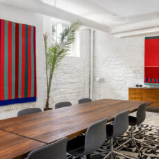
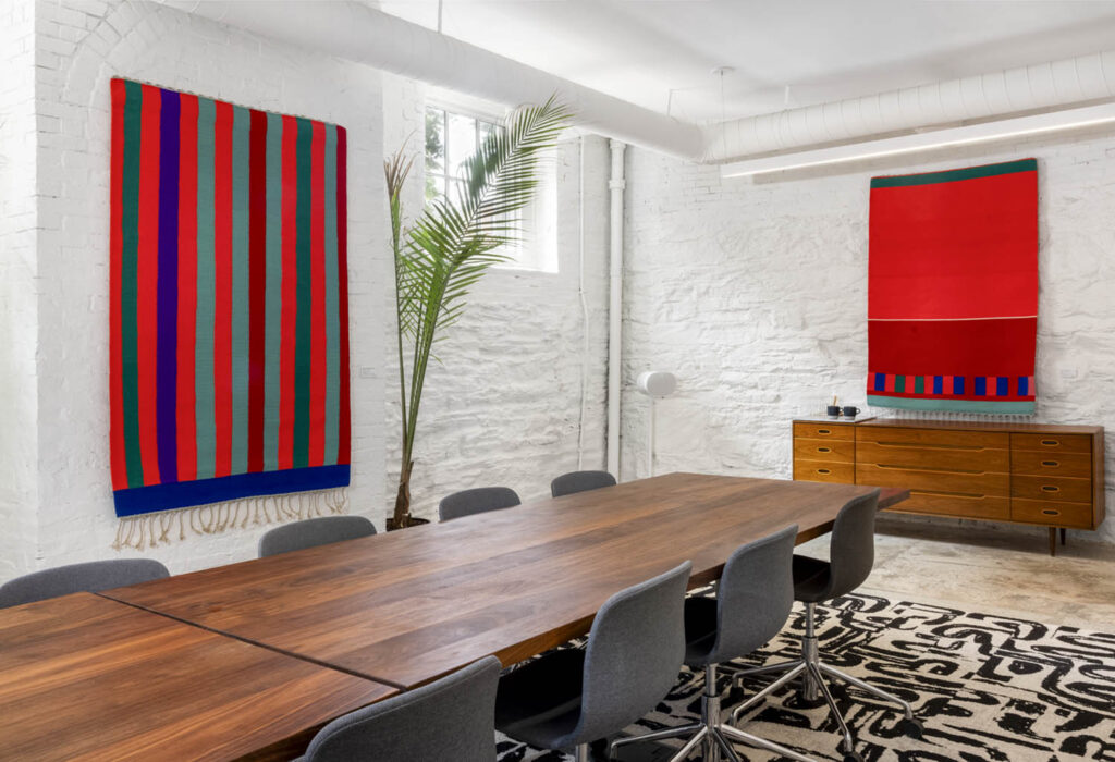
Tapestries by Morris David Dorenfeld add striking color to Woodhull’s newly renovated conference room. Artwork courtesy of Elizabeth Moss Galleries and the Morris David Dorenfeld Foundation.
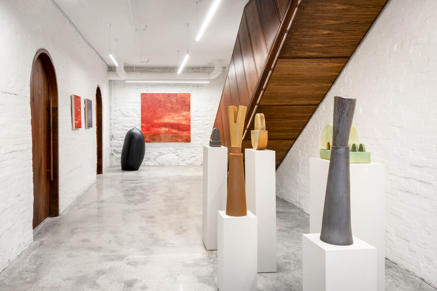
In this section, we feature beautiful projects by some of Maine’s top home and design professionals. These spaces, as the photographs show, are works of art in themselves. Each image includes one or more pieces of artwork, almost all by Maine artists, sourced from our excellent local galleries. We looked for pieces that resonated with each project to demonstrate how a work of art can bring out the special qualities of a beautiful home. In some of these spaces, we didn’t need to bring anything in; we simply captured the works that owners had chosen to be part of their homes and their lives. We hope this section will inspire readers to step into local galleries, to spend time with the abundant, diverse art of our state, and to imagine their own walls as frames for beautiful objects.
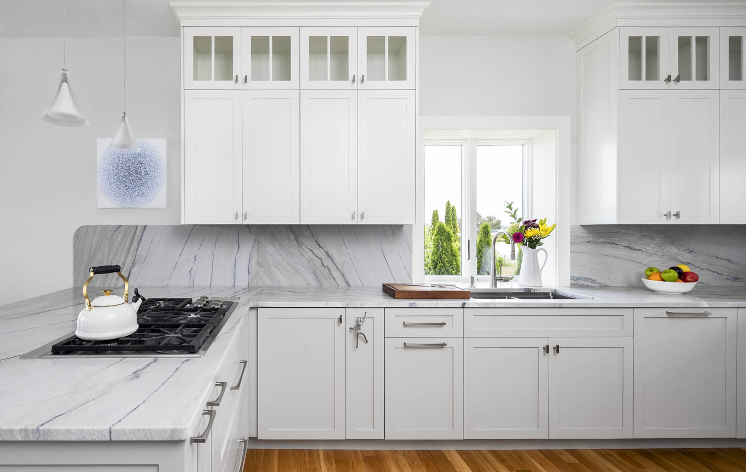
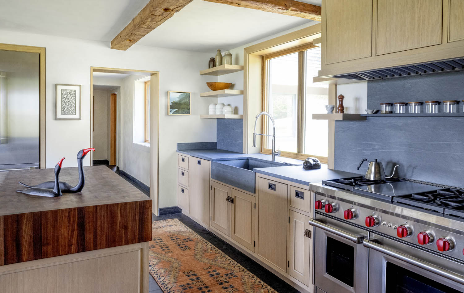
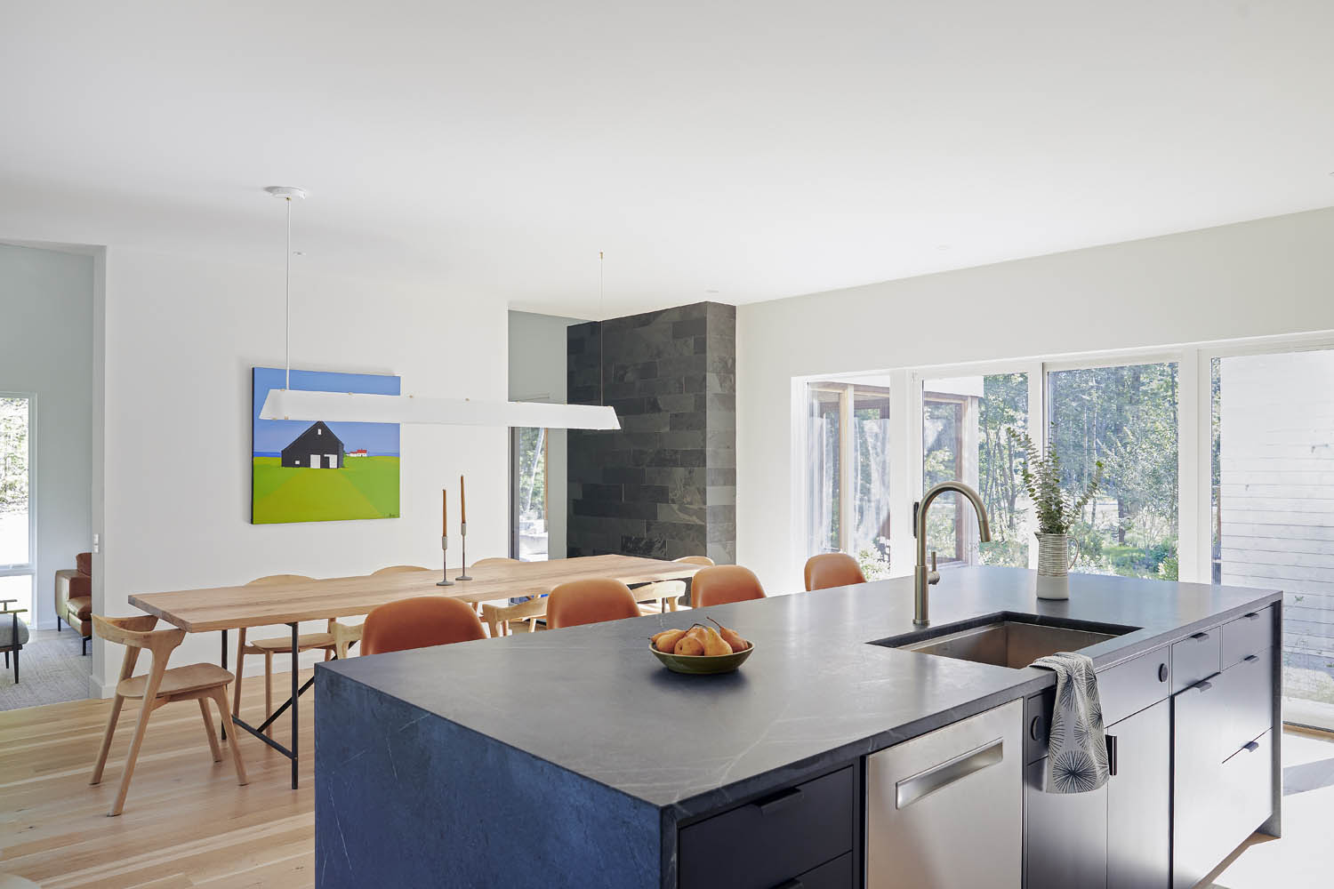
“In a kitchen where form meets function, even the art becomes part of the story—a beautiful balance of creativity, craftsmanship, and coastal calm. Designed by Caitlin Tucker and Katie Therrien of Arcadia Kitchen and Bath, every element in this space was thoughtfully chosen to reflect the home’s natural surroundings while delivering timeless elegance. From the custom cabinetry to the serene stone surfaces and the art that now graces the wall, this kitchen is more than just a place to cook—it’s a curated experience that brings beauty and purpose to everyday living.”
—Kim Connell, owner, Arcadia Kitchen & Bath
Kitchen Designer: Arcadia Kitchen & Bath AJ Oishi, Foundations 7 Acrylic on canvas, 20” × 20” Courtesy of KW Contemporary Art
“This kitchen has a walnut, end-grain butcher-block island top, slate countertops, and lightly stained rift-sawn oak doors with a beveled bead detail. The hardware is antiqued solid-brass butt hinges, pulls, and latches. Simple details put together well can draw the eye and add interest to the character of the style. In this case, the style is no more or less than the elements.”
—Rick Sawyer, Blue Hill Cabinet & Woodwork
Island & Cabinets: Blue Hill Cabinet & Woodwork Robert Pollien, Western Point, Oil on linen, 12” × 12” Jennifer Judd-McGee, Swirled, Hand-rendered papercutting, 12½” × 6½” David Sears, Cormorants, Carved and painted cedar, 10” × 22” × 5” All courtesy of Artemis Gallery
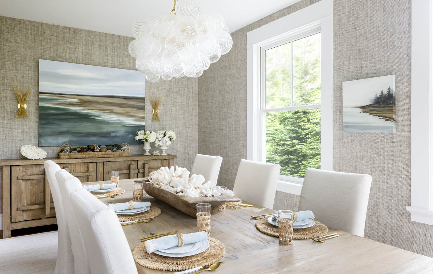
“Every one of our agents connects with the community in their own way—through kids, grandkids, golfing, sailing, animal rescue, even designing clothes for breast cancer survivors. A personal connection for me is through artists I’ve known as people long before knowing their art—swimming with Jessica Ives and Colin Page in master’s swimming groups, waiting tables with Jo Rocknak a lifetime ago at the iconic Waterfront Restaurant in Camden. This is a place where our lives are woven together in all kinds of ways, and we are fortunate to be able to experience it through the vision of our local artists.”
—Nancy Hughes, owner, Camden Coast Real Estate
Architect: Christopher Glass Jo Rocknak, Megunticook Reflections, 36” × 36” Jessica Lee Ives, The Sound of Sunlight Made Visible, Oil on cradled birch panel, 40” × 40” Colin Page, Birch Hill, 40” × 40” All from owner’s collection
“My vision was to embody casual elegance with an organic nod to our coastal surroundings—not as a typical beach house but as a timeless, year-round generational home. I believe a home should have a strong sense of place, and our art selections reflect that intention. I’m most at ease in a calm, neutral palette that still offers warmth and comfort. It’s where I truly thrive.”
—Anne Clarke, interior designer, Hurlbutt Designs
Interior Designer: Anne Clarke, Hurlbutt Designs Jill Matthews, Beach Break, Oil on linen, 48” × 60” Purchased from Maine Art Hill Jill Matthews, Misted Point, Oil on canvas, 20” × 20” Courtesy of Maine Art Hill
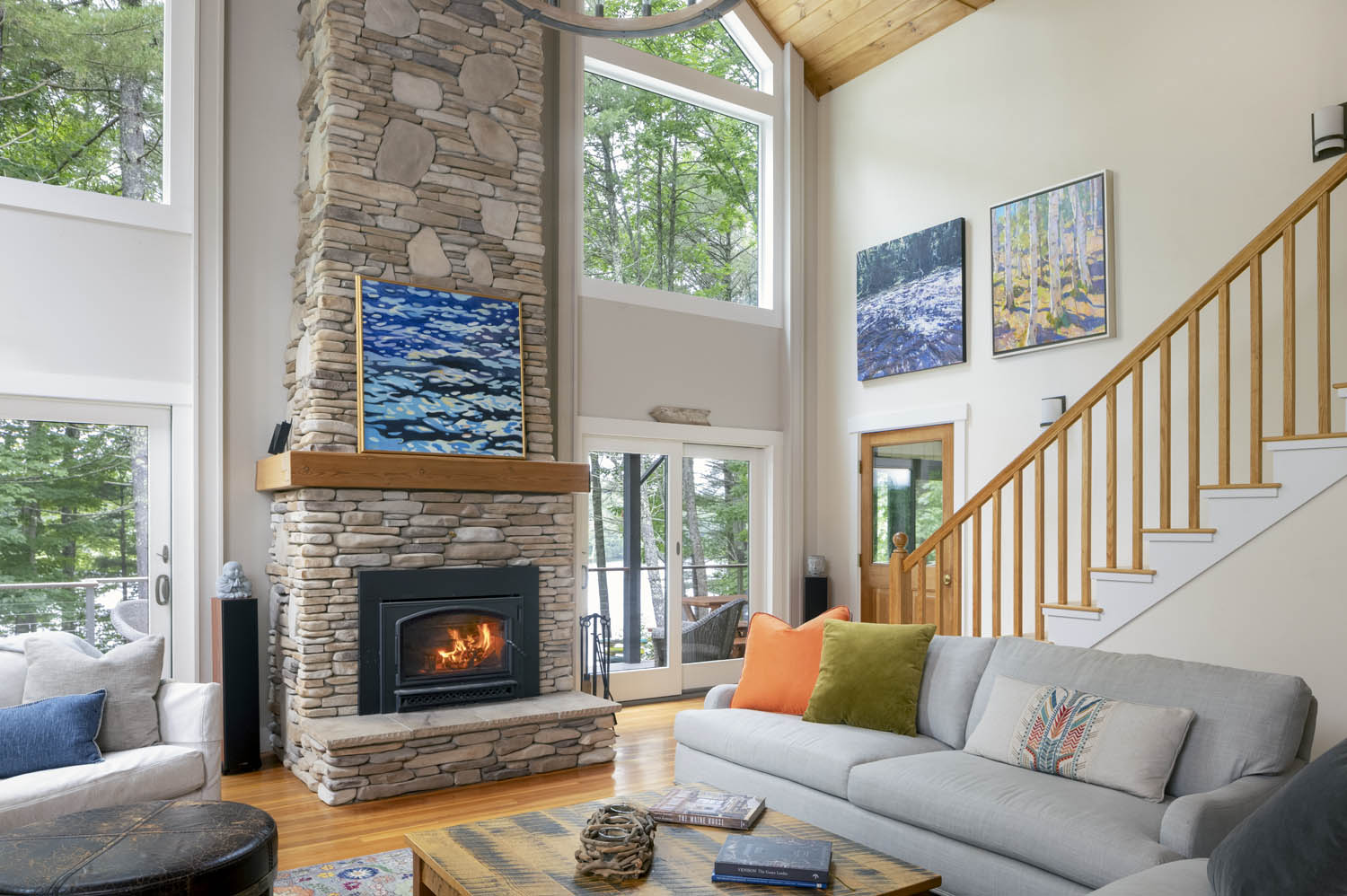
“In this understated lakeside retreat defined by clean lines, midcentury forms, and natural materials, artwork has a profound effect on the atmosphere of the space. Night Dock by Gail Spaien envelops the viewer in a sense of calm, the flickering light dancing over water mirroring the lake’s surface just beyond the home’s generous windows. Much like the chandelier that echoes wind-stirred leaves, the painting offers a connection to the natural world that feels both intimate and expansive.”
—Andrea DiBello, interior designer, Kevin Browne Architecture
Architect & Interior Designer: Kevin Browne Architecture Builder: Codere Construction Gail Spaien, Night Dock, Acrylic on linen, 38” × 40” Courtesy of Elizabeth Moss Galleries
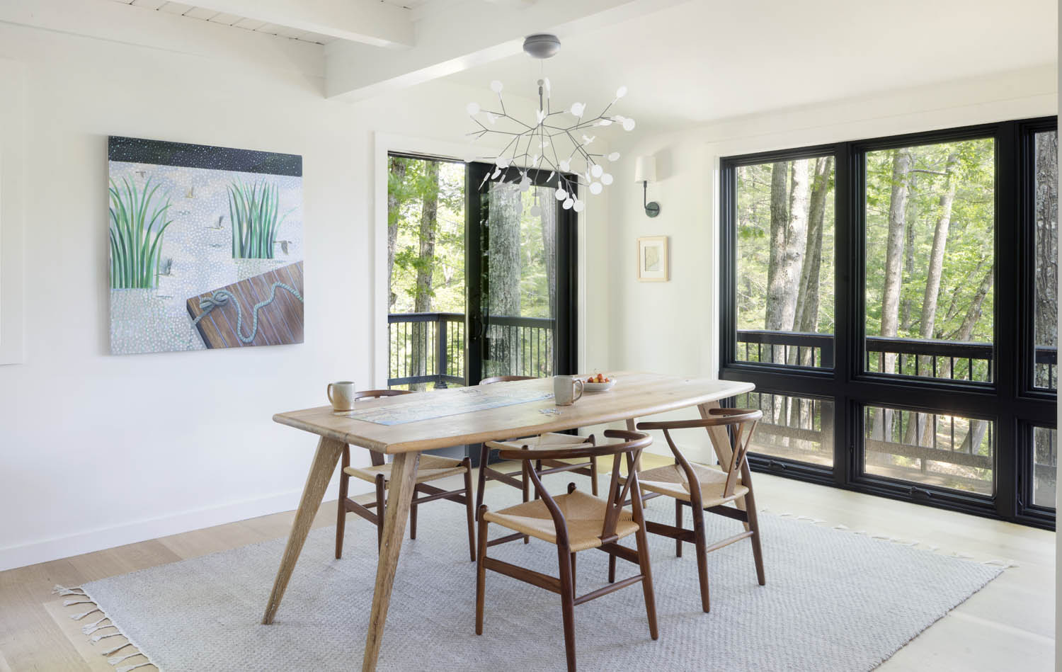
“We are drawn to the simplicity of Jean Jack’s paintings, specifically the way the buildings fit into the broader landscape. A similar approach guided the siting of this multi-gabled residence, nestled among the trees near Goose Rocks Beach. We used natural materials to connect the interior to the natural beauty of the site. The oak flooring contrasts with the soapstone counters and slate tiles of the fireplace surround to create a home that is very Maine and very modern.”
—Jessica Jolin, principal, Mobile Studio Design
Architect & Interior Designer: Mobile Studio Design Builder: Bowley Builders Cabinets & Table: Derek Preble Countertop: Morningstar Stone & Tile Jean Jack, Black Barn in Friendship, Oil on canvas, 40” × 40” Purchased at Portland Art Gallery Photograph: Liz Daly
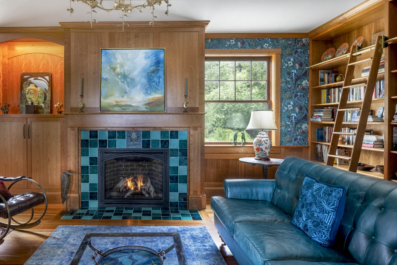
“This cherry library tells a story through custom details and materials, including the custom-tiled gas fireplace, art niche, and bookshelves for an extensive collection. The room is designed to create an elegant yet relaxed space for enjoying reading and conversation, or even competition in the bonus game table area. A custom, hand-molded thistle tile reflects the family’s Scottish heritage, while the owner’s world travels are evoked by House of Hackney’s Florika wallpaper, inspired by paisley patterns from the ancient Silk Road. The jewel tones of the hand-glazed hearth and rich wallpaper create inviting and inspiring surroundings for gatherings of family and friends.”
—Michelle Phelps, principal, Phelps Architects
Architect & Interior Designer: Michelle Phelps, Phelps Architects Builder: Hewes & Company Feature Lighting: Currey & Company Windows: Marvin Tile Fireplace Surround: Old Port Specialty Tile Co. Custom Feature Tile: Lea Nigel Studios Kathy Buist, Captured Light, Mixed media on canvas, 36” × 36” Digby Veevers-Carter, Small Hunkered Heron (1/10) Bronze Both courtesy of Artemis Gallery
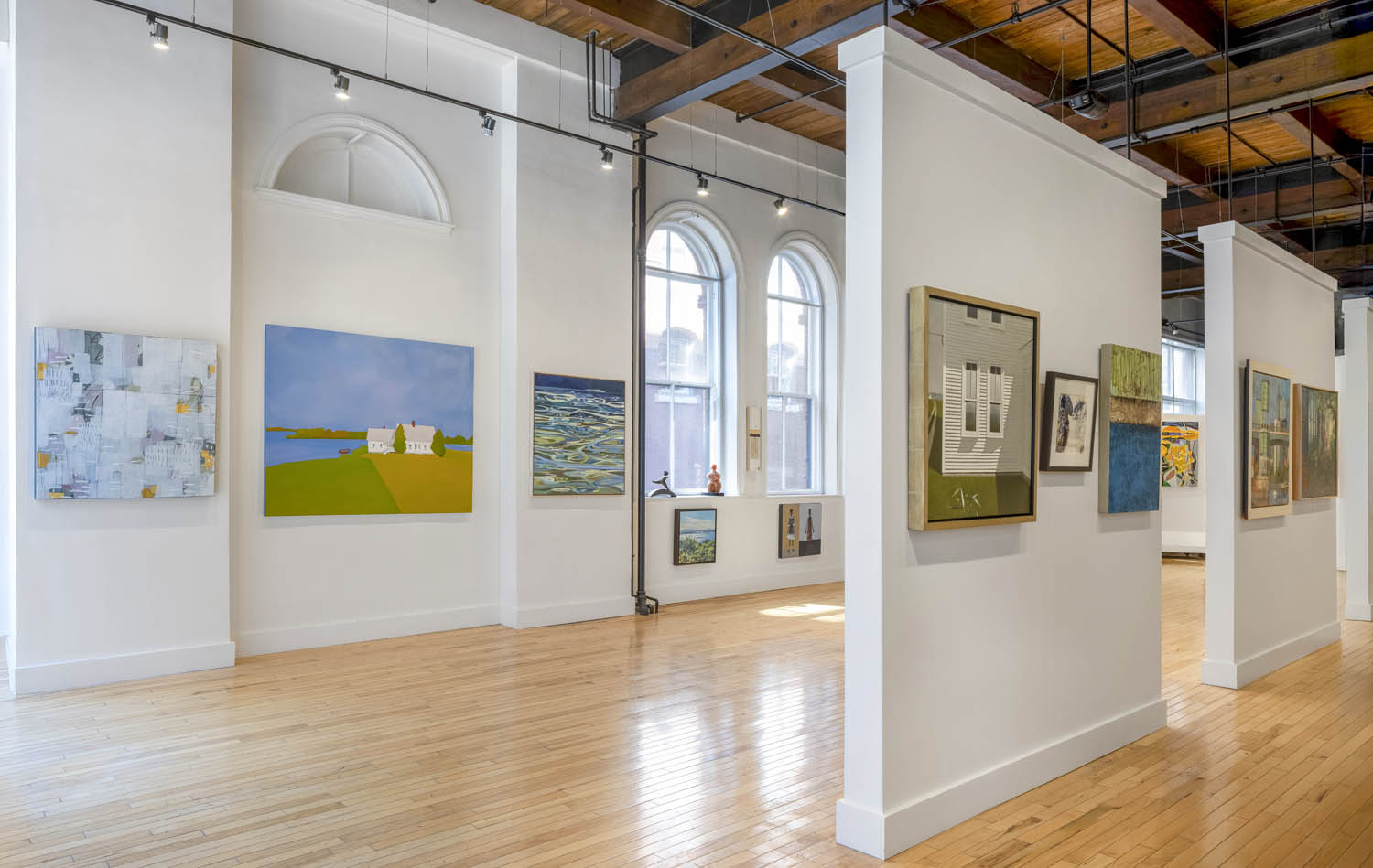
“We’re often asked what makes the Portland Art Gallery different. Honestly, it starts with the space—soaring ceilings, tall windows, and natural light that fills the heart of Portland’s Old Port. But more than that, there’s no pretension. Visitors come in whether they’re collectors or just curious, and everyone gets the same warm welcome. Prices are on the wall, and you can ask to see works in storage or hear stories about our 65 represented artists. Our goal is simple: help people find something they connect with and love. It’s about making art feel personal, accessible, and part of everyday life.”
—Emma Wilson, gallery director, and Sean Thomas, gallery manager, Portland Art Gallery
From left to right and back to front: Dietlind Vander Schaaf, Jean Jack, Liz Prescott, Andreas von Huene, Dick Alden, Helen Lewis, Holly L. Smith, Sheep Jones, James Bonner, Susan L. Johnson, Annie Darling, Karen Blair, Dale Roberts, Brian Emerson
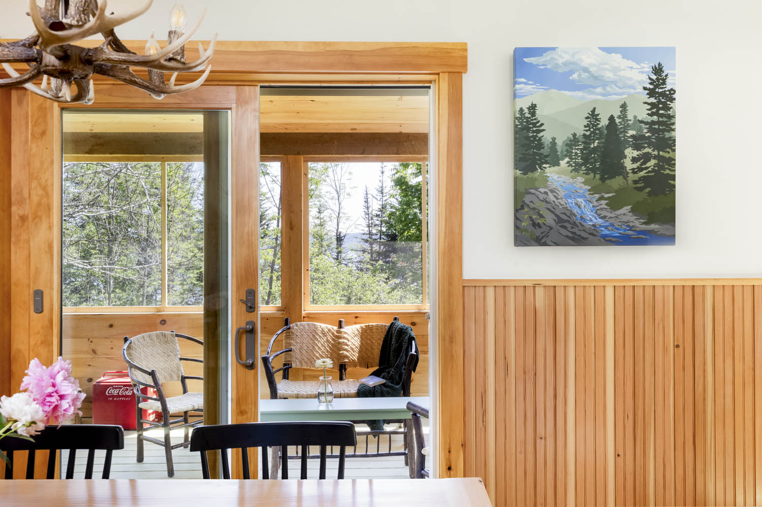
“In recent years there has been a trend toward larger and more complex lakefront homes. We loved building this small, classic lake house because it was a chance to get back to the roots of it all—the simple Rangeley camp. With the warm wood tones of Douglas fir and lots of natural light, the home brings the outside in and is the perfect place for a family to gather, year after year.”
—Jill Gordon, designer, Rangeley Building & Remodeling
Builder: Rangeley Building & Remodeling Ed Wintner, White Mountains Calling, Acrylic on canvas, 30” × 24” Courtesy of Portland Art Gallery
“My business does a good amount of general contracting for renovation and restoration, and this project is a great example. It’s a beautiful 1990s custom-built home by the ocean, and the owner wants it to be in good shape to hand down to his daughter. It’s very special to be part of making sure a home like this is ready for the future.”
—Steve Boucher, woodworker
Home renovation: Steve Boucher, LLC KX2, Ferry Beach (individual section from set of 12) Brushed aluminum inset with mixed media on panel, 10½” × 3½” Carolyn Johnson, Firm Foundation, Mixed media, resin, and surfboard, 76” × 19” Chloe Saron, Caeruleus(Blue), Oil on wood with varnish, 12” × 9” All courtesy of KW Contemporary Art
“For Woodhull, the Safford House wasn’t just a property; it was a future home. Though it required extensive modernizing to meet the demands of our design and build firm, its original layout proved ideal for our organization, facilitating collaboration across our specialized teams. The space comfortably houses our entire operation while also providing room to showcase local art. We are committed to opening our doors for public events in partnership with our local arts community and are thrilled about the current show in collaboration with Lights Out Gallery”
—Scott Stuart, director of millwork, Woodhull
Atlantic Morning exhibition curated by Lights Out Gallery Terracotta sculptures by Lynn Duryea courtesy of Lights Out Gallery Paintings by Melanie Essex courtesy of Caldbeck Gallery Wooden sculpture by Steve Bartlett courtesy of Lights Out Gallery
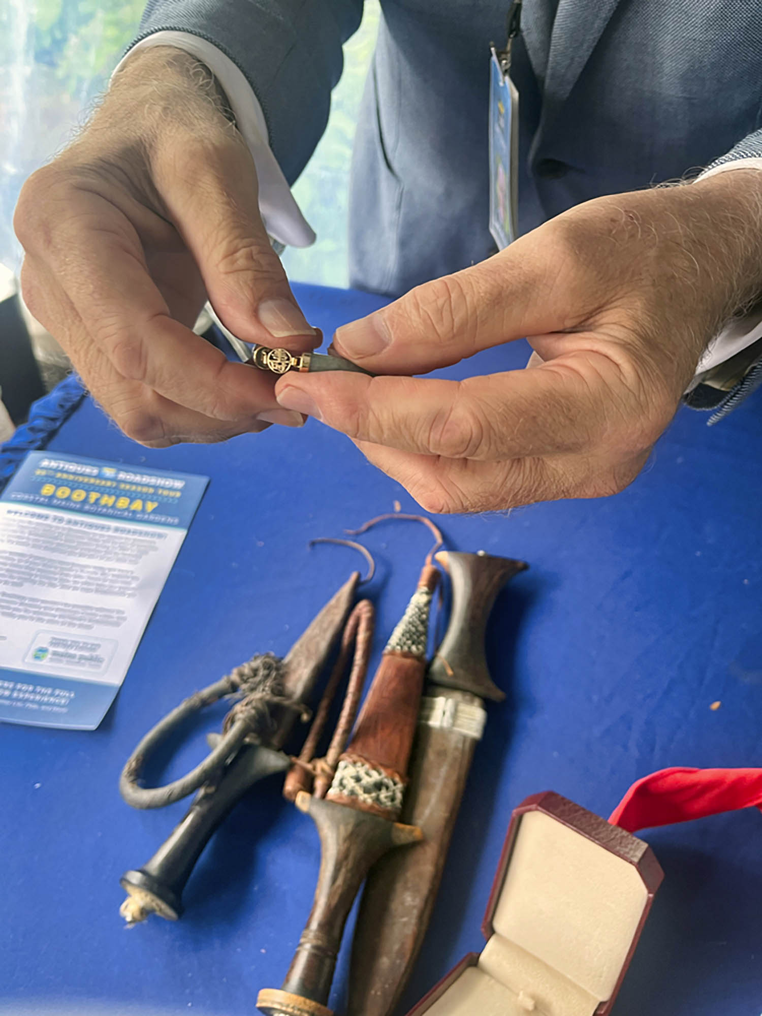
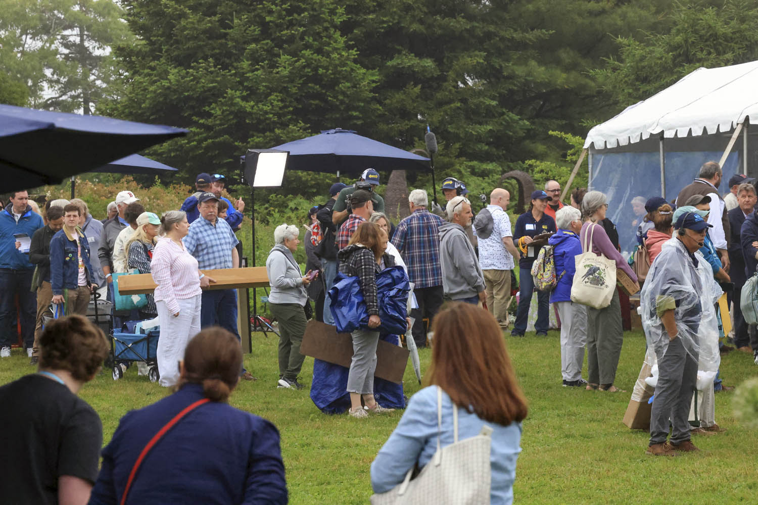
The author reconnects with longtime appraiser Lark Mason. Mason evaluates an Egyptian knife collection and a baby’s jade bracelet reset in gold.Visitors brave the rain and wait their turn to meet with the appraisers outside their tents.
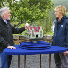
This past June, as part of its 30th anniversary tour, Antiques Road-show, PBS’s beloved appraisal series, traveled to Vacationland for the first time. Coastal Maine Botanical Gardens in Boothbay was one of five stops on the show’s 2025 tour. (The other stops were in Savannah, Georgia; St. Louis, Missouri; Salt Lake City, Utah; and Charlevoix, Michigan.) When I heard the news back in January, I entered the raffle to win a ticket and put in a press request.
Antiques Roadshow is the only television show where I often get to see someone I used to work with. My kids and husband, unfortunately, are not impressed by my celebrity connections, but they do enjoy watching the show and seeing the shocking amounts some treasures are worth. Weeks after my press request, the WGBH press office finally replied, saying I could not only attend the show and but also bring two objects for appraisal. The only problem was, I didn’t have any family heirlooms or flea market finds that I didn’t already know the value of.
As luck would have it, when my mom visited right before the show she brought with her, as a gift for my daughter’s birthday, a delicate jade bracelet my dad had given her 40 years ago. Then my husband decided it was the perfect time to unveil his secret collection of Egyptian knives (!), which he had amassed while living in Egypt with his family in the late 1980s.
There was a considerable amount of traffic leading up to the Botanical Gardens entrance, where I was directed to a distant field to park my car. Of course, it was raining. I joined the swarm of people clutching their treasures (many wrapped in quilts to protect them from the elements) and walked over to the check-in area. After showing the greeter my two objects, I was directed to the Asian tent, where a familiar face caught my eye: Lark Mason, a longtime appraiser on the show and founder of iGavel Auctions. Seeing him brought back a flood of memories—Lark had been my mentor during a graduate school internship in 2006. We greeted each other, posed for a quick photo, and caught up.
Lark examined the Egyptian knives first, offering the kind of appraisal that only years of experience can deliver. “These are fun pieces,” he said with a smile, “but they were made for tourists—decorative more than valuable.” Then he examined the jade bracelet. Lark’s face lit up with interest. “This is actually a baby’s bracelet,” he explained, “originally intended as a protective charm. It appears to have broken at some point and was reset with gold, featuring good luck symbols. It’s quite lovely.” It was worth around $600.
With my items appraised, I wandered through other sections of the event, where the real treasures turned out to be the people behind the tables. I spoke with Suzanne Perrault of Rago Auctions, known for her expertise in ceramics and twentieth-century design. While I was at her table, she was appraising a pink and green Roseville vase with a cherry blossom pattern. Although these once fetched good prices at auction, their value has decreased in recent years. Nearby, Arlie Sulka of Lillian Nassau in New York—an expert in Tiffany glass and decorative arts—was examining a cobalt iridescent vase. Unfortunately, it was not a Louis Comfort Tiffany.
On the way out, I spoke with a few visitors about their appraisals. Some had been invited to the taping area for possible inclusion in the 2026 season, but most were just happy to be there for the experience: to engage with world-renowned experts, to share the story of how they acquired their objects, and to learn.
THREE GREAT FINDS FROM THE DAY:
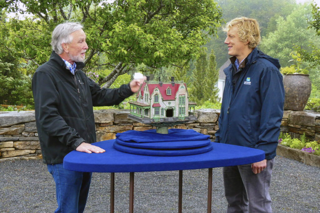
Cast-Iron Birdhouse
A cast-iron birdhouse was brought in by a Roadshow guest that originally belonged to the guest’s grandfather. It is a model of the Clifton house designed by Frederick Copley on Long Island, New York. Expert Jason Preston appraised the birdhouse for an insurance value of $12,000.
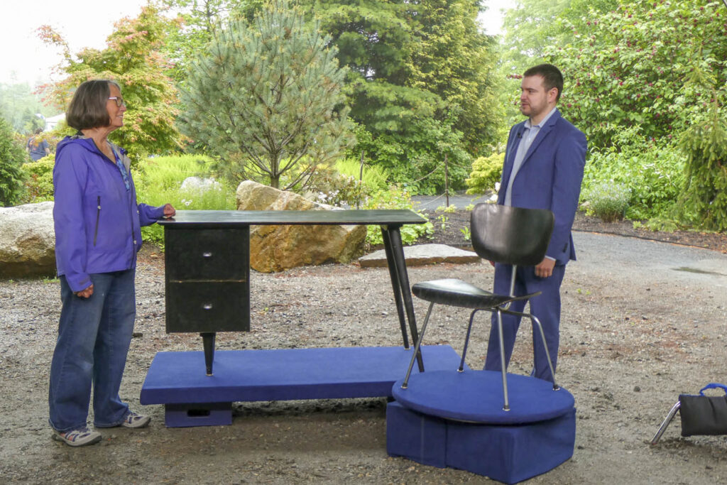
McCobb Desk & Eames Chair, ca. 1955
A guest brought in a McCobb Desk and Eames Chair that they inherited from their uncle. Both the desk and chair still have the original finish. Furniture expert Tim Andreadis valued the desk at $600 to $800 retail and the chair at $700 to $900 retail.
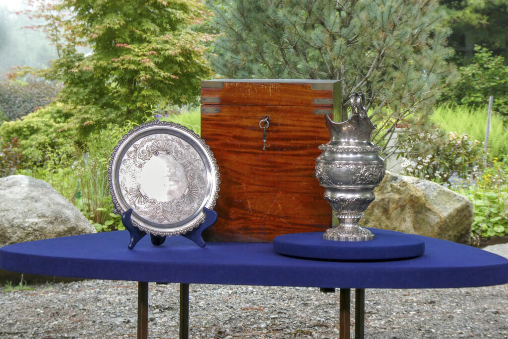
1834 John B. Jones Presentation Silver
A collection of John B. Jones present- ation silver that a guest’s great- great-grandfather had received in 1834. The silver had been passed down through the family for generations. The pitcher and tray were made by prominent silversmith John B. Jones, who was based in Boston. Silver expert David Walker appraised the collection for an insurance value of $15,000.