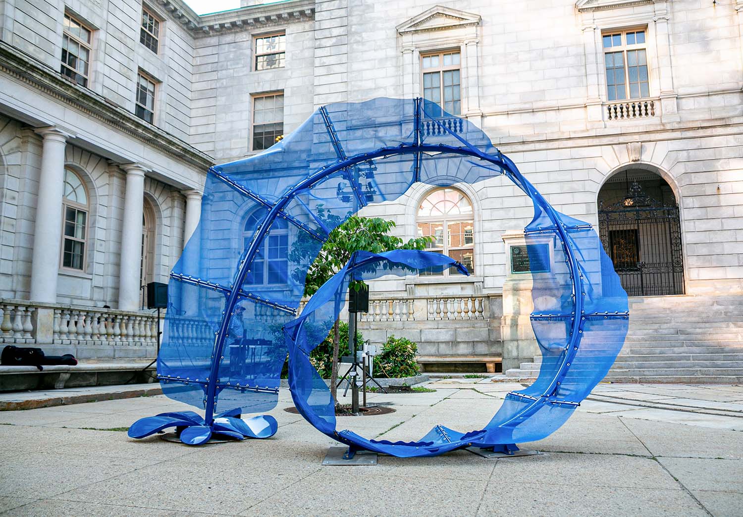
Maine’s architectural landscape is as varied as its terrain: ranging from renovated public libraries that strengthen community ties to beachside residences designed to weather salt air and shifting tides, to homes with Corten steel panels and others with salvaged foundations. For nearly two decades, MHD has had the privilege of documenting this ongoing story of resilience and imagination. These 19 projects reflect the best of Maine architecture—work that respects history, embraces innovation, and responds with precision to the demands of place. Together, they honor 19 years of architectural excellence and lay the foundation for what comes next.
2025 ARCHITECTURE LISTING—RESIDENTIAL
Weathering Steel House
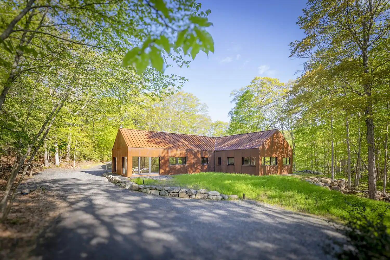
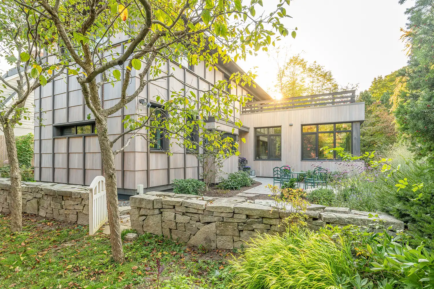
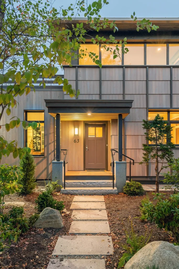
Sited on an existing wooded clearing, this house designed by ARQ Architects has views to a tidal harbor. The clients desired a straightforward but modern interpretation of traditional New England design using durable and timeless materials. The design process focused on critical plan relationships, along with views and natural light for all rooms. After reviewing exterior materials options, weathering Corten steel wall panels and a standing-seam roof were chosen, creating barnlike gable roof forms.
Four-foot-wide steel panels aligning with windows and doors add to the elegant rhythm of the exterior elevations. The design approach adopts the simplicity of Shaker design, reflecting the client’s approach to simplicity and minimalism.
The house is sited between existing ledge outcroppings and mature trees that were critical features for the clients to retain. The one-story, 2,500-square-foot plan is fully accessible, designed for aging in place. The desired simplicity and ease of maintenance continue in the interior. There is a restrained palette, with emphasis on sustainable materials.
The floors are primarily linoleum made from all renewable natural materials. Gypsum walls and ceilings are augmented with areas of locally sourced ash ceilings, trim, and interior doors. Full-height pocket doors connect rooms, blurring the boundary between the interior and exterior.
The panelized wall and roof system reduces construction waste. Employing passive house strategies significantly lowers energy use and carbon footprint. These strategies include using continuous wood fiber exterior wall insulation, cellulose roof insulation, and continuous slab insulation. Air tightness tests confirm passive house goals, and energy analysis showed the number of heat pumps could be reduced to just one. The house design incorporates all the elements of the clients’ and ARQ’s simple, innovative, and sustainable approach.
Project Architects: Paul Bonacci and Lucy Schlaffer
Architect: ARQ Architects
Builder: Brendan King Construction
Photographer: Hennessy Productions
Location: Kittery Point
Completed: 2024
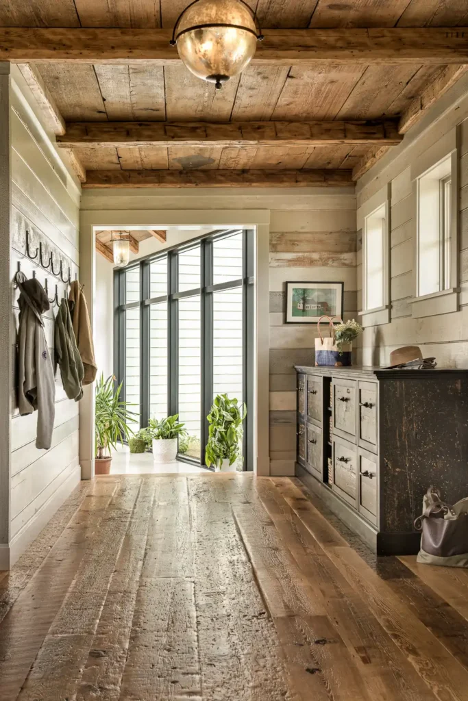
Meadow Ridge
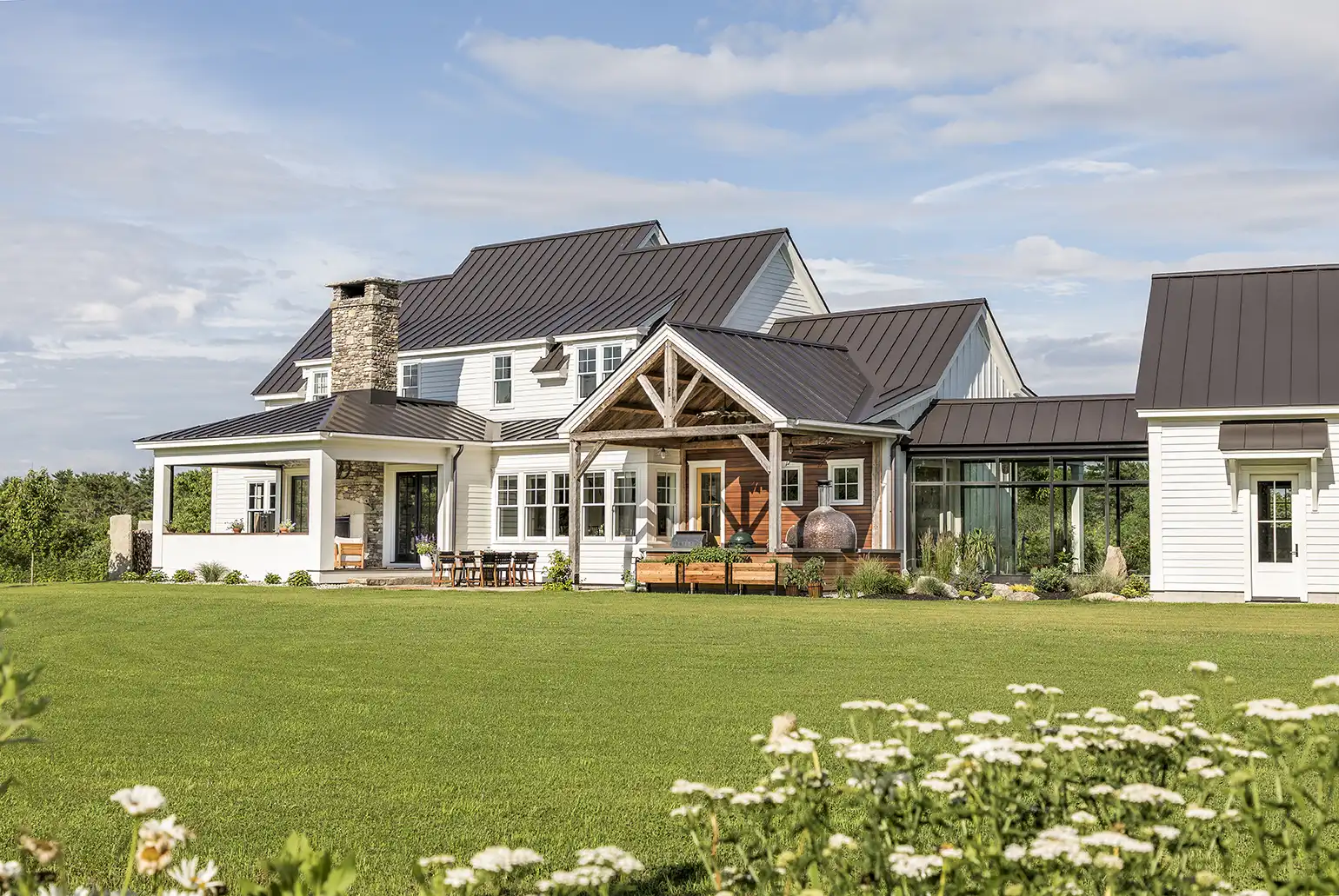
Nestled on a hill, this newly constructed home blends seamlessly with its surroundings, making it feel as though it has existed for over a century alongside the fully restored 1887 barn still standing on the property. The former farmhouse was too dilapidated to remodel, but the owners knew the now-restored barn was the anchor of the property, and they wanted to ensure it remained the focal point.
Knowing they wanted a home that feels like part of this history, the owners set out to create a farmhouse that blends with the surrounding landscape and barn while including some modern upgrades.
The design team approached the build with deep respect for what had existed on-site for over a century before. Salvaged materials from the former house appear throughout the new build. Floorboards worn smooth by decades of foot traffic became a mudroom built-in, ceiling beams were restored and installed in the new living room and kitchen, and one of the antique doors cleverly conceals a play space tucked under a run of stairs.
A sun-filled, glassed-in walkway connects the garage to the mudroom. Featuring rustic reclaimed wood ceilings juxtaposed against polished concrete and glass curtain walls, the walk creates a moment of modern contrast to the farmhouse aesthetic. Reclaimed flooring, a double-sided fireplace built from stones found on-site, and Vermont-made artisan light fixtures lend the home a grounded, historic feel.
Architect & Interior Designer: Kevin Browne Architecture
General Contractor: Zachau Construction
Landscape Architect: Gretchen Giumarro
Landscape Design + Installation: Rosengren
Landscaping
Mason: Green Island Stonework
Photographer: Jeff Roberts
Location: Pownal
Completed: 2025
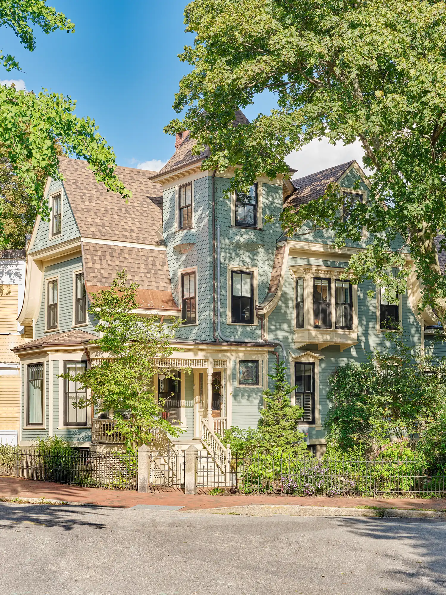
West End Residence
This project, located in Portland’s historic West End neighborhood, included a full renovation of a Victorian-style home’s interior while carefully preserving the exterior’s period-specific massing and detailing, as it is a landmarked house built in 1866. The existing interior of the house was plagued by structural issues, old, cracked plaster finishes, outdated wiring, single-paned windows that were drafty and nonfunctional, a lack of insulation in the walls, and outdated mechanical systems.
The original home had undergone countless renovations throughout the past century and a half, resulting in many awkward, disconnected spaces full of “Yankee ingenuity” that needed thoughtful architectural consideration to improve the home’s flow, quality of light, and safety.
Care was also taken to modernize its amenities and finishes to selectively complement the well-preserved historic elements that remained. Key high-use rooms in the existing layout, including the kitchen, dining room, and sitting room, were too small and enclosed for modern living and furnishings to be functional. The house had existing structural issues that needed to be corrected, allowing the opportunity to reimagine the existing wall layouts in the key living areas to open up the space to improve livability, while also giving functional access during construction.
The existing exterior shell remained intact throughout the project. New historic-style windows were installed throughout the house while the existing historic exterior trim remained original. Several exterior areas of the home received updated window arrangements to provide more natural light into the key living areas while maintaining the original design intent of the architecture. The process of fusing the old and the new produced a residence that represents its neighborhood: a place where modern urban living meets the historic sensibilities that have long made the West End a gem.
Project Manager: Brian Knipp
Architect + Builder: Barrett Made
Structural Engineer: L&L Structural Engineering Services, Inc.
Interior Designer: CK A+I and Barrett Made
Photographer: Erin Little
Location: Portland
Completed: 2023
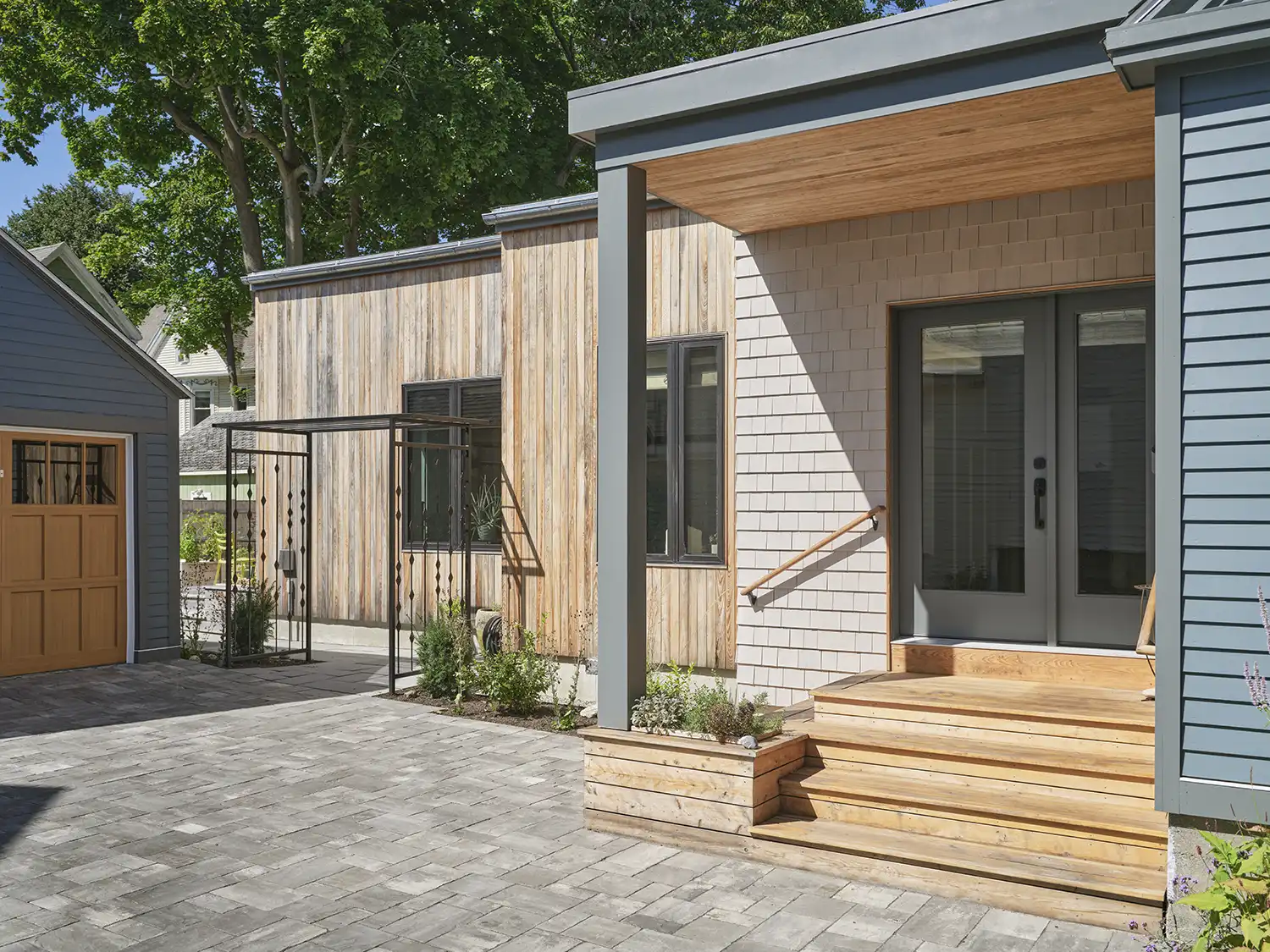
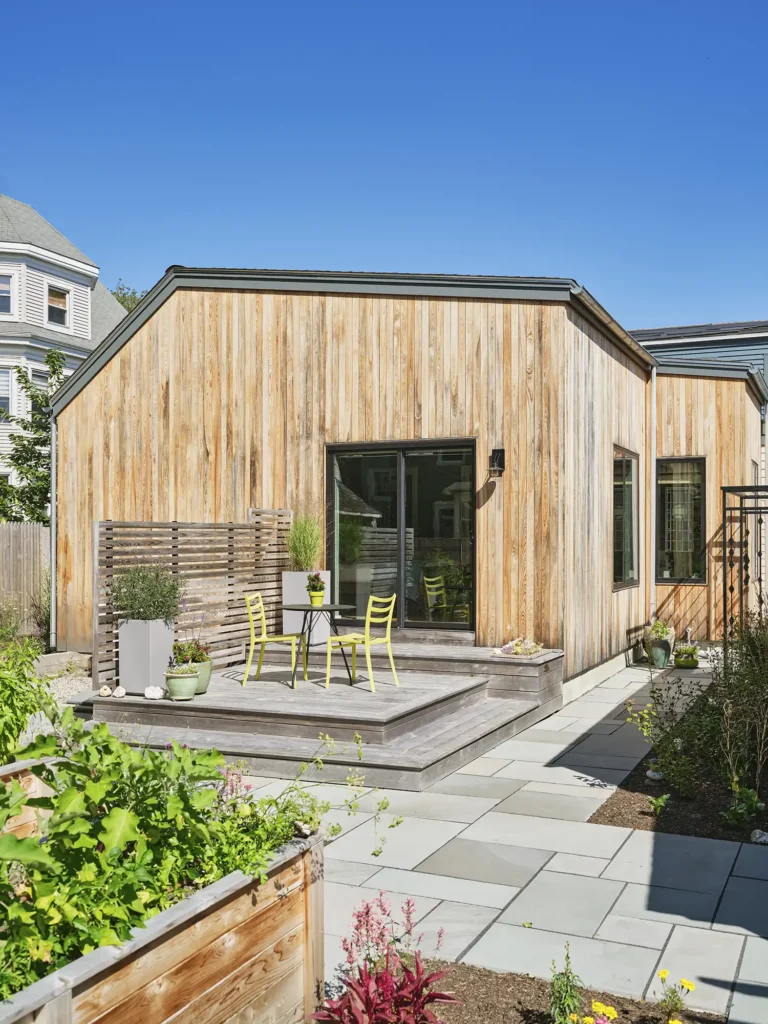
West End Garden House
Ground-up residential projects often start with a blank slate—a vacant lot or a quiet patch of woodland. However, this house, situated in Portland’s historic West End, began its journey on an existing garden plot. Nestled within one of Maine’s oldest and most cherished neighborhoods, this verdant oasis provided a unique and inspiring touchstone for the project. The garden had been well maintained for decades and was a visual staple of the neighborhood. It offered a natural respite for pedestrians navigating the dense fabric of the West End.
The main objective was to design an energy-efficient, sustainable house that would remain in dialogue with its surrounding landscape. BRIBURN began by locating the house on the southwestern end of the lot. This preserved as much vegetation as possible while also forming a central patio space to give a direct, landscaped connection to the owner’s existing home nearby (now occupied by extended family). Next, BRIBURN worked closely with the owner to minimize the building footprint and increase green space.
These two opening design moves were simple yet fundamental to the project’s successful integration with the garden. Recognizing the client’s meticulous attention to the garden, it was essential to design an exterior that would match this level of discipline. A durable exterior cladding layout that combines wood species, textures, and colors was developed to introduce another natural pattern within the landscape.
The lapped siding is black locust, a domestic, durable hardwood with varying grain patterns, stained a light silver to help “pre-age” its complexion and complement the surrounding greenery. To add contrast, the darker-stained cedar battens set a vertical rhythm across the facade. These horizontal and vertical lines define a module, which in turn helps generate the exterior features of the house.
Architect: Briburn
Project Team: Christopher Briley, principal; Samuel Day, project architect
Builder: Wright-Ryan Construction
structural Engineer: L&L Structural Engineering
Photographer: François Gagné
Location: Portland
Completed: 2024
House at the Water’s Edge
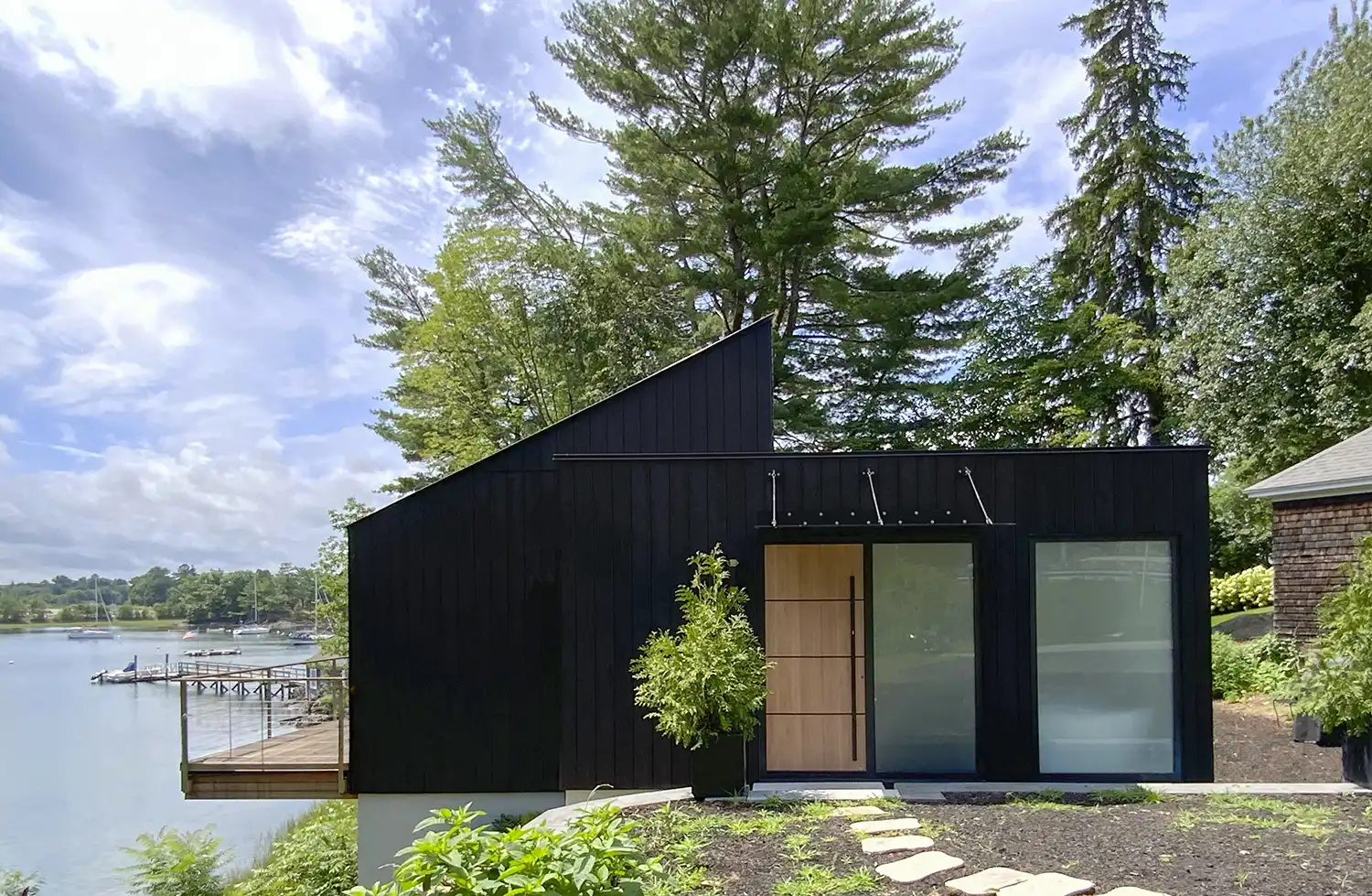
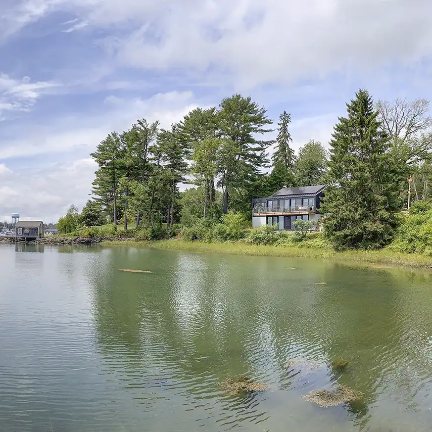
Built on a constricted parcel of less than two-tenths of an acre, this site would be unbuildable based on present zoning, but an existing grandfathered structure provided the footprint and volumetric constraints for rebuilding within the shoreland setback. The original foundation was salvaged and reused for a new residence that was built to exceed the International Energy Conservation Code. Zoning allowed for a small expansion to the west, but otherwise the house reorganizes the new plan within the perimeter of the original structure, incorporating the basement into the scheme.
The owners wanted a tight, efficient envelope that would be environmentally friendly and not reliant on fossil fuels. Taking advantage of the southern exposure, a solar array on the roof provides 50 percent of the home’s electrical needs, while heating, cooling, and hot water are provided through a series of heat pumps.
Triple-glazed tinted windows offer views out while providing passive heating in the winter. Clad in charred wood siding, the house recedes into its wooded backdrop, particularly from the water, not seeking attention. From the interior, the large expanses of glass allow the architecture to take a background role to the beauty of the cove and site beyond.
Architect: Elliott Architects
Project Team: Correy Papadopoli, Matt Elliott, Sarah Elliott, Maggie Kirsch, Elise Schellhase
General Contractor: MDB Design/Build
Structural Engineer: Albert Putnam Associates
Carpentry: Steve Stripto, Adam Fortin, Danny Dempsey
Landscape Designer: Edzui Sentkowski, Northeast Walls & Patios
Solar Array Design+Installation: ReVision Energy
Photographer: Corey Papadopoli
Location: Kittery
Completed: 2024
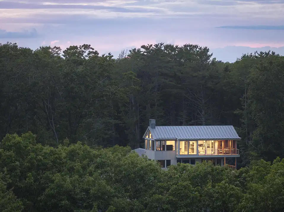
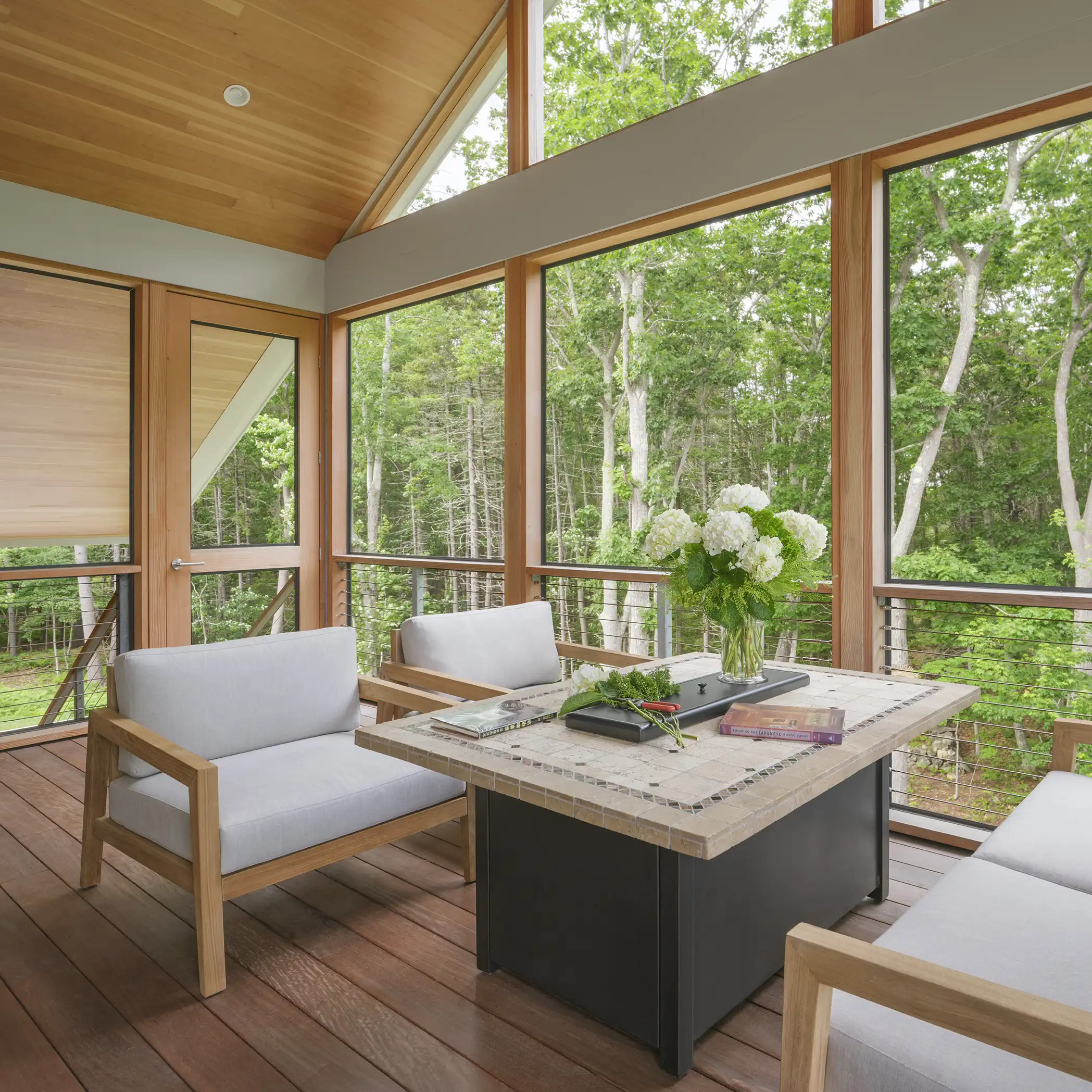
Squid Cove
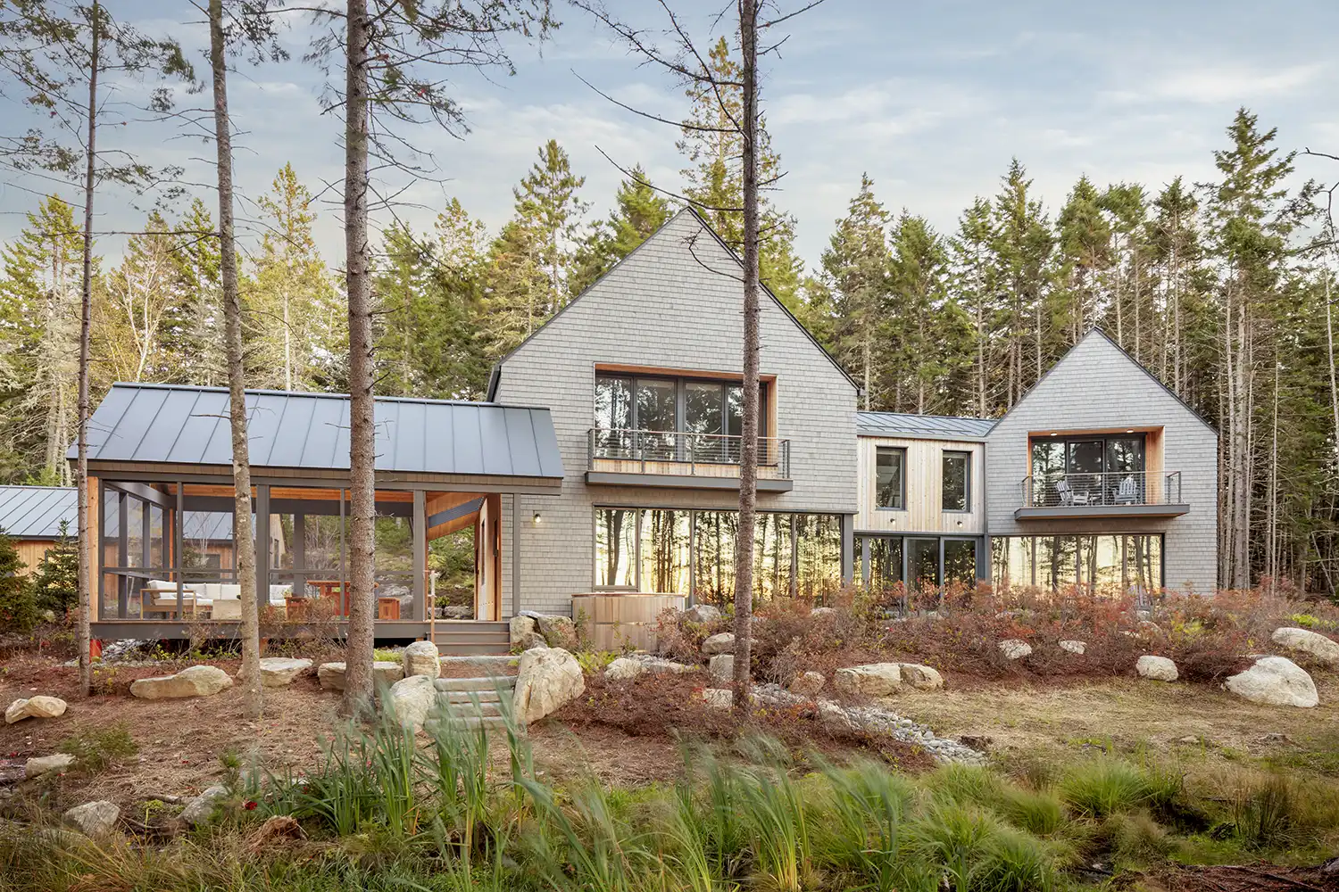
For decades, the clients rented a house in Acadia National Park to occasionally slip away for hiking, mountain biking, and sailing. In 2021 they purchased 15 acres on Mount Desert Island to facilitate longer and more frequent visits that would eventually transition to a permanent stay. The narrow property connects a sheltered cove on the east with an open bay to the west.
Setbacks from both shorelines and the parcel’s many wetlands limited buildable areas on the expansive parcel to just a few waterfront locations. With two coastlines to consider for home sites, the owners chose to embrace both. Coveside, a boathouse offers respite from mosquitoes on its screened porch and stores a small sailboat between daytrips. To the west, a new residence unfolds along the bay’s craggy edge.
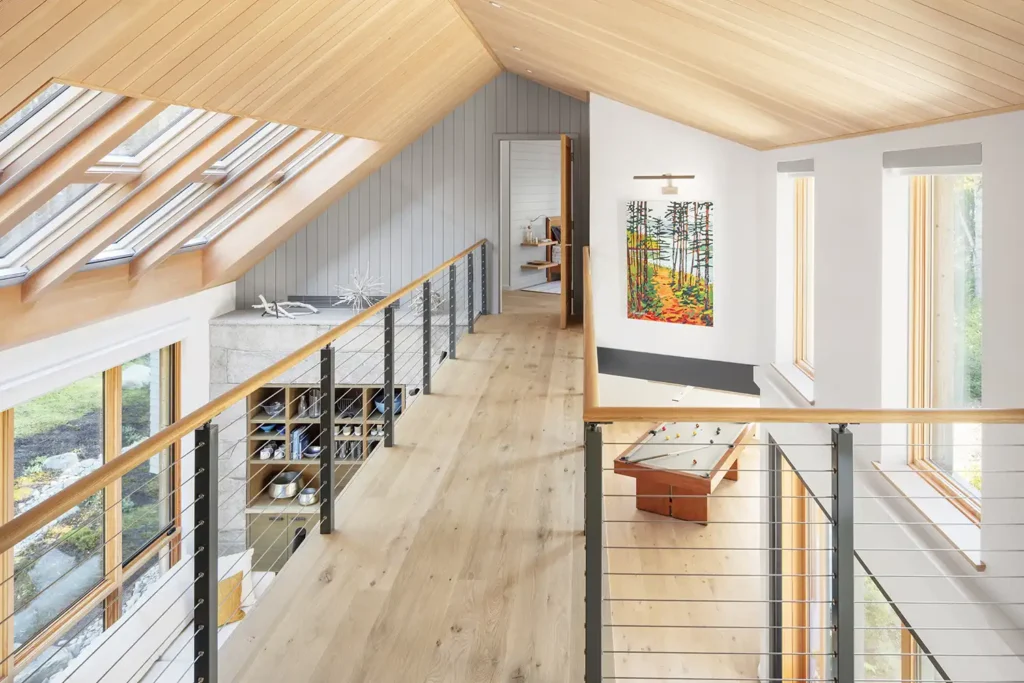
A stand of spruce shelters the building from the wind and waves, filtering 180-degree views through its trunks. The building mirrors this phenomenon and presents as a series of solids and voids, alternately opening to the environment and shielding more intimate spaces. Primary living areas cluster within two gabled masses bridged by a glassy connector. A continuous, clear ribbon of floor-to-ceiling windows and a 20-foot sliding door system wrap the lower level of the water-facing facade and defy the weight of the peaks above.
Each gabled form skews toward a unique view, staggering the interior’s open floor plan enough to create a sense of seclusion in rooms with no doors between them. Traveling through the home evokes exploration as one finds places to hide in plain sight or discovers new spaces around each corner. Reaching the respite of second-story sleeping accommodations requires journeying across a buoyant catwalk spanning the double-height central connector. Triple-glazed skylights bathe the elevated walkway and den below in southern sun.
Architect: Kaplan Thompson Architects
Builder: Peacock Builders
Structural Engineer: Albert Putnam Associates
Landscape Architect: Coplon Associates
Photographer: Irvin Serrano
Location: Mount Desert Island
Completed: 2024
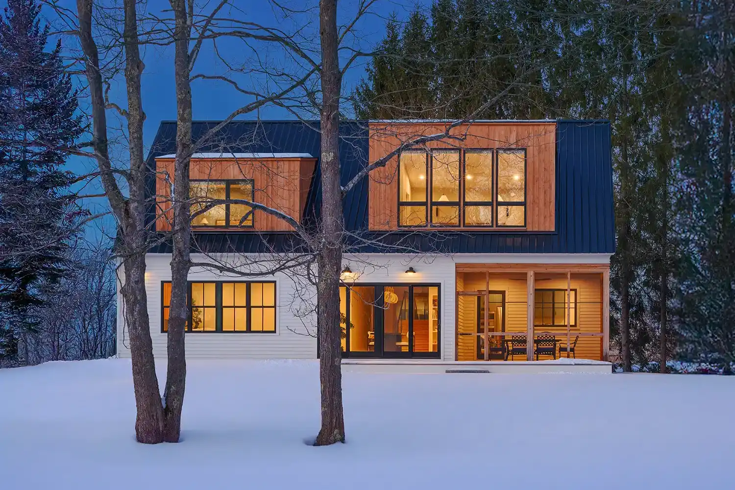
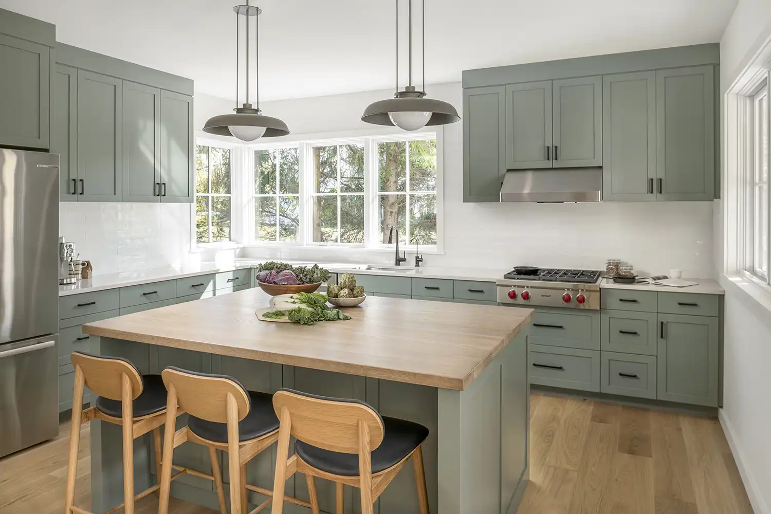
Sylvan Hill
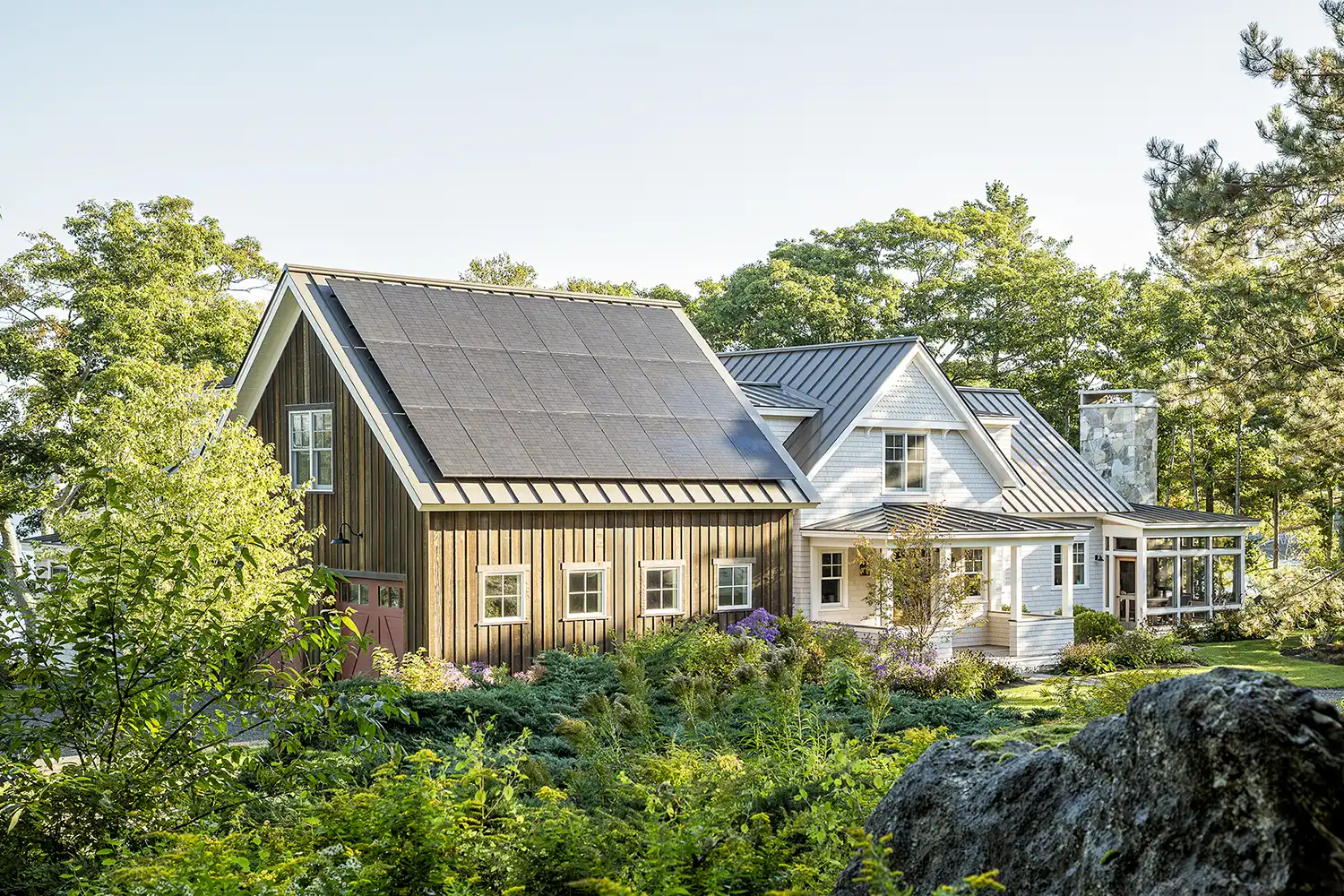
From the outset, the homeowners envisioned a high-performance home rooted in Maine’s architectural vernacular, blending historic charm with modern sustainability. The design features steeply pitched roofs, dormers, cedar shingles, and white-trimmed windows, reinforced by a welcoming porch and barn-inspired garage—hallmarks of classic New England architecture.
While grounded in tradition, the home is meticulously detailed to reflect modern craftsmanship and efficiency. Intricate millwork, refined trim, and historically inspired proportions elevate its aesthetic while maintaining warmth and familiarity. The open-concept living, dining, and kitchen areas seamlessly connect to outdoor spaces, ensuring both functionality and timeless livability. A first-floor primary suite supports aging in place, ensuring accessibility and adaptability for generational living.
Sustainability was seamlessly integrated without compromising the home’s traditional essence. A tightly sealed thermal envelope, wood fiber insulation, and sheep’s wool enhance efficiency while preserving the home’s natural materials palette. A rooftop solar array, energy recovery ventilation system, and ductless heat pumps further reinforce its low-carbon footprint. Cork flooring, hardwoods, and locally sourced stone maintain authenticity while prioritizing occupant health.
The landscape architecture continues this balance between historic character and ecological responsibility. Locally quarried granite is used for patios, walkways, and terraces, anchoring the home within its natural coastal setting. Native plantings and pollinator-friendly gardens not only enhance biodiversity but also provide a low-maintenance, seasonally rich landscape that evolves harmoniously over time. The design respects the site’s natural topography, ensuring a seamless integration between the built and natural environments while preserving the timeless charm of traditional Maine homesteads.
Architect, Interior Designer, Landscape Architect + Builder: Knickerbocker Group
Landscape Installation, Site Work + Excavation:
Back Meadow Farm
Electrical: Woods Electric
HVAC + Plumbing: Yereance & Son Plumbing & Heating
Audiovisual: Home A/V Solutions
Building Supplies: Hammond Lumber Company
Countertops: Morningstar Stone & Tile
Furniture: The Studio by Knickerbocker Group
Solar Panels: ReVision Energy
Tile: Old Port Specialty Tile Co.
Windows: Marvin Windows (manufacturer),
Hammond Lumber Company (supplier)
Photographer: Jeff Roberts
Location: Midcoast Maine
Completed: 2024
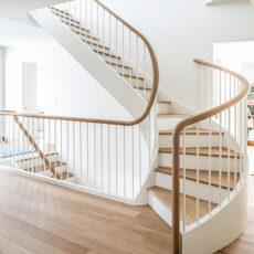
Hidden Gem
The clients approached Leslie Benson Designs after they bought a small Cape across the street from their existing Victorian house. The goal was to downsize, but it turned out that the 1,200-square-foot house was a bit too small for their spatial and programmatic needs. This led the design to take the shape of a full gut renovation with a single-story addition.
They asked for something “fun and funky.” The new 750-square-foot addition fulfills this with its boxy, asymmetrical, and wood-clad form. It is sited so that it’s barely visible from the street while containing a new main entry, mudroom, powder room, sitting room, and primary suite. The entry is housed under a flat roof connector to the existing house that now holds a reconfigured kitchen and living and dining rooms downstairs, with two bedrooms and a new full bath upstairs.
Heading toward the backyard, one can access the more private areas of the house, first passing through a high-ceilinged, sun-filled sitting room before entering the primary suite. Tall, sloped ceilings and large south-facing windows help to distinguish the experience of old and new.
A deck off the primary suite leads into a beautifully landscaped yard filled with raised-bed gardens, hardscape patios, and meandering wood-chipped paths lined with perennial plantings and fruit trees. The siting and design of the contemporary addition, paired with the historic-leaning renovation of the existing house, allow this project to keep its contextual, neighborhood appeal while still offering its inhabitants a bright, airy, and modern way of living.
Architect: Leslie Benson Designs
Builder: Cairn Building & Renovation
Interior Designer: Christina Rae Interiors & Homeowners
Structural Engineer: Structural Integrity Engineering
Landscape Designer: Catherine Hewitt
Hardscape Installation: Mike Mercier
Landscaping: Cashel O’Sullivan, Opus Fine Gardens
Photographer: Erin Little
Location: Portland
Completed: 2024
Dock Square Retreat
Designed for an artist and nurse, the retreat prioritizes spaces where natural materials, clean lines, and curated details foster family connection, creativity, and quiet reflection. Touching the property setbacks at three corners, the Kennebunk home maximizes a compact lot at the end of a dead end street, embracing both site constraints and budget with ingenuity.
Contemporary dormers punctuate the silhouette of the classic white farmhouse, directing views toward the protected forest at the rear of the property. Inside, exposed steel beams meet warm white oak finishes, creating a dialogue between structure and softness. Built-in niches, cabinets, and shelves provide curated spaces to display art books, paintings, sculptures, and collected objects. This creates a rhythm of personal moments woven throughout the home.
Every element, from light and texture to proportion, was considered to reflect the owners’ creativity and deep love for Maine.
Architect: Mobile Studio Design
Builder: Building Concepts Maine
Cabinetry: All American Woodworks
Photographer: Peter Morneau
Location: Kennebunk
Completed: 2025
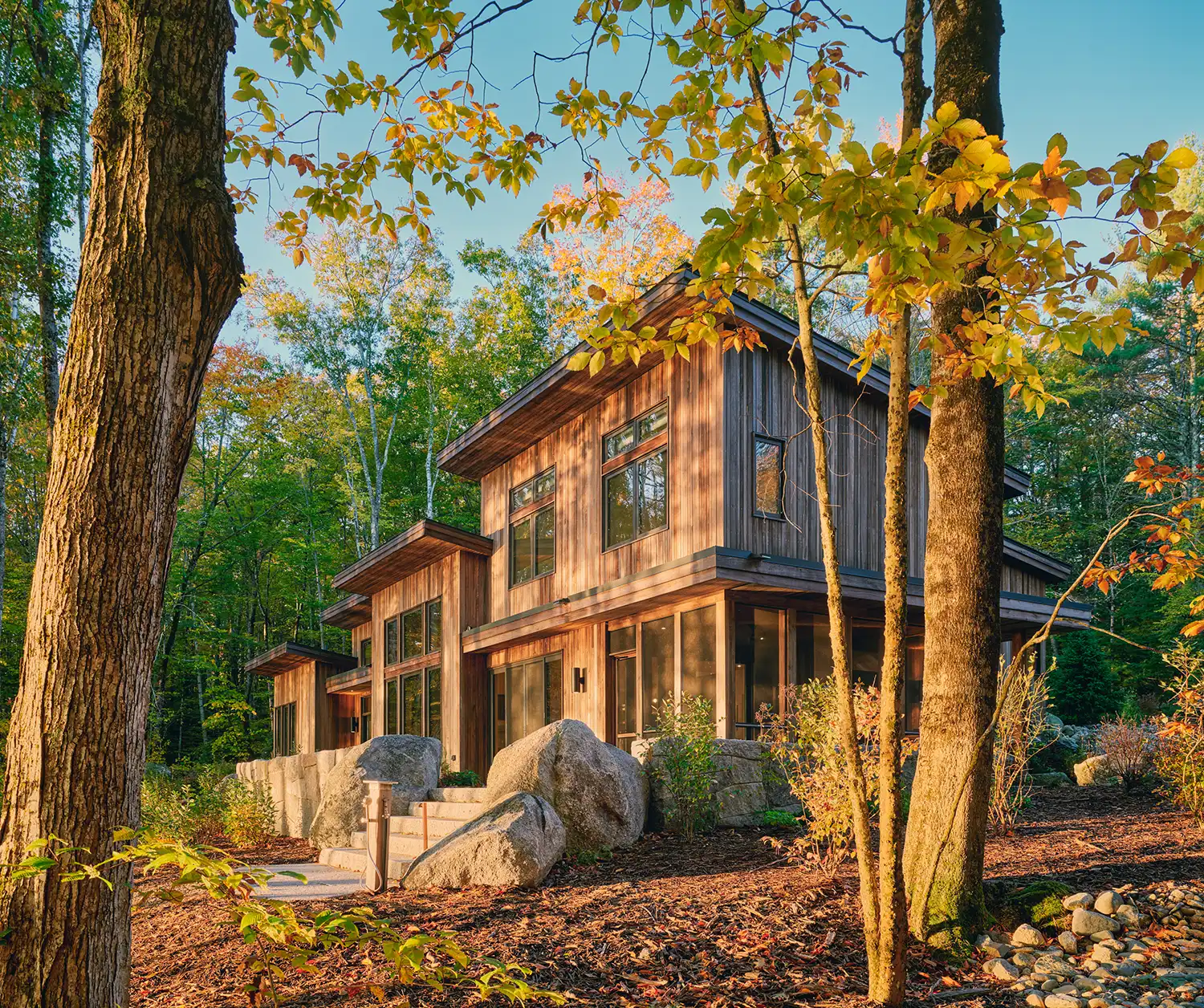
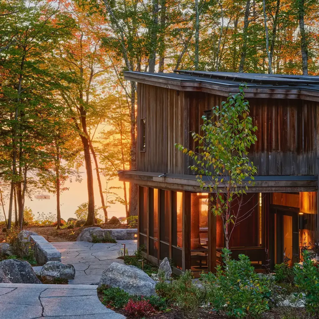
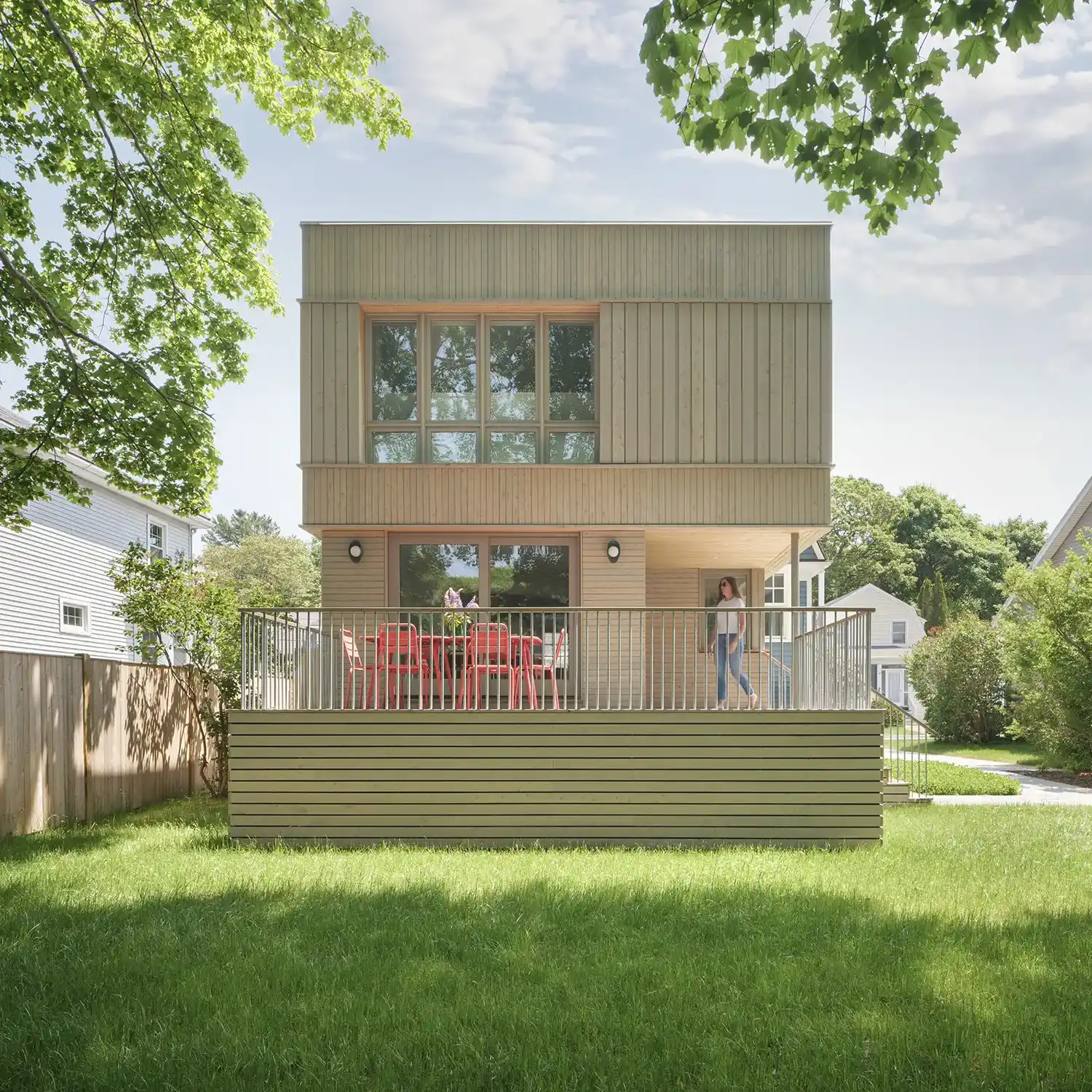
Elemental
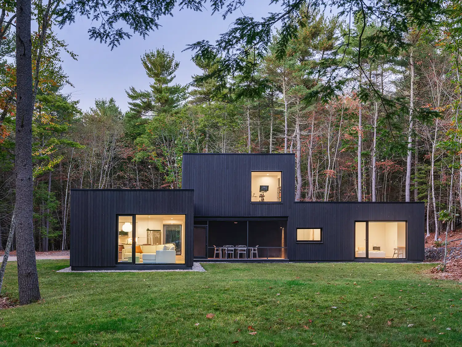
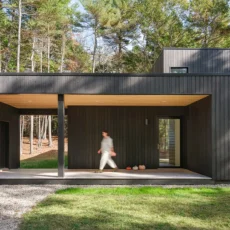
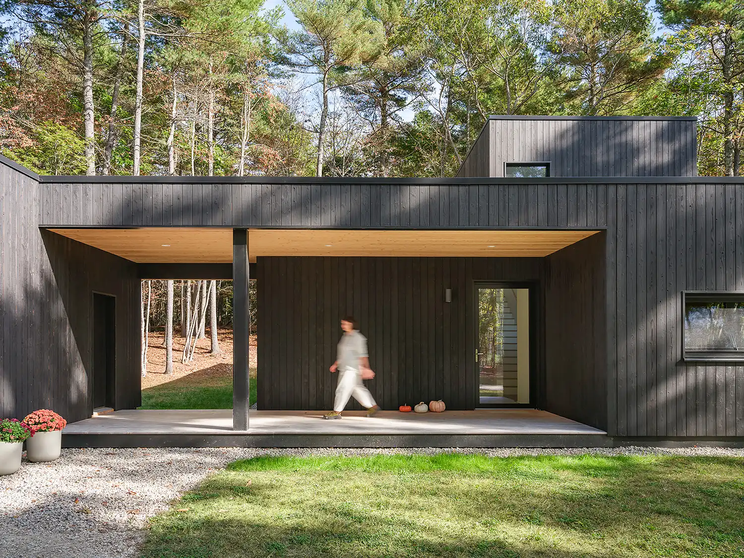
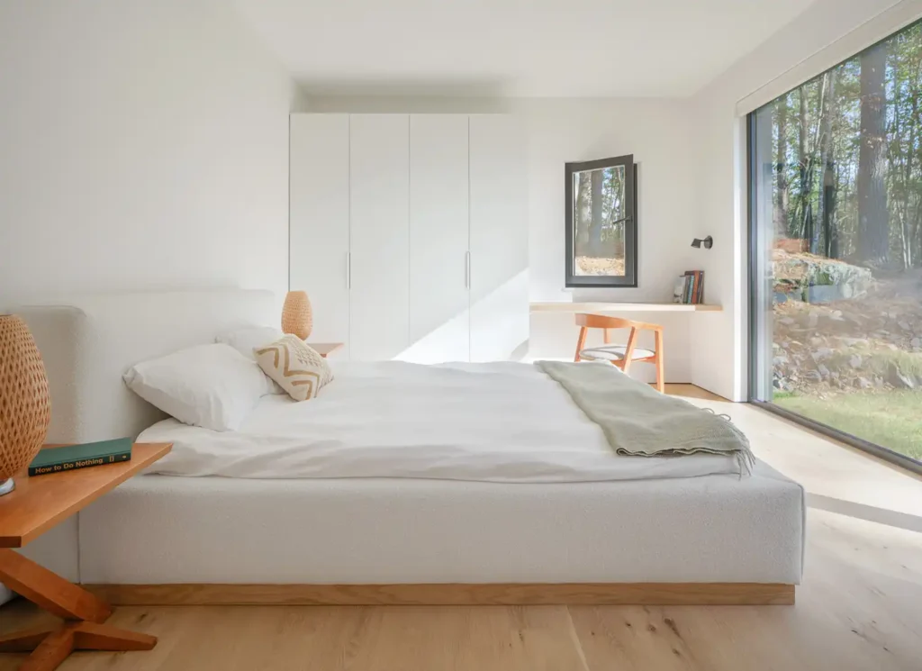
Elemental is a modern prototype starter home for a young family of four, designed to balance sculptural clarity with ecological performance. Sited on a wooded lot in southern Maine, the L-shaped plan shields a partially sheltered private yard from the driveway while creating multiple points of entry and moments of transparency that connect the interior to the surrounding landscape.
A carved entry porch links the home to a garage and workshop, while a screened porch extends the kitchen outdoors. The structure’s dark, charred-wood siding echoes the verticality of surrounding trunks and contrasts with the bright, ash-lined interior. Large floor-to-ceiling openings are carefully placed to frame views, bring daylight deep into the plan, and produce a lanternlike effect after dark.
Following passive house principles, Elemental is all-electric and designed for year-round comfort and efficiency. The building envelope features high levels of insulation, triple-pane glazing, and meticulous air sealing, paired with an energy recovery ventilation system that provides HEPA-filtered fresh air. The narrow form encourages cross-ventilation, while solar orientation supports passive heating in winter.
These strategies, combined with modest spans and a slab-on-grade foundation, create a cost-effective structure that achieves exceptional performance without sacrificing design quality. The flexible second floor provides adaptable “away space” for work, play, or fitness, allowing the home to evolve with the family’s needs. The siting, materials palette, and high-performance shell demonstrate how thoughtful design can meet budget and energy goals while enhancing a strong sense of place.
Architect: OPAL Architecture
Project Team: Riley Pratt, design partner; Alexandra Pagán, project manager; Dan Rodefeld, designer
Builder: StoneWood Builders
Structural Engineer: Thornton Tomasetti
Photographer: Trent Bell
Location: Southern Maine
Completed: 2023
Shingle-Style Guest Cottage
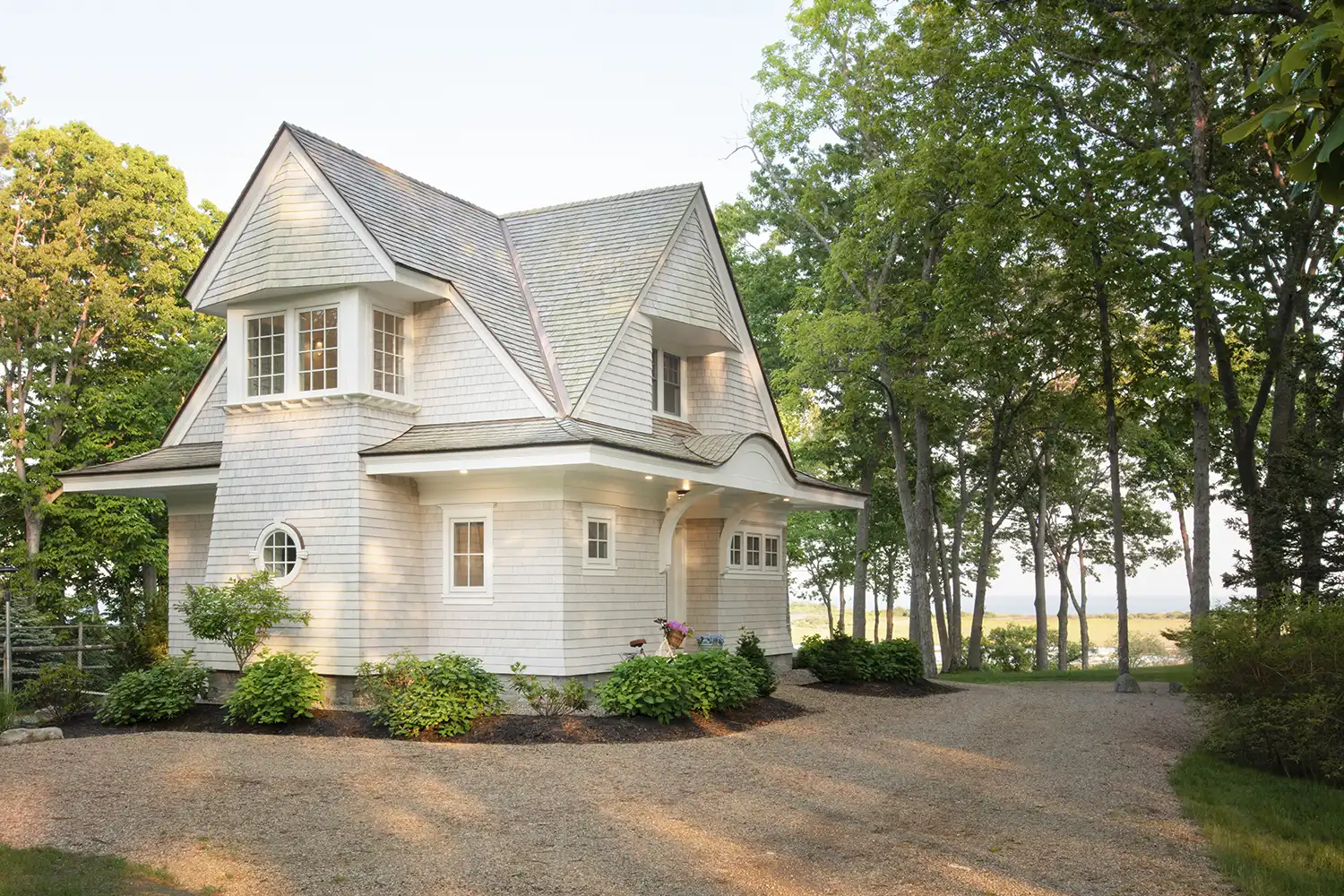
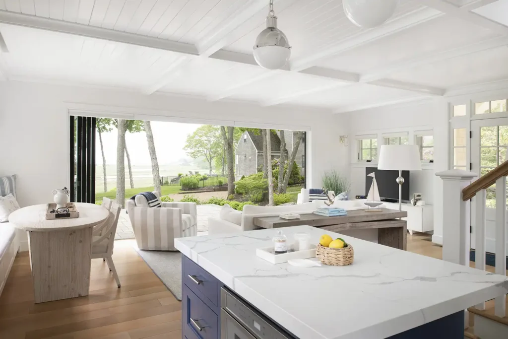
Set on a picturesque ocean- and marsh-front site, this 990-square-foot guest cottage was designed as a versatile retreat for guests and a temporary home for the clients while their primary residence undergoes reconstruction. Tucked into the footprint of a former garage, the new cottage meets accessory dwelling unit size restrictions while maximizing spatial efficiency, coastal views, and architectural charm.
Designed for a pair of active, tennis-loving homeowners, the structure is conveniently located near the property’s tennis court and blends shingle-style elegance with functionality. A 16-foot panoramic bifold door opens the living space directly onto the patio, highlighting seamless indoor–outdoor living. Above, a private deck with a curved rail detail softens the massing and mirrors the eyebrow entry below. Exterior materials are rooted in regional tradition and context: white cedar shingles with a weathering stain and a red cedar shake roof allow the home to settle naturally into its coastal surroundings. Nautical motifs appear throughout, including a round captain’s window and a porthole detail on the first-floor bathroom door. Inside, a serene palette of soft blues and whites enhances the home’s breezy, maritime feel.
Though technically a one-bedroom residence, a sleeper sofa adds flexibility for additional guests. Careful planning allows the compact floor plan to feel open and livable, supporting a variety of uses without sacrificing comfort or character. The result is a charming, compact coastal cottage that balances personality and practicality, making it a perfect fit for the property and a meaningful addition to the homeowners’ evolving lifestyle.
Architect & Interior Designer: TMS Architects & Interiors
Principal: Jason Bailey
Builder: Greenier Builders
Interior Designers: Margo Villandry, Weekender House; Christian Daw, Christian Daw Design
Photographer: James Reed
Location: Coastal Maine
Completed: 2023
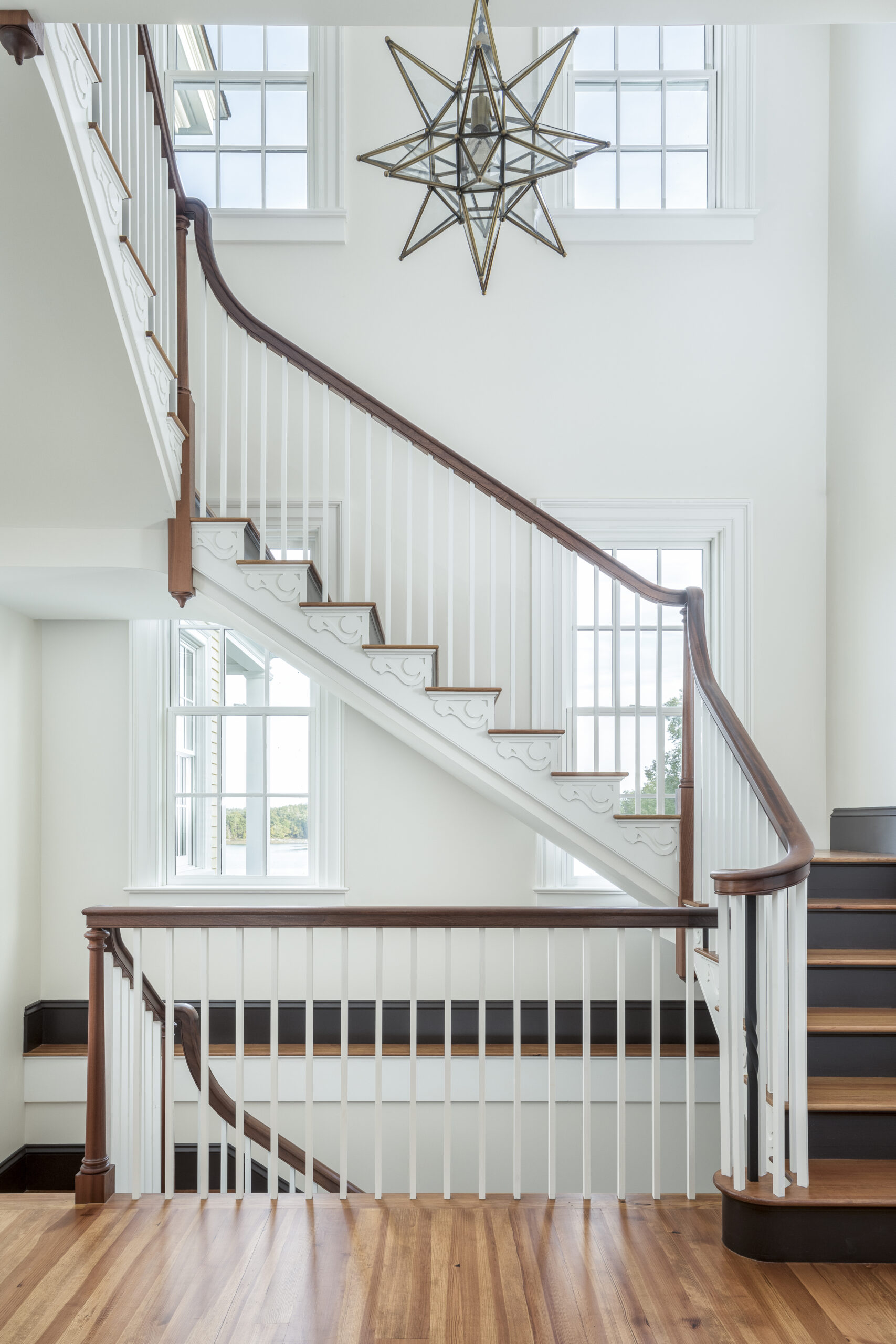
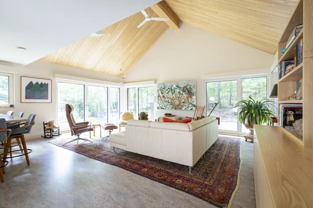
Tree Tops
Tree Tops is a site-specific home designed to serve the needs of a professional couple and their extended families. The property has distant views of the coast and outer islands. The Whitten Architects team worked with the clients to design a multilevel home with privacy and outside living spaces in a developed subdivision.
The design features a lower level walk-out with gym and golf simulator area; entry-level front hall, mudroom, guest suite, and open-riser stair; second-level primary suite and shared home office; third-level guest suite; and fourth-level open-plan living, dining, and kitchen space with screened porch and view balcony. An exterior stair with porches provides private outside access to all levels.
Architect: Whitten Architects
Project Team: Rob Whitten, principal; Roo Collins, project architect; Jesse Patkus, designer
Builder: Bowley Builders
Structural Engineer: Albert Putnam Associates
Cabinetry: Derek Preble
Landscape Designer: Callahan + LeBleu
Photographer: Trent Bell
Location: Kennebunkport
Completed: 2024
Big Water Camp
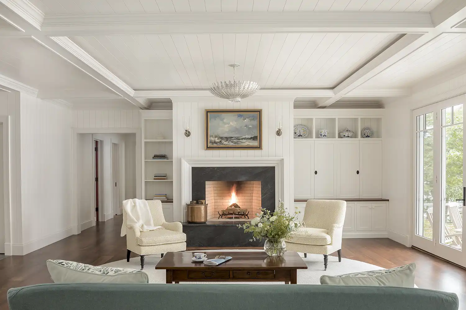
Situated along the shores of Sebago Lake, this three-bedroom waterfront home is thoughtfully designed to engage its pristine natural setting. Taking advantage of 400 feet of shoreline and a private beach, the home emphasizes a strong indoor–outdoor connection through expansive glazing, a shed roof oriented toward the water, and a fully retractable glass wall that opens the main living areas to a screened porch. The architecture blends a “soft modern” sensibility with midcentury influences, featuring dark-toned natural wood siding and a metal roof that allows the structure to recede into the surrounding landscape.
A large photovoltaic array on the shed roof supports the home’s net-zero energy goals. Interiors are warm and serene, defined by ash-clad walls and ceilings, white oak floors, and rough-sawn hemlock timbers, achieving a fine yet rustic aesthetic.
The open-plan kitchen, living, and dining areas are flooded with natural light and lake views, with a generous skylight positioned above the kitchen. The surrounding landscape, composed of native Maine plantings and a stone terrace, offers a seamless transition between built and natural environments. The primary suite includes a private patio and outdoor shower, while guest bedrooms on the upper level also enjoy uninterrupted lake views.
Architect: Winkelman Architecture
Project Team: Will Winkelman, principal; Michael Ritchie, project architect
Builder: R.P. Morrison Builders
Interior Designer: Morrison Design House
Structural Engineer: Albert Putnam Associates
Landscape Architect: Richardson & Associates
Photographer: Sean Litchfield
Location: Raymond
Completed: 2024
Willard Cube
A renovation and expansion in South Portland’s Willard Square brought new life and a bold contrast to a classic gambrel-style cottage. With two growing kids and both parents working from home, the original layout no longer met the family’s needs. From the outset, the homeowners were open to doing something different. Instead of mimicking the existing architecture, the new addition embraces a contemporary, cubist form clad in eastern white cedar.
With the clients’ appreciation for cooking and dining together, kitchen space was a priority. Fully reimagined and built by Woodhull, the kitchen features warm cherry cabinetry that’s both beautiful and unexpected, as well as a built-in bench for seating at the dining table. What was once a tight, outdated layout is now open and flowing, with space for the family to cook, eat, and connect without sacrificing the generous backyard they loved. Along with a new office to accommodate the couple working from home, a primary suite above allows more privacy for the entire family.
Updates to the original house include new windows, fresh siding in a deep blue, and a thoughtful reconfiguration of the entryway to add storage and a powder room. Throughout, the focus was on texture and tone, subtle shifts in siding orientation, and deeply inset windows that create shadow lines that bring quiet richness to the exterior. From day one, the clients were open to something bold, and the result is a respectful contrast: a home that bridges old and new, practical and expressive, in a way that feels entirely its own.
Architect, Builder + Millwork: Woodhull
Project Team: David Duncan Morris, principal; Ali Ward, architectural designer; Dee Dee Germain and Ben Brown, builders; Scott Stuart, Thomas Strayhorn, Nicky Sontag and Jordan Gehman, millwork
Structural Engineer: Structural Integrity Engineering
Photographer: Trent Bell
Location: South Portland
Completed: 2024
2025 ARCHITECTURE LISTING—COMMERCIAL
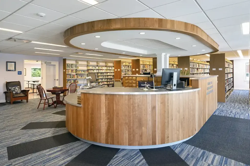
Louis B. Goodall Memorial Library Addition/Renovation
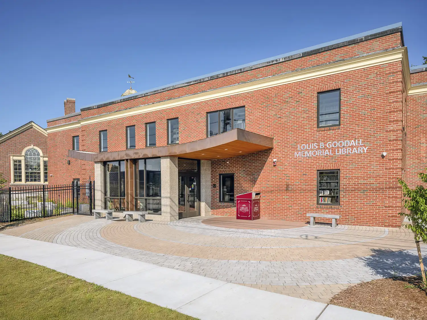
Barba and Wheelock redesigned the Goodall Library, creating a new and inviting entry experience, adding much-needed meeting spaces in a rear addition, and undertaking a comprehensive interior renovation. The 1937 massing of the Louis B. Goodall Memorial Library is a Georgian Revival one-and-a-half-story, tripartite building. The structure’s brick facade, topped with a slate roof and a domed cupola, was designed by Sanford native William O. Armitage. A
substantial two-story addition was constructed in 1976, connecting to the rear elevation of the original massing with a one-story hyphen. This project includes the removal of the existing circa-1990 vestibule and reimagining the entry vestibule as a transparent filter for welcoming patrons, thus providing the library staff with full visibility of approaching visitors. The upward-curving cantilevered roof transforms the basic 1976 addition and creates a memorable, iconic entry to the beloved library.
A larger, two-story addition attaches to the rear of the 1976 addition, allowing additional meeting rooms, storage, staff work rooms, and a walk-up book drop directly to the staff room. The two-story addition incorporates modern, locally produced masonry materials; compatible colors will complement, but are distinguished from, the 1976 and 1937 brick masonry facades as products of their own time.
Architect: Barba + Wheelock Architecture
Builder: TPD Construction
Photographer: Dave Clough
Location: Sanford
Completed: 2025
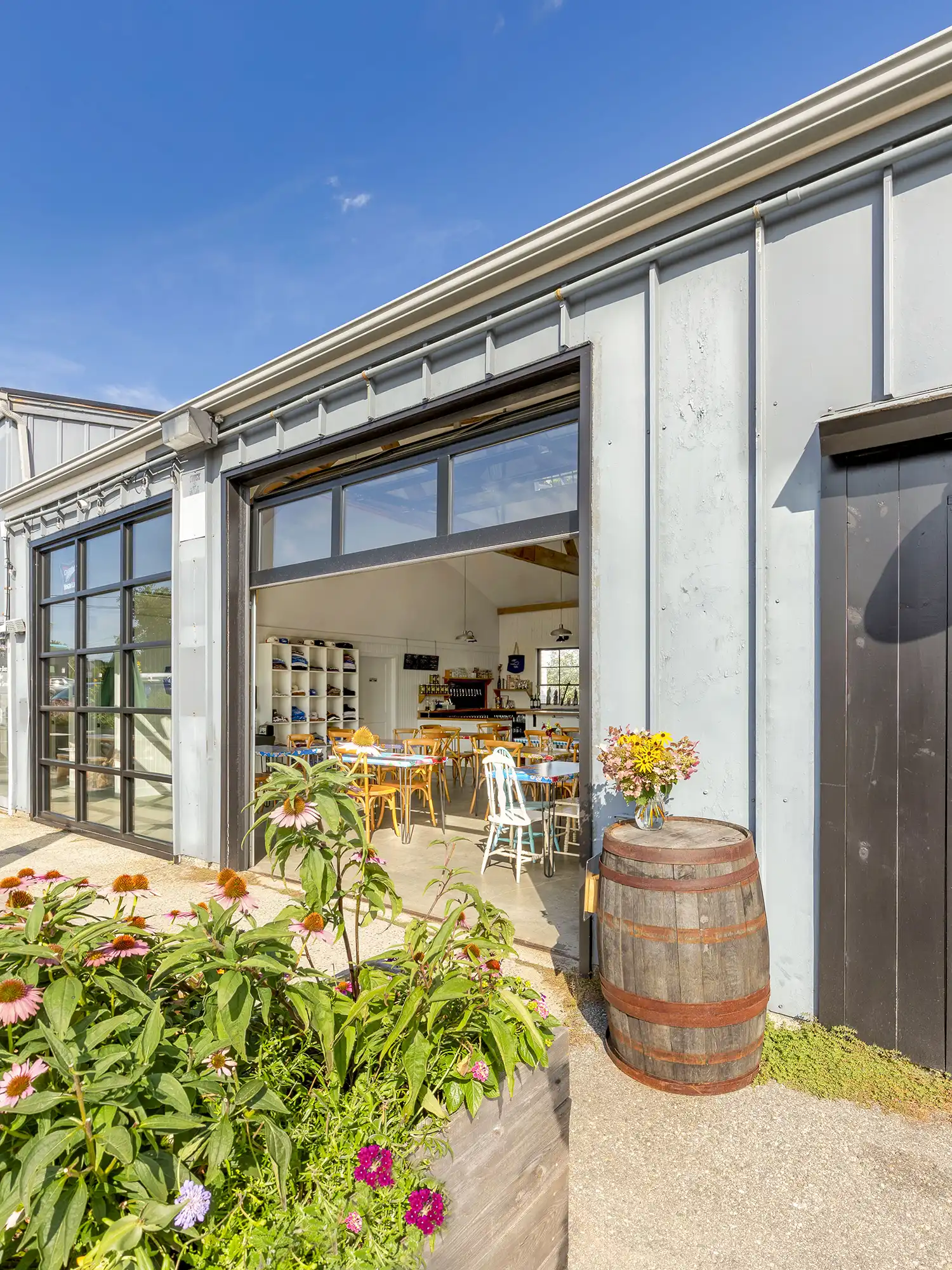
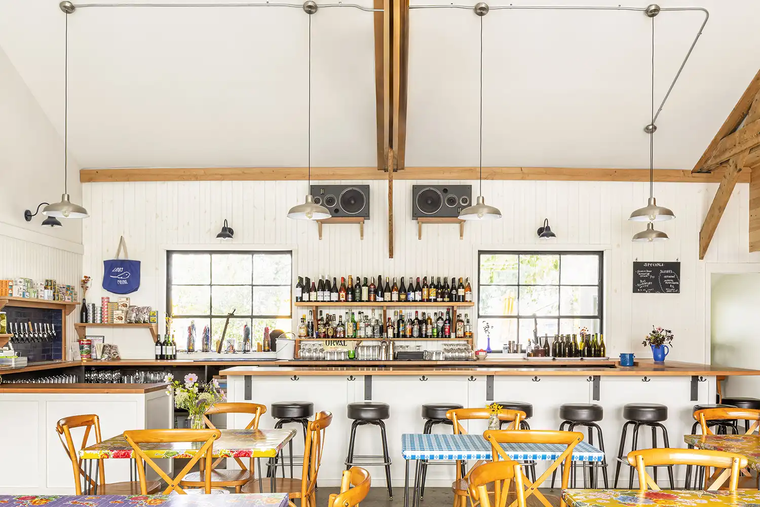
Lambs
Lambs was designed and built in tandem with Night Moves Bread, both moving into neighboring sides of a recently vacated auto mechanic’s shop. The space underwent a complete gut renovation to transform from a dingy and rundown industrial garage into a bright and airy bar. The bar now comprises two of the three original garage bays, whose openings have been infilled with a new full-light garage door and storefront system.
These bring in tons of light, and when the garage door is open, the cross-ventilation through the space makes it feel as if you’re sitting outside. Vaulted ceilings, with exposed original wood trusses provide height and openness, while a new alcove with built-in banquette seating offers a more intimate space. Situated along the back wall, the main bar looks out onto the tidal Fore River through two original pivoting steel-framed windows.
The materials palette is simple, consisting of wood paneling painted in shades of white and green, white drywall, refinished concrete floors, and the warm tones of wood at the trusses, bar top, and alcove. Bright oilcloth-clad tables and simple lighting create an approachable and comfortable atmosphere.
A new doorway was added to the back of the building to provide access to outdoor seating, situated on a sliver of land sandwiched between the building and the river. A second, back bar area provides window service for the outdoor area, where you can sit at picnic tables, soaking up the heat of the afternoon sun while taking in the beautiful views.
Architect: Leslie Benson Designs
Builders: Jimmy Rodney and Ross Spencer
Structural Engineer: Structural Integrity Engineering
Photographer: Myriam Babin
Location: South Portland
Completed: 2023
Rice Public Library
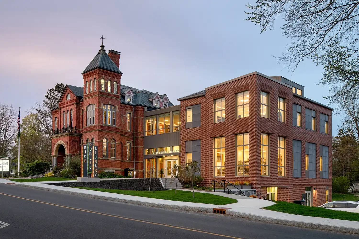
Completed in 1888, the Rice Public Library has long been a cherished community landmark, known for its welcoming presence and wide range of public programming. For decades, the library operated across two buildings on either side of Wentworth Street in downtown Kittery: the original Rice building and the Taylor annex, added in 1988 to expand the collection. Listed on the National Register of Historic Places in 1979, the original Rice building remains an architectural highlight of Kittery Foreside.
In 2018 the town committed to restoring and expanding this historic structure, consolidating all collections under one roof and making the building fully accessible. Simons Architects, in collaboration with Lassel Architects, designed a 10,400-square-foot addition that provides staff and patrons with a flexible, open environment suited to both current needs and future growth.
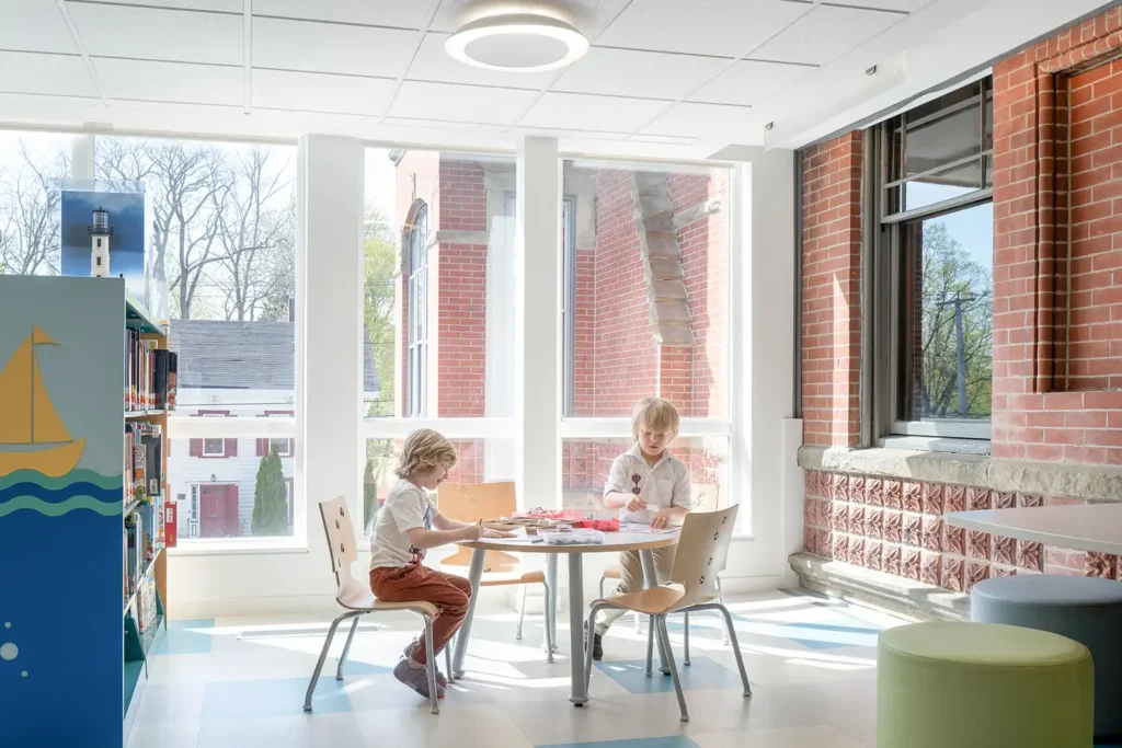
The expansion introduces a large, subdividable community room and makerspace on the first floor, enabling more robust programming and extended access for after-hours films, lectures, and events. The leading entry floor houses most circulation functions and features a bright, inviting reading room with expansive windows overlooking downtown. On the second floor visitors can access the historic Almyra Roberts Reading Room, featuring dedicated spaces for children’s and young adult collections and activities.
This thoughtful blend of restoration and modern design ensures that the Rice Public Library continues to serve as both a cultural landmark and a vibrant hub for learning, creativity, and community engagement.
Architects: Simons Architects and Lassel Architects
Builder: Wright-Ryan Construction
Structural Engineer: Thornton Tomasetti
Mechanical Engineer: Ripcord Engineering
Photographer: Ryan Bent
Location: Kittery
Completed: 2023
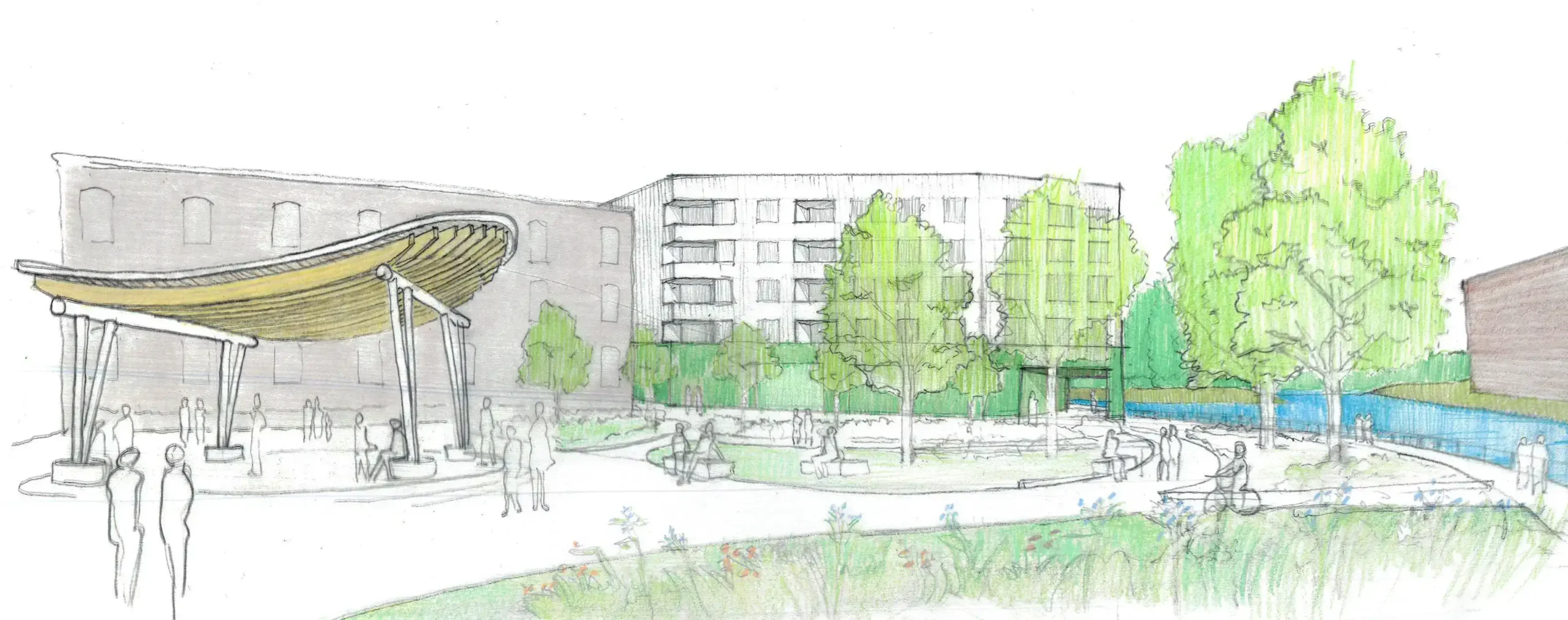
Seavey Terraces
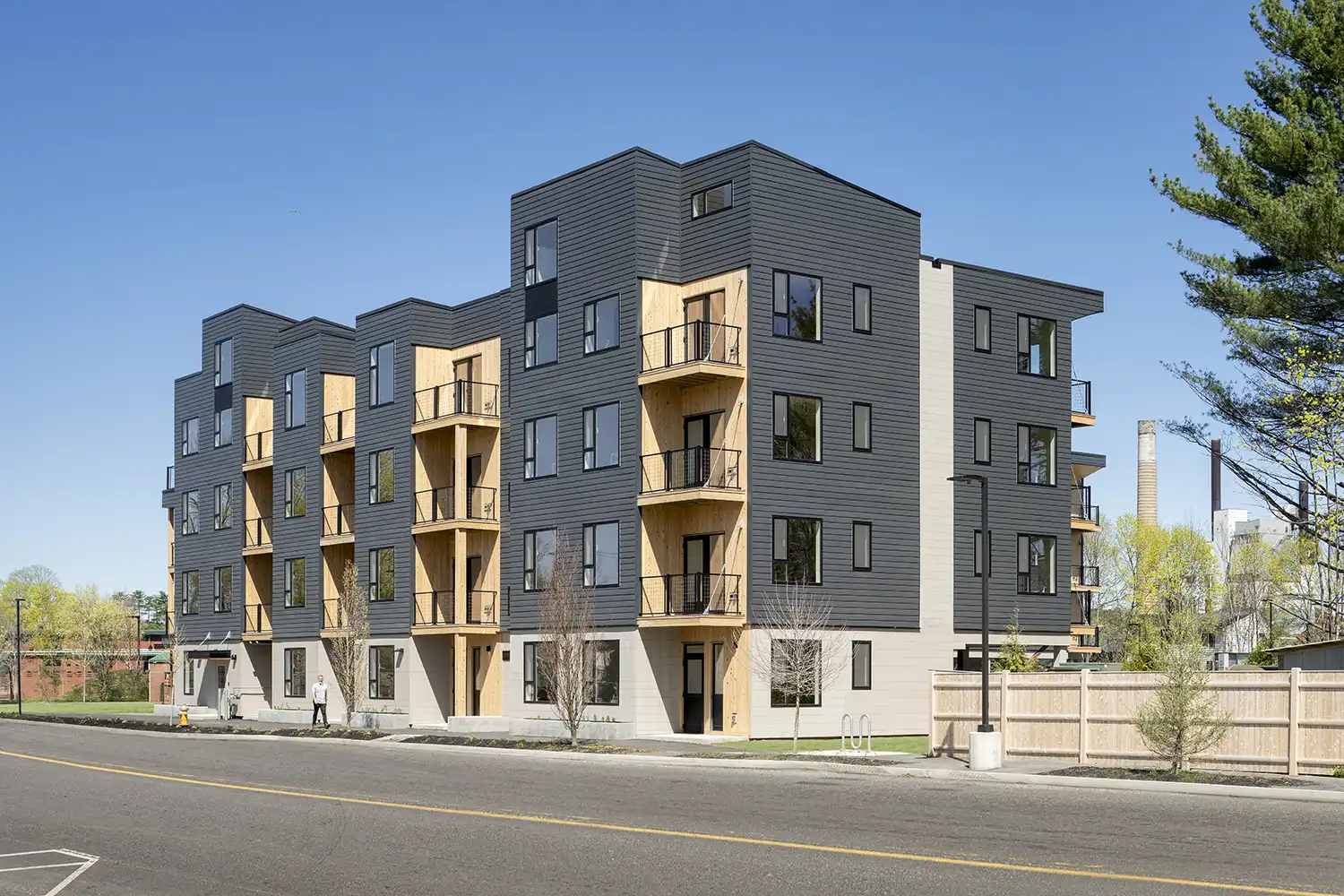
An innovative infill housing project on a challenging brownfield site beside an old railroad siding, Seavey Terraces in downtown Westbrook is the first of three buildings in a diverse 184-unit, pedestrian-centric redevelopment. The design extends the existing city fabric, strengthens neighborhood connections, and creates a vibrant, human-scaled streetscape. The site plan accommodates a mixed demographic, with unit types for graduate students, workforce housing, subsidized rentals, and residents aged 55 and older. This inclusive model fosters a diverse, representative community that will contribute to Westbrook’s ongoing growth.
Developed through a joint effort between for-profit and not-for-profit developers and long-term property operators, the project advances the goals outlined in Westbrook’s Comprehensive Plan, Downtown Revitalization Study, and Downtown Streetscape Plan. The building features bright, daylit living spaces; a highly efficient, fully electrified heating and cooling system; high-performance windows; and panelized construction. The envelope incorporates continuous exterior insulation and locally sourced wood-cellulose cavity insulation, achieving an exceptional air-infiltration rate.
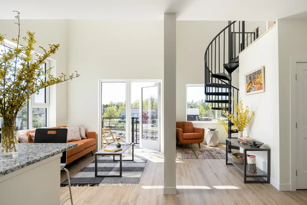
This initial 64-unit building, currently leased as graduate student housing, offers a mix of one- and two-bedroom units. Street-level residences have individual front porch entries, while upper-level units include balconies and lofted volumes. The articulated street-front presence provides a familiar scale of private entries, semi-public spaces, and a vibrant, complete street lined with shade trees and plantings.
Architect: Simons Architects
Builder: Hebert Construction
Structural Engineer: Thornton Tomasetti
Mechanical Engineer: Design Day
Landscape Designer: Rasor Landscape Architecture
Photographer: Ryan Bent
Location: Westbrook
Completed: 2025
East Coast Cannabis
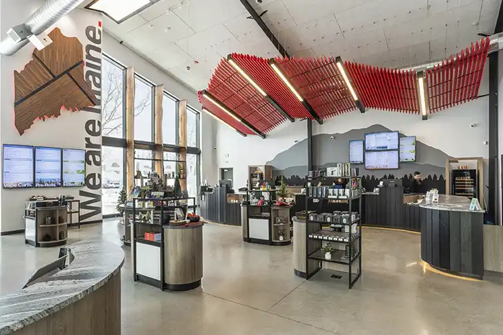
East Coast Cannabis set out to reimagine what a dispensary could be—envisioning a boutique retail environment that would set a new standard in Maine’s competitive cannabis market. Their goal was to create a space that embodies their premium brand, Live the Adventure, and offer customers an immersive, memorable experience from the moment they arrive.
WINTER HOLBEN brought this vision to life through a fully integrated design approach—uniting brand strategy, architecture, interiors, and experiential graphics into one cohesive concept. The challenge was to transform part of a newly constructed industrial metal building into a flagship destination that feels as elevated and adventurous as the brand itself.
The resulting space seamlessly blends rugged Maine character with refined contemporary design. Distinctive brand elements shape the customer journey, from the dramatic red, mountain-shaped canopy over the retail bar to custom fixtures and millwork that reference the state’s natural landscapes. Environmental graphics and carefully curated materials carry the brand’s story throughout the store, while strategic lighting, spatial flow, and sight lines create a sense of discovery and connection.
Opening in Eliot in 2025, the flagship store quickly drew attention as an award-winning retail destination. More than just a store, it serves as a physical expression of East Coast Cannabis’s identity, welcoming customers into a world where high-quality products, local pride, and design excellence converge.

Architect: Winter Holben
Fixtures: Orion Red
Signage/Graphics: Sundance Sign
Photographer: 16 Hoops
Location: Eliot
Completed: 2025