Neighbors, Friends, and Friends of Friends
Word of mouth helps a budget-conscious couple build an eco-friendly, modern home
The architects I know often talk about how they choreograph the approach to a house. If the location is beautiful, there’s always the possibility of arranging sight lines and pathways for a big reveal: the “Wow!” of the view. I get this “wow” when I visit Carol Morris and Barry Salter’s home in Kennebunkport, but only after I get a chuckle, greeted as I am by four chickens. They were pecking by the front door when I stepped out of my car. I notice them at the same moment I see Salter seated at a table inside, raising his arm for a hello. The next thing I know, the door is open and three dogs are pushing forward for their own greetings. I hear Salter ask, “Are you OK with dogs?” I’m not—terrible phobia since girlhood—but I lie and say I am, because the three animals pressing forward are so friendly. Ditto Morris and Salter, who were just behind them. Somehow it seems right that friendliness should so overwhelm me at the doorstep, since friendliness was, in a manner of speaking, what got the house built.
Morris and Salter have lived in Kennebunkport since 2003. In 2012, despite their fondness for their previous house and land, the latter cut through by a tidal river, they were ready to downsize. Morris was still self-employed as a communications outreach consultant, and Salter was beginning to consider retiring after four decades of work as an internist in York. They weighed their options, including the possibility of moving to Portland. But they kept stumbling over their love for their land. Because they had four acres, they wondered if they could sell their existing house and carve off a portion of the land to build anew.
Even if they could, they didn’t imagine working with an architect. It would be too pricey, they reasoned, especially given that downsizing was partly about budget. A year later and still mulling things over, Morris, who is an interior design enthusiast, was flipping through an issue of Maine Home+Design and saw an article about a small house. It was open to its surroundings, topped with a green roof, and designed by architect Will Winkelman of Winkelman Architecture in Portland. Morris thought, “I could live in that.” Some time later, Morris shared her thoughts with a friend from down the road, landscape architect Todd Richardson of Richardson and Associates in Saco. Coincidentally, Richardson and Winkelman are frequent collaborators, so Richardson offered to make an introduction. It turned out that, with a budget-conscious builder—Ben Trout of Trademark in South Portland—and a creative yet simple design from Winkleman, Morris and Salter could afford what they wanted. And Richardson could be part of the project, too, helping to locate the house in a spot where (given wetland setbacks and regulations) the couple hadn’t even known they could build: on a plateau overlooking the river ravine, just above the spot where fresh water burbles noisily into salt. This is the “wow” that I see through large windows when I first enter the house.
Morris and Salter wanted an affordable, forwardthinking, environmentally conscious house with modern, industrial design, minimal ornamentation, clean surfaces, a green roof, and a shower sans bath for the owners’ bathroom. As a doctor, Salter is all too aware of how many older patients slip in the bath. Morris pointedly didn’t want anything shiny. They wanted to be able to live on one level.
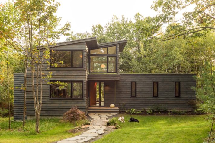
For cost effectiveness, “simplicity is your mantra,” says Winkelman, and this belief happily dovetailed with other priorities. “When you have a view-oriented site, very frequently the shape of the plan is a long thin rectangle, so every space lines up to get a view, instead of some spaces being behind other spaces,” Winkelman adds. He designed a singlestory rectangular form with a flat grass roof, almost like a shoebox with green hair, which is to the right when you arrive at the house. To the left is a soaring, glass-filled, double-story form with a shed roof. The different levels allow for both “tall spaces and cozy spaces,” Trout points out. Inside, the ground floor has eight-foot ceilings for an open kitchen/dining/living room with a striking staircase of maple and stainless-steel cabling that incorporates the light-filled, open stairwell into the central space. A short hallway off the entry has closets and a laundry room. A parallel short hallway at the far side of the great room leads to the powder room and owners’ bedroom with adjacent bath. The stairs lead to an upstairs office on a large landing with a separate TV room.
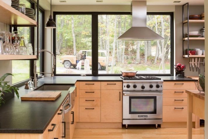
Though the facade of the single-story portion of the house has narrow, vertical windows for privacy, oversized windows otherwise fill the home, offering views of the green roof (seeded with a fescue mix), the woods, and the back deck facing the river and a seating area just beyond. “You feel like you are outside, even when you are inside,” says Morris. There are even big windows, per Salter’s preference, behind both the kitchen sink and stove, so one can gaze outside while cooking. The kitchen glass runs dramatically from the countertop to the ceiling, necessitating a four-sided oven hood. As installed, it has an almost sculptural quality.
Trademark’s cabinetry shop further customized the kitchen. The space is one room but with two sections: one a work space, another more like a pantry. The countertops are black leathered granite in the work space and maple (which Morris regularly oils) in the pantry. The cabinetry below the counters is of prefinished maple plywood with iron hardware. Morris wanted open shelves above the counters, and Trout found inspiration for wood shelves with iron brackets at Bramhall Pub in Portland. At first, Morris worried her belongings would look too eclectic on her open shelves, despite her desire for such shelves. She discovered the items she’d culled from her previous house “ended up going together, because I have a specific palette that I like,” she says. The same was true for furnishings. The couple mostly used items from their previous house; however, one new purchase is a French farm table from Restoration Hardware that cleverly butterflies open so it can seat 12.
With no interior trim around the doors and windows and “few visual lines to capture your eye inside,” says Winkelman, the focus is always toward the outdoors. Even so, there are a few extra design touches: simple built-in bookshelves and a deep bench below a large square window. Intended as a reading nook, the space, in practice, functions more like a baby-changing table for grandchildren, Salter says.
When it is time for me to go, I cross a short bluestone path to my car that takes me across an oversized slab of Mystic Mountain fieldstone that Richardson found at Genest in Biddeford. It forms a small bridge over a drainage swale in the yard. (Siting, elevations, water management, and drainage were part of Richardson’s contribution to the overall plan.) When I arrive at my car, I turn back to look one more time at the house. It has Scandinavian-inspired, extra-wide red-cedar boards with square edges that serve as cladding. They have been laid like clapboard and treated with a dark semitransparent stain. An even darker stain has been used for the red cedar that frames the windows. “I like to do something different,” says Winkelman, speaking of the atypical exterior choices (though he could be speaking of the house as a whole), “and to have a little bit of a pause.” Before I drive away I pause myself, thinking how sensibly unusual this whole house is, both practical and one-of-a-kind, tucked just off the road but feeling worlds away.


