Modern Mix
A 1900s Dutch colonial in Cumberland gets redesigned with family in mind
Lately, it seems that every well-appointed condo or house in Portland is dressed in low-slung couches, blond-wood Herman Miller chairs, and sheepskins—a hangover from the hygge craze of 2015. Katie Judkins used to live that way. She bought into the streamlined, Scandi-influenced style before it became hip, thanks to the influence of her grandparents. “My grandmother and grandfather had a very classic midcentury modern home and a lot of furnishings that were exactly of that era,” she explains. “I have such an appreciation for that style—I think it stands the test of time.” For years, she lived with her husband, Tyler Judkins, in a modern townhouse on Munjoy Hill filled with dark walnut furniture, a wide platform couch, a large modern woodstove, and plenty of big modern art. She was happy there, but as her family grew, their needs changed. “We wanted a yard,” she says. “And we weren’t using Portland the way we used to.”
In 2017 the Judkinses made the move from city to suburbs, purchasing a 1900s Dutch colonial in Cumberland that inspired a stylistic shift. “Katie is a Gemini, and that’s import-ant to note,” says her business partner (and sister-in-law) Heidi Lachapelle, who collaborated with Katie on designing and renovating the couples’ new place. “When she likes something, she really goes for it. In Portland, she leaned into her modern side. In Cumberland, she’s leaning into a bohemian family farmhouse look.” Katie agrees, saying that her goal was to create a “warm and comfortable family home.” Since they sold much of their Munjoy Hill furniture with the house, Katie and Tyler were able to start fresh in Cumberland. “It was nice to have a blank slate,” she says.
Well, it wasn’t entirely blank. The couple inherited a good deal of family furniture from all their antiques-loving parents and grandparents. They also had some pieces they just couldn’t part with, like the marble-topped dresser that functions as a sideboard in the living room by the stairs. “We’ve had that in every house we’ve lived in,” Katie says. Or the carved wood chairs that once belonged to Katie’s grandparents. “I reupholstered them in a denim color I loved,” she explains. “Overall, we wanted it to feel like easy living. And I really wanted a nice place to cook.”
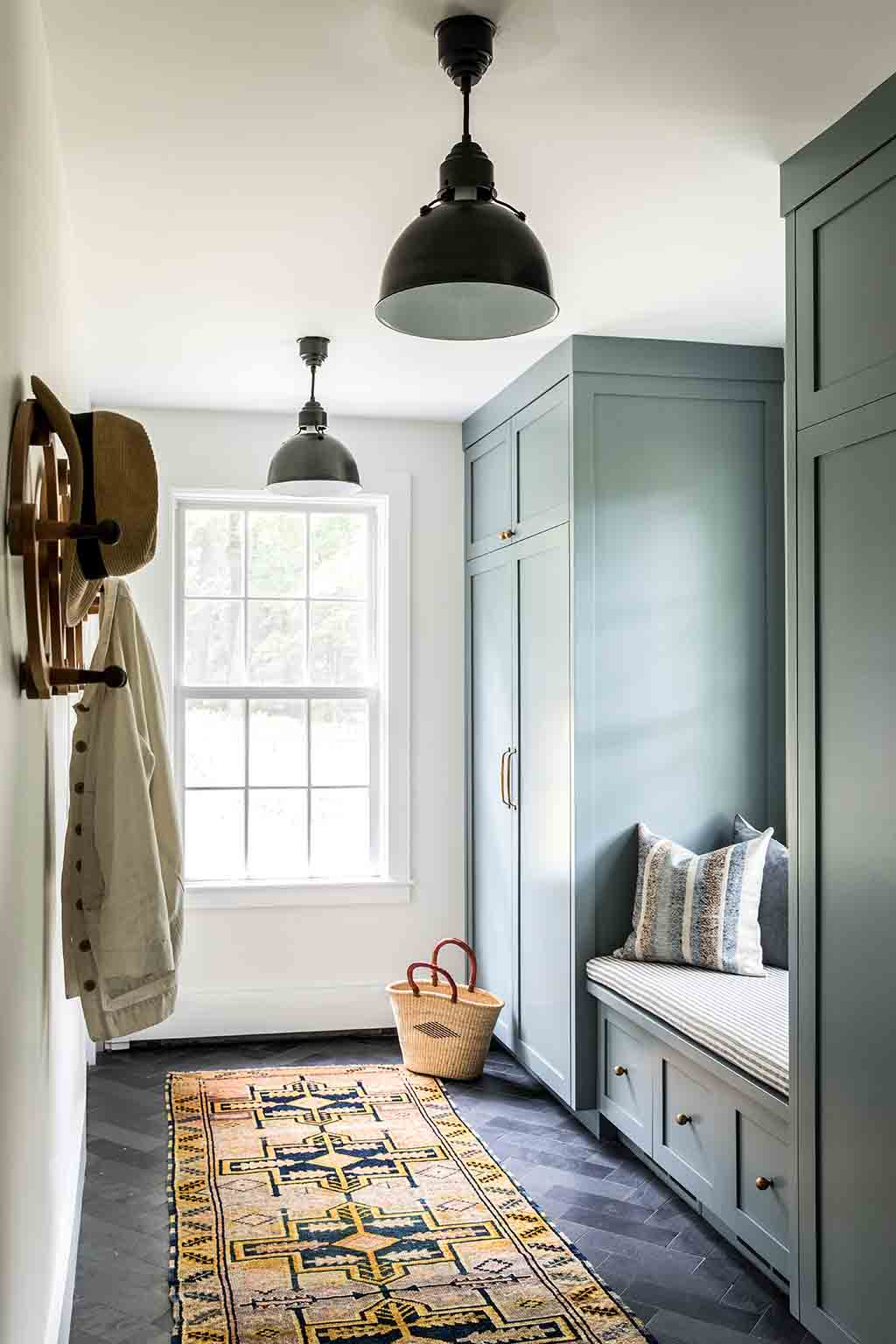
Although the house was in good shape when the Judkinses purchased it, they weren’t crazy about the layout of the kitchen, and they noticed right away that there was a serious lack of storage for winter boots and coats. Katie redesigned the floor plan and brought in Mike Monsell of C.A. Monsell and Company, whom she’s worked with in the past, to knock down walls, add new windows, retile the kitchen, and build a brand-new mudroom. For Monsell, the job was a welcome and exciting challenge. Monsell learned carpentry from his father, who had been building in Maine for decades and “got exposure to all kinds of old techniques and craftsmen,” he says. “He got to learn from some really great guys, and I feel fortunate that he was able to pass those traditional methods down to me, including tricks of the trade that aren’t necessarily taught today.” While some builders might balk at working on an old home with slightly sagging floors and a bowed wall, Monsell saw only the house’s potential. He used wood furring in the kitchen walls to create a flat plane for the new windows, and because the kitchen floor dipped in both directions headed toward the mudroom door, he also put down furring strips beneath the new slate tile flooring. This, he says, “tricks the eye so you see it as proportional, straight, and level, even though it’s not.” Of all the aspects of the job, he adds, “that’s the most fun part.”
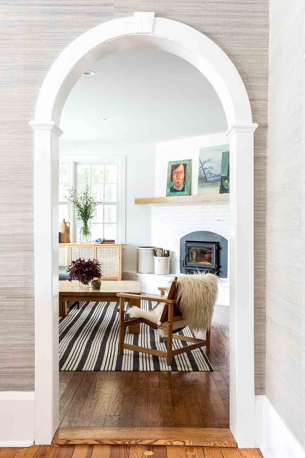
While old homes present some challenges, they also often come packed with character, and this one was no exception. In almost every room in the house, the Judkinses found new architectural details to marvel at, from the twisted brick fireplace in the dining room to the wave-shaped moulding on the side of the stairs. “I also really love the floors,” Katie enthuses. “They’re pine, and there’s great character to them. I think they’re really special.” She was also drawn to the curved archways that connect the various living spaces downstairs. When she went to upgrade the kitchen, she initially planned to install a rectangular doorframe, but Lachapelle convinced her that it was worth “pushing the budget” to accommodate a matching arch. “That’s what makes this house special and original,” Katie says. “That was a big splurge—it’s more challenging than you would think to make an arch and a seamless trim piece.” Lachapelle also weighed in on whether to paint the dark wood beams in the living room. “It was such a beautiful original detail,” she says. “Maybe it wasn’t the light, bright space that she envisioned at first, but it really sets the tone for the whole home. That’s the core living space. It shows the structure of the house and how it’s built. We agreed that it would be a shame to cover it up.”
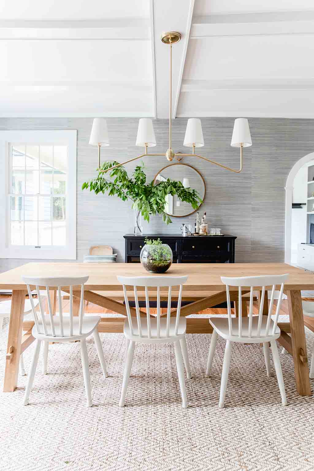
Lachapelle’s influence can also be seen in the various prints and patterns that are scattered throughout the home. While Katie opted for clean white walls in most rooms, and a classic white kitchen, she decided to install quirky gray fox-print wallpaper in the downstairs powder room and neutral-hued grasscloth wallpaper in the dining area. “Katie likes to strike a balance between formal and informal,” says Lachapelle. “I think the grasscloth sets the tone for that room and brings in a formal element.” While the wallpaper elevates the space, the wood farm table (a gift from Lachapelle and Tyler’s parents) grounds it.
The idea of balance comes up time and again when discussing this project: the design duo knew they had to walk a line between formal and informal, contemporary and historical, calming and colorful. “I knew from the beginning that I didn’t want the house to feel like a relic,” Katie says. “I wanted it to be a bit relaxed. And I wanted to bring in color.” To that end, almost every room has a burst of vibrant indigo somewhere—one of Katie’s favorite hues—and a pile of handmade pillows. “Pillows are personal,” says Katie. “They can really change a room.”
Katie and Lachapelle have been collecting vintage textiles for years, and in 2019 they decided to start making them into custom pillows and selling them under the sub-brand CAMP by HLI. “We were buying fabric all the time,” says Katie. Every time they went to Brimfield Antiques Center together, they would leave with bags of European linens. “We love the texture and look of linen, and when it’s vintage it gets a nice lived-in quality and fades in interesting ways,” says Lachapelle. They’ve found saffron yellow, warm washed red, and faded indigo bed sheets, which they repurpose into lumbar pillows and big soft throw pillows with help from the seamstresses at Wallace James. The Judkinses live among these pillows. Katie explains, “Our kids like to pile them up and jump into them.” They also decorate the couples’ upstairs bedroom. “It can be hard to make your bed,” Katie admits, a sentiment that most moms will probably agree with. “But that’s why I like having those lumbar pillows. It’s all you need, and it really gives the room such a nice finish.” Pulled-together and practical, it’s just another example of how she finds balance at home.


