Kismet in Falmouth
The paths of a house, a designer, and a client fortuitously converge in a revamped 1950s ranch house.
In the 1950s an interloper arrived on Waites Landing Road in Falmouth. “It’s a very coveted street to live on,” says Portland-based interior designer James Light of the shaded, barely mile-long lane cut through the woods in the nineteenth century to allow access to a quiet stretch of beach. “Many are New England–style homes that sit right on the water. It’s a very Old World sort of street. And then there was this wacko ranch tucked back into the woods.”
Said “wacko ranch” was a low-slung three-bedroom structure with vertical wood cladding that boasted several of the features that attained popularity in the aesthetically transitory Eisenhower era, when tastes were shifting from traditional to modern. “He knew he needed a wood kitchen and an Eames chair,” Light says of the original owner. “But he used paneling that wasn’t great and didn’t know to create concealed storage and that sort of thing”—elements, in other words, that have become de rigueur for our modernist sensibilities and continue to influence even today’s traditional architecture and interiors, such as the aforementioned concealed storage, open-plan living, a closer indoor–outdoor relation, and generous fenestration to increase natural light. In this case, the Eames chair kept company with chintz- upholstered armchairs, most windows were small, and a bulky brick fireplace divided the living and dining areas into two formally separate spaces. Light muses, “I think he just didn’t have enough help from a designer to take the vision to the next level.”
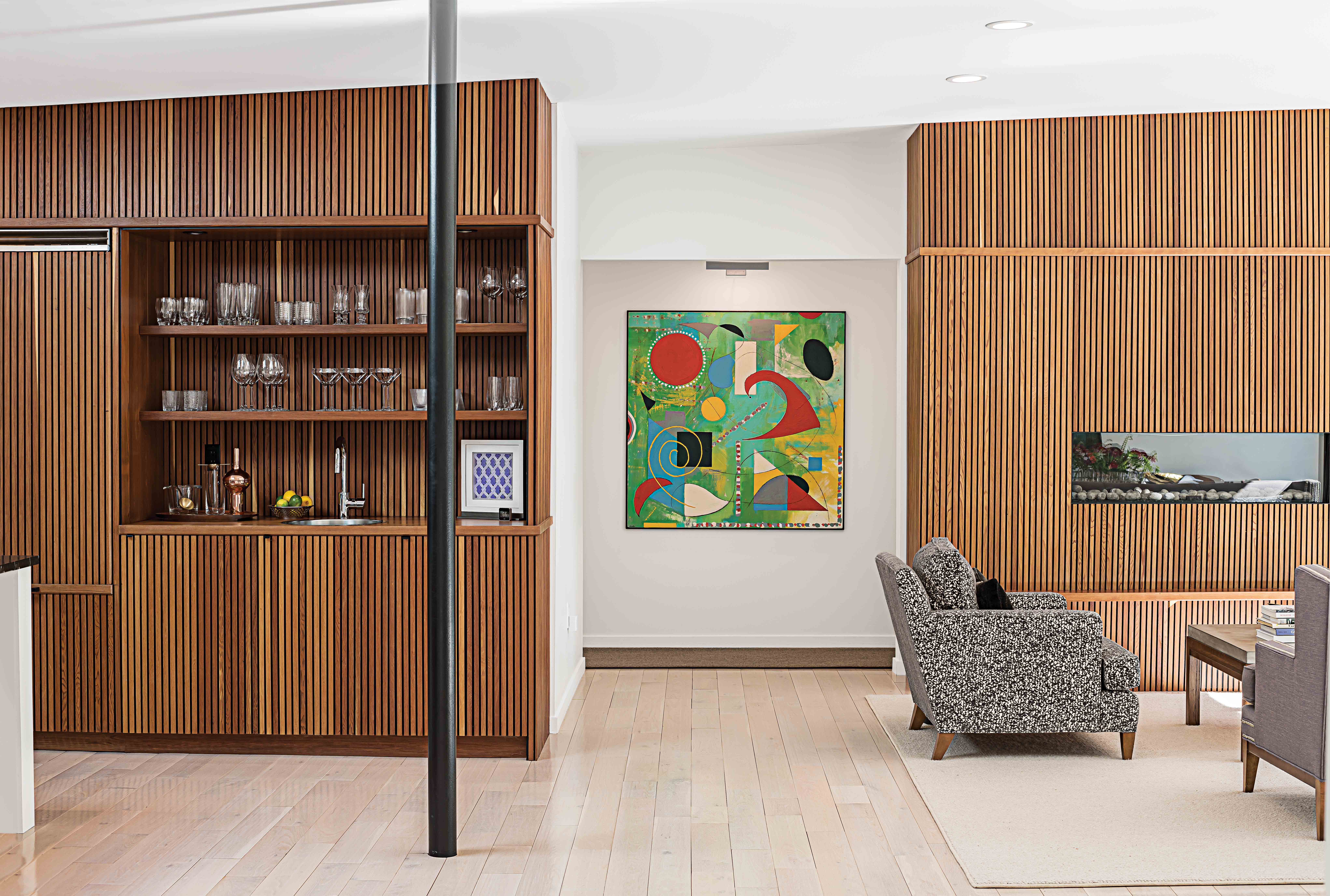
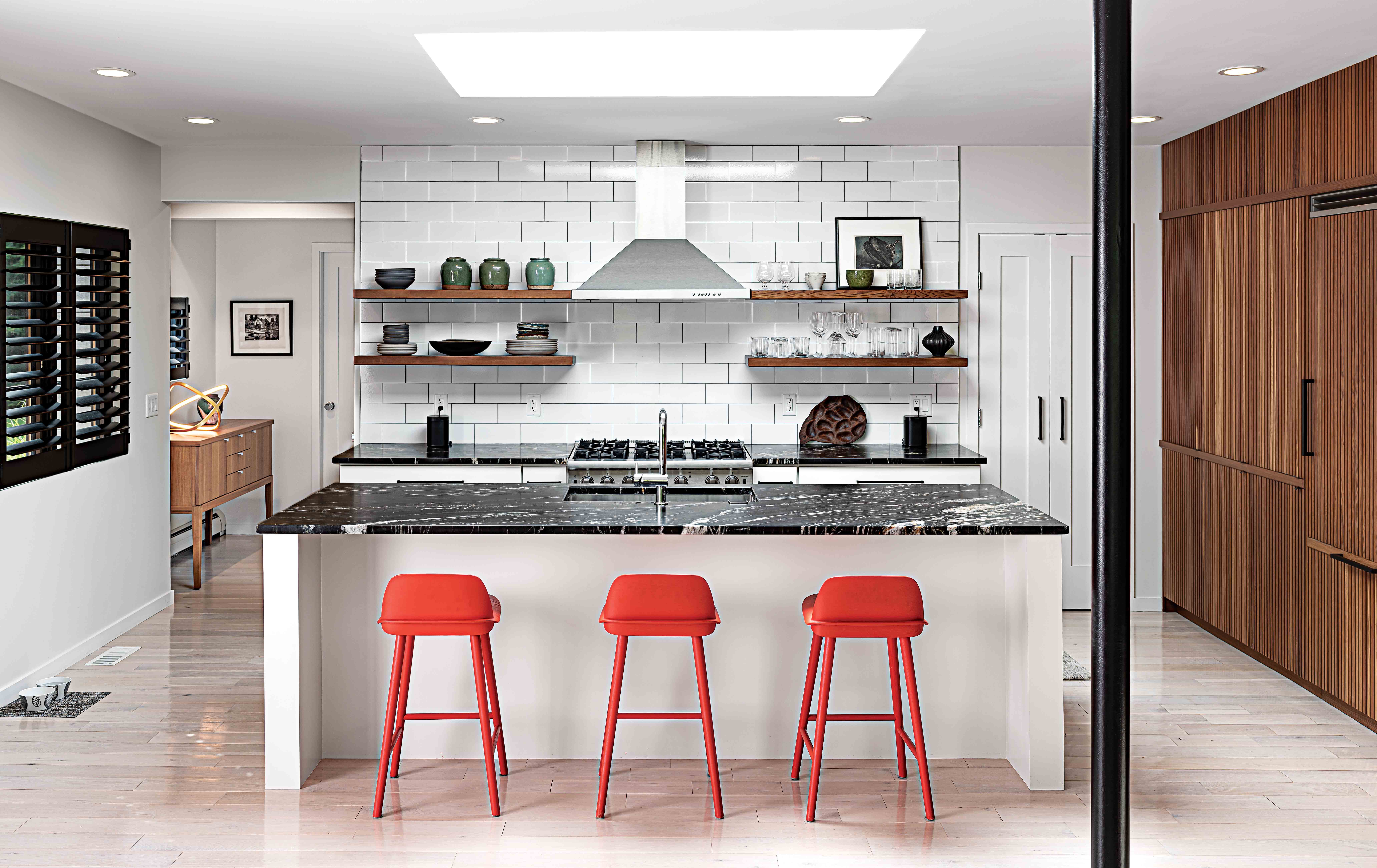
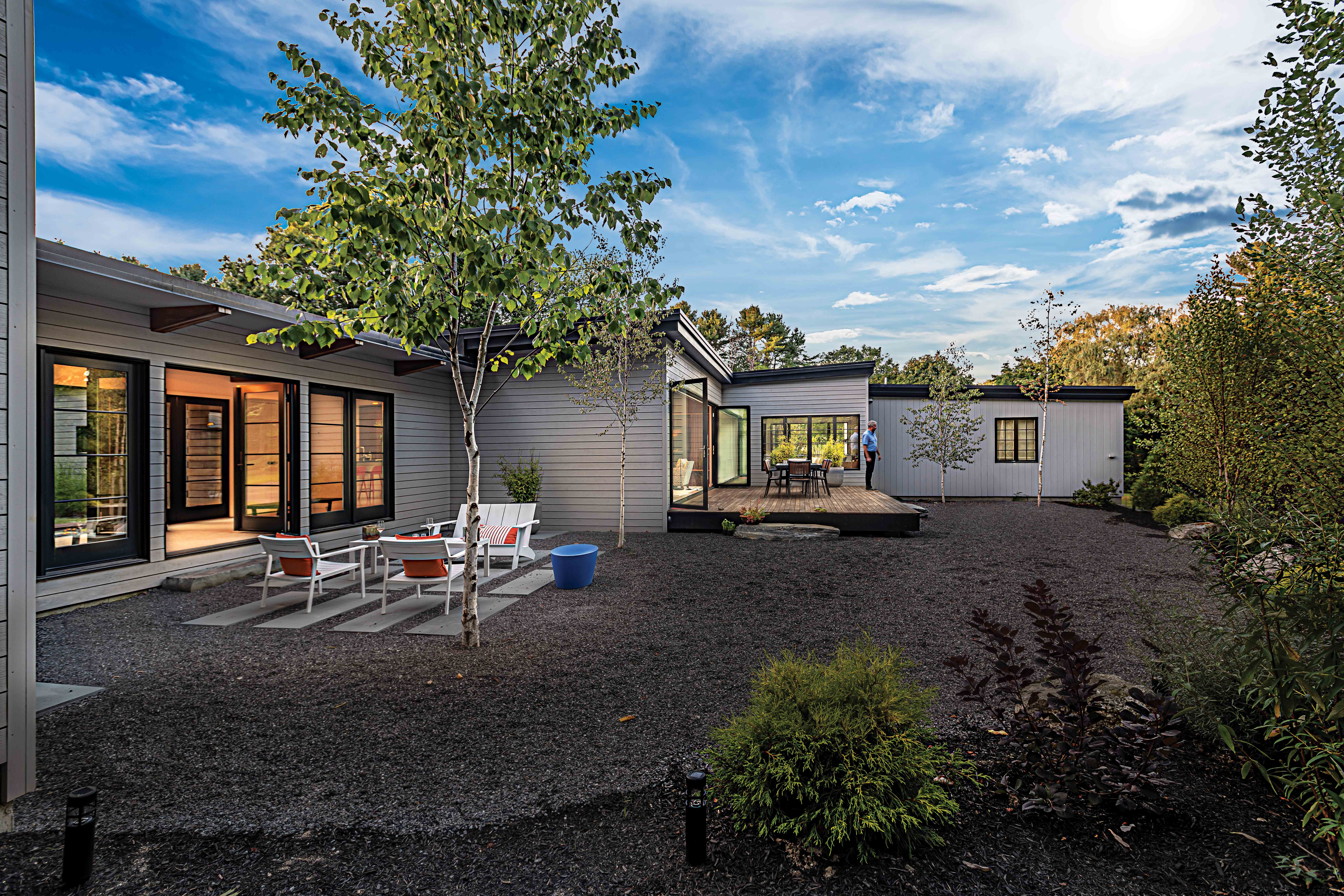
Fortunately, a more recent owner with a thoroughly contemporary vision hired Light and architect T. Scott Teas of Scattergood Design in Portland to revamp the 3,145-square-foot residence. The team completely reoriented the plan, converting the existing garage into a den and powder room, off of which they extended a deck. The intrusive brick fireplace vanished so that the living and dining areas could blend into each other, as well as into the kitchen, which Teas and Light subsumed in the airier, more circulation-friendly open plan. Light then integrated a gas fireplace into a far wall that separated this public space from a corridor leading to an owner’s suite, two guest bedrooms, and a bath. He appropriated some of the corridor and bedroom square footage for closets and cabinetry in which to stash audiovisual equipment.
When the men removed the building’s painted cladding, they were delighted to find it was all California redwood, a completely anomalous material for Maine. Rather than chuck it into the dumpster, Teas and Light took advantage of their opportune discovery and had all the wood milled down. The bulk of it was cut into three-quarter-inch-thick slats that Light applied vertically to a kitchen wall and to the living-area wall that houses the fire-place as well as a niche for a flat-screen television. The designer recycled the balance of it into open kitchen shelving, custom bathroom vanities with leather-wrapped pulls, a bed for the owner’s suite, and nightstands. “It felt like the house liked it,” says Light of the repurposed redwood. “It had good juju.” As a spectacularly expanding final touch, they installed a NanaWall facing the backyard, which opened the entire main space to the outdoors.
Teas and Light didn’t stop there, however. On a perpendicular axis to the original house, they constructed a two-car garage and connected it to the house with a wide cedar-and-glass entry hall, bringing the home to almost 4,000 square feet. Visitors can enter the glass door—framed in wood but painted to look like industrial black steel—and traverse the hall to another set of doors that open onto the backyard. (A former painting studio behind the owner’s bedroom is now also a separate apartment, which brings the bedroom count to four and the bath count to three and a half.)
As renovations continued, Light was simultaneously designing a Munjoy Heights townhouse condominium for Paul Andrews, a Poland Springs native who had returned to Maine after retiring from a career as an executive for a financial-services company. “James was trying to help, but the condominium just wasn’t fitting my style,” recalls Andrews. “He kept telling me I should come out and look at this great house he was working on, but I never went.” Then, serendipity: the owner of the Waites Landing house had a change of heart and decided to sell. Still uneasy with his townhouse, Andrews began casting around for other real estate options. Unbeknownst to Light, the agent brought Andrews to that very house. “I knew from the moment we came into the drive that this was what I wanted,” says Andrews, who purchased it in January of 2019. “And when I walked in, I also knew it was the house James had been talking about.”
By then, says Light, “The house was a cupcake and we only had to frost it.” At least, almost. Andrews had the front yard grade of the 1.6-acre property lifted and embarked on a new garden design project spearheaded by All Things Green. Fortunately, however, explains Light, “Almost all the furniture is Paul’s from the condo. We were lucky because most of it slid right in. We thickened the plot by adding a pantry, wallpaper in the bathrooms, and updated lighting; we also brought in Paul’s wonderful art collection.”
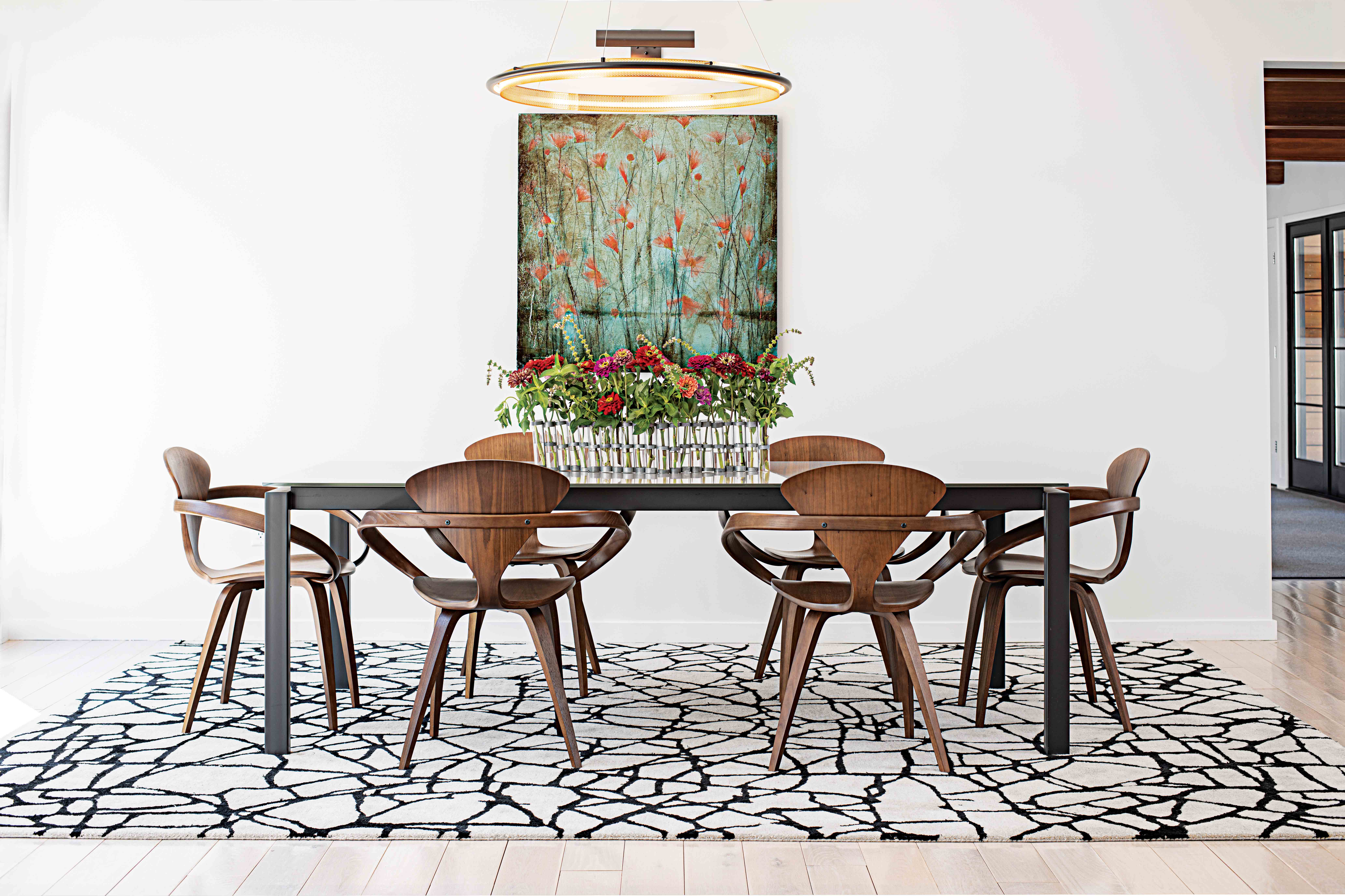
A new dining room table and a painting for the back corridor wall by Maine artist Jodi Edwards replaced other specimens that were not properly scaled for those spaces. Others were within-an-inch snug (one guest room door just clears the foot of its king-size bed). There were a few items so perfectly suited to the rooms—George Nelson platform benches in the entry hall, for instance—that Andrews purchased them from the previous homeowner. But, for the most part, Andrews’s tailored, monochromatic aesthetic could not have been more apposite for the architectural envelope provided by Light and Teas.
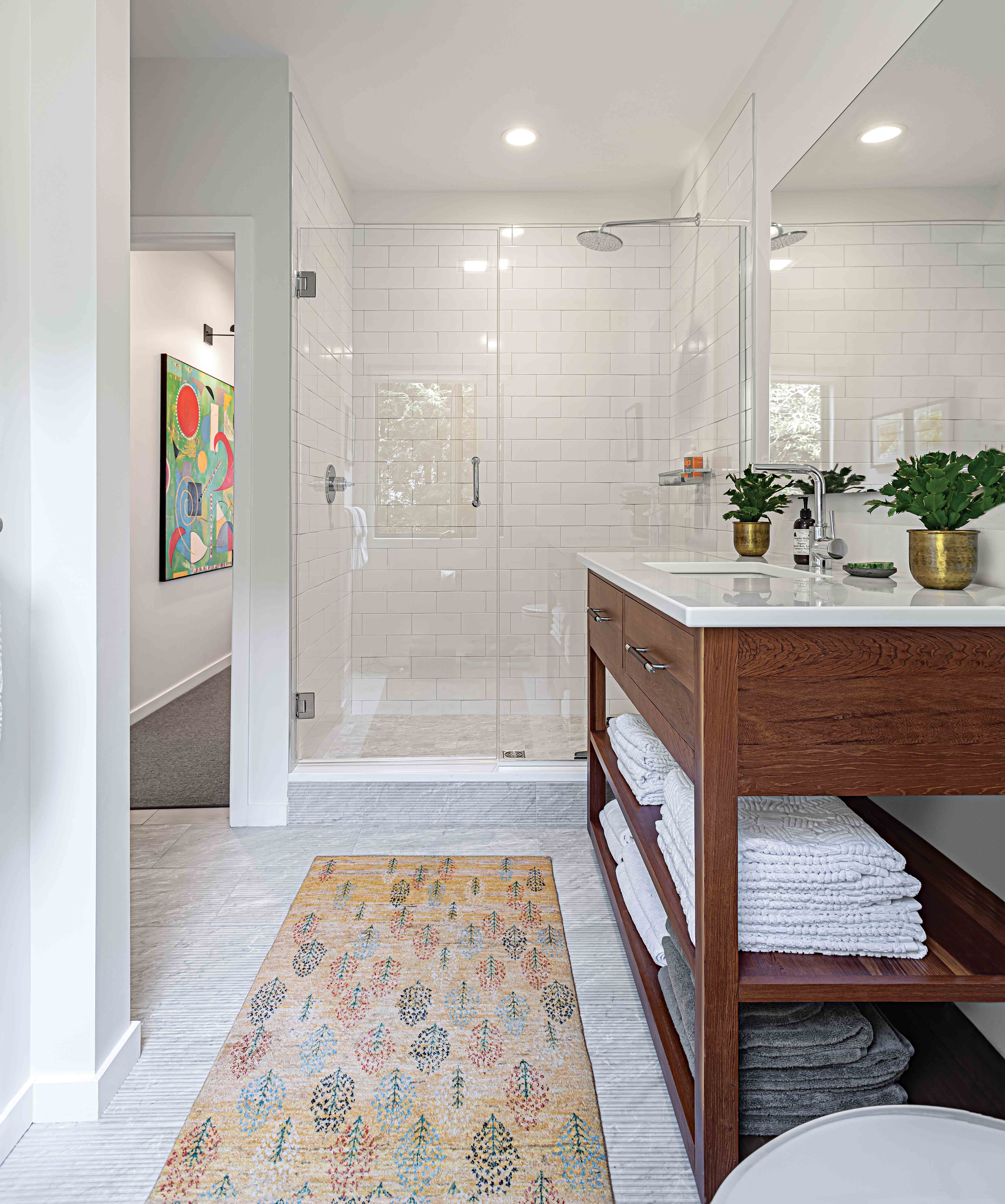
Neither could designer and client have been better matched. Though Light has conjured his share of traditional interiors, both he and Andrews are enamored of a warm modernism that is characterized by clean lines, bright open spaces, and a limited palette spiked occasionally with colorful art and given depth by the mellow organic glow of wood. Case in point are the vanities Light designed for the bathrooms. He was careful to create consistency in their design but varied the way the grains were matched on the drawer fronts. Ditto with the bathroom floors, which share the same grooved marble tile. “I like repeating materials, but altering it each time,” he acknowledges.
The home, in turn, could not have been more fitting for its new owner. “All of my friends who visit,” says Andrews, “whether they’re local, or have known me during various periods of my life, say this is the kind of house they always thought I’d live in.” Acknowledging the ideal convergence of desires and events that led to this situation, Light adds, “I just didn’t realize I was designing this house for you!”


