Inside Look
17 New & Noteworthy Interior Design Projects


RESIDENTIAL
Foreside Gem


Firm: Susie Smith Coughlin Interior Design
Designer: Susie Coughlin
Photographer: Peter Morneau
Location: Falmouth
The goal for this home was to feel like an adventure. So that, when a person came into the space, they would get to see small glimpses of the owners’ lives through their pictures, books, and artwork. “I loosely used the concept of an old bookstore you may find tucked away down some alleyway in Paris to describe where I wanted to go with the design,” says Susie Coughlin.
Coughlin found herself working with two very different styles: a cozy, L.L. Bean vibe and a modern artists’ loft like you would see in downtown New York City. “It was definitely a challenge, but luckily everyone agreed to compromise and meet in the middle,” Coughlin says. Using richer, moodier colors in unexpected ways gavethe feeling of being unique and artistic but also cozy and comfortable. The design relied on mixing modern lines with more traditional soft layering and art. Keeping the same moody color scheme throughout the house kept the whole look cohesive and using various styles of furniture allowed the space to remain exciting and fresh.
Coughlin’s unofficial tagline is “eclectic and modern design,” and this space hits both notes. There is no one particular theme running throughout the house, so in many ways every room offers something unique. The end result is a home that is warm and inviting, relaxed and unpretentious yet curated and polished, all at the same time.
Farmstead


Firm: Ariana Fischer Interior Design
Designer: Ariana Fischer
Photographer: Erin Little
Location: Brunswick
This nineteenth-century farmhouse is surrounded by actively farmed fields on a long country road. The owners are a couple who went to college together in Maine and have a deep connection to and nostalgia for the region. They live in a modern flat in California during the year and have a ski house in Utah, but for this home they wanted the design to reflect the historical farmstead that it is. Fischer fully embraced classic country New England style with modern touches.
One of the biggest challenges was the sunken living room, which was narrow and long. The clients are a family of four with a revolving door of family, friends, and neighbors, so the main living area had to be able to accommodate a good number of people. Ariana Fischer had a built-in sofa made so that the whole space would be usable for seating. It gives a very loungey vibe with just a hint of modernism.
The clients wanted to use a black and white palette, but since those colors alone have the potential of feeling stark and cold, Fischer brought in natural warm tones in wood and heavily textured fabrics to soften it. The result? Country with a bit of an edge. Almost all the artwork is contemporary photography with the exception of a few Spanish antiquities inherited from a parent. The varied art collection, while initially risking being over the top for a traditional Maine house, is integrated in a way that adds character and depth to spaces. “I love the challenge of pulling seemingly disparate aesthetics together and making it work, creating harmony,” says Fischer.
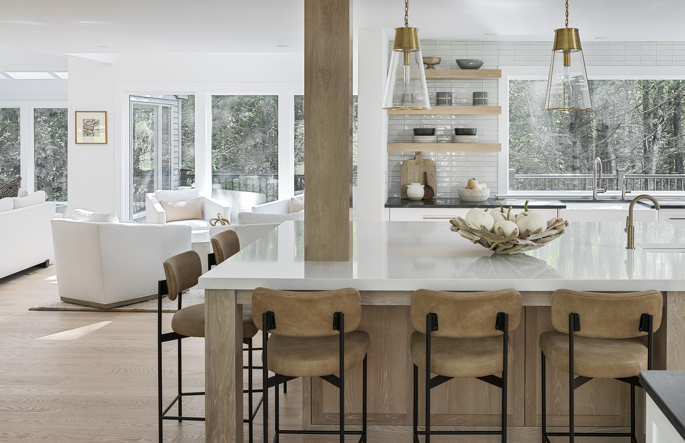
Modern Beach Reno

Firm: Duquette & Company
Designer: Sarah Duquette
Architectural Designer: Lucy Gorham
Photographer: Rob Karosis
Location: Ogunquit
“Serene and organic with modern minimalistic warmth” is how Sarah Duquette would describe the vibe of this Ogunquit cape, the interiors of which partner effortlessly with the outside views of the woods and pool area. The main color palette was chosen based on the natural materials used in the decor—white oak, marble, rattan, leather, concrete—and contrasted with black and white.
When the designer first saw the home, it was dark and dated and felt claustrophobic. Her vision was to create sweeping sight lines across the spaces, making everything feel weightless. The walls, ceiling, and trim were painted in Benjamin Moore’s Super White, serving as a perfect backdrop to the many varied textures. “Even on the darkest of days it feels light in the house,” Duquette says. The living room upholstery utilizes Crypton fabrics for heavy wear and tear. “The clients have teenage children and wanted to have a big open space that would invite more family time together, even if they were engaged in individual activities,” Duquette explains.
An inlaid clamshell coffee table in the small conversation area is a showstopper, and the floor-to-ceiling Thassos marble fireplace is flanked by floating white oak consoles and shelves. When not in use, the family’s smart TV turns into a work of art on the wall.
Duquette believes that the best interior designers are conduits who take a client’s innermost wishes and create a space they both love and feel at home in. She was thrilled to give this client a beach house inspired by nature and texture but not pigeon-holed into more traditional definitions of New England waterfront homes.
Bridge Road

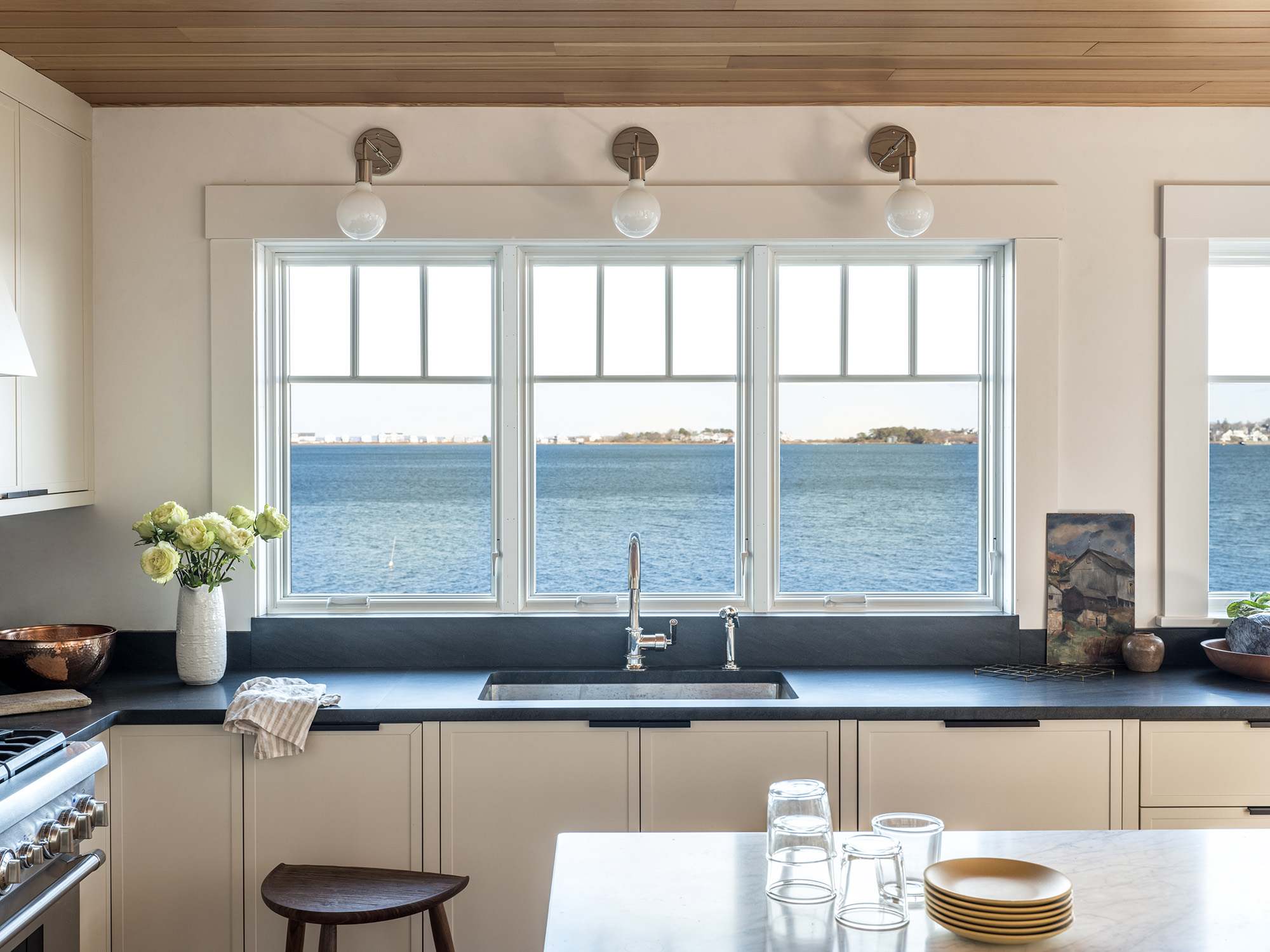
Firm: Heidi Lachapelle Interiors
Designer: Heidi Lachapelle
Cabinetmakers: Northe Woodworking
Photographer: Erin Little
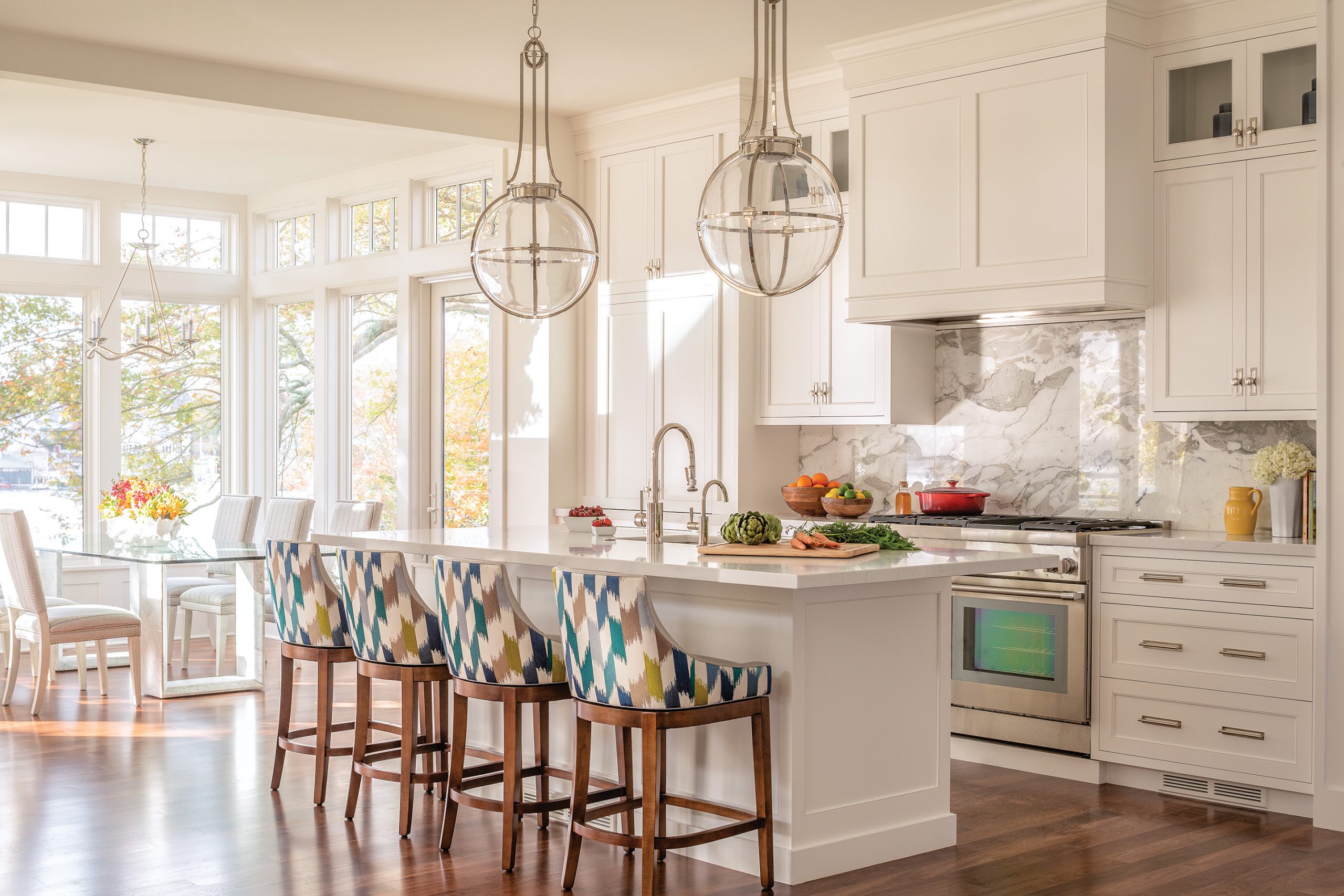
Location: Biddeford Pool
The inspiration for this kitchen refresh was the serene oceanfront setting and the fun, creative couple Heidi Lachapelle was designing for. “This is a forever home, and we took great care in considering every detail,” Lachapelle says. The space feels both warm and modern, with everything in its place, also making it neat and tidy. Lachapelle didn’t want to detract from the view, so she selected soft and natural colors and textures that wouldn’t overwhelm the space but would still give it lots of personality.
The kitchen is in a relatively small area, creating the task of fitting a lot of function without making it feel cluttered. This was accomplished by maximizing cabinetry space with an addition of a pantry a short walk away from the kitchen, as well as in the smart design of the coffee bar. Appliances were concealed to avoid breaking up the sightlines too much.
The palette is based in neutrals: warm white, walnut, soapstone, and marble. The cabinet profile is a slim Shaker style—modern, yet traditional. Edge pulls add a modern element, as do stools custom-made by local furniture designer Adam Rogers.
The result is a combination of smart design with careful material selections, making a kitchen that feels timeless and classic but still maintains a bit of an edge. “Our projects are always reflective of our clients,” says Lachapelle. “We like to see ourselves as the editors.”
Lakehouse Renovation


Firm: Fiore Home
Designer: Vanessa Helmick, Jackie Andrews
Contractor: Danny Fisher Custom Carpentry
Photographer: Sean Litchfield
Location: Raymond
The clients wanted a classic blue and white color palette for this Sebago Lake house. Fiore Home created a calm and airy space using a water inspired palette grounded by earthy textural elements of white oak, walnut, rope, and grasscloth.
The biggest challenge was that the architecture of the home lacked 90 degree angles. Many of the rooms being renovated were hexagonal or octagonal shaped, but the firm wanted to keep moving walls to a minimum. The fix? The same color palette was used throughout the house to bring cohesiveness and to soften all of the angles. The wood species used in flooring and furniture were all similar in color and texture.
The guest bathroom had seven walls, which the designers wrapped in a wave patterned wallpaper. A custom vanity meant to look like a furniture piece grounds the space and draws the attention away from the many corners. It is accented by matte brass cabinet hardware and nautical inspired sconces.
For the five-walled, four-windowed breakfast nook, a built-in bench was added to the room, creating a focal point and symmetry. The bench is covered in a textured blue Perennials outdoor fabric to hold up to both sunlight and guests who have been swimming in the lake. The abstract blues of the pillows add dimension, and the Ethnicraft white oak pedestal dining table complements the wide plank white oak floors.
All of the materials selected are extremely durable, sustainable, and hold up well to UV rays, entertaining, lake life, and dogs. Fiore Home’s goal is to create beautiful spaces that are livable and acquire patina with time. It’s a place to truly relax and not sweat the small stuff.
Scarborough Refresh
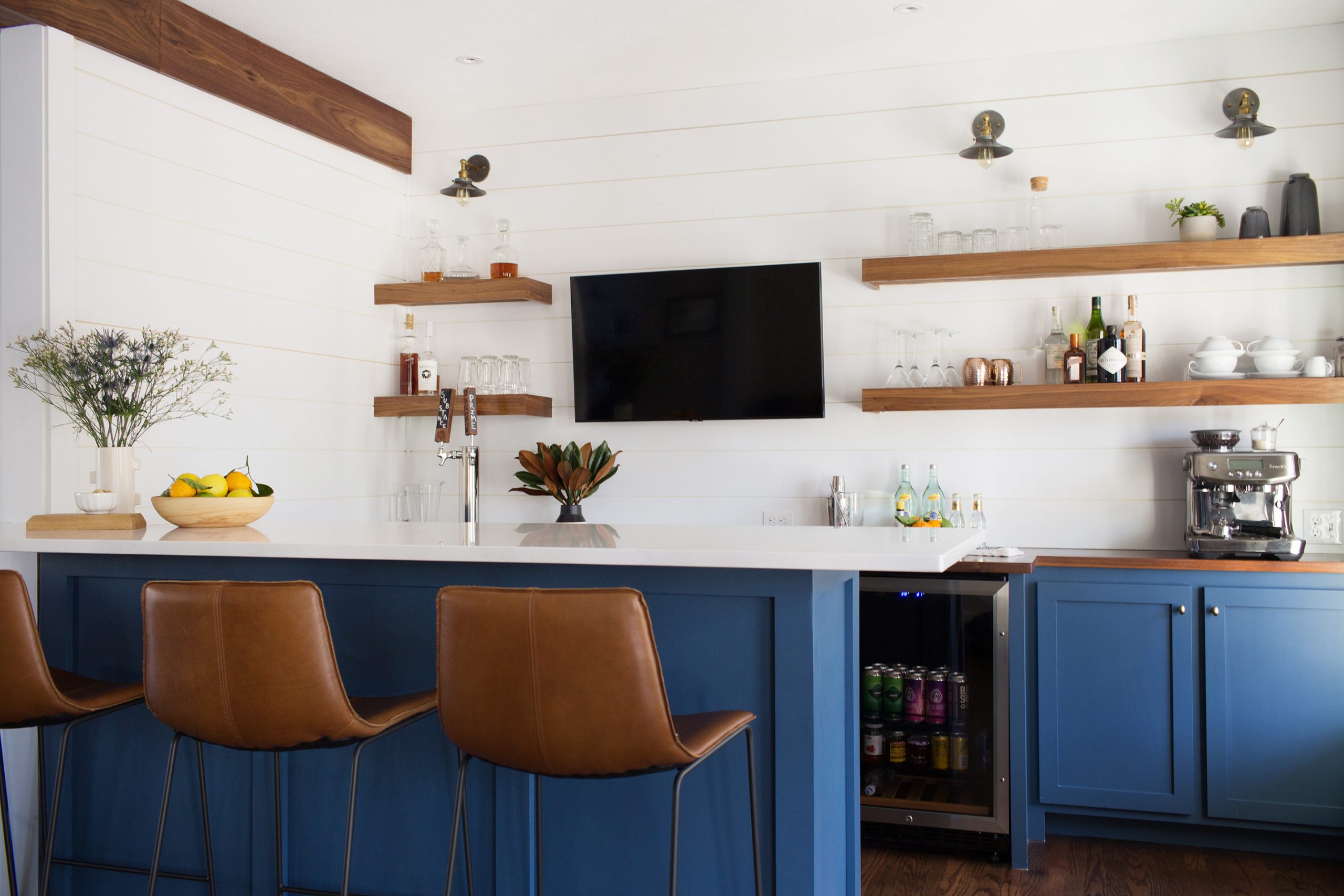

Firm: Huffard House
Photographer: Meredith Purdue
Location: Scarborough
This first floor renovation came from the clients’ love of sports and entertaining, with their main goal being to repurpose their underutilized formal living room into a bar and home entertainment space. Developing the connection between the bar and open-concept kitchen and dining area was probably the biggest design challenge. The team at Huffard House widened the doorway between the bar and kitchen/dining room creating two spaces that easily flow while also maintaining enough separation. A beautiful walnut-wrapped beam was installed to accent the newly widened opening and visually separate these two spaces.
Walnut was also selected for the bar countertop and floating shelves. The hardwood floors throughout the first floor were refinished by Casco Bay Hardwood Flooring in a rich brown. The walls in the three adjoining spaces were painted with Farrow and Ball’s Shadow White, which is quite warm.
With the new open living space, it became a priority to update the kitchen finishes. Being conscious of cost, Huffard achieved a fresh look by painting the existing kitchen cabinetry in a neutral color, Sherwin-Williams’s Egret White, and updating the island color in Farrow and Ball’s Stiffkey Blue to match the bar peninsula. The previously dark granite countertops were replaced with white quartz, cabinetry hardware was changed out for a matte-black finish, pendant lighting was added, and a Clé Tile hexagon backsplash was installed behind a new farmhouse-style sink. The result is a bright, cohesive, and welcoming first-floor living space where the clients can happily entertain friends and family at home.
Vaughn Street


Firm: Honey Collins Interiors
Designer: Honey Collins
Builder: Wright-Ryan
Photographer: Sarah Winchester
Location: Portland
The architecture of this West End home is traditional and detailed. Honey Collins worked with her clients to create designs for each room that honored the past but also incorporated modern elements and colors to give the spaces an updated feel. With the use of a strong color palette and various textures, each room became warm and inviting, which felt like the biggest challenge in this design. Many of the rooms in the home, which were large with beautiful moldings, felt cold, in need of personality and purpose.
The house had such a large entryway that Collins decided to create a few different areas within to give the room warmth. The antique center table anchors the space, and Collins then created a small corner sitting area with a beautiful antique chair. The Oushak rug adds color and movement. Collins and the clients visited artist Laurie Fisher’s space in Portland and found the perfect modern piece to place above the antique chest.
The Honey Collins philosphy is to have rooms with touches of old and new—antiques combined with modern pieces. Collins sourced many of these pieces from Atlanta, where she is from. The client, also being from the South, appreciated the use of antiques combined with modern elements. “This project perfectly illustrates what I love best,” Collins says. “Taking a well-loved, family-centered place and incorporating new materials and updated designs, while never losing sight of the history of the treasured antiques.”
House on the Shipping Channel

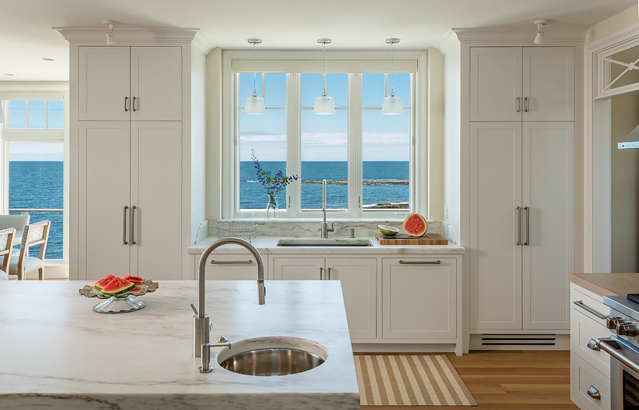
Firm: Banks Design Associates/Simply Home
Designer: Linda A. Banks
Project Manager: David LeBlanc
Photographer: François Gagné
Location: Cape Elizabeth
Designing this home from the ground up, Linda Banks’ team based the entire palette on the soft gray floors, which were inspired by the faded gray glacial ledge on which the house is perched. The home is drenched in light, with a partially open plan and bold interior architecture. This was intended to be the ultimate couple’s retreat and the ideal weekend getaway for the clients, who also like to host family and friends.
Banks wanted a welcoming but strong “classic American” vibe, somewhere between New England country and semi-formal. The soft, inviting fabrics and furnishings are decidedly uncluttered. The allowable footprint for the new build, due to lot size and its proximity to the shoreline, required a vertical, three-story floor plan. Keeping the spaces open to each other and creating a practical layout without hallways was the biggest challenge.
A few favorite pieces are the limestone fireplace Banks sourced from Jamb in London, a weathered gray custom coffee table from Italy, and the David Witbeck fisherman painting above the fireplace. The kitchen is a combination of symmetry, honest textures, and practicality.
Banks says the home is a perfect representation of her team’s design philosophy: “Include beautifully appointed and exceptionally well-resolved interior architecture, strive for symmetry, incorporate as much natural light as possible, display art, and make sure the furniture is comfortable, tidy, and not too big,” she says. “But most importantly, it should look like I was never there when I am gone.” For Banks, this means no two projects look the same, ever.
Harborside Shingle

Firm: Leandra Fremont-Smith Interiors
Designer: Leandra Fremont-Smith
Builder: Knickerbocker Group
Architect: Sue Mendleson, Knickerbocker Group
Project Manager: Derek Chapman, Knickerbocker Group
Photographer: Jeff Roberts
Location: Boothbay Harbor
The spectacular view of Boothbay Harbor was the biggest design inspiration for this project. The team aimed to create a sophisticated and harmonious interior that would comply with the clients’ needs, from entertaining to relaxing, while emphasizing the home’s stunning view of the harbor. To accomplish this, a cohesive blend of neutral hues with the occasional pop of color were chosen to add excitement and interest.
This harborside retreat is elegant yet projects a sense of comfort and calmness. The designers aimed to make the kitchen sophisticated, using a palette of white and grays combined with the metallic tones of polished nickel found in the cabinet hardware and light fixtures. The bold, dark walnut floors ground the room, while playful splashes of color can be found in the fabric on the back of the bar stools, which coordinate with the lacquered wet bar and playful powder room wallpaper.
The biggest challenge was that the home is situated on a very narrow lot, and the clients wanted an unobstructed view of the water. To do this, an open floor plan was created for a calming flow throughout the home, keeping the view of the water as the main focal point. The kitchen features crisp white cabinetry along a marble backsplash, leading the way to an understated but elegant glass dining table-top with marble pedestals.
History in the Remaking
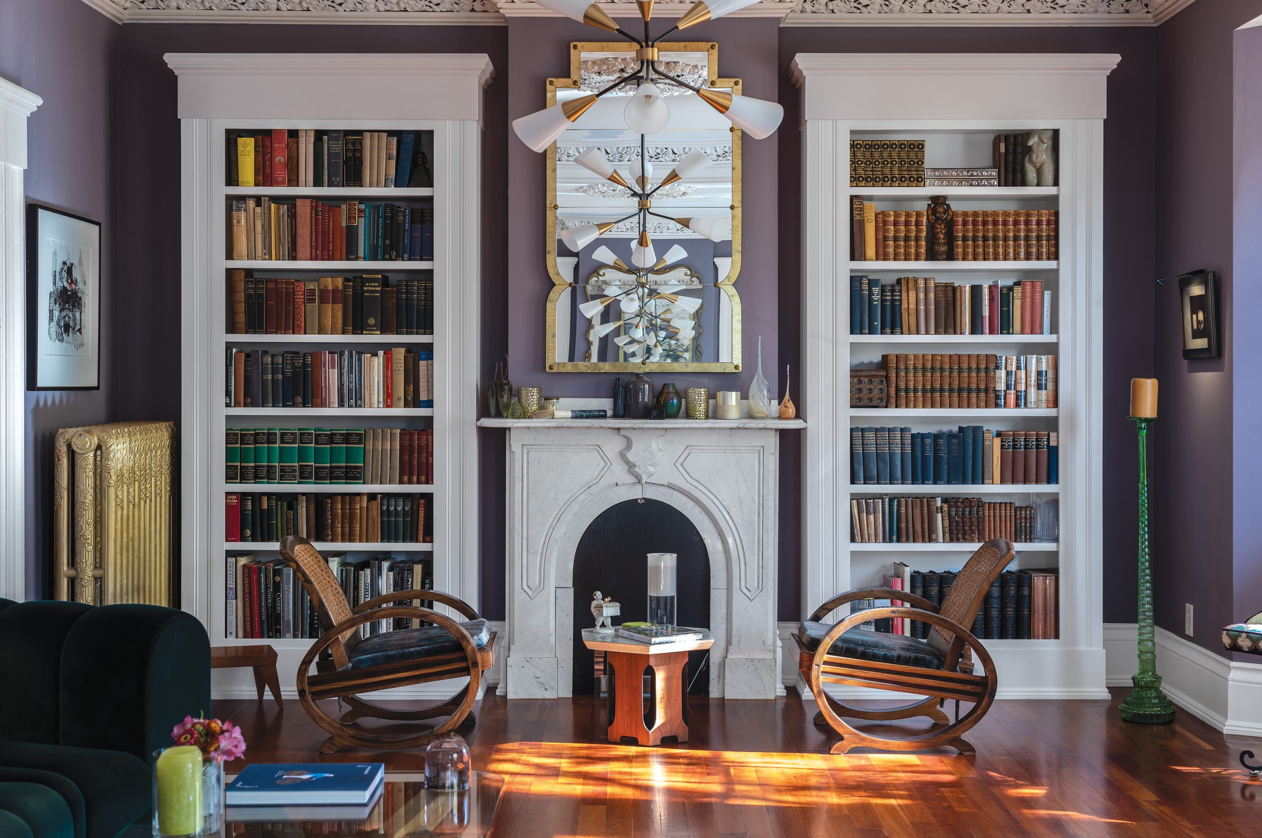

Firm: Enclave Interiors
Designer: Marianne Lesko
Photographer: François Gagné
Location: Portland
Designer Marianne Lesko wanted to keep the integrity of this historic home on Munjoy Hill but update it for modern living. The living room has 12-foot-high ceilings and full-height windows, along with traditional marble mantels for the original coal stoves as well as ornate plaster ceiling mouldings. Lesko wanted to take advantage of these traditional elements and combine them with a more modern sensibility by using current furniture, objects, and artworks.
This was clearly a space where the mixing of antique and modern would make a spectacular effect. By retaining the traditional elements of the room and keeping an open, uncluttered space with a careful selection of modern and recent vintage pieces, the designer was able to create a warm and comfortable feel even though the space seems very grand, striking a careful balance of the opulent with the casual, and the antique with the modern.
The two biggest challenges Lesko faced were choosing the color of the room and resolving the imbalance of the windows. With such a large space, the color needed to be subtle but also highlight the room mouldings, furniture, and artworks. In addition, the southern wall of the room had beautiful floor-to-ceiling windows, while the northern wall had no windows at all. This created a disturbing lopsidedness to the room. The solution was to design and build custom bookcases that mimic the size, shape, and mouldings of the original windows on the opposite wall. They were created by local furniture maker Gabe Keith Sutton in Biddeford.
Throughout the house traditional paint colors by Farrow and Ball were used. The living room (shown here) was painted in Brassica, a dark lavender with gray tones. This had the effect of bringing out the original plaster mouldings. The centerpiece of the room is a Swedish-designed sofa, the Bob sofa from Blå Station, covered in a jewel-tone green cotton velvet fabric that complements the room’s traditional elements. The artworks are by a mixture of local and European artists, including Rachel Gloria Adams from Portland and Jean-Philippe Pernot from Paris.
Back Cove Dutch Colonial


Firm: Tyler Karu Design and Interiors
Designer: Tyler Karu
Photographer: Erin Little
Location: Portland
The original 1930s architecture, the owner’s collections, and the urban waterfront setting inspired the overall design of this Dutch Colonial. The plan was to create a clean space and allow light and nature to easily flow into the interior plan. It was important to maintain the charm and qualities of the original house while also updating the systems and functions of the home to today’s standards.
The furnishings were eclectic: antiques, custom pieces, and collected items mixed with more sleek modern selections. Just the right balance was struck by creating a clean palette that allows the art and furnishings to speak for themselves. Each room is designed to showcase specific pieces. The majority of the house is a timeless, clean, warm white that acts as a blank canvas. The office and the guest room are dark and moody, which is what the furnishings and art dictated. The homeowner’s mother was a renowned portrait artist, and Tyler Karu made sure that her work was strategically and thoughtfully displayed. The design of the home is personal to the client, reflecting her history and individual style.
This space is a direct reflection of the firm’s design philosophy, using antiques and heirlooms to inform the design direction. This ensures that the project is personal, allowing the client to curate and cultivate collections of art and furnishings over many years.
Neutral Playground


Firm: Morrison Design House
Designer: Jennifer Morrison
Photographer: Erin Little
Location: Falmouth
Jennifer Morrison used Maine’s shoulder seasons as the inspiration for these rooms. “While the weather here is often unpredictable between fall and winter,” Morrison says, “the coloring is particularly beautiful.” The color palette she chose is primarily cream tones with the occasional contrast from art and furnishings. Dark hardwood floors set off ivory rugs, furnishings, and window coverings.
Morrison’s team chose a photography print from Heidi Kirn to hang over the bed and a number of botanical prints to hang in the living room, a dramatic choice when set against the alabaster white of the walls, but one that brings a sense of modernism to the rooms. The drapery in both the living room and the bedroom was custom-made in Belgian linen.
The client has two small children, a dog, and a cat but prefers light-colored materials, meaning everything had to be kid-and pet-friendly. “She wanted everything to be neutral but low maintenance, which can be a challenge,” Morrison says. “Thankfully, performance fabrics have come a very long way.”
Morrison Design House strives for simple, natural, and timeless interiors, and these spaces capture all three of those philosophies. The rooms are cozy but grown up, with nothing feeling overly fussy and comfort being paramount.
Heron Pond Renovation


Firm: Samantha S. Pappas Design
Designer: Samantha Pappas
Photographer: Courtney Elizabeth
Location: Freeport
Designer Samantha Pappas gathered inspiration for both the kitchen and bathroom of this Freeport home from vintage items the homeowners already owned. The midcentury modern table and chairs as well as the vintage radio set the tone for the entire design. This, combined with the beautiful natural surroundings of the property, influenced the colors, textures, and patterns throughout the space.
One of the more challenging aspects of this redesign was opening up the kitchen without changing the layout or footprint. The space needed to be more inviting, with room to easily entertain and a graceful flow and functionality for the client.
All the color and art in the space pulls from nature. Pappas wanted a neutral color palette but with deep hues, like the accent tile in the kitchen, and the dark charcoal floors in the bathroom. Since the homeowners owned some great vintage pieces, Pappas re-covered the dining room chairs with a fun Fayce Textiles linen in a pattern reminiscent of waves and a hue that pairs perfectly with the kitchen’s tile. The countertops are a honed quartzite that provides beautiful color and texture to the kitchen without being overwhelming.
The overall design is calming and creates an atmosphere where the owners can relax and rejuvenate. It is a modern and clean space that has become a peaceful oasis to gather and make memories.
Downtown Portland Escape
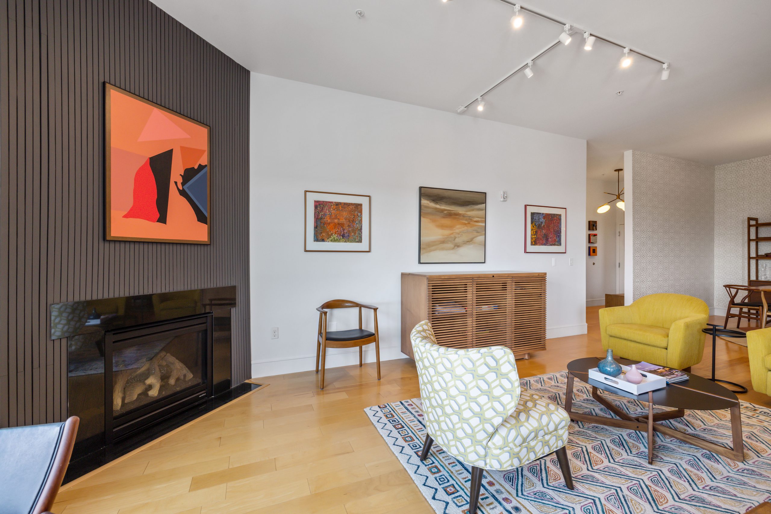

Firm: Robin Davis Interiors
Designer: Robin Davis
Photographer: Matt Congdon
Location: Portland
The inspiration for this condo update came from the clients’ fantastic collection of art from Maine’s William Manning, along with their previously stored midcentury modern furniture. They own a traditional year-round home in Cape Elizabeth and had been renting out their downtown Portland property for about ten years. Since heading to Florida for the winter wasn’t an option during the early months of the pandemic, they thought they’d escape to the downtown condo for the winter in order to be less isolated. But its very dated interior needed some cosmetic changes.
A blank canvas was created to allow the furniture and artwork to take center stage. Walls that were once a dingy yellow were painted Decorator’s White by Benjamin Moore. Wallpaper in modern patterns punched up the powder room and dining room. Davis also added walnut slated panels in the entryway, leaving the finish natural, and updated the fireplace panels in a painted charcoal to add some dimension to these once overlooked spaces. Fun and modern ceiling fixtures and table lamps were also added throughout.
A big challenge was to hide a television in the living room. Davis was able to source a modern slat custom cabinet with power-up lifts from an Amish company in Ohio. Finished in a beautiful walnut, one would never know it holds a TV, allowing the clients to keep their art on full display while making it possible to catch a movie on Netflix.
COMMERCIAL
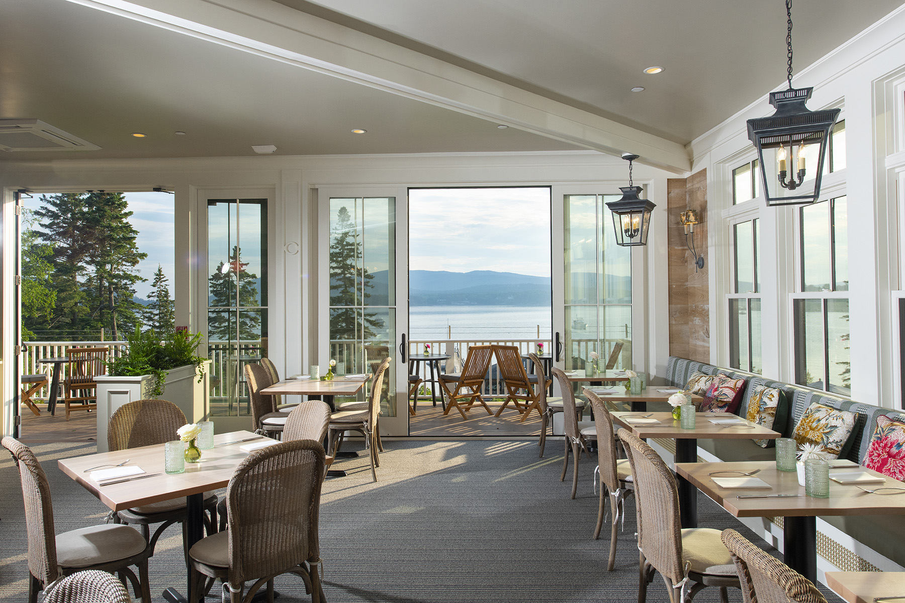
The Spruce Point Inn

Firm: Knickerbocker Group
Interior Design: Knickerbocker Group
Design Team: Bob Francisco, Scout Hartz, Chloe Kregling
Photographer: Darren Setlow
Styling: Patty Boone
Location: Boothbay Harbor
Families have been coming to Boothbay Harbor’s Spruce Point Inn, year after year, for decades. Knickerbocker Group wanted to embrace the inn’s authentic, enduring appeal while giving it a face-lift for today. The firm was inspired by the 1892 inn’s coastal charm and sense of history—it was once a private fishing and hunting lodge, and notable summer guests have included a U.S. vice president and senator—as well as the inn’s incredible location: it’s poised among 57 acres of pine forest and on the Boothbay Harbor coastline.
The inn has classic coastal New England summertime style balanced with charm, elegance, and a sense of whimsy. It was important to honor the past while refreshing the spaces for today. Furniture and other pieces of decorative art original to the inn were given a second life with either a fresh coat of paint, new upholstery, or updated elements, like changing the shades on table lamps. These objects were paired with vintage pieces discovered at local antique shops and flea markets, and new pieces were sourced that would still feel intrinsic to the inn’s history. Taking inspiration from the inn’s name and its wooded location, touches of deep spruce green were added throughout, from the custom decorative latticework in an entryway to the contrast welting on the cushioned wicker chairs in the lobby.
Jewel box moments were incorporated in areas like the ladies’ room, updated with a Carrara marble countertop, a custom silk taffeta vanity skirt, and lobster wallpaper. The men’s room, which features toile foxhound wallpaper—a nod to the inn’s past as a hunting lodge. Vintage nautical flags were framed and hung above guest beds, and newer pieces, such as navy blue leather swivel bar chairs, feel as though they’ve always been there. Rounding out the eclectic mix are leather director’s chairs, brass travel trunks that serve as side tables, and a custom brass picture rail that showcases a mix of art pieces, from a print by local artist Brad Betts to a vintage painting of a sea captain.
Scorebuilders


Firm: Bowerbird Design Collective
Designer: Melanie Scamman, Laura Zoulamis
Photographer: Lauren Hottenger
Location: Scarborough
Bowerbird was initially inspired by the architecture as well as the raw structural elements that architect Kevin Browne used for the exterior of the building, and the designers wanted to bring that feeling through to the interior. Keeping the ceilings exposed seemed like the natural choice from the beginning, and the designers also chose polished concrete floors and black metal architectural glass wall systems by DIRTT.
The interior is modern, creating a more refined industrial office space. Pulling from modern Scandinavian influences, Bowerbird paired light woods, such as exposed Baltic birch plywood, with details like modern industrial and contemporary lighting fixtures. The space is minimalistic with clean lines, yet warm and inviting. Special consideration was given to sight lines so that, no matter where one is situated in the space, one’s eyes are met with visual interest. Since the space was open and all on one floor, the designers used several elements to divide it up; examples include an open bookcase, felted panels, carpets, and a partially suspended ceiling.
The color palette was largely inspired by the Interface carpet product called Video Spectrum. It has layers of color on color, creating depth and texture. It was exactly what was needed to offset the industrial neutral palette of blacks, grays, and off-whites. The accent color, Bermuda Blue (a deeply saturated jewel tone), creates a stunning backdrop to the main workstation layouts and conference room.
A custom-made 7- by 7-foot steel base table became the center of the resource library, a place to gather, restore, and study. For this special piece, the designers worked with Huston and Company of Kennebunkport. The graphics in the library include a series of interworking cogwheels, referencing Scorebuilders’ own ingenuity; Scorebuilders was the first commercial building at the Downs development, so the client was excited to include the Downs logo next to their own within the cog mural.
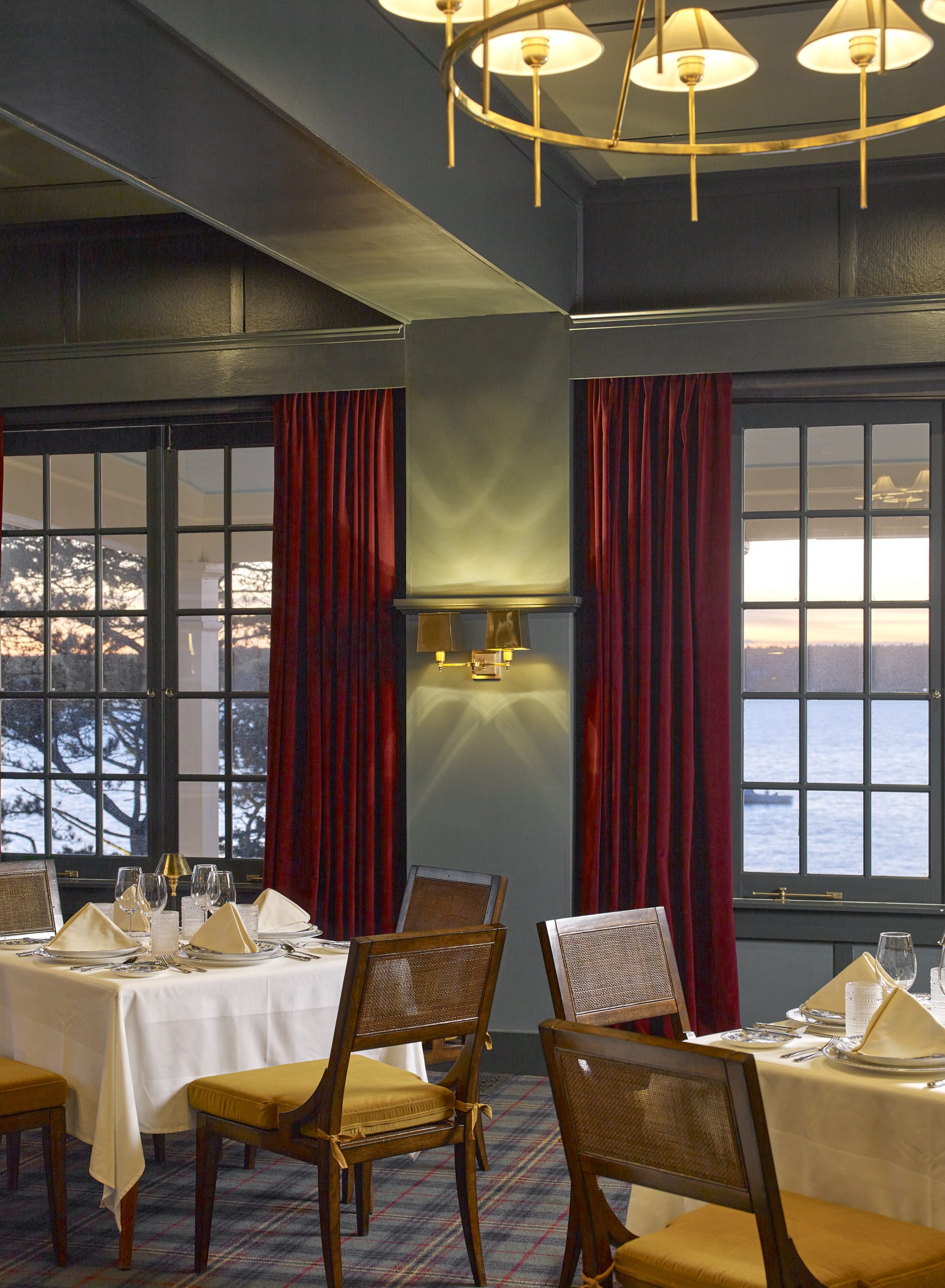
The Claremont

Firm: Keeler and Company and Krista Stokes
Designer: Laura Pierce and Krista Stokes
Photographer: Douglas Merriam, Erin Little
Location: Southwest Harbor
The Claremont is one of Maine’s most historic hotels. The six-acre shorefront property has provided a classic summer refuge to visitors seeking a quiet coastal respite since 1884. “The property has seen generations of guests and celebrations, so much of the inspiration for the design is in sustaining that nostalgic, bygone era that guests have enjoyed for years on the property,” says Laura Keeler Pierce, founder and principal designer of Keeler and Company.
“Old iconic images were referenced of people dressed for any and all occasions, enjoying the mundane in style,” reveals Krista Stokes, lead designer and art director at the Claremont. It was all about taking the moments and elevating them with small details. “The gardens, the woods, the harbor, the smells, the mountains, the local people, all of it is magic,” says Stokes. The goal of the designers was to make the guests feel inspired, lighthearted, transported, sentimental, and nostalgic.
The biggest challenge in designing the Claremont was also its greatest opportunity. The Claremont is an iconic Mount Desert Island hotel and has been home to moments of significance for so many. Ensuring that the hotel remained true to its roots—a grand dame on the edge of Somes Sound—while being enhanced with the amenities that today’s travelers require took a special balance. Consideration was taken to retain and enhance architectural details in the public spaces, such as coffered ceilings, custom millwork, and sophisticated paneling, the kind of consideration given to the summer cottages found throughout the island. And the designers leaned on decorative elements to pull out that nostalgia and charm, whether with iconic wallcoverings from Sister Parish or mixtures of textiles by William Morris and Pierre Frey, creating a layered, collected experience. The majority of the new artwork is by David Allen and Claire Cushman. All of this is enhanced with furnishings, art, books, and ornaments that were original to the hotel.
The color palette was inspired by the hotel’s surroundings: the edge of the ocean and Acadia’s iconic mountains. Guests can find greens, blues, and pops of cherry throughout the main building, while the oceanside spaces have a more nautical flair, and the wooded cabins are mossy and intimate in their color palettes.
After an extensive transformation guided by a strong commitment to excellence, attention to detail, and passion for creating unforgettable hospitality experiences, this coastal Maine classic has been reborn with a modernized twist.