A Sense of Place


From traditional to sleekly contemporary 15 spaces that are stylish, striking—and sure to make a lasting impression
When we asked the designers on the following pages to tell us about their philosophies, what came up, time and time again, was how their clients inspire them. “No two spaces should be the same,” says designer Gretchen Boulos, whose focus is on office spaces, “because no two clients or sites are the same.” That ability to hone in on what exactly it is that each client uniquely needs, deserves, and desires is perhaps what made these projects in particular rise to the top of the submission pile. (Speaking of unique, don’t miss the croquet-mallet-inspired balustrade designed by Margo Moore Interiors’ Megan van der Kieft.) After weeks spent working with—and listening to—their clients, these designers have all created intuitive and inspirational spaces. But what really sets their projects apart is that they have more than a passion for their work and an eye for beauty: they also have an open ear.
1. A Waterfront Home with Warmth & Ease
This new home replaced an existing, grandfathered cottage within the 75-foot setback rom the shoreline. “The interior combines the warmth and ease of Scandinavian design with an elevated coastal aesthetic drawn from its island surroundings,” says designer Brady-Anne Cushing, who worked with designer Elena Duralde, both of Knickerbocker Group, on the project. The solid surfaces within the home are a study of restraint in color. The pair implemented a uniform, soft warm gray for the walls throughout and whites, blues, and wood tones for the cabinetry. “This becomes the canvas for a juxtaposition with the textiles, which feature bright colors of citron, blue, and turquoise,” says Duralde.
Notable are the designers’ use of natural finishes that allow the materials’ characteristic beauty to shine through. “It was important to us to maintain the aesthetic and integrity throughout—unaffected finishes such as the concrete parging on the fireplace surround, the raw steelwork of the diamond-lattice wood box, and the natural brass of light fixtures, for example,” says Cushing. The pair also designed a winding open stair that creates a visual connection between the home’s three floors; with its unique handrail and baluster system, it seems to float in the space. In addition, Cushing and Duralde incorporated thoughtful function at every turn: a quirky loft space at the top of the stairs was made into a cozy reading nook by incorporating two large custom benches, and a dresser inset into the wall of the second-floor bedroom adds storage without taking away valuable floor space.
The designers transformed the lower level—formerly a dirt-floored storage area— into an elegant, open-air entertainment room with a cedar-coffered ceiling, porcelain- tiled floors, a stone fireplace, teak cabinetry, and mahogany-framed screen panels between shingle-clad columns, selecting materials for warmth and aesthetic value as well as weather resistance. “Every inch of space was treated with significance and attention to detail,” says Duralde, “which resulted in a home that is carefully designed and beautifully decorated. The design challenges gave us an exceptional opportunity for creative and uncommon solutions, making this space sing with individuality.”
Brady-Anne Cushing & Elena Duralde
Knickerbocker Group
knickerbockergroup.com
2. A Quaint Summer Retreat
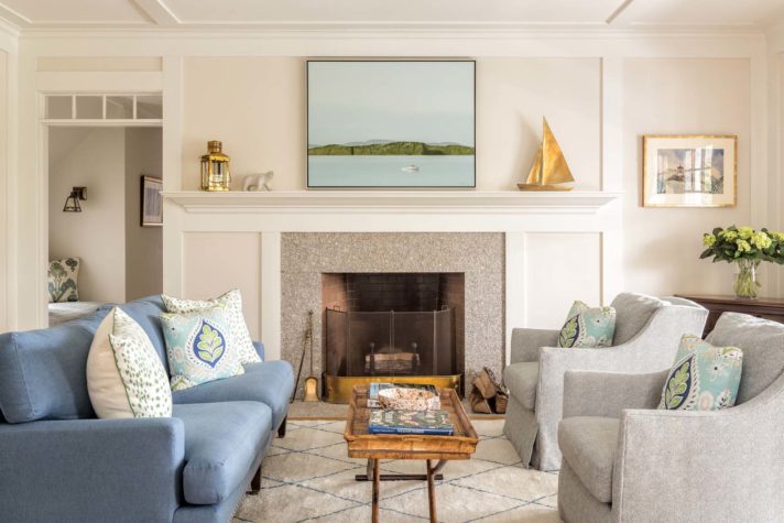
This quaint summer retreat in Seal Harbor, Maine which was designed by architect Keith Kroeger, is a tribute to an original Fred L. Savage summer cottage. Kroeger enhanced the project with intricate wall paneling and moldings, an elaborate wood-paneled staircase with curved newels, and an elegant Maine granite surround for the living room fireplace. Designer Leandra Fremont-Smith introduced slender yet comfortable furniture to update the traditional space. “The living room is a palette of fresh and light blues and greens that reflect the ever-changing ocean outside the cottage,” she says. She created layers of patterns in pillow fabrics from Schumacher, Thibaut, and Martyn Lawrence Bullard. For the artwork above the mantel, she reached out to Deirdre Boland of Artemis Gallery in Northeast Harbor and selected Francis Lipari’s Flanders Bay, which portrays a beautiful, calm summer day on Mount Desert Island.
Tucked around the corner from the living room is an upholstered window seat, which provides a cozy reading nook. Underneath the stairway sits a bench from Thos. Moser, with vibrant green pillows that contrast against the rich wood paneling of the adjacent billiards room. The guest bedroom is clad in beautiful tongue-and-groove pine walls with a thick moulding above, and features a McAdoo hooked rug that portrays a scene from neighboring Northeast Harbor. Overall, Fremont- Smith strove to blend the rich traditional elements of the home with a playful palette and furniture pieces that will continue to be used and loved for many summers to come.
Leandra Fremont-Smith
Leandra Fremont-Smith Interiors
leandradesign.com
3. A Colorful Family-Friendly Living Area
The client, who lives in an 1884 house with her two young daughters, described her aesthetic as “bohemian meets modern farmhouse.” “I saw this as a unique design challenge to merge these styles into a really beautiful, family-friendly space,” says designer Heidi Lachapelle.
The home’s double living area had six large windows, which offered lots of light but made furniture placement “a little bit of a puzzle,” says Lachapelle. Her solution was taking advantage of the large room, creating a more formal living area in one space and a cheery playroom area in the other. “The key to designing any older home is to work with the architecture instead of against it—quirks and all!” she says.
Cyr Painting Service painted the built-in a strong blue green, a shade that helped inform the rest of the space’s color story. Pops of raspberry add contrast, but most of the furniture is neutral, with a focus instead on textures such as weathered wood and metal accents. Lachapelle hung paintings by Louis-Pierre Lachapelle on the walls and selected simple white window treatments from Accent on Windows. But the room’s showpiece is the stunning capiz globe light. “It ups the sophistication level without feeling too stuffy,” she says.
Heidi Lachapelle
Heidi Lachapelle Interiors
heidilachapelle.com
4. The Mix Is In
Designer Bronwyn Huffard’s clients were repatriating to Cape Elizabeth after years of living in London. The inspiration for the design was the clients’ artwork and treasures collected during their time abroad. Huffard mixed old and new, quirky and traditional, European and American, all while keeping the look clean and functional.
Early project inspiration came from pendants (now hung over the kitchen island) that the clients found at auction, as well as a vintage Bibendum Man poster, which helped to inform the color palette. The inspiration for the kitchen cabinetry came from a photo the homeowners took of a kitchen in Sweden with very dark cabinets. “It took some trial and error with samples to get the exact color, but in the end, we got it just right,” says Huffard. She kept the sitting area, which is open to the kitchen, subtle in soft grays and added a custom loveseat and rug sized to the space.
She also oversaw the opening up of the kitchen area. “The old space was littered with fluted columns that we wanted to remove, so we had to study how the loads were being carried before taking them out,” the designer explains. “Ultimately, we only had to keep one support, which is visible in the corner of the island. Paul G. White Interior Solutions did a great job creating a template of the countertop and creating an escutcheon of sorts around the pole with the countertop material.”
With the wall between the kitchen and dining room left as a cased opening, the two rooms needed to relate to one another while still maintaining their individual characters. Huffard softened the palette in the dining room and elevated the details, adding light blue silk wallpaper and a simple, refined chandelier. “These both softly complement the clients’ cherished landscape painting that hangs center stage above the fireplace,” she says. Overall, it’s a space that perfectly illustrates Huffard’s design philosophy. “I inherently mix old with new, high with low, and near with far, so this project was a great fit,” she says.
Bronwyn Huffard
Huffard House Interior Design
huffardhouse.com
5. A Charming, Classic Bedroom & Nursery
The owners of this historic summer cottage, which retains much of its original detail, have shared many cherished moments at the home. Their two daughters were both married at the house. Their first grandchild was born this year, and they wanted to update the new parents’ bedroom and turn the guest room next door into a comfortable and functional nursery.
“Both bedrooms are done with a fresh spin, but they still blend in with the classic antique look of the home,” says designer Nicki Bongiorno. The new mother selected a color scheme of navy and white with punches of orange, for a palette that’s both fresh and classic. Bongiorno then outfitted the space with a clean-lined parsons-style desk, which also doubles as a vanity, so the couple can still work while visiting. The designer also created a seating area for quiet moments with or without the new baby, for reading, and for just taking in the beautiful view. “And the luxe bed is so comfy,” she says. “Perfect for new parents desiring all the sleep that they can get!”
The nursery, which is just next door, updates a former guest room that had horsehair plaster with wallpaper on top. “There was no way to remove the existing wallpaper,” explains Bongiorno. Instead, she found a new, nautical-inspired wallpaper to layer on top. “The wave pattern is a nod to the location without being too thematic or babyish. I love that it is so highly patterned, but is still gentle in color and contrast,” she says. “It doesn’t scream, ‘look at me.’” She finished the space with a large soft rug that will be the perfect surface as the baby learns to crawl. “While the family has plenty of seating elsewhere in the house,” says Bongiorno, “they have told me that this room is where they all gather now: three generations seated on the floor, window seat, and glider.”
Nicki Bongiorno
Spaces Kennebunkport
spaceskennebunkport.com
6. A Sophisticated & Lively Condo
“My inspiration for this condo was the architecture of the space,” says designer Tyler Karu. “The 14-foot ceilings, original brick accent walls, and clean palette dictated bold design ideas and out-of-the box concepts.”
The goal was to create a home that would be casual, sophisticated, and lively—a space where it is clear that an active, adventurous person resides there. To do that, Karu kept the furnishings modern and clean-lined and selected a neutral color palette with pops of yellow and blues. “The blues are inspired by the ocean, as the homeowner loves the water,” says Karu. The shade is evident in the eye-catching Akdo tile from Old Port Specialty Tile that adds life to the pared-down kitchen.
The design challenge was rooted in the scale of the space. “There was not a ton of square footage but a lot of volume,” says Karu. To enhance the home’s expansive height, the designer focused on drawing the eye up. This is done with the mural in the owner’s bedroom—Karu had it made from a nineteenth- century map of Maine that she obtained through the Library of Congress—as well as with a paddleboard used as decor in the living area. “Even though they weren’t part of the original design plan, they add another proportional piece to suit the space,” she says.
“I love mixing organic and earthy elements such as wood, leather, brick, and concrete, and they all play together well in this space. Even with a centuries- old map taking up an entire 14-foot wall, the modern furnishings still work because the overall aesthetic is tonal and neutral,” says Karu. “It’s the mix of elements that excites me the most about design.”
Tyler Karu
tylerkaru.com
7. A Rockport Seaside Retreat
The homeowners were downsizing from their New York farmhouse and moving to a seaside condominium in the midcoast. Designer Ariana Fischer created a sophisticated, chic home incorporating well-loved family heirlooms and furniture as well as places for the clients’ beloved—and expanding—contemporary art collection. “The couple travels extensively, so incorporating all of these elements into an easy and comfortable home was the goal,” says Fischer. “They also really love modern European design, so we took this opportunity to have their new home and life reflect that.”
Fischer acknowledges that there were some design challenges: “Condominiums can have tricky structural details that cannot be altered. That being said, we were able to convert a tiny, dark 1980s kitchen into an open and bright space.” Citing the homeowners’ love of travel and art as her design inspiration, Fischer used neutrals to reflect their tailored sensibilities, played homage to their favorite places with the Italian- inspired kitchen and Belgian bluestone floor, and honored meaningful family pieces by incorporating antiques into the kitchen. She also furnished the space with decor that complements the variety of the homeowners’ contemporary art collection, with pieces ranging from an African woven rug to a modern Eames chair.
“I like to mix things together that represent the client: where they came from, the life they live, and the aspirations they have,” says Fischer. “I am always determined to create spaces that give respite but also inspiration. I have been designing for these clients for years, and it is an effortless, trusting, and symbiotic relationship, so the result feels totally natural and perfect.”
Ariana Fischer
Ariana Fischer Interior Design
arianafischer.com
8. A Neutral & Natural Coastal Home
In a coastal house built by Thomas and Lord, designer Nicola Manganello created a peaceful and calming look through her use of neutral and natural colors and textures.
In the kitchen, the design evolved around the woven lights. “Apart from the artistry of their weave, they filter a soft, subtle light you’ll never find in a Pantone book,” she says. She added vintage Maguire stools, which were handed down by the owners’ parents, “proving that good furniture never goes out of style,” she says. Manganello reupholstered their seats in orange fabric with a Bermuda-red stripe, adding a splash of color and fun to the room. Then, as the kitchen is a high-traffic area, she selected pieces for beauty and durability, such as the heart pine floors.
In the living area, Manganello says she “took particular care to sidestep the traditional blues and whites often seen in waterfront settings.” Instead, she gravitated toward Indian stitch pillows, a contemporary painting, and distinctive antique mermaid accents. Clean, oiled beams add a touch of visual orientation. Elsewhere in the house, she incorporated the clients’ antique and vintage finds, such as old boards. Manganello had them pressure washed, “which revealed a tone and grain that was reminiscent of a vintage Hawaiian longboard.” She says. “It completely changed the character of the wood, and we used it everywhere.”
The home has a sense of warmth and familiarity that’s instantly welcoming to both owners and guests alike. Perhaps that’s because Manganello puts so much of herself into the work. “When I design a space for a client, I’m also designing it for myself,” she says. “If I wouldn’t want to call it my own, my work’s not done.”
Nicola Manganello
Nicola’s Home
nicolashome.com
9. An Organic Modern Kitchen
For this timeless, modern kitchen, the homeowners requested a design that would be both colorful and serene yet also maintain the natural feel of the home’s wooded site. Designer Catherine Weiland, who collaborated on the space with architecture firm Briburn and builder Senecal Construction, used a tranquil color palette and natural wood to achieve the look that the clients were after.
“The homeowners asked for cabinets that felt present—in other words, not white— with bold touches throughout the space,” says Weiland. Her solution was slab cabinet doors painted graphite blue. “This style of doors can be seen in kitchens from every decade,” she says. “And the color is a shade similar to the rocks of the shore nearby. It falls just outside the gray trend, which gives the space lasting independence.” Gallery- white walls enhance the light and view from windows on three sides, while bold pops of color come in through accessories such as bowls, textiles, and cookbooks.
Because the kitchen was an addition and contains a load-bearing wall, there is a large structural post in the space. To keep the design feeling proportionate, Weiland centered the island on the post, creating a feeling of alignment and order, then added a wood waterfall countertop for a clean, seamless interaction. The natural wood counter, along with the floors and shelves, lends an organic modern element and echoes the view of the trees just beyond. “My design philosophy is simple,” says Weiland. “Design the space your clients would design for themselves.”
Catherine Weiland
Balance Design Studio
balancedesign.studio
10. A Neutral & Timeless Living Area
Cape Elizabeth homeowners Chris and Laura Lynch were ready to update the living room that their family uses every evening to watch TV, read, and relax. They loved all of the antiques they had collected but wanted to freshen things up. Designer James Light created a living area with an Old World feel that incorporated some of their existing pieces.
“The heart of this room is the view,” explains Light. “So I started with a palette that was borrowed from the outside landscape. I wanted everyone who entered the room to immediately go zooming over to the window and experience the vista that is hard to beat.” In order to do that, Light swapped out brocade curtains for light-colored linen ones, adding a neutral but bold trim to further frame the view. He also re-covered the couple’s floral George Smith sofa and chair in a solid neutral. On the TV side of the space, Light added new Lee Industries swivel chairs and a deep Hickory Chair sofa with a gracious curved back. “I chose to put bold pattern on the pillows,” says Light. “It’s an easy swap if the family wants another change down the road.”
James Light
James Light Interiors
jameslightinteriors.com
11. Restoring Luster
In renovating the three-story, neoclassical Grand Trunk Railway Company building in Portland, designer Gretchen Boulos says she looked to the site’s history for inspiration. “I wanted the lobby to showcase the history of the building while at the same time making it a first-class office space for Gorham Savings Bank,” says Boulos, who worked with Archetype Architects and builder Monaghan Woodworks on the project. “The building has so much character and architectural detail that I really felt my job was to not overdesign the space, which would distract from its original beauty.”
Preserving as much as possible, Boulos restored the wainscoting, wood floors, doors, and doorframes, and even custom designed historically appropriate wall signs from Welch Signs directing visitors to the reception. But she wasn’t afraid to modernize certain elements of the space, such as the large, chrome circular pendants that hang from the lobby’s 14-foot ceilings and the additional seating and office furniture from Creative Office Pavilion.
The building offers up views of both the ocean and the city. From the third-floor boardroom, one can see in all directions. “Look left, and you’ll see the ferries. Look straight, and you’ll see up bustling Commercial Street. Look right to see across Munjoy Hill,” she says. In order not take away from the natural beauty of the site, Boulos selected a scheme of wood tones, neutrals, and blues. “The colors allow the eye to gaze from the floor, to the ceiling, to the views, seamlessly,” she says.
“As with any project, my approach is always the same. Learn about the client, learn about how they work, and learn how they can work better,” says the designer. “Then I can design an office space unique to them.”
Gretchen Boulos
Boulos Commercial Design
bouloscommercialdesign.com
12. An Airy & Modern Lakeside Bathroom
Designer Emily Ennis Mattei’s inspiration for the space—a dated, forest green bathroom with dark wood trim and a sunken tub—was to design a clean, European-modern owners’ bathroom that would showcase sweeping views of Lake Sebago’s Mystic Cove and align its look and feel with the rest of the contemporary lake home.
Working with builder Wright-Ryan Homes and Wright-Ryan Millwork, Mattei first broke up the square space into sections, allowing a main function to reside in each corner of the space, where a soaking tub, oversized shower, and modern floating vanity were located. The bathroom’s showpiece is the custom vanity that Mattei floated in the center of the space and paired with a custom ceiling- mounted mirror. “I didn’t want to clutter the ceiling with too much hardware,” Mattei says, “so we concealed the support mechanism for the mirrors in the ceiling structure.” In addition, she used specialty junction boxes so that the pendant light canopies could be only two inches in diameter rather than the more common four or five inches. “These small details had a big impact on maintaining the Zen-like feel of the space,” she explains.
The designer selected a modern and soothing color palette, choosing textures, sheens, and mixed materials—such as polished chrome and flat-black metal—to create balance and keep the focus on the view. She wrapped the shower walls and the toilet wall in an oversized, high-gloss ceramic tile that gives the appearance of Carrara marble and then grounded the space with square, charcoal-colored ceramic tile flooring that mimics real stone. Finally, she created an alcove for greenery that creates a natural privacy shield for the shower yet connects the space to the outdoors. “Living and working in Maine, I find that I am often designing spaces that lend themselves to celebrating the whole spatial environment, both inside and outside of the home,” she says. “This bathroom, with its large picture windows and views beyond, is no exception.”
Emily Ennis Mattei
e4 Interior Design
e4interiordesign.com
13. A Happy Remix
This unassuming home in a row of cabins overlooks Megunticook Lake and Maiden Cliff. Flanked by boulders and covered in pine needles, this beautiful property required a light and fresh approach to lake life.
Designer Megan van der Kieft of Margo Moore Interiors first found inspiration from an article she had filed away more than 12 years ago on antique croquet mallets. “I immediately thought of spindles on a staircase,” says van der Kieft. I knew, the moment I saw this space and understood the eclectic decor that the client wanted, that this was the perfect location to introduce the idea.” Van der Kieft worked with Phi Builders and Architects to build the spindles to resemble mallet handles. “Phi further developed the stairwell design by creating a functional newel that houses croquet balls,” she says.
Van der Kieft designed the kitchen around a colorful retro refrigerator and range and added natural black slate countertops to ground the space. Rather than traditional wall cabinets, she had Benjamin Leavitt Metalwork craft raw-edged open shelves and brackets to keep the spacing feeling airy. More unique details abound, including quilt- pattern decorative flooring painted by Two Itinerant Artisans (who also painted the stair spindles) and gothic arched doors with antique closures installed in the owner’s loft. One other unique detail was a happy surprise. Concrete tiles with a star pattern, which were originally intended for a different project but didn’t arrive within the timeline, were installed in the owner’s bath—and were clearly meant to be. “I showed the tile to the client and her family, and they fell in love,” says van der Kieft. “It reminded them of her husband and his passion for stars. Installed on the walls and the floor, it looks like the night sky and is perfection.”
Megan van der Kieft
Margo Moore Interiors
margomoore.com
14. A Historic Home with a View
This historic cottage, a former blacksmith’s shop, is situated on a beautiful overlook on the Goose River right at the spot where it empties into Rockport Harbor. “It’s a stunning view, and what struck me about it when I first stepped into the house we now call home was the way it celebrates the beauty outside and also brings it within,” says designer Michael Hampton, who’s based in Washington, D.C.
Renovated by architect John Priestley of Priestley and Associates, the home has an open plan that incorporates a living room, kitchen, and dining area, and at its center, a set of floor-to-ceiling glass doors that look right out onto the river. “Everything in the room, from the bright white paint to the furniture and the art, was chosen to harmonize with the view,” says Hampton. “I did not want anything to take away from it.”
The home is a vacation house, so the designer chose furnishings that are well made but budget-friendly and fabrics and accessories in a palette of pale blues and soothing greens—”colors that reflect those outside without trying to compete with them,” Hampton says. Because of the home’s small size, he also looked for furniture that would do double duty. (In the dining area, a custom upholstered bench, which serves as both seating and storage, is just one example.) He found local help in all of this, especially with the art, thanks to Debbie Chatfield of Chatfield Design. “One day shortly after we bought the house, there was a knock on the door. It was Debbie, whose office is just around the corner. Being a Southerner—Debbie grew up in Louisiana—she wasn’t shy about coming over to say hello, especially as she’d heard that the new owner was a designer, too. We hit it off immediately, and thanks to her I not only got a line on the best artists and craftspeople in the area, but also had a chance to meet them.” One of Hampton’s favorite pieces came out of this friendship: a large oil-on-canvas chart of Penobscot Bay by Paul Fenton that hangs in the dining area. “It’s a constant reminder,” he says, “both because of the artist and the subject matter, of where I am: a place whose landscape and people I’ve come to love.”
Michael Hampton
Michael Hampton, Inc.
michaelhamptoninc.com
Debbie Chatfield
Chatfield Design
chatfielddesign.com
15. A Charming Classic Cottage
This two-bedroom home is actually the former Cape Porpoise post office. “I wanted it to stay very much a Maine coastal cottage,” says Louise Hurlbutt of Hurlbutt Designs, who added V-groove paneling along with fabrics in blue and white with pop of coral to keep the classic coastal look.
The biggest design challenge was the home’s small footprint. Hurlbutt worked with architectural design firm William Ross Design and construction manager Diversacorp to squeeze in two bedrooms with en suite baths, as well as a round dining room table with a custom banquette and a powder room with a stackable washer and dryer in a closet.
She designed the home both to take advantage of beautiful views of the garden in the summer and for comfortable seating around a fireplace in the winter, finishing the rooms with antiques and unique lighting for visual interest. “It is compact, and wonderful for a couple to be able to have everything they need within one block: Cape Porpoise Kitchen, Bradbury Bros. Market, a church across the street, the library, gift shopping at Farm and Table, dining at Musette, the Atlantic Hall, and nearby views of the ocean,” she says. “One could not ask for anything more!”
Louise Hurlbutt
Hurlbutt Designs
hurlbuttdesigns.com