Boldly Modern
FEATURE – September 2014
By Debra Spark | Photography by Jeff Roberts
A Massachusetts couple, two builders, and one architect create a home full of surprises
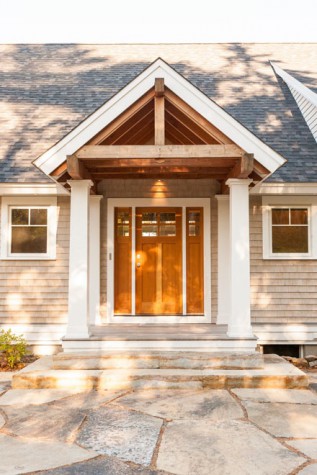
Heraclitus said you can’t step in the same river twice, and it would seem that you can’t design the same house twice. A house isn’t always moving, like a river, but in general, when it is complete, it is complete. It can be renovated and tweaked endlessly but not designed and executed again. Unless you are architect Joseph Russillo, who had the unusual experience of designing the same Owls Head house twice. The first time was in 2009, when Russillo, of Maple Street Design Studio in Camden, drew plans for an older couple who wanted a simple structure with vernacular elements for their oceanside property. The end result, built by Taylor Martens of Taylor-Made Builders in Northport, had traditional cedar shingles, white trim, and gable roofs, although it also embraced the contemporary with an exterior wall of windows and a long exterior balcony with stainless steel cable railing. Although Russillo and Martens presumably provided what was asked for, the homeowners weren’t ready to commit to the house, so the interior was never completed. Even so, the couple lived in the house with a makeshift kitchen and bath. Ultimately, they decided not to finish the project.
When the house came on the market, Garth Smith and Susan Irwan of Massachusetts had none of the original couple’s indecision. For them, the property felt fated, from the start. On their initial drive to the site, Smith and Irwan passed the Owls Head General Store, which advertised itself as having Maine’s Best Burger, as determined by the Food Network. This was a plus. Smith loves hamburgers. Past the post office, there was a dock with picnic tables on which to eat lobster—another of Smith’s favorite foods. “It was so magical,” Smith says. One of the roads that led to the house incorporated part of Smith’s name. This felt like another welcoming coincidence. And then the actual property was gorgeous: a peaceful wooded lot on a calm cove with a beach where Smith and Kirwan’s two young daughters could safely play. Smith and Kirwan hadn’t yet looked at other houses in Maine, but they didn’t need to. They made an offer that day and had a purchase and sale agreement within the week.
They might have been disappointed that they weren’t going to design their own home from the ground up. That had always been their fantasy, but they loved the simplicity and lines of the existing house and welcomed the chance to shape the interior. Russillo designed the house again, this time focusing on the interior and with Rockport’s Phi Home Designs as builders and cabinet- and furniture makers. “Garth and Susan set the tone for the process,” says Russillo. “Everyone was to be open-minded about design. Nothing was off the table.” The original owners had wanted a traditional Maine look. Smith and Kirwan wanted the boldly modern.
The results are striking: a home whose one-of-a-kind pieces have eye-popping colors, intricate forms, and intriguing textures. Much in the house feels worthy of being in a design museum—or an art museum, given what’s hanging on the walls—but it’s clear that comfort and the needs and pleasures of Smith and Kirwan’s daughters drove the design as well. (Nota bene: The doorbell chime is a recording of the girls’ laughter.)
One of Smith’s favorite parts of the house is the kitchen island, which incorporates a blue agate counter that waterfalls into a blue agate wall. Although it looks like a four-inch slab of stone, the semi-transparent agate is actually on resin, so the countertop and wall can be lit from within. “It’s like a piece of art for the house,” Smith says.
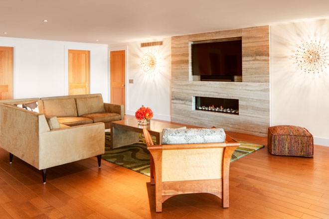
Part of what makes the island so impressive is that there isn’t anything in the immediate vicinity that competes with it in terms of color. The island is positioned against elegant, restrained neutrals, like the kitchen’s sleek cabinets, which are made of a high-quality maple plywood—the material is called Europly—and stained a charcoal gray that lets the wood grain show through. The kitchen is part of a great room that also has a dining and living area, and the same design impulse (bold color and form against white wall or textured neutral) is repeated here, as with a yellow wall sculpture, whose tendrils curl out from the white dining room wall, or the slouchy royal blue Ligne Roset couch that faces a sculptural gray “wave wall” that surrounds the large rectangular gas fireplace.
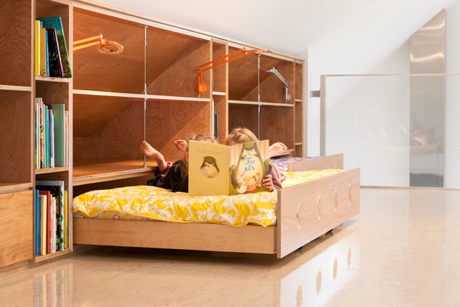
One of the pleasures of the house, Russillo observes, is that every room has its own surprise. An upstairs mezzanine forms a balcony over the great room. The loft-like space has an aluminum rail and banisters that are in-filled with glass panels. Under the pitch of the loft’s ceiling, Phi has built red birch Europly bookcases atop what look like three long drawers but are in fact three hidden trundle beds—perfect for the children’s sleepovers. The girls’ bathroom is similarly tailored to their needs, with an additional surprise: one of the drawers pulls out to form a step stool. (When the girls grow older, it can be flipped over and converted into a regular storage drawer.) The master bedroom has a custom bed built by Phi with a headboard that incorporates petrified wood tiles. Even small spaces are allotted something special: the floor of the staircase landing has two glass windows to illuminate the darker space below; the powder room has a dark bowl sink with an undulating curve for a pedestal, both of honed basalt. The entryway wall sconces look like clumps of giant glass grapes. The front closet is a whole room, and its built-in doors have unusual pulls that have been created by carving into the Europly to reveal the grain of each layer. Even the garage interior is unexpected: it is made of corrugated metal. Better that resilient material, reminiscent of airplane aluminum, Smith thought during the design process, than scuffed-up drywall.
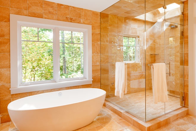
When Smith and Kirwan talk about their house, “fun” seems to be the operative word. They could be referencing the outdoor landscaping that has created a cave in which the children play and a rock wall on which they climb. They could be talking about the girls’ bedroom, with fairy houses and avocado-colored nest beds with dark pink comforters. But often enough, they are talking about the adult pleasures of picking lights, tiles, and rugs. Kirwan is a huge Angela Adams fan, and the Maine designer’s rugs are throughout the house and frequently determine the design direction of a room, as with a gray-and-white living room rug, which has forms that suggest cumulous clouds. (A photograph of actual clouds by Jacob Hessler hangs on a nearby wall.) Lights include large silver anemone-shaped sconces, which surround the silver travertine stone of the downstairs fireplace wall, and suspension lights of thin, brushed metal rods, which illuminate the high space of the living room. As for the tile, it encompasses three-dimensional glass tiles for the kitchen backsplash and an assortment of variously textured, honey-colored onyx tiles for the master bathroom. The girls’ bedroom has Italian glass aquamarine tiles with glass butterflies and dragonflies. “Something fun and whimsical that the girls’ would never outgrow,” says Kirwan. The ground floor of the home has a family room and two guest rooms. The guest bathroom’s tile is one of Kirwan’s favorite in the house; it is a black-and-white stripe that runs the whole length of the floor and then up through the back of the shower.
One surprise of the home isn’t even visible: Smith wanted to hear the outdoors when he was in Maine, not the everyday noises of the house and running children, so he asked for materials that would decrease noise transfer. Phi’s project manager Rob Troxler explains that these included “insulated walls, pipes, and electrical boxes, as well as specialized drywall. We even coordinated a unique pocket door jamb to limit sound transfer.”
For all the original aspects, the Smith-Kirwan home coheres in no small part because of the clean way in which wood, glass, and steel are used and balanced throughout the house and because the home is so … well, neat. You’d think a home with two young children would be cluttered, but it is the very lack of possessions that makes the things the family does have all the more vivid and beautiful. There may be a jumble of cell phone chargers, iPods, books, muddy boots, and cereal boxes somewhere in this home, but if so it is hidden away in the stylish built-in cabinets and closets.
Now that the Smith-Kirwans have been in their house for one year, they have discovered that the Owls Head General Store makes pie; indeed, a chocolate cream pie on Wednesday. (Chocolate cream pie … one of Smith’s favorite desserts.) The couple buys the treat weekly, sharing it with neighbors or friends when they can’t finish it. It is more evidence (as they see it) that their real estate decision, happily aligned with their gustatory pleasures, was right.


