Inspired Interiors
FEATURE
The beginning of a relationship between an interior designer and client can resemble a first date. First impressions. Casual conversation that gives way to a deeper understanding. And questions—always questions: What do they surround themselves with? What brings them joy? How do they live? What do they gravitate toward? Perhaps most important, though, is that there’s a lot of listening. That’s because good interior designers know it isn’t about them, but about their clients—that the best design reflects those who live there.
For this year’s Interior Design Issue, we chose a handful of spaces by designers who do an incredible job listening. The spaces they create are soothing and restful. Electric and eclectic. Vibrant and bold. Neutral and subtle. They are the perfect combinations of beauty and function, but above all they are one-of-a-kind, just like the people who live in them.
Restful Retreat
Designers: Louise Hurlbutt & Bonnie Weeman | Hurlbutt Designs
Transforming a 1940s ranch-style cottage from small and cramped to open and airy for a young family with two active sons presented a unique opportunity for Louise Hurlbutt and Bonnie Weeman. The design included removing several walls and a central fireplace to transform the formerly seven-foot-high ceilings into cathedral ceilings. An open plan evolved, with a new kitchen, dining, and living space looking through large picture windows onto a golf course.
Inherited antique furniture was refurbished, reupholstered, and brought back to life, adding a sense of history and style. Colors flow from room to room and, along with the rich woods of the antiques, bring warmth to the house. The White Sand wall color is carried throughout the house—in the kitchen, dining room, and living room and down the hallways. “It is light and fresh,” says Hurlbutt, “and beautifully complements the many antique wood pieces and the new custom-stained wood floors.”
A design philosophy centered on attention to detail and comfort makes this summer vacation cottage a place to relax and enjoy the views. “The cottage had good bones that had stood the test of time,” she says. “Now, with the renovations completed, it is ready for the next generation.”
For more: hurlbuttdesigns.com | 207.967.4110
Art Filled & Intimate
Designer: Krista Stokes
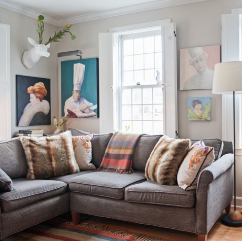
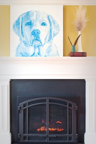
Krista Stokes helped two former New York City residents find connection to their space through distinct expressions of art, function, and comfort—he, an evolving artist with a revolving assortment of photography, paintings, and sculpture; she, a pure sentimentalist relating to the layering of objects and memories. Stokes guided them in their renovations, melding their stories (and their belongings) into their 1,200-square-foot house.
“The result,” says Stokes, “is a mix of transient and anchored pieces that backdrop the vibrant narrative of their lives.” Using her design philosophy of honoring what you have, Stokes helped the couple curate their beautiful collection of artwork and meaningful accessories into an intimate, comfortable, well-lived-in space.
For more: kristastokes.com | 207.251.9890
A View-Filled Sanctuary
Designer: Brett Johnson | Maine Street Design Co.
T his master suite is in a converted John Calvin Stevens carriage house in Cumberland that has been modified to suit the needs of the couple and their two children. Brett Johnson’s mission: create a sleeping sanctuary, his-and-hers dressing room closets (both with personalized custom built-ins and both in an extremely confined space), and a shared master bath that is both luxurious and functional. “The biggest challenge was adding visual volume to a small space,” he says.
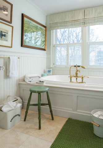
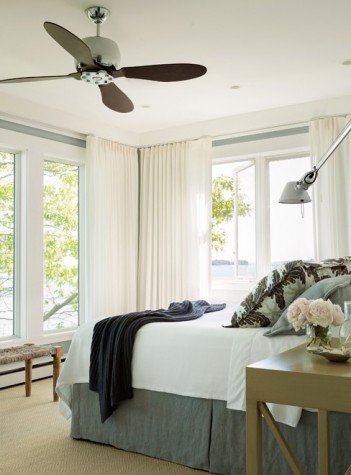
In the bedroom, soaring ceilings and ample windows open the room up to the outdoors and the sweeping views of Casco Bay and Sturdivant Island. The cool blues and subtle greens complement the natural linen fabrics. In the dressing room, the built-ins designed by Maine Street Design Co. embrace the Shaker ideal: a place for everything and everything in its place. Every nook and cranny in both dressing rooms was utilized and serves its own specific function. The bathroom features a large soaking tub with equally beautiful views.
For more: mainestreetdesign.com | 207.541.9187
Balanced & Beautiful
Designer: Leandra Fremont-Smith Interiors
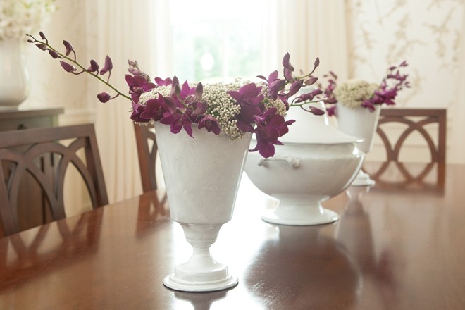
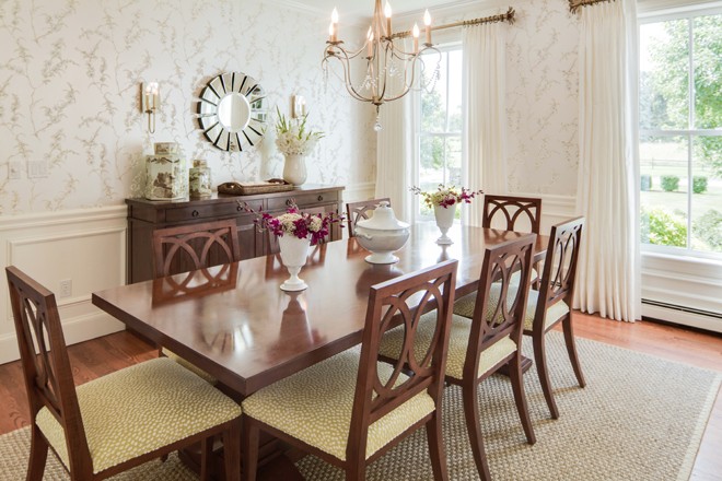
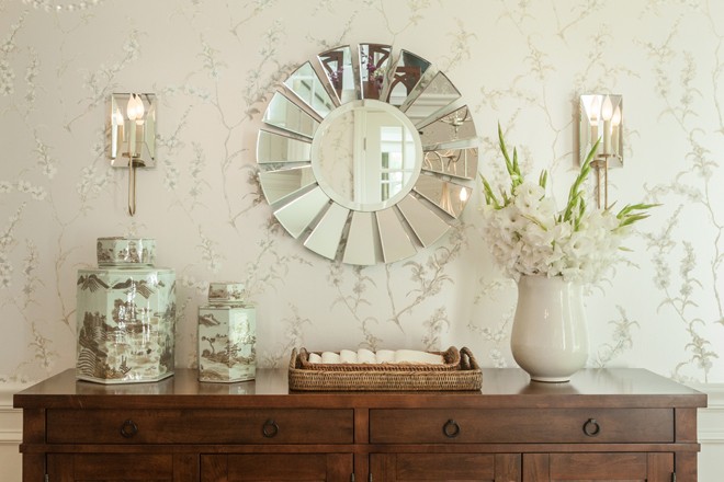
Leandra Fremont-Smith’s clients dreamed of a dining room that was not only stylish but also conducive to entertaining. The dining room in their classical-revival-style home is centrally located on the first floor, adjacent to an elegant Carrera marble entryway. The challenge was designing the room to complement the house’s mixture of Federal, Victorian, and contemporary styles. To do so, Fremont-Smith chose a neutral palette of elegant whites, ivories, and grays punctuated by metallics for a contemporary twist. The room’s tall ceilings and sophisticated wainscoting called for wallpaper, a traditional chinoiserie floral pattern with clusters of cream flowers on a silver-gray background. “The elegant floral paper has an element of surprise,” she says, “a silvery hue that reflects light in the evening, transforming the room into a enchanting dining experience.” Solid silk drapery panels, Sheridan-style dining chairs, and ginger jar accessories complement the elegant scheme of the room. The wood tones of the furniture help ground the room and warm the space. A hint of green in the dining room chair fabric complements the slight shade of green in the flowers on the wallpaper. The different textures of the hand-blocked wallpaper, sisal rug, and classic “stumpwork” pattern in the chair fabric add elements of interest and depth.
For more: leandradesign.com | 207.831.0013
Carefree Comfort
Designers: Linda Banks & James Light | Simply Home & Banks Design Associates
Linda Banks and James Light joined forces to redesign a small, nondescript ranch with a stunning view. Their goal: create a place for a young family to trade in their fast-paced California lifestyle for a restful summer of getting lost in the beauty of Maine.
Banks’s architectural work involved opening up the views, managing flow, and creating a lower-level bunk room for visiting cousins as well as an extra guest room. Light pulled together the furniture floor plan and a palette that wouldn’t compete with the amazing views. “Comfort was the first consideration,” says Light. “Second was carefree durability.” The family wanted to feel comfortable letting the kids be kids and lending out the keys to family and friends.
With a nod to the ’70s ranch and respect to the colors outside the window, Banks and Light gave the family everything they asked for and more: comfort, durability, style, and the opportunity for a lifetime of memories on the Maine coast.
For more: simplyhomepage.com | banksdesignassociates.com | 207.781.5651
Understated Elegance
Designer: Ariana Fischer | Ariana Fischer Interior Design
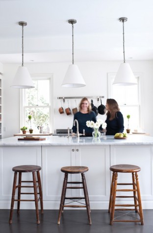
Ariana Fischer’s inspiration for this farmhouse in a charming seaside village came straight from her client—an “elegant, organized, down-to-earth, fun, judicious, stylish” woman, says Fischer, “with discriminating taste and a deep connection to the old-school vernacular of a New England lifestyle.” After the three-bedroom, 1,800-square-foot gable-roofed house was gutted, Fischer and her client culled through items to decide what would work in the new streamlined space that she would share with her two teenagers. “We focused on her aesthetic and values so that the house is a real manifestation of her. Decisions had to be very well thought out and judicious, as there was no room for error.”
Fischer embraced the architecture, using furnishings to add the homeowner’s imprint. Dark painted floors add a sophisticated element to the old farmhouse and, coupled with a classic white, set the tone for the whole house. Fischer built on the classic New England aesthetic with a collection of the homeowner’s antiques, while adding in feminine elements—a French chandelier in the dining area, pink curtains in the office, a chair upholstered in a metallic light purple linen. The rooms are filled with a spare elegance—components of contemporary tailored details punctuated with warm, well-worn pieces.
For more: arianafischer.com | 207.210.6450
Rustic Yet Refined
Designer: Nicola Manganello | Nicola’s Home
Open family living is at the heart of this contemporary farmhouse by Nicola Manganello. Living and dining spaces flow together in plain view of the kitchen, encouraging friends and family to find their own niche without sending them apart. When mealtime arrives, everyone comes to the table, where people can linger for hours or drift on to a nearby couch or chair to continue the conversation.
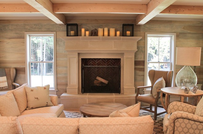
The materials drove Manganello’s color palette: natural oak cabinets in the kitchen, slightly whitewashed to bring out the grain, and hemlock beams left in their authentic form. “I always turn to unique materials—tiles, textures, natural and treated wood—to create atmosphere,” she says. Structured details, paneled ceilings, stone work, and reclaimed timbers lend a sense of scale and personality. Manganello selected lighting that is at once industrial and warm. Exterior spaces were designed to naturally flow from interior to exterior, inviting guests and loved ones to enjoy the natural beauty of Maine.
“I am a detail collector,” says Manganello. “I collect objects everywhere—yard sales, flea markets, auctions, junk shops. I appreciate a found object’s beauty, its impact, its essence, even if I don’t yet know where it belongs.” Manganello incorporated rustic elements into this contemporary farmhouse, from the metal casters on the base of the island to the hand-painted terra cotta tile in the front foyer. “Each item was designed with a function in mind,” she says.
For more: nicolashome.com | 207.847.3466


