Streamlined Space
FEATURE
A 1950s ranch renovated for art and stress-free living
What movies do actors watch, what books do writers read, what clothes do fashion designers wear? I always want the inside scoop. So when I was offered a chance to visit Kevin Thomas’s house, I jumped at it. Thomas is the publisher of Maine Home+Design (as well as Maine magazine), and from 2003 to 2010 he built high-end custom houses under the auspices of what is now Thomas and Lord in Kennebunkport. Since Thomas has built many beautiful houses and seen even more, I wondered what he might want for his own home, given his clear sense of the possibilities.
It turns out that the answer to that question—at least in 2011, when he moved out of a lovingly detailed shingle-style house—was “not what I had before.” Not that he didn’t value his previous home, but in that year, Thomas was looking to downsize. “I wanted to go in the complete opposite direction,” he says. “Single floor, clean lines, lots of simplicity.”
Thomas found a modest-sized 1950s ranch in Cape Elizabeth that was, in many ways, ideal. Although it wasn’t on the water (and didn’t have the accompanying tax bill), it sat on a hill above the water and offered expansive views. There were three bedrooms on one end of the house—convenient, as Thomas has three teenage sons—and a master bedroom with a private living room on the other. The ranch’s floor plan twisted in such a way that most of the rooms were angled to face the water. What’s more, the windows were large, atypical for the era in which they were installed. Major reconfiguration would not be necessary. Still, there was work to be done. The house, which had gone unoccupied for months, hadn’t been updated since it was built. The interior was damp, moldy, and musty. The inspection report was not encouraging.
Not surprisingly, Thomas turned to his former partner, Kevin Lord, for renovation help. “Most of the people involved in the house were longtime suppliers or contractors for Thomas and Lord,” Thomas says. C.O. Beck and Sons of Waterville installed a new standing-seam metal roof. Keegan Construction re-sided the house with untreated red cedar shingles, which were left to weather out over time. The front exterior doors were replaced with fir doors, the original Andersen windows with new Andersen windows with a different grill pattern. There were additional desirable, but less sexy, updates (a new water heater, new Viessmann furnace, and new plumbing). TC Hafford Basement Systems took out the perimeter of the basement slab and installed an underground water management system to deal with the dampness and mold.
As for the fun stuff: Thomas and Lord were joined by Biddeford cabinetmaker Derek Preble on the front end of the project (to design the kitchen and built-ins) and Brett Johnson of Portland’s Maine Street Design Co. on the back end (to bring order to the whole). Their combined impulses were, as Brett Johnson puts it, “to create a space for Kevin’s vast art collection, to house his three wonderful boys, and to create a personal sanctuary.” To this end, the various partners worked to “neutralize and streamline everything.”
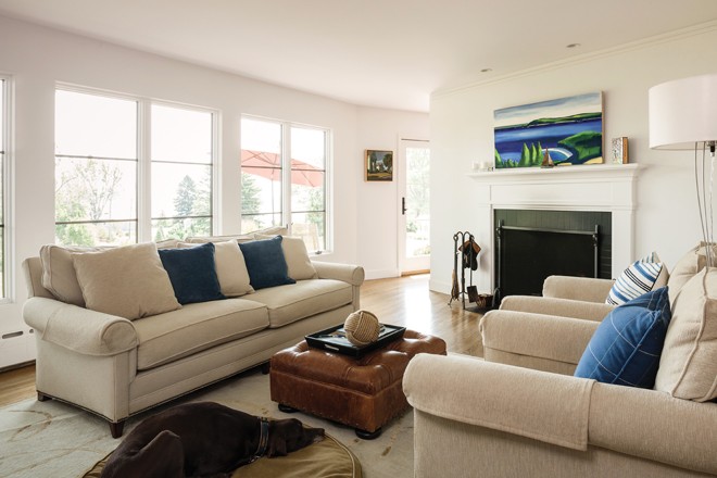
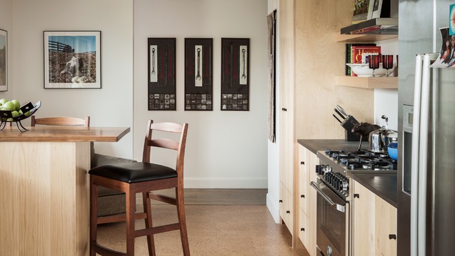
Each room in the house exhibits this goal in a different way. The kitchen is outfitted with simple maple cabinetry, open shelving around the stove, cork floors, and PaperStone counters. Thos. Moser stools surround a high breakfast table with a walnut top. The beautiful but pared-down bathrooms are outfitted with Carrara marble and white subway tile. The living room is minimally ornamented with a fireplace at one end and built-in shelving at the other. Preble designed the latter to be simple but “beefy,” as Thomas puts it, since the wood shelves are unusually thick.
“I believe in removing all unnecessary elements of design,” Preble says. “It shows off the beauty of the wood more, and you’ll see that everywhere in the house.” A bedroom wall of nickel-gap maple paneling serves as an example, as does a master bathroom vanity of steel and limed white oak, four platform bed frames with steel legs and oak headboards, and a second wall of built-in bookshelves and drawers in the master suite’s living room. The red brick of the home’s two fireplaces was neutralized by painting it black (at Johnson’s suggestion), and the master bedroom suite was finished with a stainless-steel fireplace surround. Johnson recommended all stainless-steel hardware, which is, he says, “architectural and substantial but understated.” The living room and dining room walls were finished with a subtle, off-white Venetian plaster that also wraps around the window and door openings, gently curving the wall edges. Beyond all this, the home was made ready for art by eliminating moldings and trim. “I wanted to create a space that felt like gallery space,” Thomas says. Preble adds, “You don’t go into a museum and see a lot of ornate moldings. It’s simple. You juxtapose the art against plainness.”
Thomas started collecting the work of Maine artists when he returned to Maine in 2001. Prior to that, he’d been working in Massachusetts, but his true trajectory had been that of a boomerang. Born in Presque Isle, Thomas followed his work in foodservice distribution to Bangor, then Portland, then Massachusetts. But as soon as he left Maine, he was trying to figure out a way to come back. He bought a second home in Kennebunkport in 2001 and made the state his full-time residence two years later. Soon after, he joined Maine’s building industry. “I can’t explain why I got involved in the construction business,” he says, but then he does offer an explanation: “In high school, I took two years of drafting classes and hung out there during my free time. I wanted to become an architect, but my guidance counselor discouraged it. When I got a chance to be involved, I knew it was the right thing to do.” (Thomas sold his interest in Thomas and Lord when he decided to focus full-time on his magazines.)
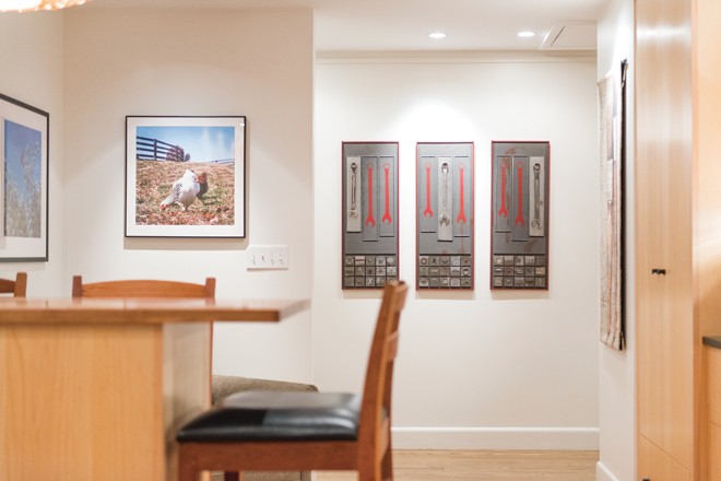
When he still lived in Massachusetts, Thomas saw a painting by Connie Hayes at Portland’s Greenhut Gallery that reminded him of Aroostook County (it was actually France). He was a “little obsessed” with the work, visiting it often, but unsure about purchasing, given the price. One day he showed up at the gallery to find it gone. He deeply regretted his dithering. Then he discovered Hayes had another like it. This time, Thomas bought the painting, which became the first of what is now an impressive collection. (He liked the Hayes piece so well that, before he moved to Maine full-time, he carried it back and forth between his Maine and Massachusetts homes.) Thomas subsequently acquired work by Dozier Bell, Mary Bourke, Laurie Hadlock, Robert Indiana, Margaret Lawrence, Frederick Lynch, John Neville, Robert Shetterly, and Shoshannah White, among others. He also commissioned a Louise Philbrick triptych that makes use of wrenches from Thomas’s grandfather’s potato farm in Knoxford, New Brunswick. The mixed-media work now hangs in a hall but is designed so that it can be split into three pieces to be given to Thomas’s three sons in the future.
Other items in the house include selected furniture from Thomas’s previous home, new furniture from Addo Novo, and a few heirlooms, like a photograph of Aunt Katie—his grandmother’s caregiver after her own mother died at a young age.
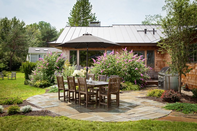
Thomas turned to Buxton’s Ted Carter of Ted Carter Inspired Landscapes for the property’s landscape design. Carter describes his work for the house as “very simple and Zen-like.” Thomas’s lot actually consists of two lots: the one on which his house is located and another grassy, lower lot, which is closer to the water. Carter felt that these two pieces of property needed some delineating, so he added trees, plants, and boulders along the ridge, as well as stone steps leading from one level of the property to another. On the house level, he replaced a deck with a flagstone walk that leads to a bluestone oval with an outdoor table and chairs from Portland’s Asia West. He also designed what he calls “a fire rock,” a piece of Washington Valley stone with a hole bored through the center, into which sits a gas fire ring on an automatic timer. The whole looks like an elegant campfire.
The ranch is Thomas’s third home in Maine. Is it his final? Probably not. Plan A, he says, is to stay where he is. Plan B is to build a smaller house on his lower lot, and plan C is to build north of Portland. As for future projects I have my eye on, Thomas’s business partner, Maine Home+Design and Maine magazine editor-in-chief Susan Grisanti, is rehabilitating a house on Munjoy Hill. When it’s done, I’ll be angling for a peek inside.


