Space Makers
FEATURE
16 of Maine’s most ravishing spaces created by interior designers whose livelihoods revolve around marrying style with function.
They are contemporary. Traditional. Spacious. Compact. In the woods, on the water, in town. Family homes. Vacation pads. Retirement dreams materialized. We’ve compiled 16 of Maine’s most ravishing spaces created by interior designers whose livelihoods revolve around marrying style with function. Each has a philosophy that shapes their work, and ultimately shapes the surroundings of those who work with them. The eye candy on these pages begins with a thoughtfully curated wish list, a blending of a homeowner’s aesthetic with a designer’s approach. From the big-picture items like furniture and cabinetry, color scheme and a materials palette, to the smaller moments, like accessories and details that hold meaning, the spaces on these pages are made for coming home to.
Timeless & Transitional
DESIGNER: LINDA BANKS | BANKS DESIGN ASSOCIATES & SIMPLY HOME
Photography: François Gagné
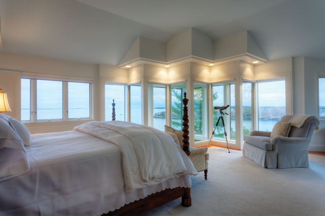
This new home perched high above Harpswell Sound on Orr’s Island was inspired by the homeowners’ 10-year residency in Germany. After moving back to Texas in 1993, their dream was to build a retirement home in Maine. Architectural and interior designer Linda Banks and her team at Banks Design Associates created interiors with a European flair. “We wanted fresh and soothing—an adult retreat that was timeless and transitional,” says Banks. “It had to be waterside but not nautical cliché.” The design also needed to accommodate the homeowners’ collection of 25 antique clocks and large Bavarian case pieces. In the great room, the custom linen upholstery and quiet palette were inspired by the granite fireplace—the focal point of the space. The great room boasts a cathedral ceiling, opening to the butterscotch painted kitchen where the homeowners can cook, entertain, and enjoy wine from their nearby wine cellar. “This is a true retirement retreat that embraces the owners’ personal style,” says Banks.
FOR MORE: BANKSDESIGNASSOCIATES.COM | SIMPLYHOMEPAGE.COM, 207-781-5651
Classic Style, Functional Design
DESIGNER: BRETT JOHNSON | MAINE STREET DESIGN CO.
Photography: François Gagné
At the core of Brett Johnson’s interior design philosophy sits the idea that every space should work for real people and their lives. He applied this approach to a salt-water farmhouse on a private 2,000-acre island in Blue Hill Bay. The farmhouse is one of several buildings still standing on the island; for years it was used by the resident caretaker and cattle farmer and his family. As the current homeowners’ family grew, they saw the need for a house fit for larger gatherings of the next generations. Johnson set out to design a space that would accommodate multiple age groups. “The goal was to use traditional prints and upgrade them with subtle color twists,” he says, “all the while making the rooms flow together cohesively and maintain a look of timelessness.” Existing family art and antiques also factored into the design scheme. The house was transformed from a warren of small rooms into a casually luxurious summer home featuring six bedrooms, three and a half baths, a study, a living room, and a large country kitchen with ample dining for everyone—all with views of the farm fields sloping to the sea and the mountains in the distance. Working within a specific budget, Johnson decorated and furnished the house from top to bottom, including dishes, linens, books, and even games and puzzles. One of the more challenging aspects was in the execution and delivery of a finished project on a remote island with no regular ferry service: team members were transported back and forth on a small lobster boat, and furniture and casework had to be barged over on a tight schedule dictated by the tide.
FOR MORE: MAINESTREETDESIGN.COM, 207-541-9187
Coastal Comfort
DESIGNER: CELIA ST. ONGE | CELIA BEDILIA DESIGNS
Photography: Liz Donnelly
Celia St. Onge’s clients did not have a clear idea of what they wanted their house to become. They loved the location, but the house itself had no cohesive design style. Originally, the project was purely cosmetic: a new kitchen, first-floor bath, and paint, but St. Onge saw greater potential. Her goal: open up the space and draw all eyes to the stunning view. She achieved this by removing the interior walls that separated the dining room, kitchen, library, and family room, creating a flow from the front door to the ocean. Once the walls were removed, the new kitchen was installed. Off-white cabinetry and gray granite helped achieve the coastal look the clients desired. “I loved working with them because they were very hands-on; the husband did a lot of the trim work, and his wife was always hunting for interesting pieces to help furnish the home,” says St. Onge. “This is a wonderful, peaceful home, and I know the homeowners treasure it.”
FOR MORE: CELIABEDILIA.COM, 207-400-6542
Artfully Understated
DESIGNER: TRACY DAVIS | URBAN DWELLINGS
Photography: Sarah Madeira
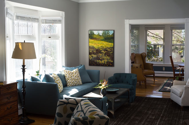
Tracy Davis’s approach to the renovation of this 100-year-old, 1,900-square-foot Cape began by connecting the home’s interstitial spaces to express flow, light, and a breadth of materials. By creating layers, Davis sought to respectfully blend the subtleties and purity of existing trims and casework, reclaimed objects displayed as art forms, materials, and contemporary art with the history of the home. “It was important to reflect objects as art, and art as form and function blended and balanced against layers of clean, swift textures,” she says. One of the challenges was furnishing the spaces modestly and decorating with art that would not compete with the views of the Kennebec River. Using one color for the majority of interior walls and ceilings evokes a greater sense of space in otherwise moderately sized rooms. Davis introduced color by using a variety of textiles. The result is an understated, clean space that blends historic elegance with contemporary style.
FOR MORE: URBAN-DWELL.COM, 207-780-6136
A Sophisticated Sanctuary
DESIGNER: MARCY VAN DER KIEFT | MARGO MOORE INTERIORS
Photography: François Gagné
Marcy van der Kieft takes her design cues from her clients—whether their style tends toward the traditional or the contemporary, the polished or the eclectic. These clients exude a sophisticated style and find inspiration in the unique. The design approach for this home was clear: this was to be a sanctuary, where life is enjoyed and business is rarely conducted. As van der Kieft explains, “A typical coastal cottage interior was not on either of our radars.” The clients wished to use local workrooms, craftspeople, and artisans wherever possible. Van der Kieft’s background in textiles and design led to a selection of the softest of cashmeres, the finest embroideries, and the smoothest of silks. The decor goes beyond what hangs on the walls, the eclectic trims, intricate fabric weaves, specialized upholstered definition, and custom furniture; it also encompasses the backdrop of seasonal views of Camden’s scenic harbor and village—”art we could have never found,” says van der Kieft. “Ultimately the house’s interior creates a perfect balance of femininity and masculinity and accents these clients’ sophisticated flair.”
FOR MORE: MARGOMOORE.COM, 207-236-4596
Balance of New & Old
DESIGNERS: CATHERINE WEILAND | MAINE COAST KITCHEN DESIGN
PAUL NOEL
Photography: Jeff Roberts
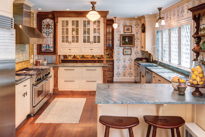
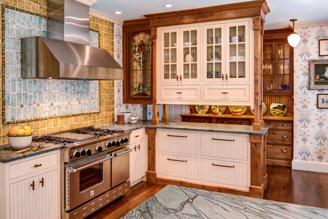
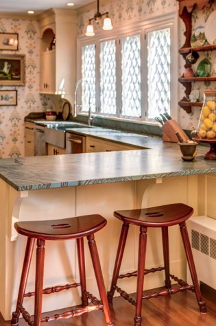
Dark Harbor House—a once-grand estate that had become a run-down bed-and-breakfast—was in need of a top-to-bottom renovation to transition it into a single-family home. According to kitchen designer Catherine Weiland, there is an art to balancing design with the unique personality, taste, and lifestyle of a client. For this project, Weiland and interior designer Paul Noel sought to create a warm, homey-yet-elegant environment that fosters meaningful everyday experiences. “We wanted an estate kitchen where tomatoes from the garden could ripen on the windowsill and fit right in,” she says. The goals were to transform a utilitarian space that once served a 32-seat restaurant into a cozy kitchen, to create a space that fits the home’s historic architecture yet is not afraid to showcase modern conveniences, and to accommodate overnight guests while the owner/chef prepares meals. Weiland and Noel worked to balance the space’s long proportions by dividing it into a butler’s pantry, guest area, and main kitchen. They used color and cabinetry to imply spatial divisions and concealed heat lamps within the upper cabinetry. Open shelves and stained glass keep the look light and airy. The designers seamlessly transitioned the color of the cabinets that straddle the butler’s pantry (stained Rustic Alder) and main kitchen (French Vanilla) using posts styled after the newel posts on the home’s third floor. A rolling cart tucks into the food-prep peninsula to transport prep items to the cooking zone. “The goal was to balance old and new finishes to bring harmony to the space,” says Weiland.
FOR MORE: MAINECOASTKITCHEN.COM, 207-321-3555 | PAUL J. NOEL, 617-216-9886
Standing the Test of Time
DESIGNER: LOUISE HURLBUTT | HURLBUTT DESIGNS
Photography: Irvin Serrano
Louise Hurlbutt’s clients both summered at Kennebunk Beach as kids and wanted to have their own children share the same experience. Her charge: create a year-round house with a summer feel that incorporates the homeowners’ love of Maine art, antiques, and collectibles into the design of a shingle-style house. The clients have two sets of twin boys and wanted not only a summerhouse but a holiday escape as well. The house was built and designed on Webhannet golf course at Kennebunk Beach only 10 years ago but contains elements of Old World fabric and furniture from around the globe that will never go out of style. Mural walls in the dining room portray early-1800s Kennebunkport’s shipbuilding days and continue around the room, highlighting St. Anne’s church, where the couple was married, and Kennebunk Beach, showing their sons playing in the sand. The couple loves collecting Maine art such as the nautical oil painting over the living room fireplace. The collection of blue and white Chinese porcelains in the antique Chippendale mahogany secretaire add color and complement the dateless Brunschwig and Fils paisley print on the chairs. “This house celebrates the combination of good architecture, ageless furnishings, and art—we created a place to build memories,” says Hurlbutt.
FOR MORE: HURLBUTTDESIGNS.COM, 207-967-4110
Light, Cheery & Eco-Friendly
DESIGNERS: JAN ROBINSON | JAN ROBINSON INTERIORS & ECOHOME STUDIO
TINA RODDA & MARY ADAMS | KITCHEN COVE CABINETRY & DESIGN
Photography: Tim Greenway
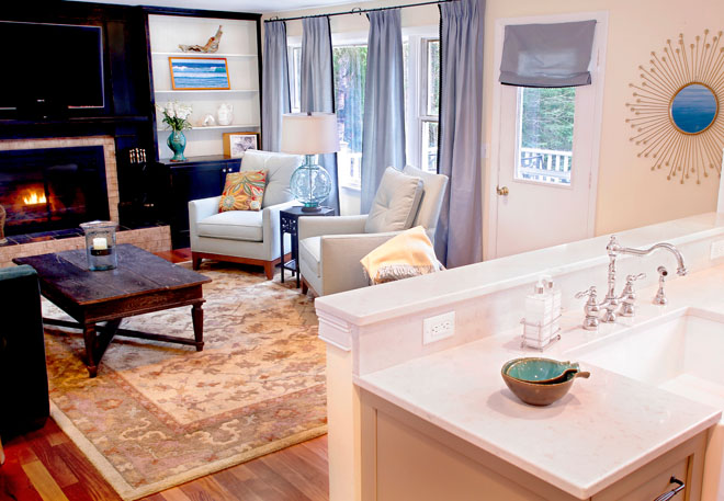
Jan Robinson has been painting and drawing for most of her life. She approaches design the same way she approaches painting: by creating a composition that has visual appeal and is comfortable for the people who live in it. As an eco-friendly designer, her philosophy is to use local sources and to be mindful of the environment by using repurposed, reclaimed, or recycled materials wherever possible. Robinson, owner of EcoHome Studio, worked alongside Tina Rodda and Mary Adams, owners of Kitchen Cove Cabinetry and Design, to create a functional and beautiful kitchen and living room for a busy young family in Cape Elizabeth. Inspiration for both spaces stemmed from the family’s desire for a light and cheerful kid-friendly space. The artistically arranged mosaic backsplash from Distinctive Tile and Design sets the tone for both spaces with its organic design in blues, creams, and yellows. Gray base cabinets not only house plates and cups at kid-friendly heights but also hide spills and fingerprints. The Thermador range was centrally located across from the custom rolling butcher block and prep sink, creating two work triangles, one for prep and cooking and the other for cleanup and dish storage. The highly functional quartz countertop has the look and feel of Carrara marble yet is stain and scratch resistant. To revamp the living room, Robinson balanced the black built-in entertainment center with the rest of the room by adding grounding colors and bold black accents. While the fabric on the sofa looks and feels luxurious, it is a polyester velvet—more practical for a family with young children. The room was completed with soft blue taffeta panels accented with black trim. The furniture is all made in the United States with a combination of recycled foam, soy-based foam, and sustainably harvested American hardwood.
FOR MORE: JANROBINSONINTERIORS.COM, 207-899-0390 | KITCHENCOVECABINETRY.COM, 207-541-9125
Rustic Texture, Contemporary Twist
DESIGNER: JEANNE HANDY | JEANNE HANDY DESIGNS
Photography: Randolph Ashey
Jeanne Handy’s design process begins with getting to know her clients beyond their aesthetic: what in life is most important to them, where do they find tranquility, what brings them joy? “Information like this is invaluable when designing a home,” she says. “One of the delights of this project was the clients’ terrific art and furniture collection that they had gathered both from their travels around the world and from past generations of their family.” The homeowners were working with architect Kevin Moquin to convert their barn into a year-round, energy-efficient home suitable for retirement. The original farmhouse, which had been in the family for generations, would become a guesthouse for their growing family and friends. Handy’s task: complement, highlight, and unite their collection of antique furniture and art with a more contemporary, eco-friendly, and highly functional aesthetic. Her tools: color, texture, and light. “We chose a simple, fluid color palette inspired by the owners’ art collection and employed rich salvaged boards from the barn to add texture to select vertical and horizontal surfaces,” she explains. Instead of being hidden by trim or wallboard, beams were exposed and painted to open up the space. Cabinets are constructed of maple Europly (FSC-certified formaldehyde-free plywood), and floors are cocoa-stained concrete. Hand-forged lights provide just the right balance of rustic and contemporary. A first-floor master suite that accommodates multiple forms of mobility will allow this space to be a truly lifelong home.
FOR MORE: JEANNEHANDYDESIGNS.COM, 207-773-2966
Refined Yet Organic
DESIGNER: NICKI BONGIORNO | SPACES KENNEBUNKPORT
Photography: David Murray
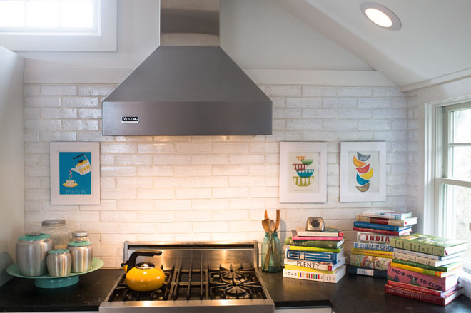
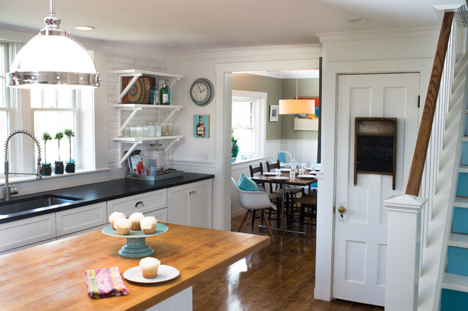
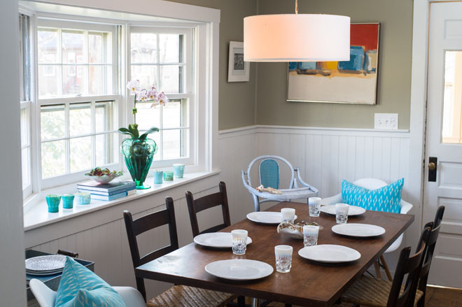
Nicki Bongiorno gravitates toward clean lines and an unfussy aesthetic that is timeless, with a punch of the unexpected. “When interpreting a client’s style I seek a balance of contrasting elements: hard surfaces with soft, shiny with matte, new with something handmade, and as many natural elements as possible,” she says. The homeowners of this 1948 shingle-style cottage in Cape Porpoise were a perfect match with Bongiorno because their style leans toward classic bohemian and their goal was to give their rustic home a modern, utilitarian kitchen that would accommodate their family of six with a baby on the way. When they purchased the house, the kitchen consisted of two rooms: the refrigerator, stove, and laundry were crammed into an uninsulated pantry space separate from the main kitchen area. They dreamed of an open space filled with natural light that would feel original to the quirky house they fell in love with but be packed with modern conveniences. With a love-it-once, love-it-forever sentimentality, the new space makes room for the butcher-block island and the Viking stove that the family moved with them from their previous home. When soapstone counters were deemed too pricey and too high maintenance, black granite in a honed antique finish offered the same rustic feel. The addition of vintage drawer pulls and knobs and the reallocation of a door for the pantry were all key to keeping with the character of the home. “One of my favorite elements,” says Bongiorno, “is the glazed, brown brick backsplash tile. Wider and more earthy than the classic subway, the tiles have irregular surfaces and the pinholes of the brick showing through.” On the open shelves, everyday kitchen essentials are easily accessible and beautifully mixed with vintage objects with a worn patina. The homeowners’ love for blue is apparent in the accessory choices as well as in the ombré paint treatment on the stair risers—an unexpected pop of color. The overall effect is a refined yet organic cook’s kitchen that fits both the personalities of the home and the homeowners alike.
FOR MORE: SPACESKENNEBUNKPORT.COM, 207-967-0040
Quiet Elegance
DESIGNER: DEBORAH CHATFIELD | CHATFIELD DESIGN
Photography: Sarah Szwajkos
Debbie Chatfield’s design approach is to start with a clean palette and then add layers. “This is where a client’s personality shines through, as we start mixing what they already own with what we buy new.” This home’s panoramic views, privacy, and ample space for organic gardening called for a quiet interior that would let the extraordinary exterior shine. The house’s bones are modern in nature, which presented a challenge for Chatfield in keeping a traditional theme throughout as the clients desired. She chose traditional upholstered pieces and introduced vintage finds and antiques to give the home a more eclectic feel that befits its contemporary lines. The couple’s penchant for entertaining (not to mention a young daughter who enjoys sleepovers) meant that Chatfield also needed to “bulletproof” the home with stain-repellent fabrics, as well as fade-resistant fabrics that would stand up to the natural light that pours in through ample windows. Chatfield’s design also had to showcase the couple’s extensive art collection: when you enter through the front door, Brian White’s Dress Box greets you. From there you wander past the likes of Jamie Wyeth, Bo Bartlett, James Rivington Pyne, Colin Page, and Andrew Winter, to name a few. The result is an art-filled home that has become a retreat for a family who leads a very busy lifestyle—a home that entertains well and also welcomes kids and pets, not to mention wet swimsuits from the hot tub on the deck overlooking the ocean.
FOR MORE: CHATFIELDDESIGN.COM, 207-236-7771
Creating Harmony
DESIGNER: ARIANA FISCHER | ARIANA FISCHER INTERIOR DESIGN
Photography: Winky Lewis
Before setting out to design, Ariana Fischer tries to get to the core of who her clients are—their history, the realities of their life, and their aspirations. “I believe incorporating elements of our past gives us connectedness, providing comfort in our everyday lives, and that having inspired surroundings in our homes and workplaces affects our well-being and productivity immeasurably.” Fischer’s aesthetic tends toward eclectic and elegant, with a focus on the balance between function and beauty. In the case of this project, manifesting a country retreat for an international art dealer with a young family was a great inspiration; comfort, ease, versatility, and space to play were all important factors. “So much nostalgia gets attached to a summer place, so I focused on making each space unique so that it could be someone’s oasis at any given moment.” The house’s wooded surroundings lent to the use of natural materials throughout: wood, stone, and textural fabrics. “My clients originally contacted me because they were overwhelmed with how to layout a huge room. They had a few favorite pieces, a mix of contemporary art, and the rest was all open. Some of the items did not seemingly go together so it was a challenge to make everything relate. But, that is the fun and satisfying part of design—creating harmony for people.”
FOR MORE: ARIANAFISCHER.COM, 207-210-6450
Soothing & Serene
DESIGNER: JAMES LIGHT | SIMPLY HOME
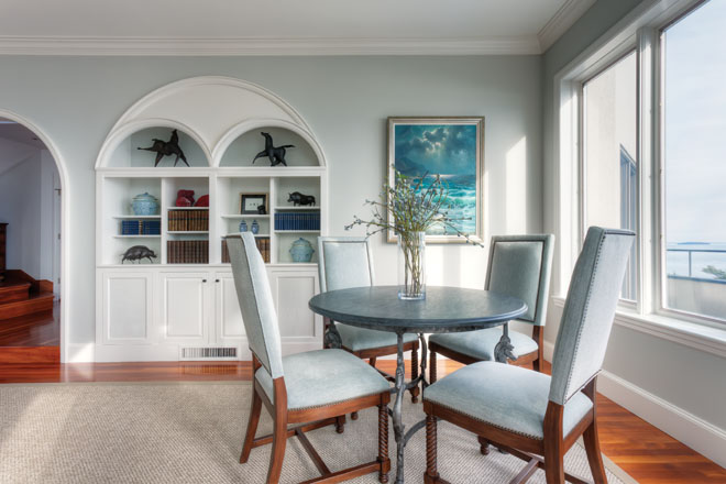
The house sits at the end of an intimate neighborhood street on a small bluff overlooking a beautiful tidal cove with an ever-changing view. The family who lives in this home has been here for 18 years. They raised their children here. Last year, when they became empty nesters, it was time to freshen up and reinvent the home for the retiring couple. The existing decorating featured rich saturated colors: red grasscloth walls and green and red floral, striped, and plaid upholstery. Willing and ready to start completely fresh, James Light selected a serenely soothing palette inspired by the view of the cove: soft tidal blues, caramel, and salted sand. The dining room and living room had been unified by an eight-foot opening. Closing down the opening to five feet and thickening the wall with bookcases gave both spaces a better sense of purpose and a better scale for living in. Curtains hung to the ceiling and on tracks give a unifying and contemporary ease as well.
FOR MORE: [email protected], 207-671-5319
A Peaceful Palette
DESIGNER: NANCY BOUGHTON | NANCY BOUGHTON DESIGNS
Photography: Lori Steigerwald
Nancy Boughton’s client grew up in Maine and, as a young boy, saw this Kennebunk property from across the harbor while at a dinner for his grandfather. As he grew older, he often dreamed of living there. “Understanding this family’s personality, likes, and dislikes allowed me to develop a unique palette that was sumptuous while relaxing and serene,” says Boughton. Boughton drew inspiration from the colors and peacefulness of the ocean as well as a unique piece of art that the family has. She chose timeless, classic, and, in some cases, whimsical elements that complement the beautiful water views without dominating the visual effect. The project not only saw a complete interior redesign but also included the addition of a bedroom, bath, and dormers. Floors were refinished, and countertops, tile, and lighting were replaced. Throughout, Boughton sought the work of local craftspeople and artists. Because the project had to conform to EPA land-use regulations, she creatively designed within the long, narrow spaces to honor the client’s wish to maximize the views. Materials were carefully curated for durability in an oceanfront environment. “Incorporating a variety of textures and colors allowed me to have transitional lines and yet elegant, refined details,” Boughton says. Walking the shore, Boughton and the homeowner’s children gathered beach stones that would eventually become central elements of the custom fireplace. “This home is not only a welcoming refuge for this busy family, but its very bones remind them of where they are: away, in Maine, together.”
FOR MORE: NANCYBOUGHTONDESIGNS.COM, 978-387-9189
Unpretentious & Versatile
DESIGNER: KRISTA STOKES
Photography: David Murray
Krista Stokes’s design mantra is, Learn to honor and curate what you have; make a realistic plan to get what you need; understand the true intent behind what you want, and let go of what you don’t. “It’s always such an honor to work with people at the start of a new chapter in their lives,” she says, “especially when the space being designed has such a rich history.” Stokes worked with Bates College president Clayton Spencer on modest renovations and design choices in the historic President’s House, built in 1890 and acquired by the college in 1921. As Bates’s eighth president, Spencer moved into the house when she took office. With the private and public life of her client to consider, as well as the function of the home as an extension of that, Stokes sought to create a home that would be both a welcoming personal and family space as well as an inviting venue for college events. It needed to reflect not only the life and story of its resident but also the values of an excellent liberal arts institution in Maine with its own rich life and story. Stokes collaborated closely with members of the Bates staff, including skilled craftspeople, architects, and the leader of dining and catering services. Working with a modest budget, her design choices had to be unpretentious and versatile. “We needed to find a design tone that would create a well-blended aesthetic among historic pieces belonging to the college, my client’s own eclectic and beloved belongings, and new items that needed to be purchased,” she explains. Work by Maine artists is complemented by classic furnishings, jewel tones, and vibrant patterned fabrics. One of the signature pieces, a painting by William Manning on loan from the Bates College Museum of Art, hangs in the stairwell—like the rest of the house, a nod to the college’s history and Maine’s rich artistic landscape.
FOR MORE: KRISTASTOKES.COM, 207-251-9890
Color as Punctuation
DESIGNER: CHRISTINE MACLIN | MACLIN DESIGN
Photography: Trent Bell
Christine Maclin approaches each project with a set of questions, and the answers then inform her work. How can the space function best? What surrounds it? Is it a New York City apartment, a cabin on a lake in Maine, a family house in Austin, Texas? What can be done to reinforce the sense of place, wherever it is, to help create a sense of belonging? What do the clients like, and what is important to them? On this project, Maclin says, she was extraordinarily in sync with her client. “She has a great eye. We definitely wanted an edited look with some emphasis on her photography collection and family pieces she wanted to incorporate,” Maclin says. The home had to be comfortable for a family with preteen and teenage children and clutter-free, with nothing extra in the spaces. Maclin used color as a punctuation mark and as a link between the rooms. The walls in the kitchen were originally a soft yellow: “Changing these to almost-black jumpstarted the whole first floor. It emphasizes the relationship between the black-and-white photos in various rooms and adds some low-key drama to the space.”
FOR MORE: MACLINDESIGN.COM, 207-774-9545
