A New Twist on an Old Home

The living room mantel with a landscape of a yellow-orange marsh by Portland artist Holly Ready.

The ground floor of the home has a neutral palette with orange accents. The furniture in the living room includes a large sofa and wood-edged chair from Lee Industries, a chair from Verellen, and a custom coffee table from the Old Wood Co.


A view from the kitchen through a foyer into the family room, which was painted a neutral white and has a David Hicks rug. The orange-red accents in the house are inspired by the homeowners’ art collection, which includes a painting by Connie Hayes in the background.


The dining room originally had dark wood paneling. To update and lighten the space, James Light had the room painted a grayish white. He added a contemporary chandelier and wall sconces. The painting is by Heidi Gerquest of South Freeport.

The paintings in the master bedroom are by Martha Burkert. The curtains and bed pillows are made of Romo fabric, and the lighting is from Visual Comfort.

Ted Carter—owner of Ted Carter Inspired Landscapes in Buxton— intended the two conifers bordering the entry of this 1920s brick Georgian home to look like columns.

An upstairs foyer has two photos of downtown New York City: one of Washington Square Park, the other of the Flatiron Building. The table is from Simply Home.

Originally, a massive chimney dominated the kitchen. Once it was removed, the space was updated with an oversized island topped in Carrara marble and a seating area. The orange and white chairs around the breakfast table are Pottery Barn chairs that have been recovered. The zinc table with a metal-banded edge was designed by interior designer James Light. Light wanted to dress, but not feature, the kitchen windows, so he used a gray linen burlap for the drapery.

The detailing of the staircase is probably original to the 1920s house.
FEATURE – February ’13
By Debra Spark | Photography Irvin Serrano
The dressing of a Cape Elizabeth home.
Interior designers have to begin somewhere. James Light starts with the least obvious room in the house. “I will often look at people’s closets before I work with them,” says Light, who is a senior designer at Simply Home in Falmouth. What better way to ascertain taste? Figure out style? If the blouses don’t have florals, the couches shouldn’t either. But Light didn’t need to do any advance snooping before he worked on Barbee and Drew Gilman’s house in Cape Elizabeth. He already knew how the couple dressed. They’d been friendly for years, ever since Light’s daughter and the Gilmans’ eldest child were in preschool together.
“Barbee is a very elegant person,” Light says, “but also simple. She doesn’t dress gregariously but very fine.” She is the sort of person, he notes, who might have a sweater collection with 12 different beiges. “I was not going to talk her into red for her home,” he says. “Or I could have, but I would have been doing her a disservice.”
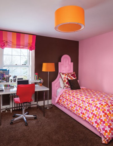
Still, color was an important consideration to Light and Barbee as they started to think about how to redo her Cape Elizabeth home. “You don’t want it so neutral in there that everyone falls asleep,” Barbee says. In the end, Light chose to do the ground floor of the Gilmans’ home in grays, browns—and oranges. The surprising accent color was not inspired by Barbee’s wardrobe but by her art collection, which consists entirely of paintings by Maine artists, some of which were acquired at the annual auction of the Children’s Museum and Theatre of Maine. A Holly Ready landscape of a yellow-orange marsh sits above Barbee’s fireplace mantel. A Connie Hayes interior of pine furniture and walls rendered in a citrusy orange hangs in the family room. The dining room’s still life by Heidi Gerquest depicts butternut orange gourds. Although the paintings are exuberant in their use of color, the house is more judicious. The kitchen is white with gray window treatments, but the leather barstools and kitchen chairs are orange. Browns and tans dominate the living and family rooms, but the lamps and pillows are orange. The oatmeal-colored living room curtains have an orange-red border. Upstairs, the orange disappears entirely, and the palette is largely lavender-gray.
“What I love about James,” Barbee says, “is how he combines the old and the new.” The Gilmans’ house is a 1920s brick Georgian. “I wanted to respect that, but I didn’t want the house to feel all stodgy and stuffy. With three kids and two dogs, we definitely wanted furnishings that you can live with and a space that doesn’t feel like a museum!” Light was able to help the Gilmans achieve this goal by selecting furniture and other items that push toward the modern while acknowledging the era in which the house was built.
Initially, the dining room had wood paneling that left the room so dark that everyone in the family subconsciously avoided entering it. Light had the paneling painted a grayish white and added a contemporary chandelier and matching sconces. This brightened the room and made for a more natural passageway to the abutting brick-floored sunroom housing an office, comfortable chairs, and game table. Although the dining room is now where the children do their homework, it isn’t entirely casual, given its formal Hickory Chair table, straight-back linen chairs, and stained-glass transom windows.
Light’s work on the house came about as part of a major kitchen renovation, itself something the Gilmans hadn’t been ready to take on until they’d lived in their Cape Elizabeth home for a handful of years. When the Gilmans bought the house, there was a massive chimney and fireplace in the center of the kitchen. To get the sort of open kitchen that most people now favor, the Gilmans had to have the chimney not only removed but also rebuilt (in a smaller form) and relocated, because the chimney served as the exhaust for the boiler. Builder Mark Jensen of Falmouth explains that because the five-by-five-foot chimney went up through the second floor, attic, and slate roof of the house, the kitchen renovation required rebuilding what was below and above the kitchen as well. Of the kitchen level, Jensen says, “We completely took it down to the bricks. There was no framing to speak of, no insulation or stud walls, just lath and plaster. We rebuilt the exterior walls, foamed them, put new windows in, re-drywalled and trimmed, propped up the old, sagging wood structure.” Jensen also redid all the plumbing and wiring.
And this was before he built what people are most likely to notice and admire: the sleek new kitchen with its long, large island, dark wood floor, stainless-steel appliances, and custom cabinetry. Kitchen designer Jeanne Rapone of Yarmouth designed the kitchen layout, which came to include a work area, dining area, walk-in pantry, and side office with a bulletin-board wall full of family photos. She orchestrated the room’s flow and figured out how to balance visually weighty items, such as the refrigerator and hutch, within the overall space. Cook and Cook Cabinetry in Scarborough built flat-panel cabinets with square profiles, aluminum pulls, and in some cases, stainless-steel mesh doors. Light designed a round kitchen table with a metal-banded zinc top that sits on a turned pedestal.
The chimney’s removal gutted a second-floor bathroom and “completely devastated” the basement, Jensen says. He rebuilt a portion of the second floor so that what must have originally served as servants’ quarters now houses a new bathroom, children’s family room, and additional office space. Jensen also restructured the basement floor (floating it over concrete) and added a playroom.
Like Light and Jensen, the designers for the outside of the house were concerned with honoring the historic character of the existing property while making the space functional. Initially, the Gilmans had a small backyard that dropped off precipitously and disconnected the lower part of the property from the higher part. Ted Carter of Ted Carter Inspired Landscapes in Buxton reshaped the outdoors with stone steps, stone walls, plantings, boulders, a rock seat, a hot tub, a swimming pool, and more. Now there are several levels to the outside space. A bluestone terrace abuts the house. A few steps below, there is a hot tub sunk into the ground and surrounded by indigenous stone, itself sunk so it is flush with the surface of the ground. Carter is ever mindful of angles of vision, so the hot tub is arranged so that bathers have a view of Casco Bay as framed by a flowering crab tree on one side and a glassed-in pool house on the other. The pool area is a few steps below the hot tub. It is bordered on one side by a garden that uses boulders and plantings to suggest an Alpine ridge. On the other side, a garden with spirea, Quick Fire and Annabelle hydrangea, and roses helps make the transition down a slope to the lowest area of the property. Here there is a small lawn where the children can play.
Brian Beaudette of Beauds Art in Kennebunk designed the pool house, which encompasses a kitchen, bathroom, and mechanical space. “I love historic houses,” says Beaudette, “and I didn’t want to compete with the brick home, so rather than tie into the house, I tried to tie into the landscaping. The pool house is more like a garden structure.” Although it is small, Beaudette gave the pool house two different rooflines. There’s a hip roof over the kitchenette, which has a cathedral ceiling, and a flat roof over the bathroom. Glass predominates, but the exterior also has stone veneer around the lower portion of the building and shingling above.
Barbee laughs when she hears James Light’s idea about the relationship between people’s closets and their interior design predilections. “There is nothing elegant about it,” she says of her closet. “I am a huge slob.” Still, she acknowledges that Light once told her that her sartorial style was “classic with a twist.” Barbee laughs again and says, “Well, that does kind of describe the house.”