Falmouth Flyer
FEATURE-March 2011
By Debra Spark | Photography Trent Bell
A sculptural marvel on the Falmouth coast
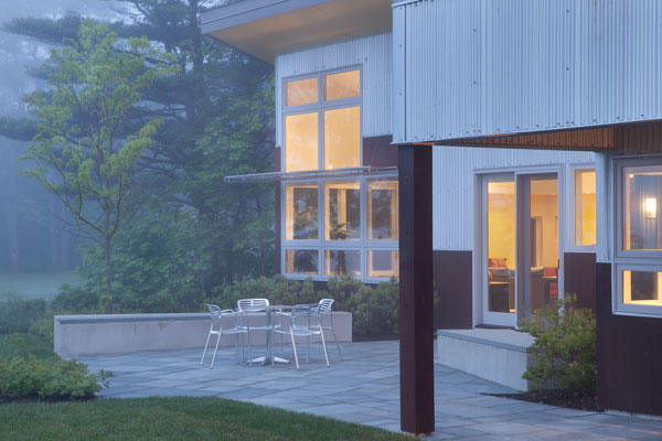
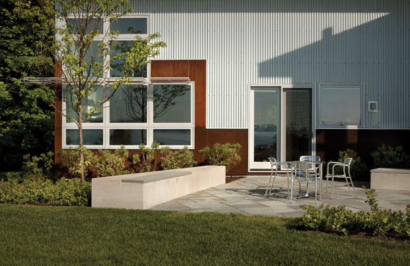
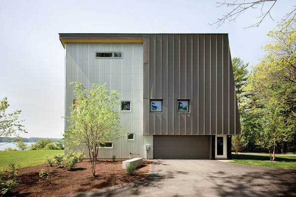
For orthodontist Jeanne McDonald, architecture is a lot like dentistry. “It’s artistic but a little mechanical,” she says. The skills that helped McDonald gain admission to orthodontic school thirty years ago—her facility in math and science and her dexterity—were skills that she knew she’d draw on when she decided to enroll in the University of Maine at Augusta’s architecture program in 2005. At the time, McDonald was moving into retirement, and she was ready for something a little different. In the end, she didn’t make a career change, but her studies did give her new ideas. “In the course of taking classes, my tastes changed. Probably if I built a house without going to architecture school, I would have built a more traditional home,” she says. Instead, the Falmouth home that she completed in 2008 is a metal-clad, sculptural marvel, ultramodern with unexpected angles, materials, and colors. It has a large triangular face, an atypical shape, and a standing-seam metal roof that wraps around one wall and part of the building’s façade. When trying to describe it, those who worked on the home resort to metaphor. It is a bird, a ship’s prow, a tree house, and even—given the bright slash of yellow painted on the roof’s soffit—American cheese. None of these comparisons quite captures the home, though. On the outside, it looks like a Richard Serra sculpture crossed with a chic warehouse. On the inside, like a high-end SoHo loft.
McDonald wanted such a house in part because of the different architects and green-design concepts that she was introduced to in school. When she was scanning websites looking for potential architects, she came upon the work of Phil Kaplan of Kaplan Thompson Architects in Portland. In one of his projects, Kaplan did something with exterior steel walls that reminded McDonald of an architect—Tom Kundig—whose work particularly interested her. “It was pretty thrilling,” Kaplan says about fielding McDonald’s initial requests. “More often than not, people in Maine with waterfront want cottage- or shingle-style homes, but she wanted something sculptural and creative. She definitely wanted to push the envelope.” Aside from her aesthetic interests and green concerns, McDonald longed for something that would be largely maintenance free. “I didn’t want to be painting a house every five years,” she says. “Even for the landscape, I wanted something that didn’t require a lot of work.”
McDonald’s various desires led to the creation of an energy-efficient, passive-solar house with an industrial feel. The home’s exterior is clad in corrugated aluminum—“the same stuff you see on agricultural buildings,” says Robin Tannenbaum, also of Kaplan Thompson Architects—and Corten steel. The home’s builder, Dan Kolbert of Kolbert Building in Portland, explains that Corten is “used in a lot of bridge building and boat building. It rusts quickly then stabilizes.” This makes it a super-durable material but also a changeable one, since its appearance evolves over time.
Inside, McDonald’s home looks structurally complicated because of its various angles, but Kaplan says, “It is really quite simple. It’s an L-shape.” The bedrooms are tucked into one wing, and the large, airy living room, dining room, and kitchen in the other. The south-facing wall of the great room is glass, allowing for views of Mackworth Island and Casco Bay.
Everything on the outside of the house is brought, in one form or another, inside. The concrete of the site walls—used to define the front of the house and the rear patio—reappears on the interior. The floor is a polished concrete slab, which has the look McDonald wanted but also serves “as a wonderful thermal battery,” as Kaplan puts it. It’s not just that there’s a radiant heating system underneath the floor, but the floor also absorbs heat from the sun during the day and releases it at night when the temperature cools. Jon Meade of Jon Meade Design in Portland is responsible for the concrete slab, which is ground down in certain areas to reveal the aggregate below the gray surface. Concrete is also used for the treads on the central freestanding steel staircase, as well as for the kitchen countertops and an angled bench that is part of the fireplace’s hearth. The cement in these various places, however, is dyed a medium black to provide a contrast with the floor.
The home’s metal exterior is also referenced in the staircase’s steel railing and stringers and in the home’s “light shelves.” Made of perforated aluminum, the “light shelves” are placed on the southern exterior to prevent excessive sunlight from entering the living room and on the living room’s interior to reflect light up to the ceiling while also letting dappled light filter down. Metal is also used on the kitchen’s backsplash tiles, which are made of recycled aluminum cans, and for the kitchen island’s stainless-steel dining counter and sink. As for the Corten, it reappears as a material bolted to the kitchen island but also as a color. Monica Dominak of MDesigns in Falmouth chose a rust-brown paint that suggests the weathered steel for one of the master bedroom’s walls. She also chose the yellow for the roof soffit, a color that she repeated in a corner of the living room, in the downstairs bathroom, and on a wall of an upstairs bedroom. The second floor has a large landing that serves as an office, and off this are two small bedrooms, a den, and a bathroom. On the landing, Dominak brought in the sky by using a strong blue behind a wall of steel shelving.
Now that McDonald has lived in her home for a few years, she finds that one of her favorite spots is the upstairs sunroom. It offers another view of the ocean, and in winter, when the screen windows are replaced with glass, it generates heat for the house. This is just one of many elements that contributed to the home’s Gold rating from the U.S. Green Building Council’s LEED certification program. Other green details include spray foam (to make the house airtight), dense-pack cellulose insulation, and dual-flush toilets.
The project’s success stems, in part, from what Kaplan calls “the integrated design process.” All the players were brought on board early and contributed to the design. Something like Dominak’s apparently simple choice of perforated lights for over the dining room table stemmed from the room’s perforated light shelves—designed by a lighting specialist and made by a metal fabricator—which depended on the windows in the living room, which were necessitated by the solar plan for the home, and so on. In other words, that simple choice was anything but.
Despite its atypical design, the McDonald house fits into its neighborhood, given how it is scaled on the street side to the existing trees and how it blends with the surrounding colors. Still it owes far more to architect Ludwig Mies van der Rohe—who famously said “Less is more”—than to the Maine vernacular. “Less is more work,” Kaplan and Tannenbaum note, quoting architect Rick Joy’s famous quip. After all, it was a fun project but not an easy one. “It was tricky,” admits Kolbert of the framing. In the end, though, it was a chance to do something daring, hard work into which the architects, builder, and homeowner were all too happy to sink their teeth.


