Open to the Elements
FEATURE-June 2010
by Deborah Weisgall
Photography Michael Penney
A house on the coast is both a beacon and a haven
The house sits low against the side of a hill just above a meandering shore road on Maine’s southern coast. Its architectural elements—weathered shingle siding, mahogany woodwork, an arched copper roof, a round tower with a pointed copper roof—combine traditional New England materials with contemporary volumes; it’s a kind of visual overture. As you approach, you know the ocean is there, but a garden gate blocks the view. A wall faced with black stone surrounds the front door, which is a glass panel, five feet wide, fixed in a narrow frame.
Through the glass there is a glimpse of rock, dark like the stone at the entrance, and beyond it the expanse of the Atlantic. The entrance sets up anticipation, a controlled tension, like coming into a theater—just what the owners and designers intended. Playing in this theater, day and night and in every season, is the spectacular view: layers of sharp black ledge tilted and stacked in vertical slabs, tide and surf, and then the immense ocean, blue to the horizon. The house is as stunning as the setting. Its use of rugged materials inside and out—wood, copper, stone, steel—intensifies the connections to the land. It feels like a luxurious lighthouse anchored to the rock.
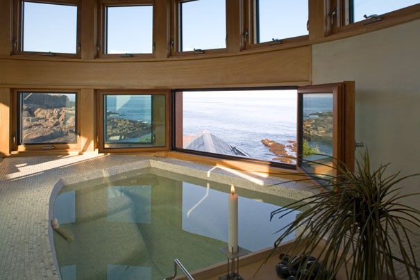
The turret, encircled with windows, embodies the lighthouse metaphor; nothing here is accidental. The owners knew what they wanted, a house that merges the inside with the outside, that dramatizes its setting and that becomes part of the drama itself. They also wanted a house that was both public and private, where they could cook and entertain, and where they could celebrate being alone with each other. The house and its construction reflect their personalities and experience: she has a background in design, and he is an entrepreneur, who poses problems and solves them.
“We went all the way to Lubec looking for the right spot to build this house, and southern Maine was where we wanted to be,” says one of the house’s owners. For several years they had rented a cottage that stood on this site; when they bought the property, they knew that to build they would have to adhere to strict building codes and grandfathered zoning restrictions on position, height, and size. “We had a footprint we could work with and very little we could alter,” says the architect, Lisa DeStefano. The problem was, she says, “How to take these unusual requirements and make it look planned and organic.”
They had to keep the house small, 2,700 square feet. This gave the owners and designers the chance to make sure that every part of it was perfect. They began building in 2000; it took two and a half years and many skilled artisans to achieve that perfection. One of the owners had experience working with local building codes and understood how to push limits while respecting the intention of the regulations. They made a virtue—a smash hit, really—out of necessity. The striking forms of the house—the fourteen-foot-high barrel vaulted ceiling in the living room and the central tower—originated as strategies to maximize square footage while adhering to setbacks. They developed as defining elements of design.
Everyone who worked on the project credits the owners with driving the process, with inspiring, and sometimes pushing, the team to implement their vision for the house. “The clients really appreciated design,” says DeStefano. And Christopher Blake, who, with his partner, Madalena Machado, worked on the interiors, adds: “They gave us incredible opportunities to experiment. They asked for what was possible, for a range of solutions, and they cared how materials came together.”
The owners, in turn, are quick to assert that the house represents an extraordinary collaborative effort. “We designed as we went along,” one says. “And we were willing to wait until we had what we wanted.”
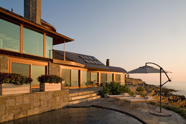
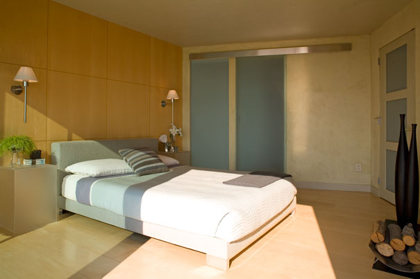
On the landward side of the house, bands of windows high in the walls protect privacy while letting in light and air. The ocean side opens, literally, to the view. The upstairs master bedroom suite is walled with glass. Downstairs, sliding doors pull back and out of sight so that two sides of the living room disappear. The wood floor and the stone terrace are built at the same level. Not even a threshold separates them, and the ceiling floats free without visible support. “What I learned from this project,” says Martyn Young, the contractor, “is that ‘no’ does not exist. I learned to think outside of the box.”
Young also learned how to build a disappearing box. The doors the owners wanted did not exist; they worked with the Duratherm Window Corporation in Vassalboro to manufacture sliding doors that met at the corner of the house with no structural support, that vanished into pockets, and that could withstand the sea and the wind. The vaulted ceiling had to be cantilevered over the open corner.
DeStefano credits the structural engineer, Jeff Nawrocki, with finding ways to implement countless aspects of the design. Challenges included: Controlling the size of a chimney containing flues for five indoor and outdoor fireplaces as well as the furnace. Routing wiring in a house that essentially lacks one wall. Designing vents so that the glass wall in the master bedroom shower, which looks out over the ocean, never fogs up. Finding space behind a sixth fireplace in the living room, faced with a granite slab that reaches to the ceiling, to store not only the sliding doors but a flat-screen television.
This attention to detail and to transitions—between public and private spaces, curved and rectangular forms, and, especially, between inside and outside—produces a heightened sense of place. Steps hewn from rock lead from the stone terrace to the ledge, from what is built to what is natural. The perimeter of the small swimming pool, shaped like a teardrop, is lined with dark stone to give it the feeling of a tidal pool. A wall in the living room is glazed Venetian plaster the gray of a stormy sky.
But the house is far from rustic. Christopher Blake calls the interiors “urbane.” Furnishings are sleek and spare, fireplaces are clean rectangles cut into the walls, and there is very little color besides the subtle layering of natural tones. Interior walls are painstakingly glazed or finished with a grid of wood panels whose proportions correspond to the fireplace openings. Everywhere, shapes resonate with each other in a way that is almost musical. A curved counter in the kitchen picks up the vaulted ceiling, and the roof swells outward over the terrace. The steel staircase, made by a local craftsman, became a work of art in itself, its materials and lines echoed in the steel dining table in the deck railing outside the master bedroom. A semicircle inscribed in the overhang protecting the front door sets the stage for the circular foyer and the turret.
Like great theater, this house conjures its own world. At dusk, from a bathtub in the tower—the most private part of the house, with the biggest view—it is possible to see five lighthouses. Once, this coast was empty and dangerous, and lighthouse beacons marked safe passage—promised haven. Perhaps because it acknowledges the ancient elements—earth, air, fire, water—the house, a haven itself, connects to that past, as well as to a timeless sense of wonder.


