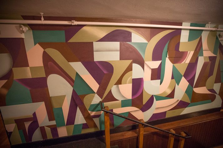
Artist Ryan Adams on Creating an Active and Engaging Space Using Murals
“My job as a mural painter is to create a unique, large-scale piece of artwork that not only fits the location but also activates the wall to be an engaging and enhancing piece of the total structure and environment.”
MH+D ASKS ADAMS TO TELL US MORE.
Q. What is a common misconception when it comes to murals?
A. People often assume that, if someone is skilled at painting canvases, they will automatically be skilled in mural painting. As someone who does both, I can personally say that they are extremely different. A mural is often an entire wall, or multiple walls, so someone can be fully immersed in viewing the work. When you’re up close, you can see only a portion of the whole piece, so it needs to be engaging in the small sections and as a whole. If pulled off correctly, a mural can serve as a landmark, an inspiration, an accent, or a design element that ties an entire space together.
Q. What is the first thing you do when you start a new project or have a “blank canvas”?
A. Before I start any project, interior or exterior, I plan a site visit. I’ve learned that it is crucial to observe the total surrounding environment for any potential curveballs that may not have been captured in photos, like awkwardly placed pipes or fun little patches in the wall.
Q. It’s fun to spot your work walking around Portland. How did you develop your signature style?
A. My signature style of mural paintings is what I call my “gem” style. In short, gem style is a geometric breakdown of letterforms that uses color, shadows, and highlights to create movement and depth throughout the pieces. Mix the structure of cubist paintings with the flow of modern-day graffiti pieces and sprinkle in a dash of the old “Magic Eye” books, and I think you get an idea. Since this style is based on letterforms and geometric shapes, it gives me a lot of wiggle room to simplify, intensify, and mold the work to fit the space appropriately.
Q. How you decide on the colors for your murals? What influences your selection?
A. With my style of mural painting, I concentrate heavily on color palette and flow to achieve the desired effect. When proposing color palettes to clients, I consider the space where it is being installed, the shape of the wall, the amount of natural light it receives, and also the energy/vibe that the piece is conveying. For instance, when creating a piece for a hip marketing agency that had neon signs and pink couches, it felt comfortable to propose a bold palette with pinks, purples, and black. Whereas a restaurant located in an old church with exposed beams and stained-glass windows would require a calmer but acclimating palette of maroons, tans, and an accent of olive green.
Q. Using architecture as your canvas can, I assume, be challenging. How do you work with the space you have without compromising your vision?
A. I use flow to help direct the eye toward or away from certain aspects of the wall. This can have a profound effect on the entire space. For example, if a large window was to the right of the wall I am painting, I would consider making the linework and general flow of the piece angled so that it would drive the eye to move from left to right, therefore giving the feel of more light expanding in from that side. Another example would be a wide wall in a central location, using maybe a layout that expands from the middle of an arched layout would help to feel as if space was stretched out, widening the entire room.
My background in graffiti writing has helped me learn how to paint large-scale and be malleable enough in my plans to fit my ideas within the space and not just onto it. Whether it is a painted pattern, a collection of flowers, or a splatter-paint abstraction, I believe that a mural can have many positive effects on a space. With the correct color palette, it can assimilate, but at the same time activate and engage people, in a space that may have been overlooked. With the correct flow, it can create illusions of additional space and draw the viewer’s eye in a specific direction. With attention to the total piece and the details within, it can be admired and utilized from afar and up close.


