Adrienne Stauffer & Olivia Bogert operations and marketing team
The operations and marketing team at an architecture firm may not be trained designers, but we do know what it takes to make a project successful. It starts long before the first sketch—you need to find the right match.
Q. When is the best time to engage an architect?
A. If you have a project on the horizon, consider starting the selection process as early as one year before you are ready to begin design. You should factor in time for research and interviews, and give yourself enough time to contact several companies thoughtfully. Some architects may offer assistance with site selection to help you evaluate the suitability of a parcel of land, but before diving into the design, most will recommend that you have identified a specific property.
You should also consider that most skilled architects have a backlog of work, so they might not be able to start your project right away. Aim to kick off the project at least two years before the desired move-in date to ensure you have ample time to go through the design process at a comfortable pace. The design process may take between 6 and 12 months, depending on the scope of your project.
This timeline accounts for work beyond just design; there may also be several waiting periods for local permitting approvals or cost estimates from builders.
Q. Who will I be working with?
A. When evaluating your options, make sure to ask who will be on the project team. This is important because, depending on the size of the company, the person you connect with in the sales process might not be the primary designer, or even on the team at all.
Successful design depends on a deep understanding of your vision, and having a good rapport with the design team makes for a more joyful experience. Building or renovating a home is often one of the largest investments—both in terms of time and cost—in your life, so trusting your team fully is critical to a smooth ride.
Q. My partner and I have different ideas about design. How can an architect help?
A. One of the most underrated skills an architect has is the ability to address the wants and needs of multiple stakeholders. Whether it’s a summer cottage for an extended family or a home for a couple, an architect’s role is to listen to everyone, integrate all their needs and goals, and then generate a solution that melds divergent elements into a cohesive whole.
It’s not uncommon for an architect to offer an elegant solution you might not have considered. That’s one of the many benefits of working with an architect!
Q. When a firm has a clear aesthetic, how can I make it my own?
A. If you have a personal vision, no matter how fuzzy or clear it is, you should be able to see it in the final result. Every experienced architecture studio has certain aesthetic tendencies. These could stem from the founder’s initial vision, or they might arise from local preferences or specific types of construction methods, but how rigidly that spirit is applied in practice varies widely.
When talking to potential design partners, let them know which projects in their portfolio resonate most with what you have in mind, and ask how the homeowner’s vision is embodied in the final design. You can also get clues from how the architect talks about their design process and how they will incorporate your ideas from how they talk about their past clients.
Q. How do you typically communicate with clients (meetings, email, drawings, 3D models)?
A. It’s probably all of the above, but not for each client! Communication styles and methods play a significant role in the design experience, so it’s ideal to have alignment in this area. This is especially important in the early stages of design when an architect’s role is to translate concepts that you might not be accustomed to thinking about.
Not everyone is trained in reading two-dimensional drawings, and other forms of visualization might work better for you. It’s important to let your architect know when you are struggling to understand a concept, and to know that different people understand space with different representation methods. Look for an architect who is adaptable and with whom you have an easy rapport.
Q. How do you develop a realistic project timeline?
A. A lot of factors come into play when designing a home, including the availability of the architect, builder, subcontractors, and other professionals like landscape architects or interior designers. The permitting process can also be unpredictable.
Developing a realistic timeline starts with an open conversation with your architect to determine what’s typical for the scope, scale, and location of your project, and working with them to align the schedule with what is possible.
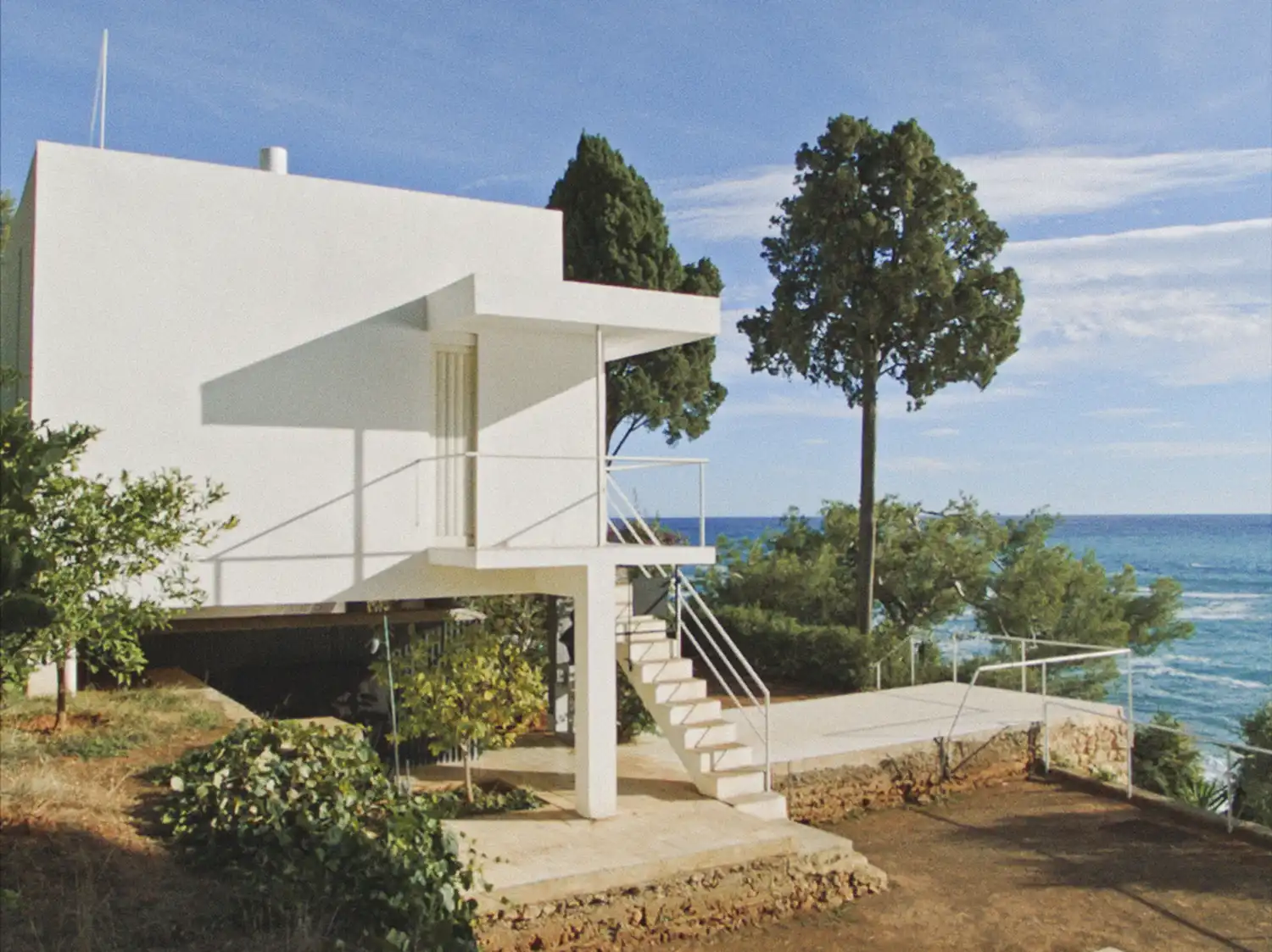
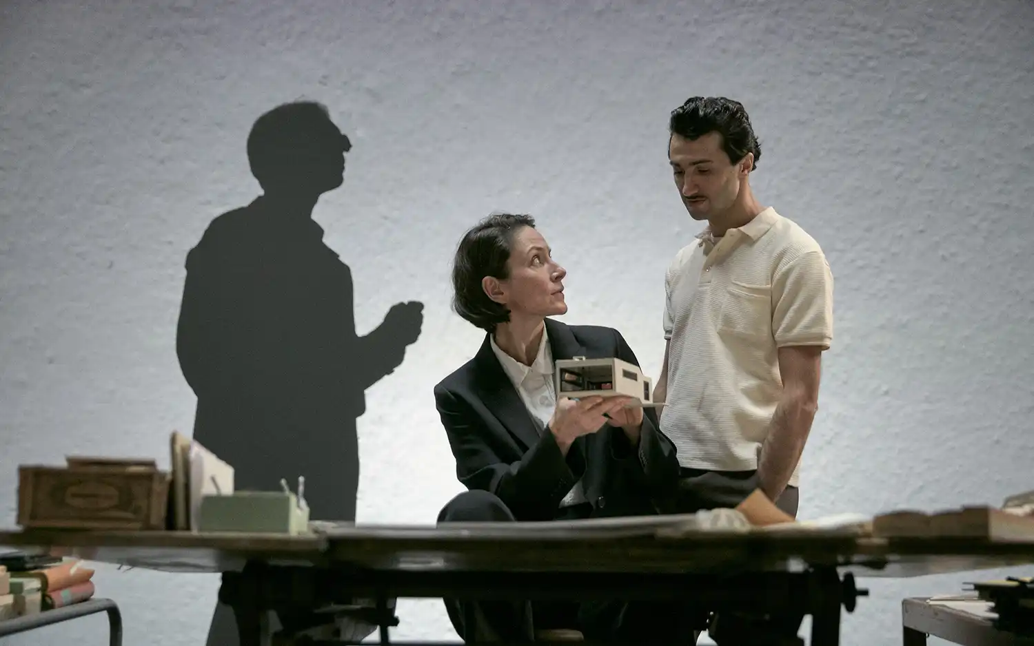
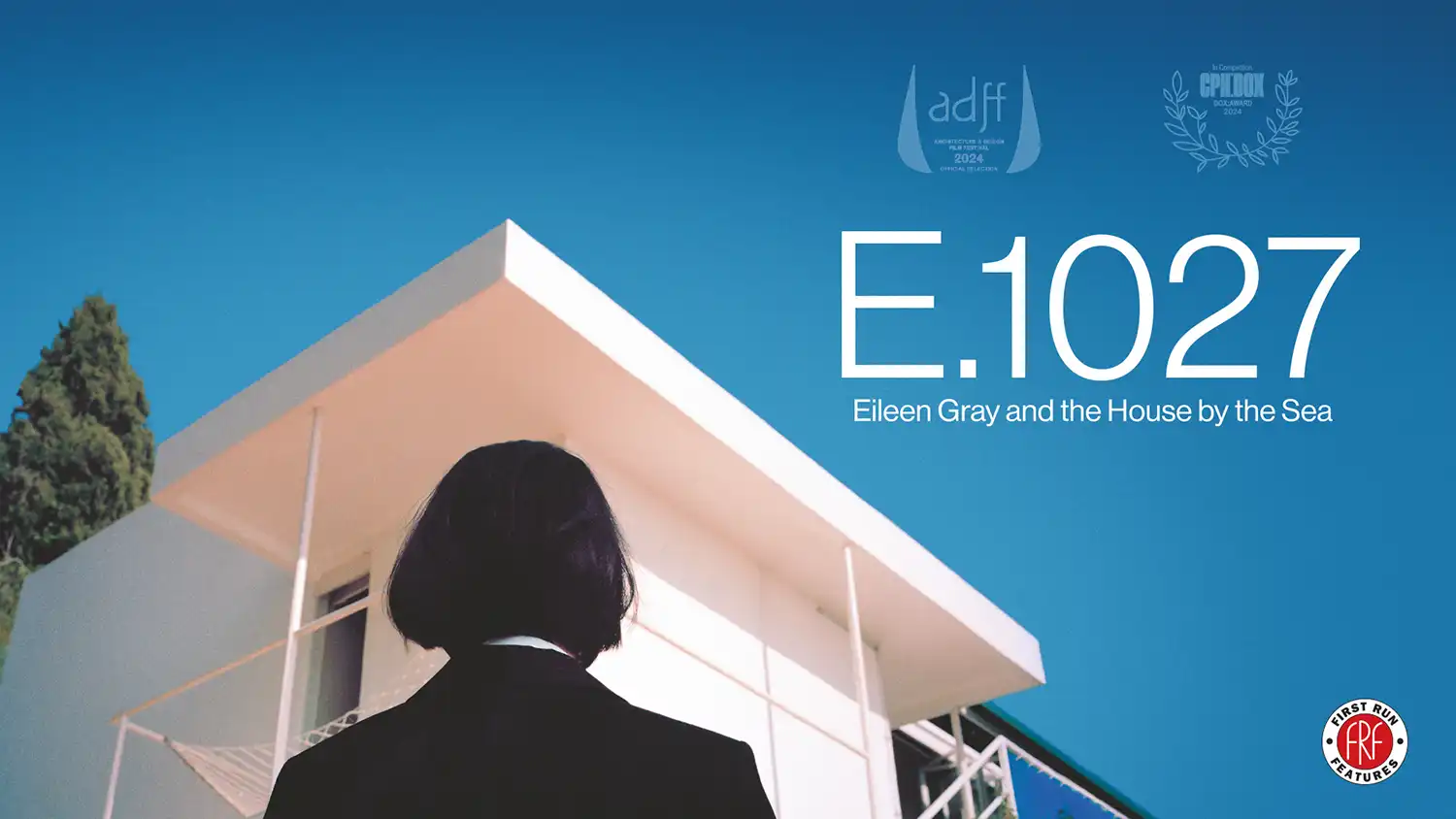
Irish architect and designer Eileen Gray is finally receiving the recognition she deserves. E.1027: EILEEN GRAY AND THE HOUSE BY THE SEA explores her legacy and her iconic Côte d’Azur home. Built in 1929, E.1027 was envisioned as a private retreat but soon drew the unwanted attention of Le Corbusier, who defaced its walls with murals and later constructed his own cabin nearby.
This hybrid docu-fiction film, presented by First Run Features and the Architecture and Design Film Festival, examines Gray’s groundbreaking contributions to modernism and the struggle over artistic ownership that ensued. It is now available for streaming on Apple TV+.
Foundation For Portland Public Schools
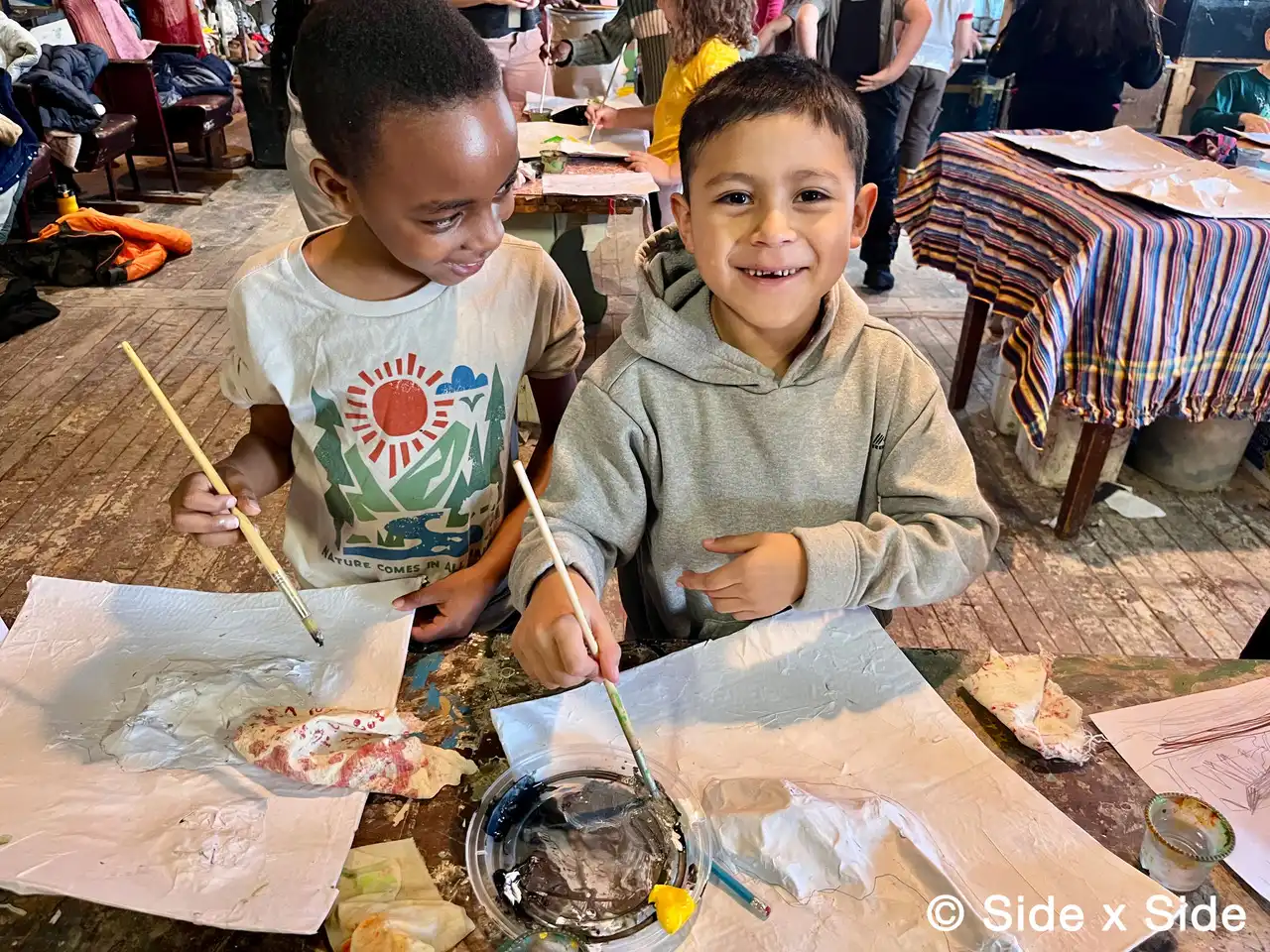
The FOUNDATION FOR PORTLAND PUBLIC SCHOOLS has received a transformative $1 million donation from anonymous alumni donors to strengthen arts and music education. Half of the funds will go directly to arts and music programs, while the remaining $500,000 will be used flexibly across the district. Executive Director Andi Summers says the gift will accelerate plans already underway to expand the arts curriculum, bringing more opportunities for creativity and expression to students.
“Exposure to and participation in the arts—whether visual, musical, or performance—are essential elements of a well-rounded education,” the donors wrote. “All students deserve to access inspiration and to discover their creativity through the arts.”
Big Night boutique
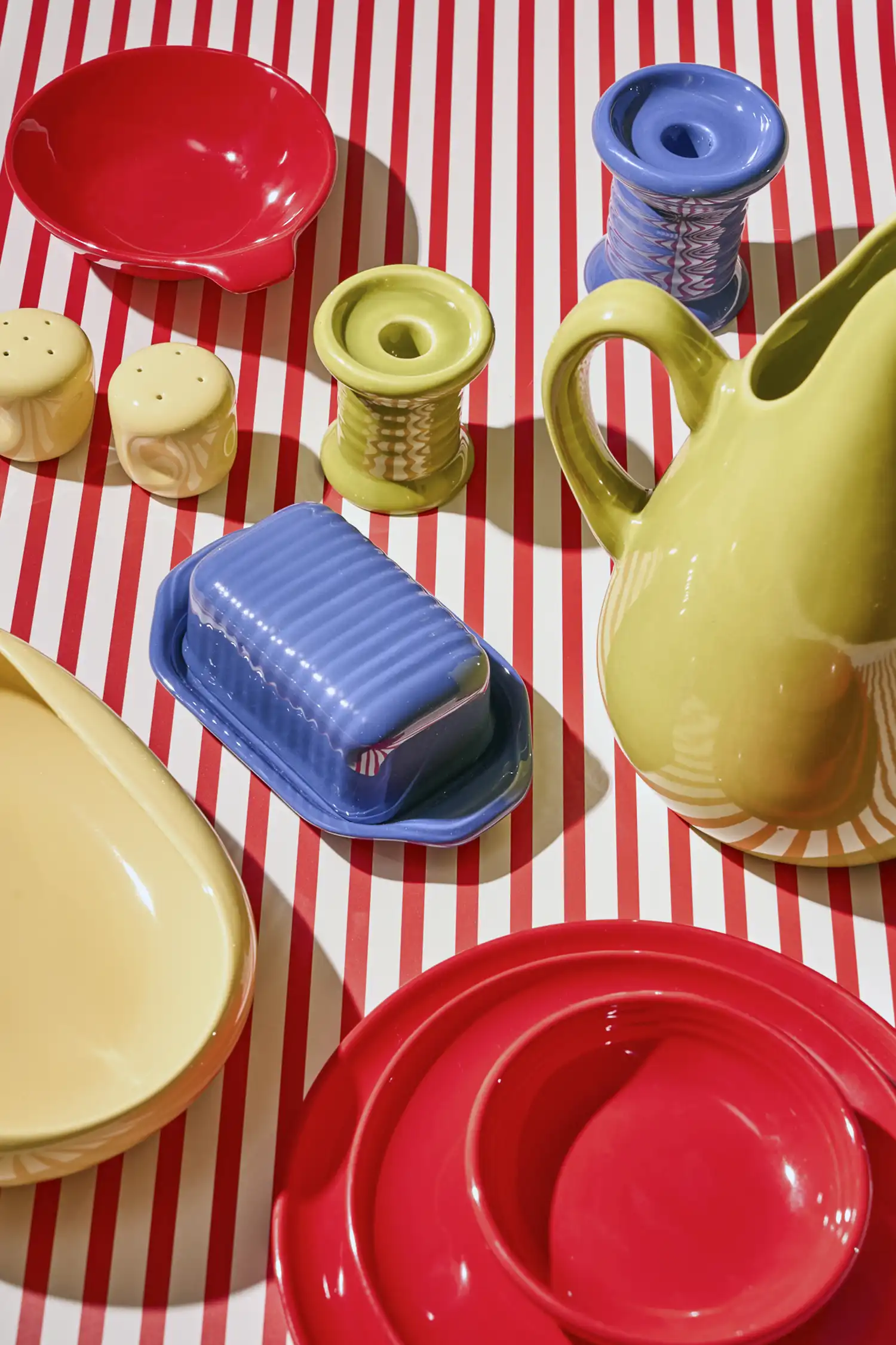
BIG NIGHT boutique in the West Village of New York City is known for its curated selection of homewares, tableware, and objects that celebrate modern and midcentury design. They recently launched an exclusive line from RUSSEL WRIGHT’S iconic AMERICAN MODERN collection. The line includes dinner plates, pitchers, lug bowls, and more in four colorways—two of which, red and buttercream, are available only at Big Night.
Originally designed in the late 1930s by Wright as part of the Good Design movement, the collection brought casual, functional earthenware to everyday dining. Historic pottery studio BAUER POTTERY, which tightly controls the line’s distribution, has made this rare in-store offering possible.
Hamilton House
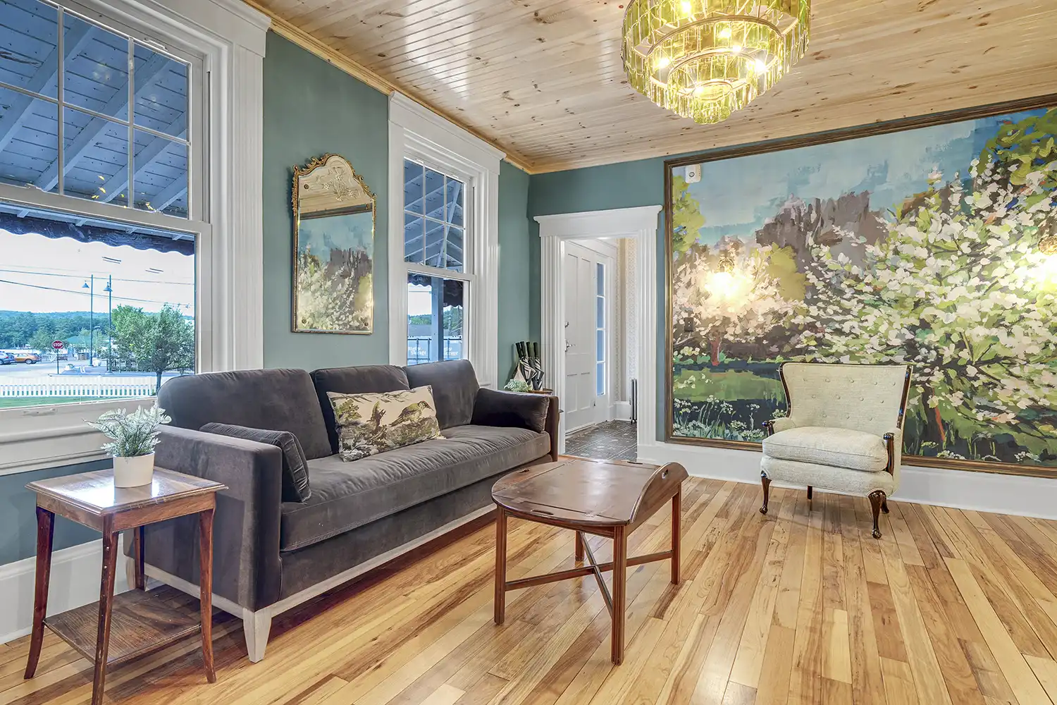
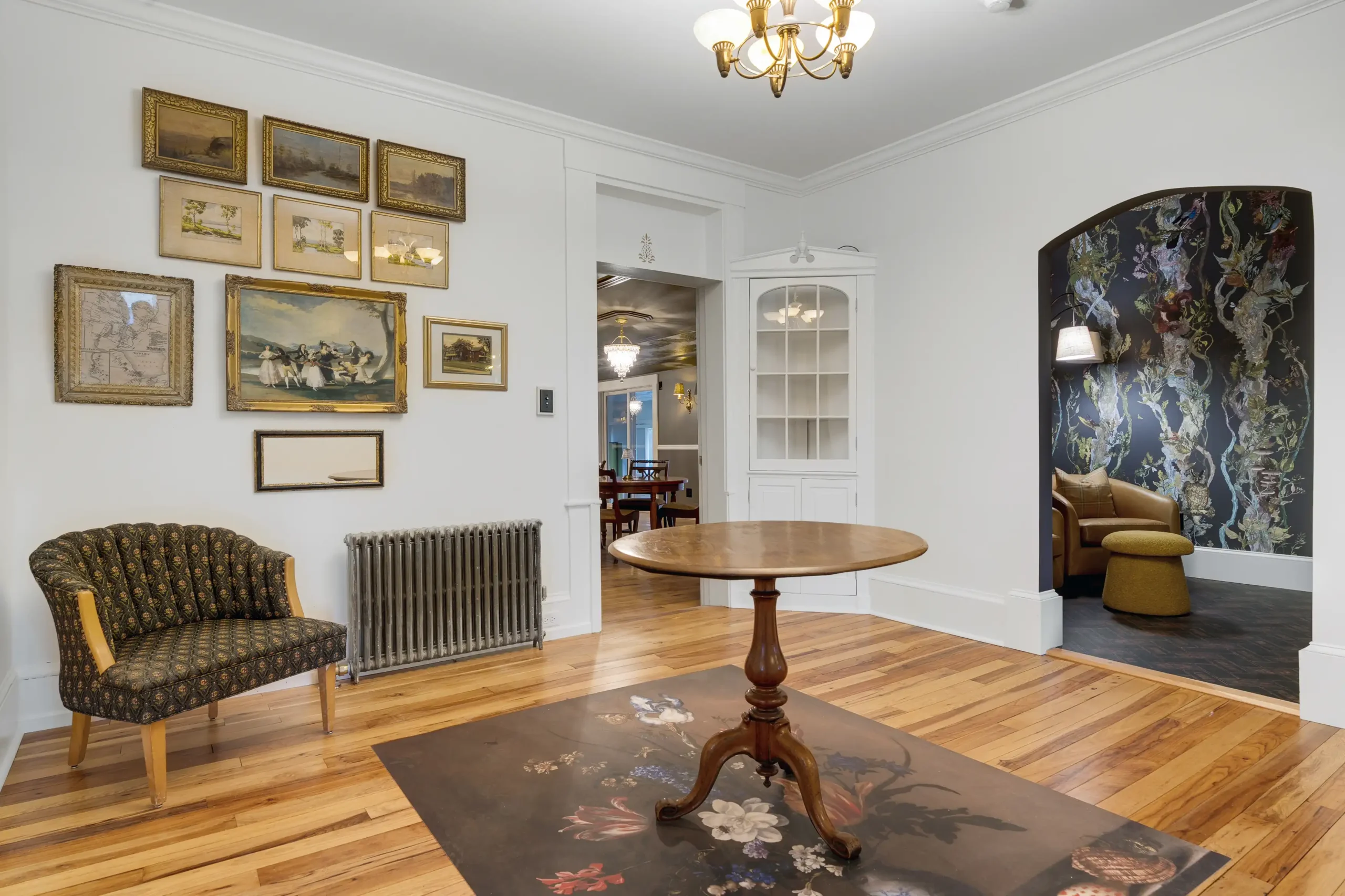
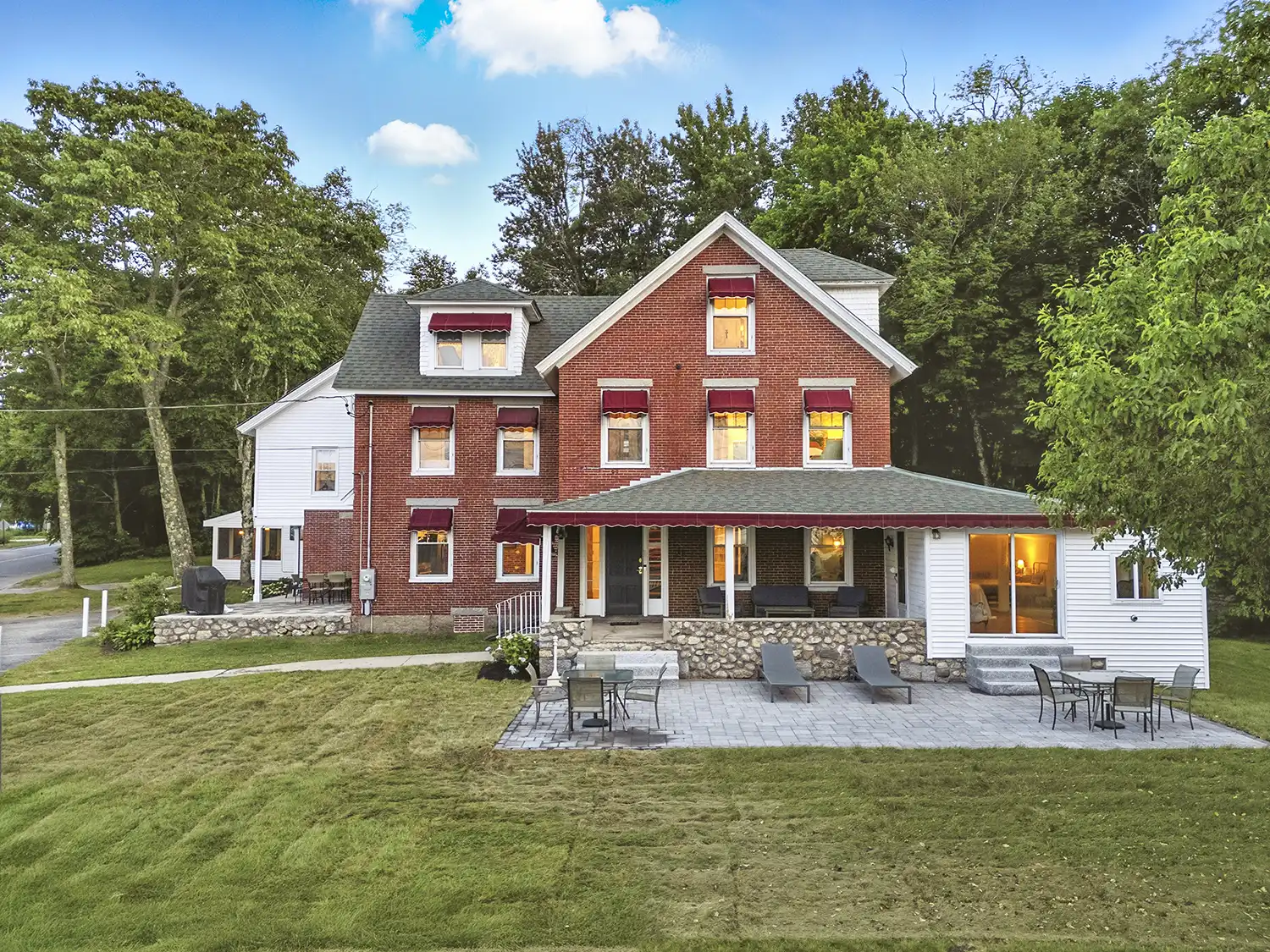
Long a landmark in Naples, the historic AUGUSTUS BOVE HOUSE has been thoughtfully reimagined and reopened as the Hamilton House. Originally built in 1860 as the town’s only hotel, the property was later purchased by politician Augustus Bove, who helped shape the Naples Causeway from the hotel’s front porch. After serving as a bed-and-breakfast for four decades, the house has now been transformed into a short-term rental accommodating up to 26 guests.
Designer Carlee Cardwell of DAMBLY DESIGN created a dynamic, multilayered interior reimagined through pattern, color, and mood. Builder Dan Phelan of RIGHT LEVEL CONSTRUCTION in Raymond restored structural integrity and elevated the interiors with careful detailing and custom craftsmanship—bringing much-needed soul back into the home.
Bath Area Family YMCA
The BATH AREA FAMILY YMCA celebrated the opening of its new early learning center at 6 Farley Road, designed to serve the children of local shipyard workers while also welcoming the wider community. The $13 million, ten-classroom facility offers 120 childcare slots for infants, toddlers, and preschoolers, marking a significant expansion of the Y’s childcare program. Funded in part by the U.S. NAVY, the center reflects a thoughtful approach to family-centered design and community support.
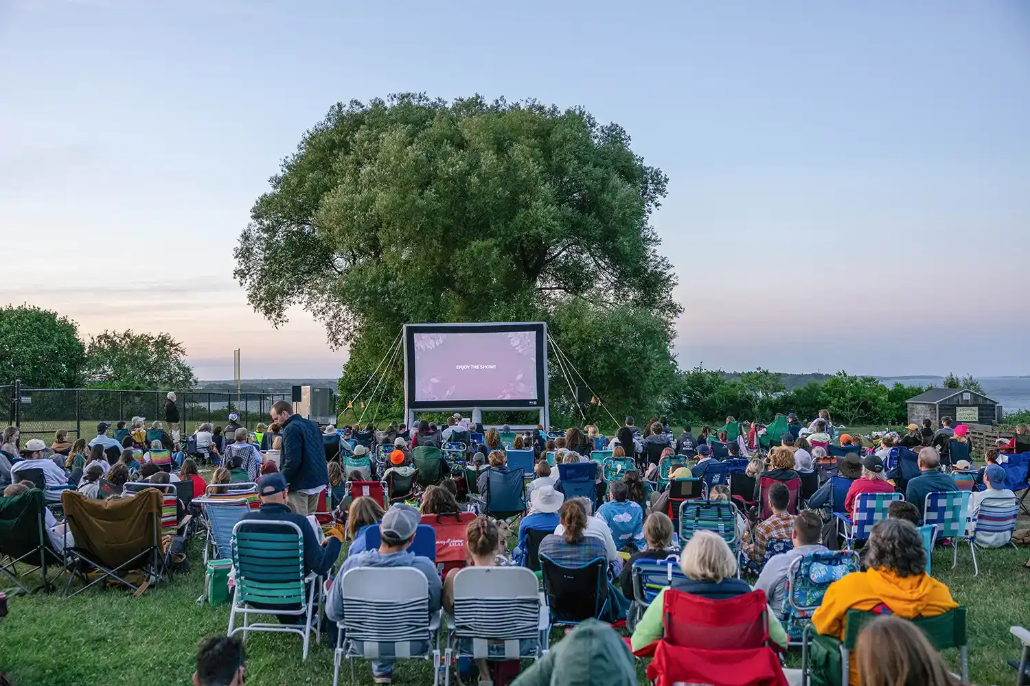
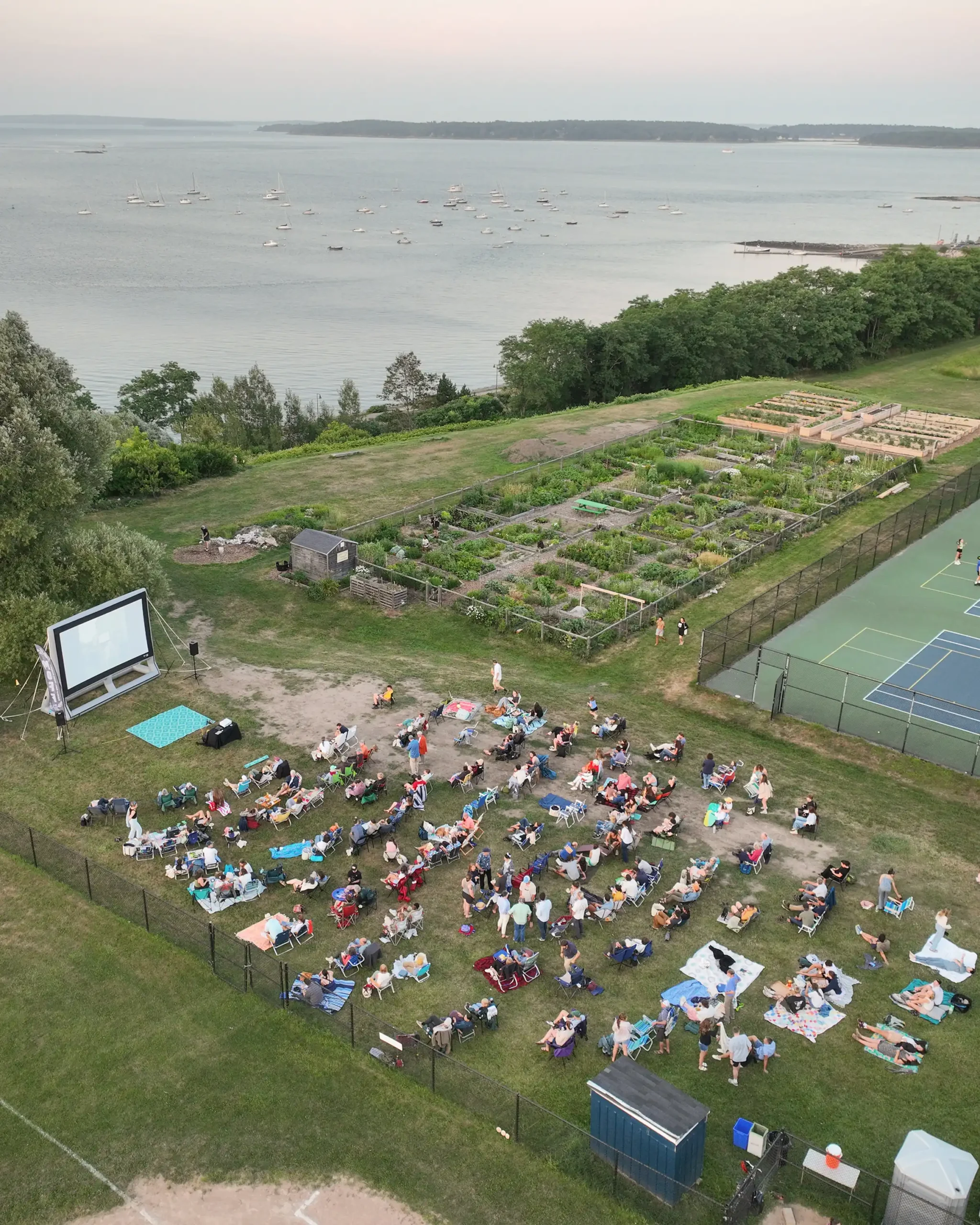
Maine Outdoor Film Festival
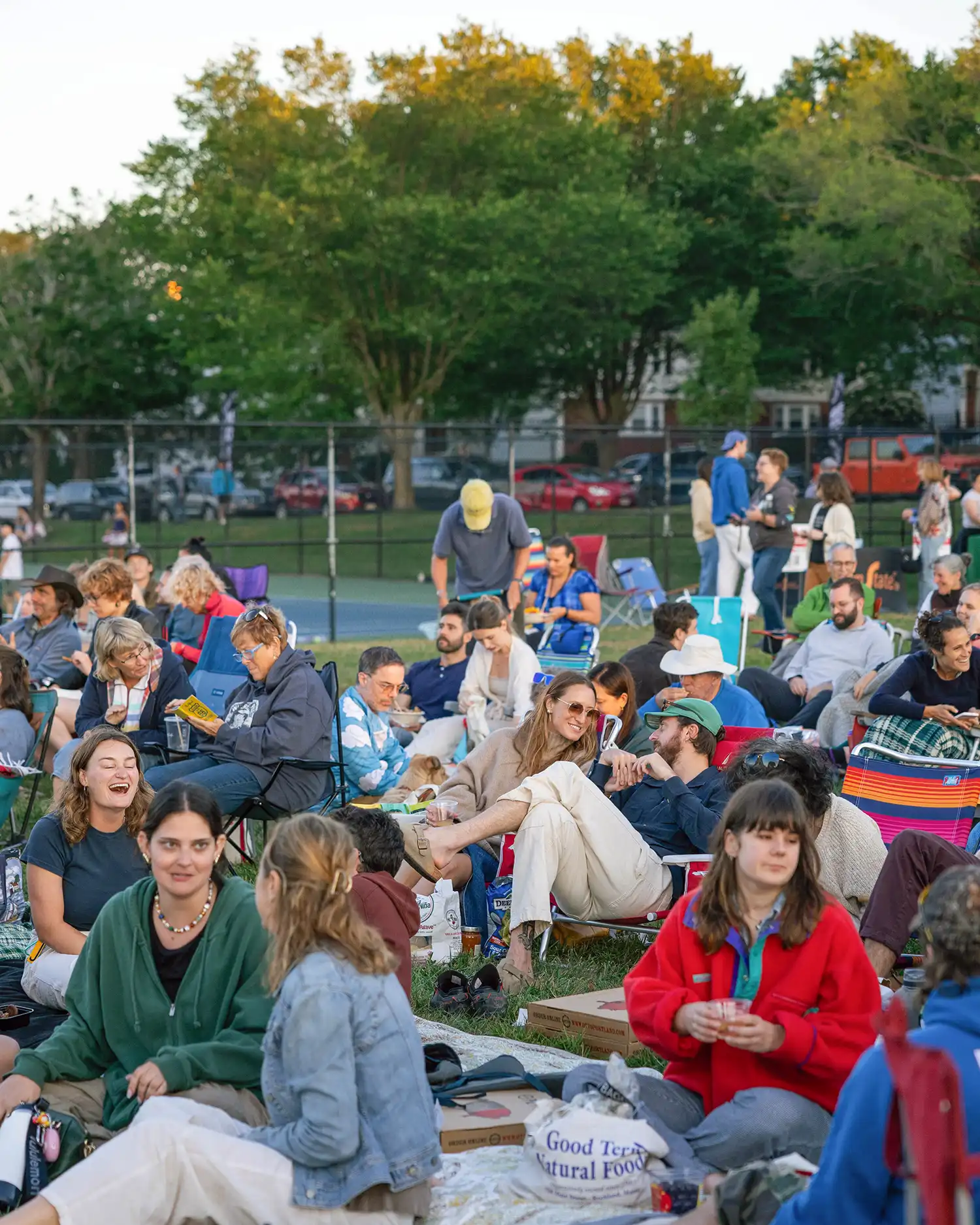
The MAINE OUTDOOR FILM FESTIVAL (MOFF) held its sixth Portland flagship festival July 23 to 27 with record-breaking attendance, featuring 95 films across 20 screenings. Panel discussions and networking events welcomed 35 filmmakers from Maine and six countries. Following the Portland event, MOFF toured 18 Maine towns through their annual Selects Tour, partnering with local theaters and land trusts to bring outdoor films to communities statewide. Film submissions and sponsorship opportunities for the 2026 festival are now open at MOFF.film.
November, 2025 | By: Dan Pelosi | Photography: Johnny Miller
This dish is made for the Carmela Soprano that lives in all of us. It’s the type of cooking that makes you feel like a mob boss’s wife—fabulous hair, perfect nails, and abundant food…maybe minus the crime. These pork chops are seared to golden perfection and smothered in a criminally flavorful sauce of onions, peppers, and a splash of vinegar, making every bite a savory masterpiece. It’s the kind of flavor that even Carmela’s mother-in-law would approve of.
Serves 6 to 8
Make ahead: The seasoned pork can be refrigerated up to 48 hours (see note).
INGREDIENTS
4 (1-inch-thick) bone-in pork chops Kosher salt and freshly ground black pepper 2 tablespoons extra-virgin olive oil, plus more as needed 1 medium yellow onion, halved and sliced 1 (16-ounce) jar sweet or hot cherry peppers, drained 1 tablespoon all-purpose flour 1/2 cup dry white wine 1/2 cup low-sodium chicken broth 1/4 cup white wine vinegar, plus more as needed
INSTRUCTIONS
Pat the pork chops dry with paper towels. Season generously with salt and pepper.
Heat the olive oil in a large cast-iron or nonstick skillet over medium heat. When the oil is shimmering, add the pork chops. Cook until golden brown, about 4 minutes per side. Transfer to a plate and set aside to rest.
Add more olive oil to the skillet if it looks dry. Add the onion, peppers, and a pinch of salt. Cook, scraping up any browned bits from the bottom of the pan, until the onions begin to soften, about 4 minutes. Sprinkle over the flour and cook, stirring, until just toasted, about 1 minute. Stir in the wine, chicken broth, and vinegar. Nestle the pork chops back into the skillet and pour over any collected juices from the plate. Simmer until the sauce is thickened and the chops are cooked through, about 6 minutes, flipping the chops halfway. Transfer to a cutting board and let rest for 10 minutes.
Add 1/2 cup water to the skillet and cook over medium heat, whisking vigorously, until a glossy, rich sauce forms, 5 to 7 minutes. Remove from the heat. Taste for seasoning and add more salt, pepper, or vinegar as needed.
Arrange the pork chops on a serving platter, then spoon the sauce, onions, and peppers over the top. Serve immediately.
Note: You can cook the chops right away, but for extra-good flavor, set a wire rack over a rimmed sheet pan and place the seasoned chops on top. Refrigerate for at least 2 hours or up to 48 hours. Bring to room temperature before cooking.
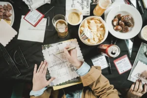
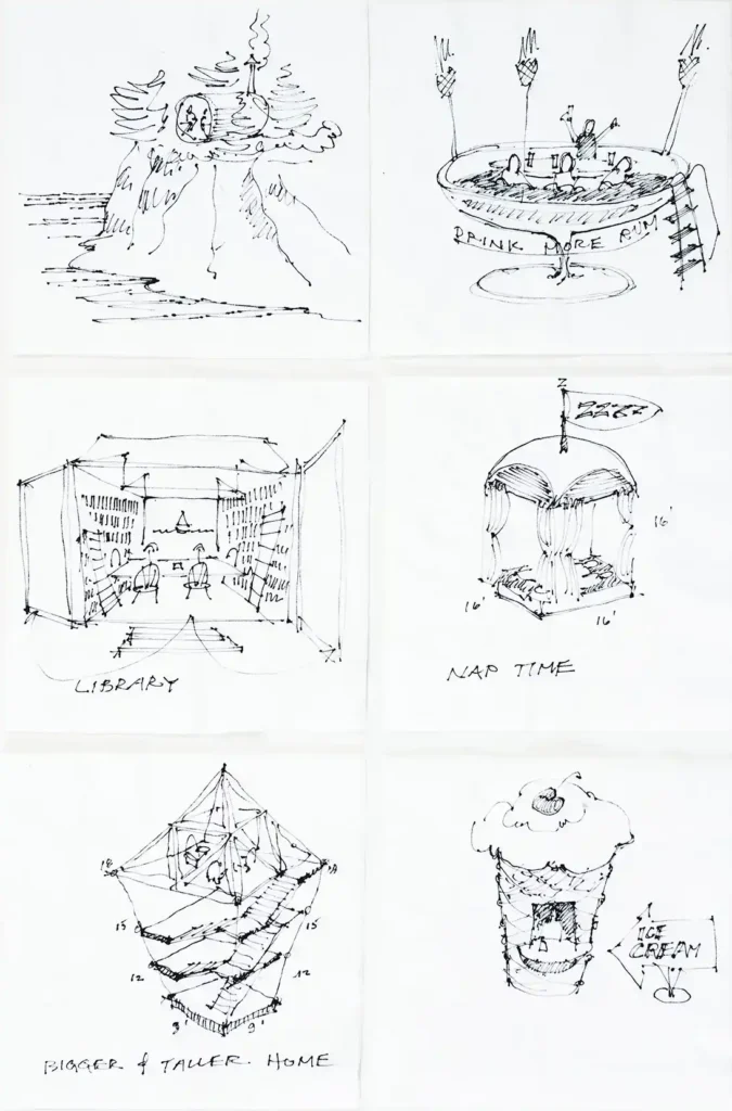
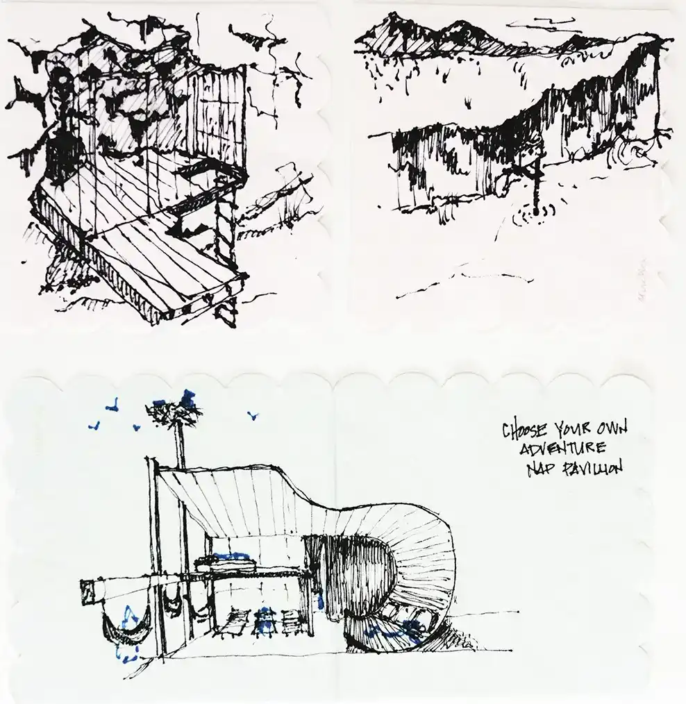
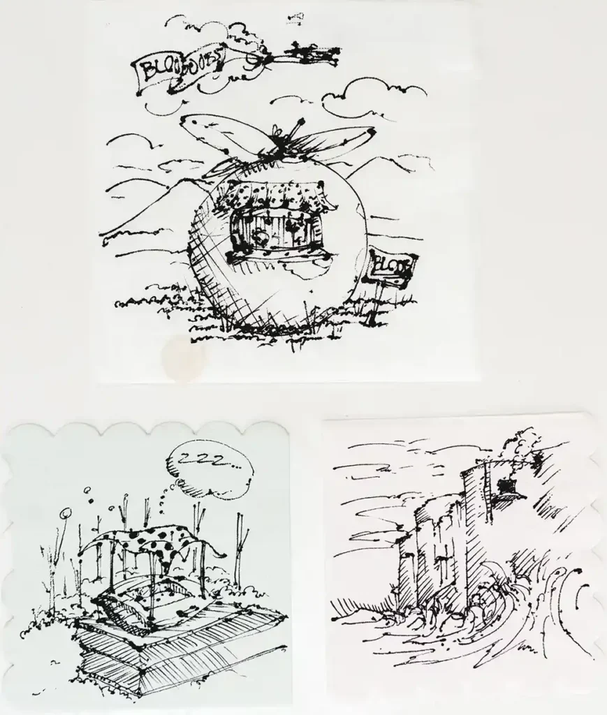
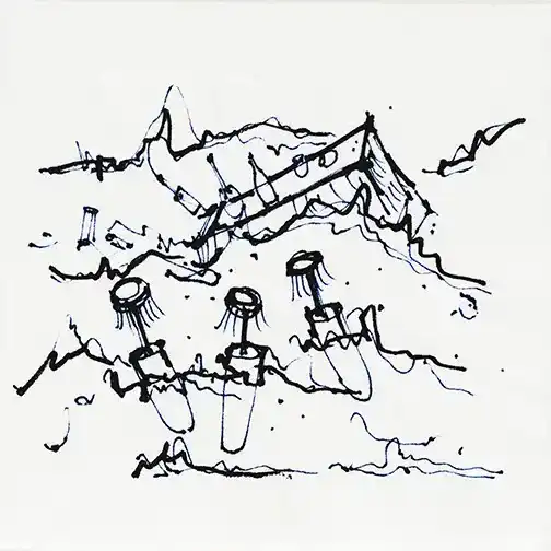
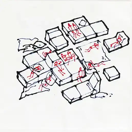
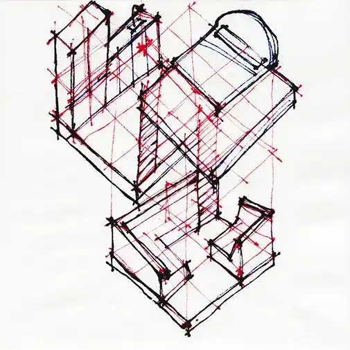
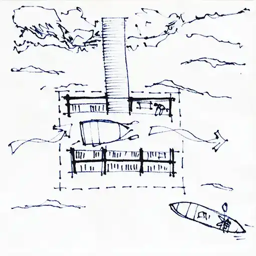
Throughout history, some of the most iconic designs have been conceived on a napkin, scrap of paper, or placemat. Architectural sketches are part of the designer’s thought process and the result of their mind, eyes, and hands working together. For a fifth year, Maine Home + Design put out a call to Maine designers to come meet us for a drink at Novare Res Bier Café in downtown Portland to create a napkin sketch of their own. Seven prompts were passed out, and each designer could do as many or as few sketches as they liked within the time given.
Napkin Sketches Prompts
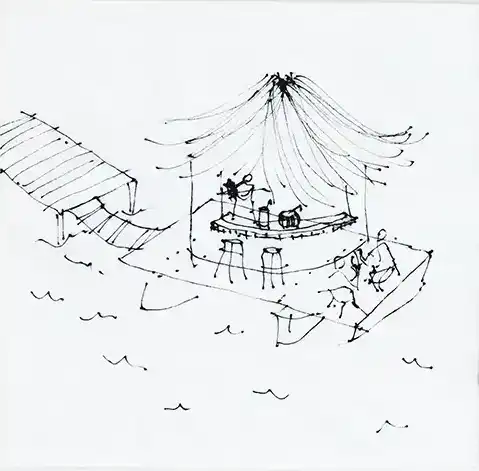
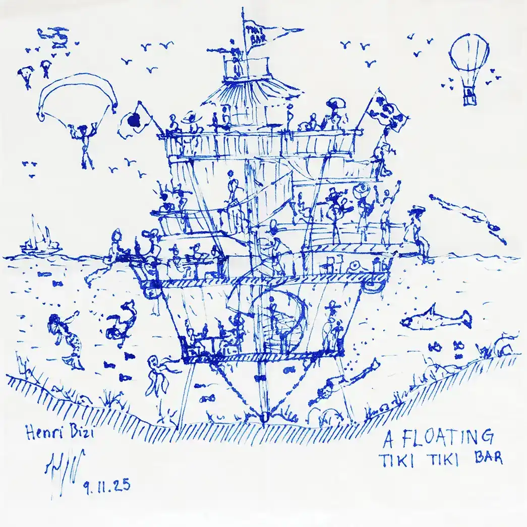
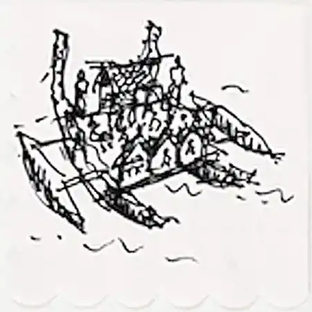
A floating tiki bar
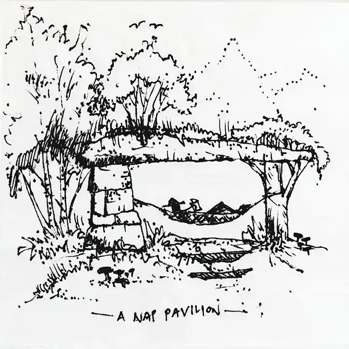
A nap pavilion (approx. 200 sq. ft.)
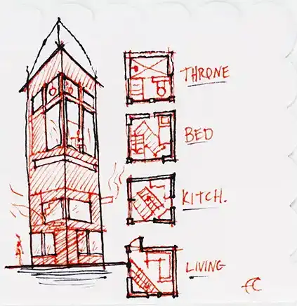
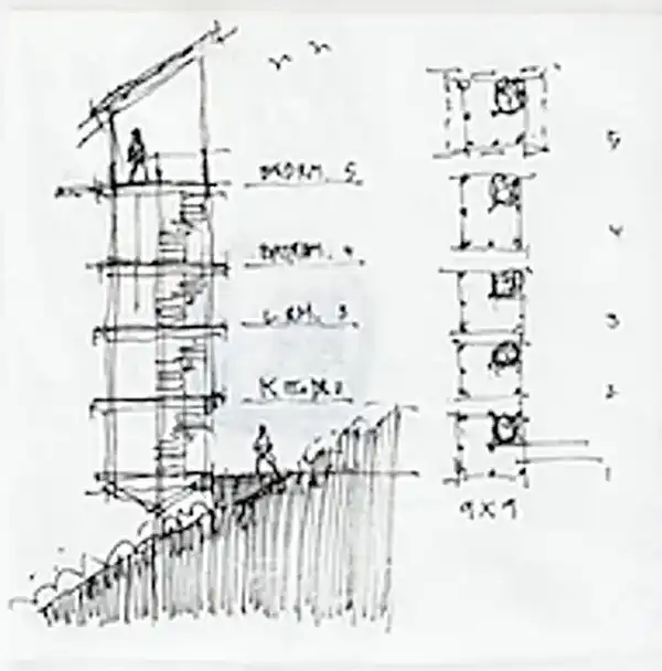
A residence with a 9 x 9 ft. footprint
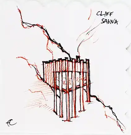
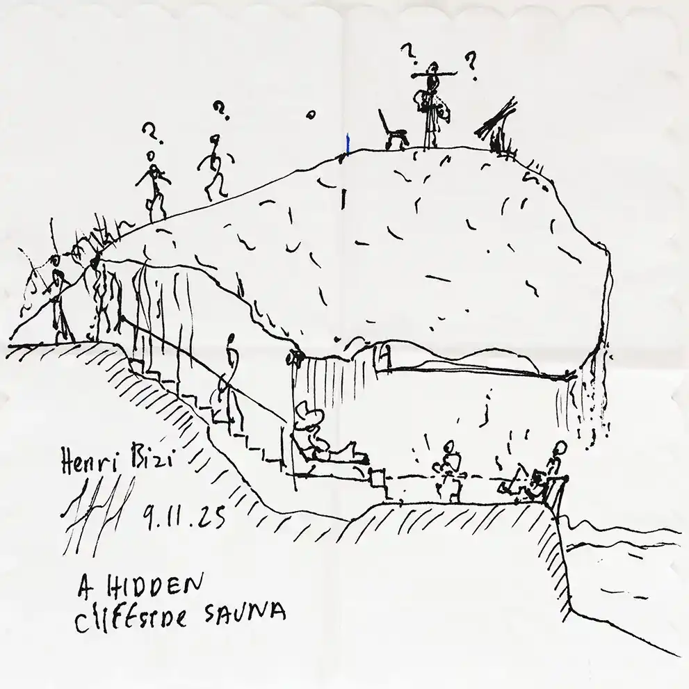
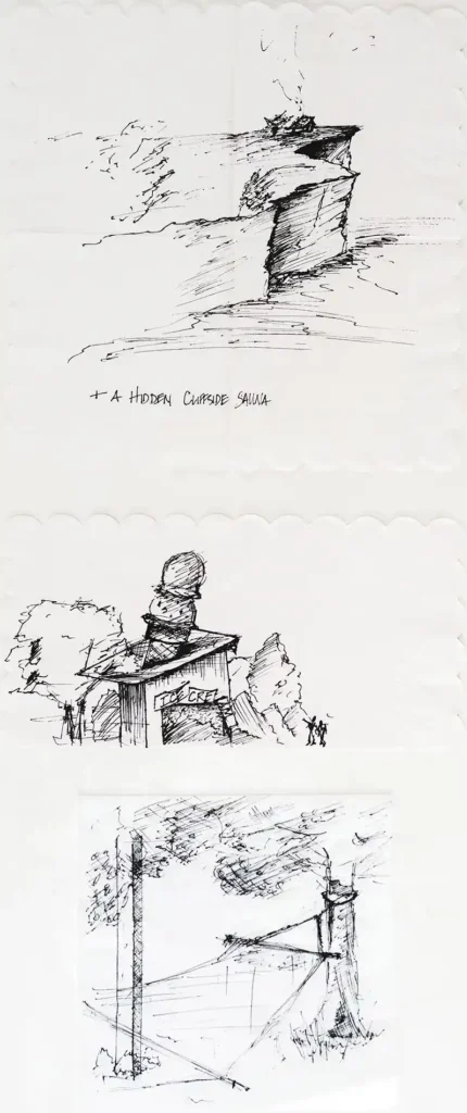
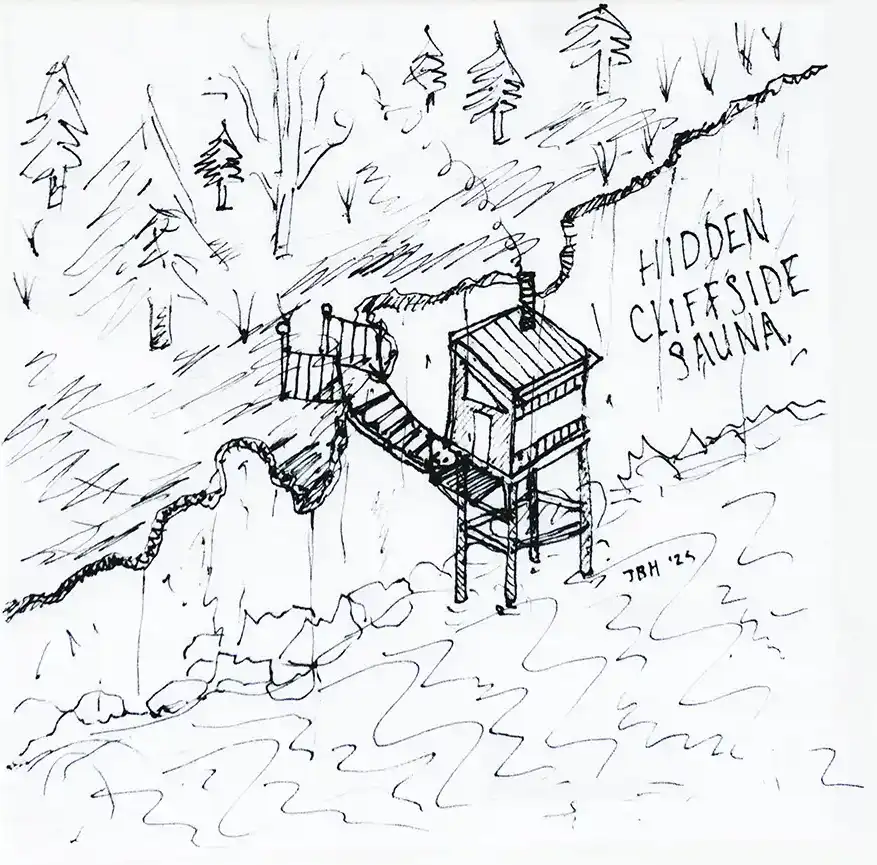
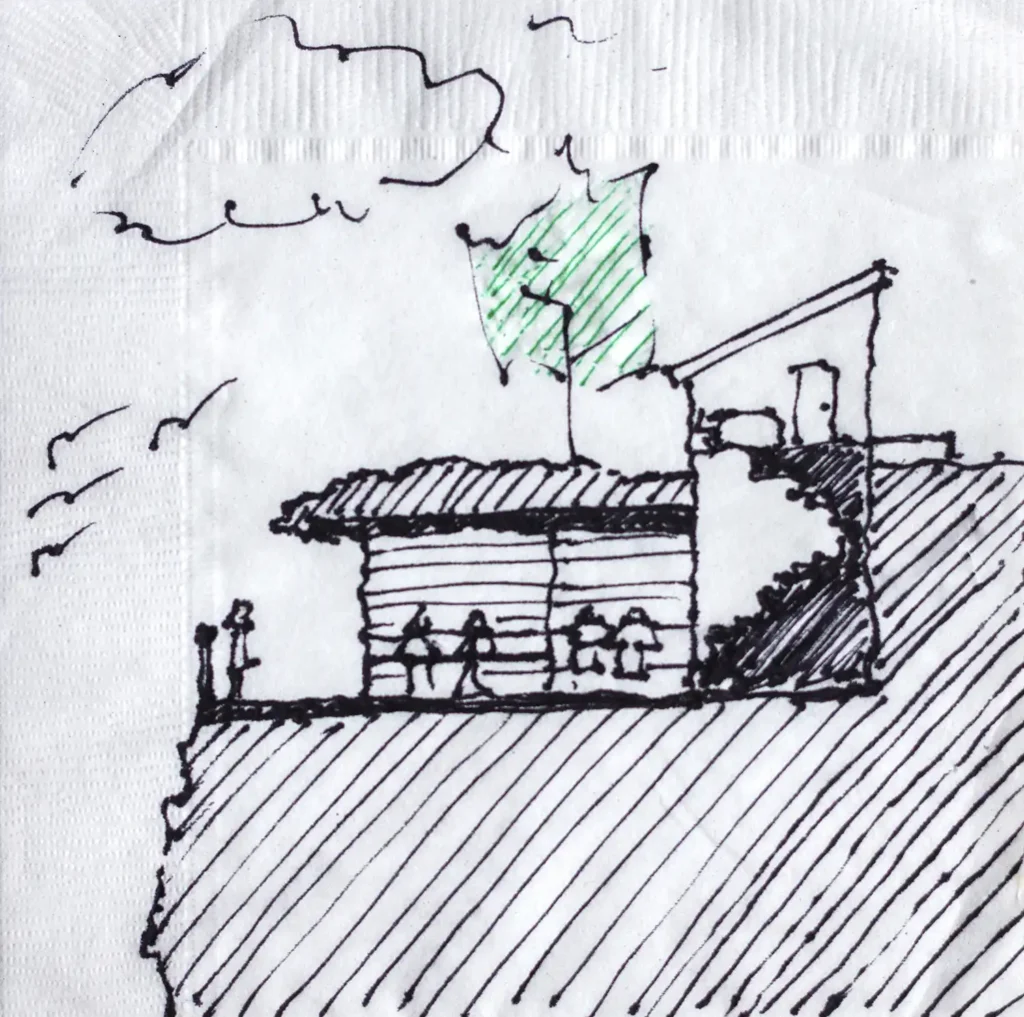
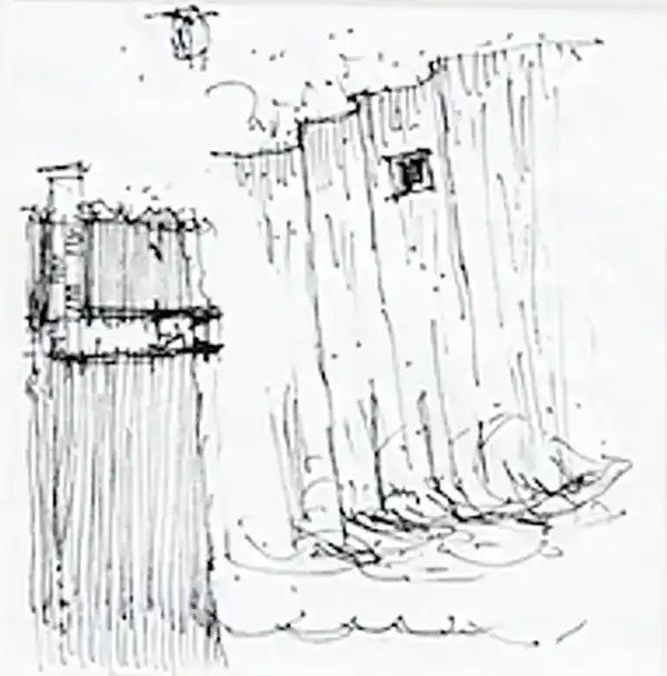
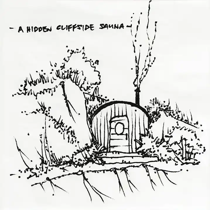
A hidden cliffside sauna
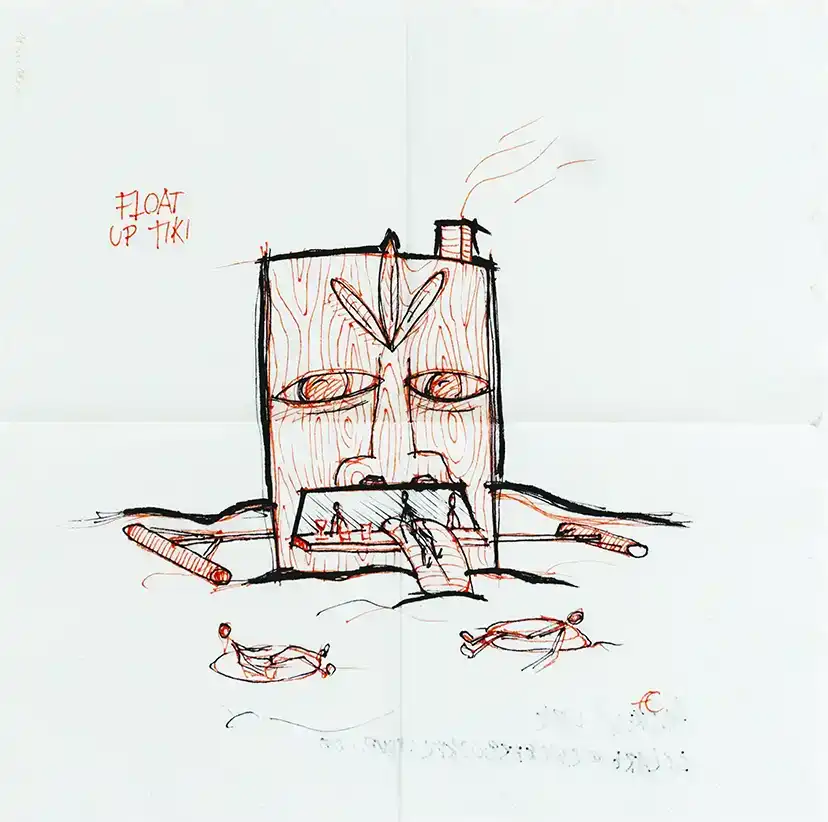
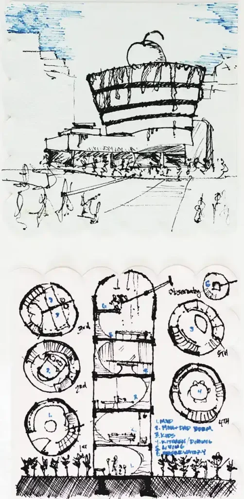
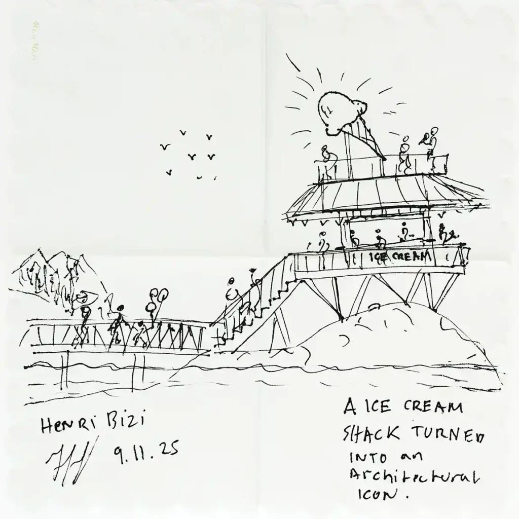
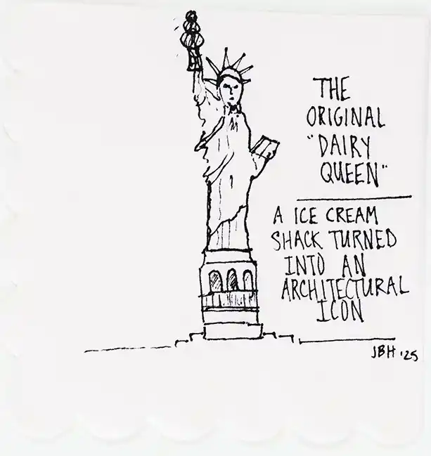
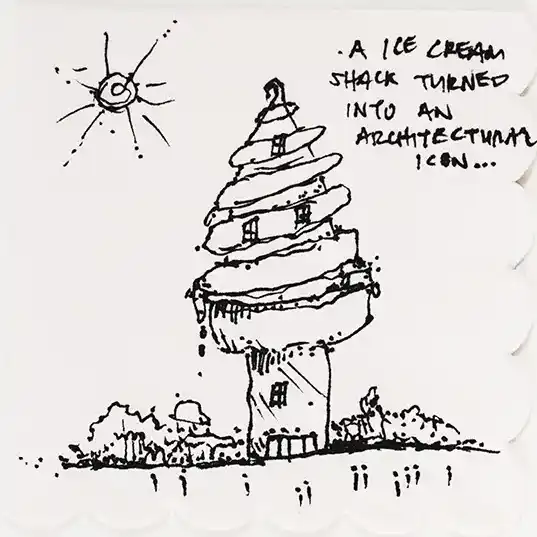
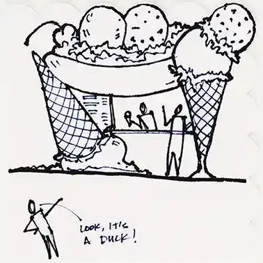
An ice cream shack turned into an architectural icon
“Nine feet wide, four stories high, and one stair that interrupts everything. The bathroom gets the penthouse, naturally.”
“I set out to design something local, but once you start subtracting everything but structure, steam, and site, regionalism starts to look a lot like a Norwegian Peter Zumthor project…”
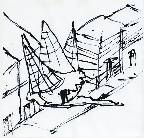
“After a summer of floating up and down the coast, this one came naturally. I just wish my real inner tube seconded as a barstool and came with a drink menu.”
Andrew Clark, designer Knickerbocker Group
Drawings, clockwise from top left: A residence with a 9 x 9-ft. footprint, a hidden cliffside sauna, a floating tiki bar.
“Start with the section! And then the basics: A place to sleep, make a delicious meal, read a favorite book, and stargaze under the night sky.”
Katie Braddock La Rose, architect and interior designer Kaplan Thompson Architects
Drawings, clockwise from middle left: A floating tiki bar, a nap pavilion (group of four), a residence with a 9 x 9-ft. footprint (group of four).
“Sketching is a quick and direct extension of deep thinking. It is relational, approachable, and clear evidence of internal creativity. Our objective for each sketch was to simplify the prompt into its simplest form. For instance, in the sauna prompt in the upper left, for me, the sauna is about an earthen experience of warmth and protection. I see it as an interior-focused activity that invigorates your core and strengthens your body. Those ideas are represented here in the architectural experience of protection—and in our concept, prospect—where through a womblike enclosure you have a commanding view of the world.”
Chris Delano, principal/owner Delano Architecture
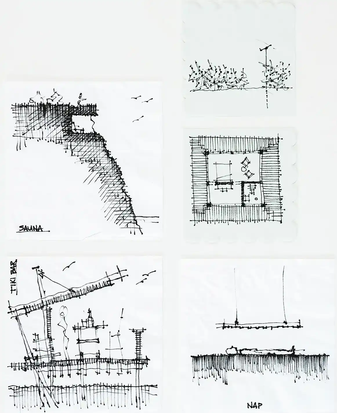
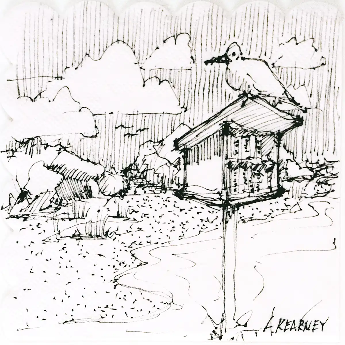
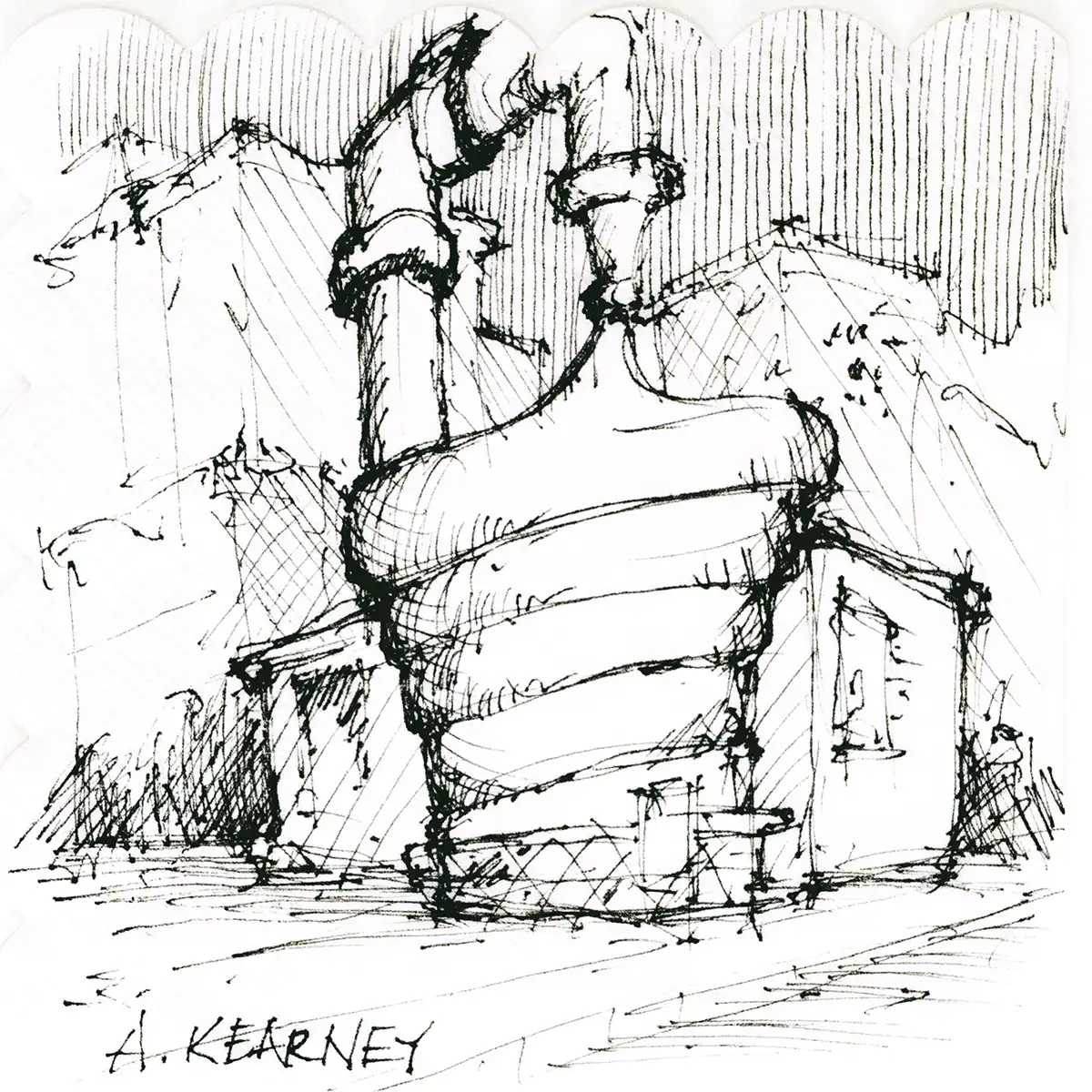
Drawings, clockwise from top left: A hidden cliffside sauna, a ticket booth for a blueberry festival, a residence with a 9 x 9-ft. footprint, a nap pavilion, a floating tiki bar.
“The cone sundae is melting into pavement.”
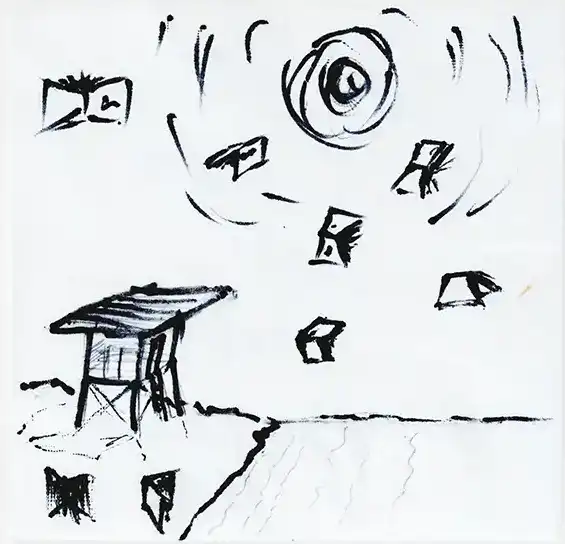
“A lifeguard tower post where book birds come to roost.”
“Cold plunge sauna under deluge.”
CAP Prasch, designer and adjunct professor Winkleman Architecture and UMA Architecture
Drawings, left to right: An ice cream shack turned into an architectural icon, a mini coastal library, a hidden cliffside sauna.
“Always a pleasure to attend the MHD Drink + Sketch and share an evening with the talented and wonderful design community we have here in Portland. Looking forward to coming again in the future!”
Charlie Payne, project manager and architect AAmp Studio
Drawings, clockwise from top left: A floating tiki bar, a hidden cliffside sauna, a nap pavilion, a residence with a 9 x 9-ft. footprint.
“Beneath the warm light of the evening, pen rapidly met napkin in search of a small dwelling that could live with nature. A modest nine-by-nine square emerged, its glass wall dissolving into a slender porch that bridged the snug shelter within to the vast open sky beyond. The little abode became less an object and more a clearing in the woods, a vessel for living always just a few steps from wind, light, and land, never apart from the cadence of nature.”
Russ Tyson, principal Whitten Architects
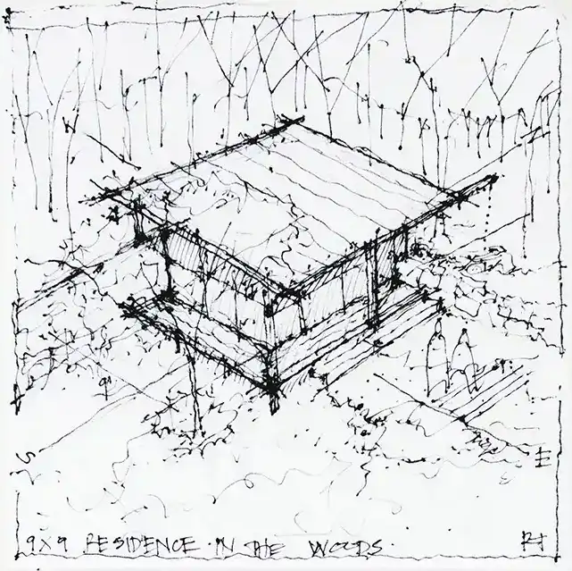
Drawings: A residence with a 9 x 9-ft. footprint.
“Napkin sketches are a great way to explore and express a 3D design concept…keep the hand moving, be sure to include people and furnishings, and have fun.”
Rob Whitten, founder and principal Whitten Architects
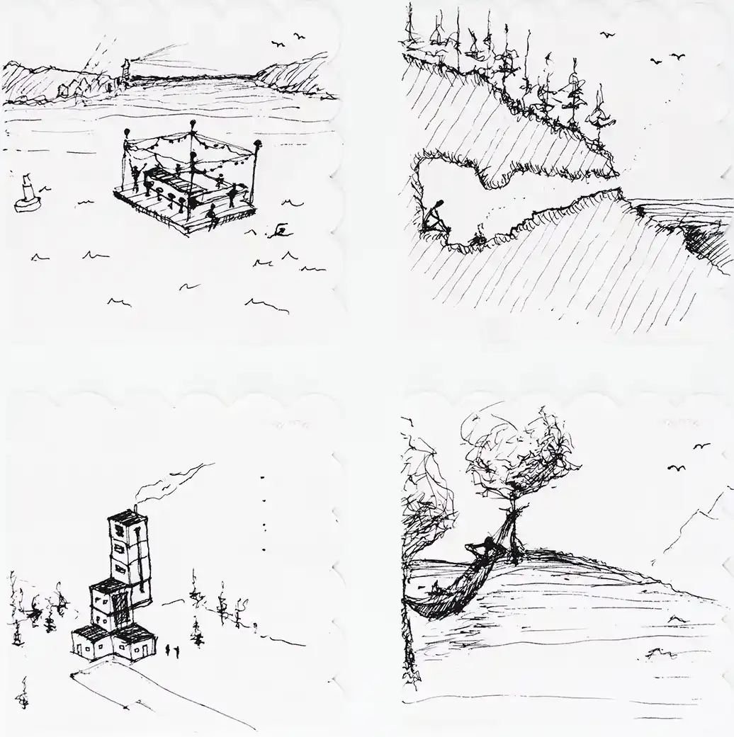
Drawings, clockwise from top left: “A barrel sauna hidden in the spruces at the top of a coastal bluff”; “A floating tiki bar in a giant Saarinen plunge pool”; “Nap Time is a giant waterbed, four posts supporting a dome tent, rod and drapes for light and privacy, and a snooze banner”; “The iconic cream booth with a cherry on top…flavor to be determined”; “The higher and taller residence begins with a 9 x 9-foot base, add 3-foot cantilevers at each level, and run the stairs to the glass conservatory above”; “The library is sketched as a floor-to-ceiling wall of books, French doors at each end, a water view, and skylight monitors above.”
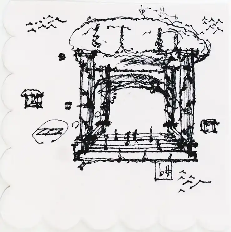
“A dreamlike pergola in the clouds, complete with a hammock slung between Corinthian columns, there seem to be eight other clouds like this among the cloudscape.”
Alex Haba, architect Whitten Architects
Drawing: A nap pavilion.
“What makes a great architect is not the ability to sketch buildings, draw floor plans, or even draft complex details. What makes a great architect is their ability to see the world through a lens toward optimism. Every challenge is an opportunity, and every problem is an invitation for improvement. This Drink + Sketch event exemplified that optimism and allowed us all to reflect on why we love this profession.”
Taylor Massey, principal BaseCamp Design Workshop
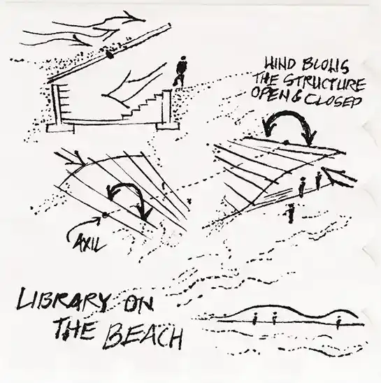
Drawings, top to bottom: A hidden cliffside sauna, a mini coastal library, a floating tiki bar.
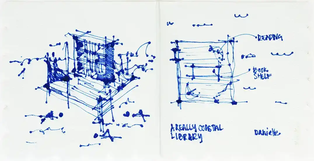
“For the idea of a small coastal library, I went really small and a little offshore. A platform you can swim or paddle to, select some (waterproof) reading material, and bask in the ocean breeze.”
Danielle Foisy, architect Juniper Design + Build
Drawings: A mini coastal library.
“My goal for the exercise was to distill each prompt down as simply as possible, keeping the drawings clear, pure, and to the point. To achieve this, I limited myself to just two minutes per sketch, which kept the process loose and immediate. The results are cartoonish, but ideally also somewhat diagrammatic—quick studies that carry a wink of whimsy.”
Andrew Ashey, principal AAmp Studio
Drawings, clockwise from top left: A hidden cliffside sauna, a residence with a 9 x 9-ft. footprint, a mini coastal library, ticket booth for a blueberry festival, a floating tiki bar, a nap pavilion.
“I love how the napkin sketch inherently expands our creativity when it comes to designing. No rules = more moments for artistry…and even more often, happy accidents!”
Drawings, clockwise from top: A hidden cliffside sauna, a mini coastal library, a nap pavilion.
“This cliffside structure brings the sauna and cold plunge experience to a new extreme. Those craving a contrast of intensity and calm can brave the raw swim and rope ladder to reach the warm, quiet perch, and when ready, can return to the refreshing sea.”
“There’s something that feels more socially acceptable about napping in public if it’s a shared experience. This nap pavilion responds to the fact that we all need rest, even birds!”
Drawings, top to bottom: A hidden cliffside sauna, a nap pavilion.
“Growing up in Ohio, I used to fantasize about living in a silo. I still do.”
“What icon already looks sort of like a dessert? Well, that delicious multi-tiered cake museum near Central Park, just needed some fudge and a cherry on top.”
Patrick Boothe, principal and partner Woodhull
Drawings, from top to bottom: A residence with a 9 x 9-ft. footprint, an ice cream shack turned into an architectural icon.
“These prompts sparked me to explore the representation of two of my favorite things: Sipping piña coladas and picking blueberries. Since I live in the Dominican Republic and Maine, I am lucky enough to get to do both quite often. Thanks to MHD for hosting this fun event where new friends and old meet up. I hope the art of hand drawing will always be cherished and valued. It was a stellar evening!”
Linda A. Banks, principal Banks Design Associates/Simply Home
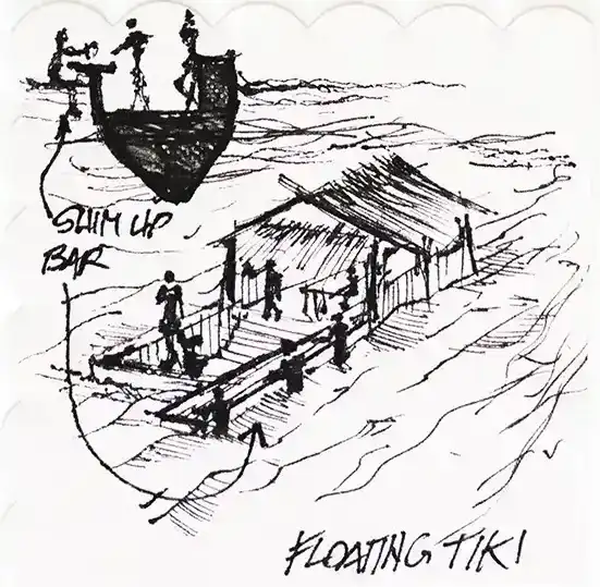
Drawings, left to right: A floating tiki bar, ticket booth for a blueberry festival.
“Designing a floating tiki bar was one of my favorite prompts. I started with no clear direction, but once I began sketching, the ideas took off. Underwater date spots, rooftop views, and even a chance to spot a mermaid. It was a fun, creative challenge that showed just how imaginative design thinking can be. Overall, it was a true pleasure to share this unique experience with others during the Drink + Sketch.”
Henri JP Bizindavyi, architectural designer Juniper Design + Build
Drawings, clockwise from top left: A floating tiki bar, a hidden cliffside sauna, an ice cream shack turned into an architectural icon.
“As a landscape designer, I am fascinated with the intersection between the built world and the natural world. With a focus on small spaces, the prompts this year gave me lots of options to explore interesting spaces. I was intrigued by the idea of a derelict ice cream shack being reclaimed by the natural world, only to be stumbled upon by hikers. In this new context, it becomes an unexpected icon.”
Kari Gallow-Wright, landscape designer Ted Carter Inspired Landscapes
Drawings, top to bottom: A hidden cliffside sauna, an ice cream shack turned into an architectural icon, a nap pavilion.
“It was a hot, humid day in New York during a high school field trip to Liberty Island. Our class slowly negotiated the winding and cramped stairway to the sweltering observation deck of the Statue of Liberty. I remember thinking, “It would be nice if they served ice cream up here…”
“This prompt reminded me of a rock-climbing trip to Otter Cliffs in Bar Harbor from several years ago. A post-climb sauna session with ocean views would have been the icing on the cake.”
John Hogan, contract sales account executive Thos. Moser
Drawings, top to bottom: An ice cream shack turned into an architectural icon, a hidden cliffside sauna.
“Fairy house construction is a tradition that is fundamental while growing up on the coast or islands of Maine. It connects us deeply to design, community, and a respect for our state’s natural beauty. Here is a 9 x 9-foot area of land, a perfect parcel to welcome them home.”
Karl Alamo, senior designer Matthew Cunningham Landscape Design
Drawing: A residence with a 9 x 9-ft. footprint.
“A tree canopy serves to provide the perfect setting for a hammock to nap. The sounds of the birds, crickets, and gentle breeze blowing through the trees sing us to sleep. Taking in the view of the diminishing road into the mountains reminds us that life is more about the journey than the destination.”
Ted Carter, president Ted Carter Inspired Landscapes
Drawing: A nap pavilion.
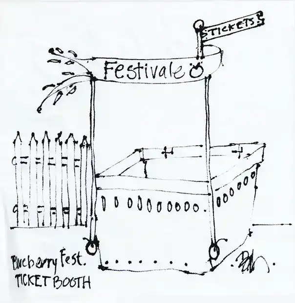
“MHD’s Drink + Sketch event is a yearly reminder that sketching should be playful and free. With prompts like “ticket booth for a blueberry festival,” how could it not be? Having to quickly think of ideas, and then draw them up on a napkin that could easily tear or be stained from a nearby spill, reminds us that design doesn’t begin with precision, but with imagination!”
Eric Wittman, senior project designer Knickerbocker Group
Drawing: A ticket booth for a blueberry festival.
“Prospect-Refuge, clad in cedar with ample steam. For me, hand-sketching encourages rapid exploration—capturing both the promising and creatively questionable ideas to push the design conversation forward.”
Sig Sandzén, senior project designer Knickerbocker Group
Drawing: A hidden cliffside sauna.
“It’s always hard to decide whether to jump from prompt to prompt or get lost developing one idea in depth. Both approaches are so enjoyable, but it’s nice to just start sketching and see where an idea takes you.”
Richard Lo, senior architectural staff and associate Kaplan Thompson Architects
Drawings, clockwise from top left: A floating tiki bar, a nap pavilion, a residence with a 9 x 9-ft. footprint, a hidden cliffside sauna.
“Sometimes you don’t have to think too deeply when creating a concept or idea. Using the design problem and applying a literal translation can help jump-start ideas that are unique to the space.”
Steven Mansfield, senior associate landscape architect Matthew Cunningham Landscape Design
Drawings, clockwise from top: A ticket booth for a blueberry festival, a hidden cliffside sauna, a nap pavilion.
“I thought of free-form iconic building types, and the Guggenheim came to me. The energy at the table also contributed to an open-minded thought process! The evening was incredible!”
Al Kearney, architect Kearney Pierce Architects
Drawings, left to right: A mini coastal library, an ice cream turned into an architectural icon, a residence with a 9×9-ft. footprint.
“We love that MHD hosts this event, and our team looks forward to this tradition every year—it’s so rare that people get to be creative together outside of the studio, and I love that Drink + Sketch gives us a chance to meet new people, laugh, and to let our imaginations run wild with the prompts.”
Matthew Cunningham, Founding Principal MCLD LLC
Drawings, clockwise from top right: An ice cream turned into an architectural icon, a hidden cliffside sauna, a nap pavilion.
“I have always loved doing 2-minute sketches, what a fun evening to do so with so many talented people!”
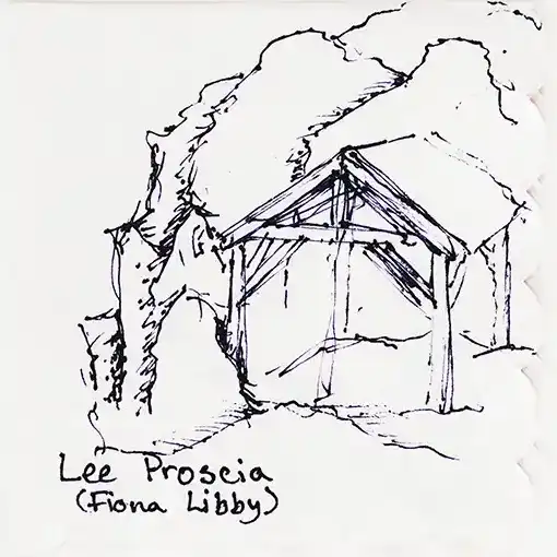
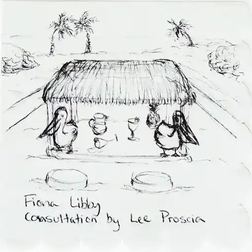
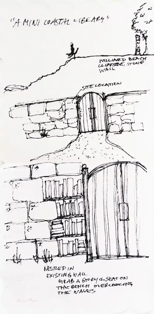
Fiona Libby, architectural designer Houses and Barns by John Libby
Drawings, left to right: A mini coastal library, a hidden cliffside sauna, a floating tiki bar.
When thinking about the “design a small library” prompt, my imagination drifted to a coastal spot I frequent. There, nestled in an existing stone wall, would be the humble collection of titles. Perhaps a curious reader would be beckoned by the library nook and inspired to choose a book and sit a spell while soaking in the ocean views.
Jenny Dillon, Architectural Designer II Woodhull
Drawing: A mini coastal library.
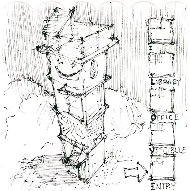
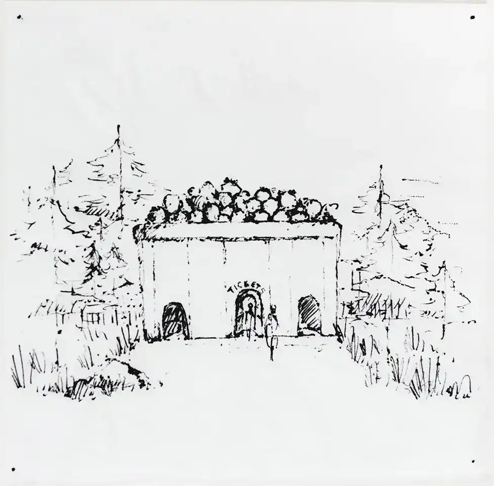
“Blueberry Box Office: A paradigm of site-sympathetic design in Maine.”
Remington Pontes, designer Matthew Cunningham Landscape Design
Drawing: A ticket booth for a blueberry festival.
“I really love this evening that MHD puts on, and it has become an event I look forward to every year. Catching up with people, witnessing creativity with the prompts, chatting pen types, napkin resiliency, and researching the expansive drink offerings from Novare Res.”
Greg Norton, director of design Knickerbocker Group
Drawings, clockwise from top left: A hidden cliffside sauna, a nap pavilion, a mini coastal library.
“Tucked into a quiet cove, the Bookhouse is a tidal take on the little free library. Seafaring bibliophiles, arriving by dinghy, canoe, or paddleboard, browse nautical novels by Melville and Hemingway and field guides to coastal flora and fauna from Sibley and Audubon. Pile-mounted bookstacks are sheltered under a single roof, with a central aisle for float-through browsing. In inclement weather, the Bookhouse doubles as an emergency boathouse, offering small craft a safe port in the storm.”
Drawings, above left to right: An ice cream shack turned into an architectural icon, a floating tiki bar; right, top to bottom: A nap pavilion, a residence with a 9×9-ft. footprint, a mini coastal library
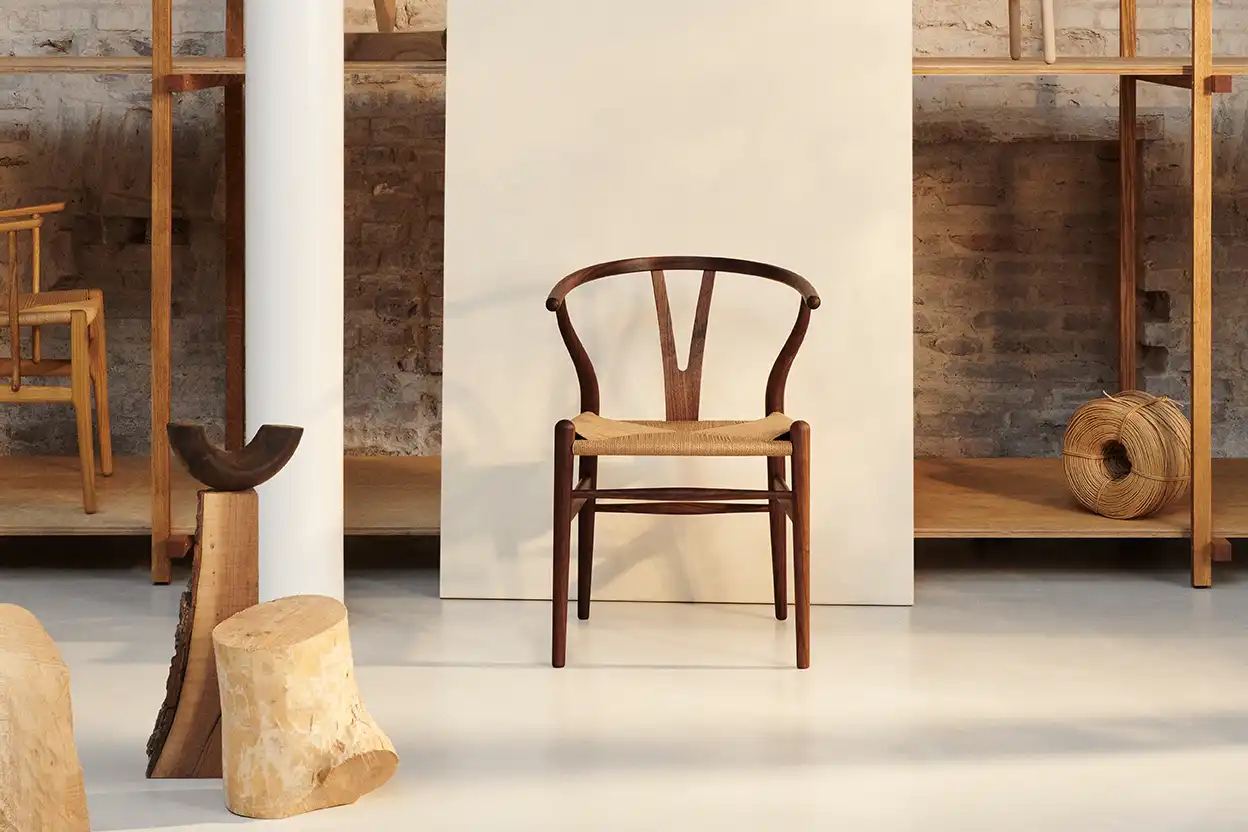
It was while walking through the Copenhagen Cabinetmakers’ Guild exhibition in 1947 that Holger Hansen, son of cabinetmaker Carl Hansen, noticed a group of chairs by the young Danish cabinetmaker and architect Hans Wegner. Wegner had been inspired by portraits of Danish merchants seated in Chinese Ming-era chairs and designed the five chairs on view at the expo.
Origins of the Wishbone Chair
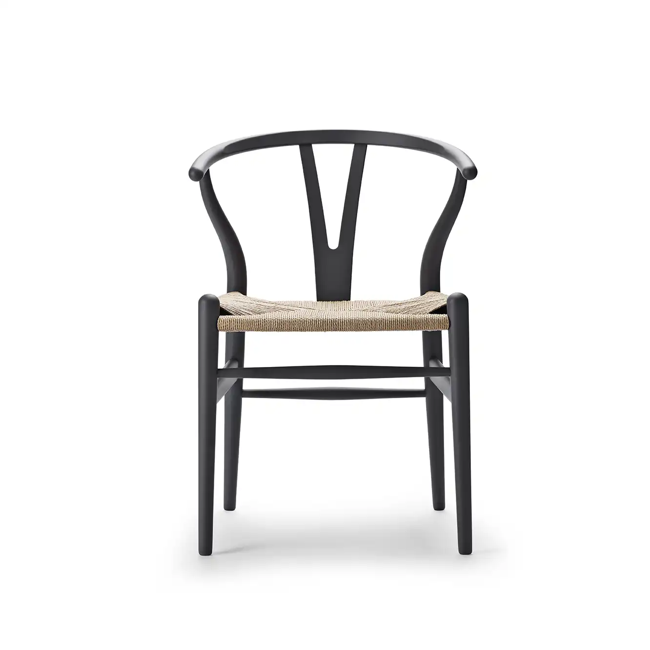
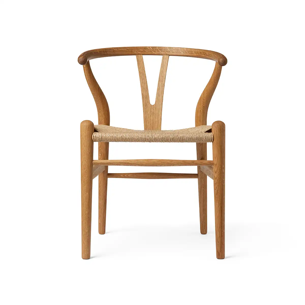
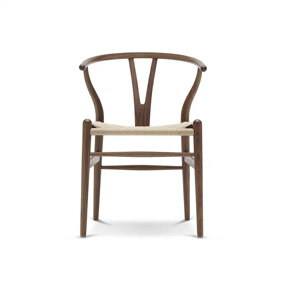
The Ming Dynasty (1368–1644) is considered the golden age of Chinese furniture, known for elegance, carved wood construction without metal fastenings, and functional design. Inspired by these traditions, Wegner created five designs that Carl Hansen & Søn released in 1950 (CH22, CH23, CH24, CH25, CH26). The CH24 became the most popular of the group, soon earning its famous nickname: the Wishbone Chair.
Craftsmanship and Materials
Wegner combined the back and armrest into a single steam-bent piece. To provide stability and comfort, he developed the Y-shaped back that gives the Wishbone Chair its name. The continuous horizon of lines, known in China as yuanhun, symbolizes power and good fortune.
Each chair is composed of 14 separate components
More than 100 steps are required before assembly
The seat takes about an hour of skilled weaving
Approximately 395 feet of paper cord are used for each seat
Wegner originally chose paper cord as a practical postwar substitute when materials were scarce, but soon came to value its strength, beauty, and harmony with the wooden frame.
How to Spot an Authentic Wishbone Chair
With so many replicas on the market, it’s important to know the details of an authentic piece. Look for:
Back/armrest crafted from a single piece of wood (no seams)
Smooth, tapered legs
A tightly and evenly woven paper cord seat
A Carl Hansen & Søn logo and Hans Wegner’s signature
A unique serial number plate under the seat
“Each Wishbone Chair seat requires 395 feet of paper cord and an hour of skilled weaving.”
Legacy and Collectibility
Wegner designed over 500 chairs in his lifetime, but the Wishbone Chair has never ceased production since 1950. Today, it remains one of the most recognizable and beloved Danish modern designs, priced between $675 and $2,000 depending on finish.
Authentic examples are featured in the permanent collections of the Metropolitan Museum of Art and the Vitra Design Museum, cementing the Wishbone Chair’s place as both a functional seat and a work of art.
Special thanks to Sarah Prak for bringing the history of this chair to our attention.