The Heart of the Home
SPACES-Nov/Dec 2009
by Rebecca Falzano
Photography Irvin Serrano
Putting historic elements to work in a remodeled kitchen
For Cristina Gomberg, the phrase “better late than never” is especially poignant when she’s standing in her kitchen. After decades of preparing meals for her family in the most basic of spaces, the 50-something finally got her dream kitchen when she and her husband, Bruce, remodeled their 1895 home on Annabessacook Lake in Winthrop. The challenge was to maintain the one-of-a-kind historic character of the Craftsman-style home while updating it to meet a modern family’s needs.
Like many houses built at a time when upper-class families had servants, the original kitchen—small and U-shaped—was on the opposite side of the house from the living area. “That layout didn’t work for me,” says Cristina. “It was very isolating. I’d be here doing my thing and everybody else would be in the other corner of the house.” To make the kitchen a focal point for the entire family, the Gombergs transformed the former dining room into a family room, turning what was once an open porch into a new indoor eating area and expanding the kitchen to roughly 360 square feet.
Fortunately for the Gombergs, their kitchen designer, Kelly Lord of Augusta-based Living Space Consultants, specializes in historic homes. During an extensive interview, Kelly and Cristina sat down and discussed Cristina’s must-haves: work space for more than one cook at a time, taller countertops to comfortably accommodate her 5-feet-10-inch frame, cohesion with the rest of the house, plenty of sink space, an entertainment focus, and of course seamless integration of the home’s historic elements.
Armed with Cristina’s wish list, Kelly selected period-appropriate Shaker-style cherrywood cabinetry that matches the architecture of the house. Because of the odd height of the ceilings, the cabinets were custom designed by cabinetmaker Jeremy Clark of JD Woodworks in Readfield. Clark also created extra-deep drawers, another must-have for the homeowners.
From cabinetry to appliances, each component of the kitchen was informed by Cristina’s cooking style and culinary preferences, which tend toward fresh, local produce. “After I sat down with Cristina, we decided she needed ample storage space for vegetables and fruit because she uses a lot of fresh foods, so we incorporated basket drawers,” explains Kelly. “We added a steamer with its own separate faucet and plenty of storage space for oils and spices, which she also uses frequently when she cooks.” And since the family bakes a lot, Kelly added a mixing shelf to match the height of the butcher-block table. “This is several inches shorter than the rest of the countertops so when you are kneading or rolling out dough, you are working at a comfortable height,” explains Cristina.
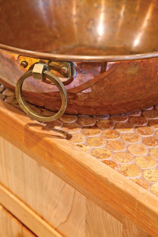
In addition to Cristina’s culinary needs, Kelly based her design on kitchen items the Gombergs already had: the antique butcher-block table and a stainless-steel refrigerator to start. She then found a new home for existing elements of the historic house. An antique door discovered in the basement was repurposed for the pantry. A copper bowl was reincarnated as a vessel sink for the wet bar. To add interest and a bit of whimsy, round penny-marble onyx tile was used for the backsplash and an antique fireplace fender was used as an ornament for the range hood. “I like to reuse materials in places they weren’t meant to be,” says Kelly with a smile.
Because of this imaginatively executed combination of old and new, the kitchen doesn’t have a too-perfect look, but seems to have evolved piece by piece over time—which was precisely the goal. “We worked very hard to not make everything too ‘matchy-matchy,’” says Cristina. “We wanted it to be a little whimsical, a little eclectic. I didn’t want it to look like a kitchen showroom; I wanted it to look like a home.”
Kelly designed the island—which has since become the family’s principal gathering place—around the former porch columns. And here is where the biggest challenge came in: “There are a lot of windows and doors in the kitchen, which really limited the wall space for cabinetry,” says Kelly, who had no choice but to get inventive. She integrated extensive dish storage into the island—an ideal solution considering its proximity to the dining area. “You look at the kitchen and think, ‘Wow, this is a huge space,’ but it’s deceiving. It’s really a small kitchen disguised as a big one,” jokes Cristina.
Large or small, Cristina’s kitchen has changed her day-to-day life considerably. In her newly designed workspace, she can create a homemade meal with her family all around her and three dogs underfoot, or she can host a charitable cooking class with five or six other amateur cooks comfortably sharing the space. “I’ve always loved cooking, even as a child. It’s one of the ways I experience the world. It’s my entryway into a culture. When I travel, I go to grocery stores in foreign countries. I go into people’s kitchens and look at their pots and pans and see how they cook,” she says.
And for those coming into Cristina’s new kitchen, it is clear at first glance how she prefers to cook: happily and with those she loves around her.


