Rule of Plum
If you're feeling bold, this stately shade of purple is an elegant choice
Evocative of the fruit from which it takes its name, plum is a delicious color. Cool and warm at once, plum balances the heat and abundance of late summer with the depth of fall days just around the corner. “Plum has that lusciousness of fruit and berry colors. It makes a room feel like a Flemish still-life painting,” says design author and consultant Sophie Donelson.
A deep purple with reddish undertones, plum is a color that immediately gives a room depth. It’s moody and cocooning—sensuous, even. “The average person is sometimes a bit scared of the deeper, rich colors, but for me, when you commit to the color, it creates an incredibly sophisticated, very regal, indulgent, and luxurious interior,” says Charlotte Cosby, head of the creative team at Farrow and Ball.
Donelson, who painted her own living room in a rich eggplant, points out that purples are more unexpected than other deep colors like navy or a chocolate brown. “Plum is a little daring,” she says. “When you pull it off, a plum room has a huge effect on people who visit. It lends a good feeling, a warmth.” Here’s how to bring this scintillating color into your home.
Look for a natural plum.
“You want some earth in the hue,” says Glenn Gissler, an interior designer based in New York. “With plum, you can’t do a clean color. You have to muddy it up so it is livable.” Look for hints of brown in the undertones of the paint, and avoid anything that looks synthetic.
Choose it for nighttime rooms.
All the experts we spoke to agree: plum walls are ideal for rooms you’ll use in the evening hours. “I chose plum for my living room because I love nighttime design, and that’s when I knew I’d use it most,” says Donelson. Gissler agrees, noting that the effect of plum enveloping a room is “sort of sexy and moody.”
Use plum to elevate your furnishings.
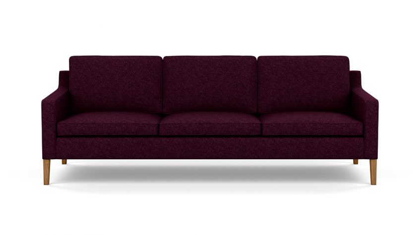
A rich wall color accentuates the furniture in a room. “Plum walls can make inexpensive furniture look grand,” says Donelson, who notes that most people have neutral-colored furnishings. “Plum adds major contrast, so you don’t need a statement sofa to make a thoughtful room. It really makes everything look richer, more polished, more defined.”
Consider hiring a professional.
If you want to use a strong color like plum in a big way, Gissler suggests it might be an occasion to bring in a decorator or color consultant. “Plum is not a color for the faint of heart,” says Gissler, whose bedroom walls and ceiling are painted a deep shade of aubergine. “You have to be willing to jump in with both feet; if you don’t and you pull back from that, you can get into a world of insipid color.”
Find inspiration at the farmers’ market.
Because plum can be a tricky shade to work with, Megan van der Kieft, lead designer at Margo Moore Interiors in Camden, suggests looking to the natural world—in particular your farmers’ market or vegetable garden—for color palette inspiration. “Look at the colors in fruits—that’s what nature made. Think of an eggplant: it goes from lavender to deep purple, with green and brown,” she says. “Bite into a plum, and you have your oranges, peach, and a little bit of a cranberry red.”
Pair plum strategically.
“Grays are fabulous with plums,” says van der Kieft. “In the bathroom, Carrara marble is a natural choice.” Gissler concurs, suggesting light blues, soft grays, and silvers as good companions for plum. The designers also agree that lavenders and greens are other easy companion colors. But avoid primary hues. “Plum is a tertiary color, so using it with a true primary is rarely successful,” cautions van der Kieft.
Opt for rich, textured fabrics.
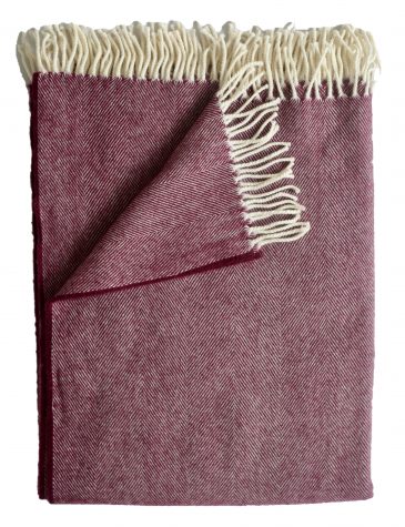
“With plum, texture is so important; it can fall really flat on a plain linen or a tight, flat weave. I love to see plum in silk and velvet,” says van der Kieft. “For me, plum shows its true colors in these textiles, where it comes out romantic and moody.”
Light it right.
“As you go deeper and darker with color, layering lighting becomes critical,” says Gissler. He recommends at least three layers of lighting: light from a hanging fixture or chandelier, lamps with diffuse or translucent shades, and accent lighting, such as picture lights or up lights. “When dimmed, clear bare bulbs can read like candles, which can work really well too,” he adds.
Avoid pure whites with purples.
“When there is a stark contrast like there is with a very white-white and plum, your eye is immediately drawn to that line of contrast,” Cosby cautions. “A pure white would be too high contrast, too clean for plum. Instead use something that has a little bit of pink in it.” She suggested Farrow and Ball’s Skimming Stone, which has a bit of magenta and would “perfectly complement plum.”
Work with washed-out woods.
“Weathered and reclaimed woods tend to look good with plum because they have a bit of a softer feel to them,” says Cosby. Likewise, Gissler’s plum-colored bedroom features rustic wooden beams. Gissler says he could also imagine pairing plum with blonder, Scandinavian-feeling woods. Finally, van der Kieft cautions against any wood with an orange cast.
A Royal Hue
Purples, including plum, are often associated with wealth and power. This color association dates back to ancient times. The Greeks, Egyptians, and Romans all prized Tyrian purple, a reddish-purple pigment made from Murex, a type of sea snail. The color was difficult and unpleasant to manufacture: In order to obtain half an ounce of dye, 250,000 snail shells needed to be crushed. And those shells were incredibly smelly—so much so that it is purported that women were allowed to divorce a man who became a dye maker after marriage!
According to the Forbes Pigment Collection at Harvard University, Cleopatra was known for her affinity for Tyrian purple. For a time, Julius Caesar outlawed purple clothing for anyone but himself. (The law eventually loosened, but the color remained reserved for powerful men like generals—and they had to pay taxes to wear it!) Queen Elizabeth I also banned non-royals from wearing purple, and it remains a symbol of the British monarchy today. “It’s long been associated with the queen,” says Cosby, who notes that British brands use purple to seem more luxurious, like the chocolate maker Cadbury, or to signal their royal bona fides, like Asprey of London, the famed jeweler and maker of crowns and scepters. Decorators too know that this color conjures subconscious feelings of luxury. If there’s a room you want to feel grand, cloak it in plum.
The first recorded use of “plum” as a color name was in 1805.
Palette Picks
Clare Paints
Prince
A deep and dramatic true purple.
Farrow & Ball
Pelt
A regal eggplant with a blue tint that appears almost black in dark spaces.
Annie Sloan Paints
Rodmell
A dusty plum in a chalk paint finish.
Benjamin Moore
Pinch of Spice
A deep shade of purple with undertones of red and black.


