A Marriage of Styles
FEATURE-October 2011
by Debra Spark Photography by Trent Bell
Collaborating to build a green home by the sea.
Remarrying later in life presents a quandary. Where to live? Your place or my place? One Boston-area couple resolved this question for their primary home (the wife’s place prevailed) but found that a former saltwater farm in Scarborough offered a new possibility: our place.
“The idea of building a house together was fun,” says the wife. “We wanted something that was our own and thought ‘What a fun way to do it.’” Although she had experience renovating homes, she had once vowed never to build new because there are too many decisions involved. Now she and her husband were going to make those decisions and figure out their shared aesthetic. The wife describes her own taste as “eclectic” and her husband’s as “Asian and clean lines,” and this didn’t quite add up to a coherent vision.
The couple turned to Richard Renner, whose architectural firm Richard Renner Architects operates out of Portland and Boston, for help. The wife says, “When Rick came to our house in Boston, he asked, “How do you want the house to feel? What kind of house do you want?’ And I thought, ’Jeez, you got me.’ I couldn’t say, ‘I want French provincial. I want bare bones steel and glass.’ He had to really fish to help us come to clarity.”
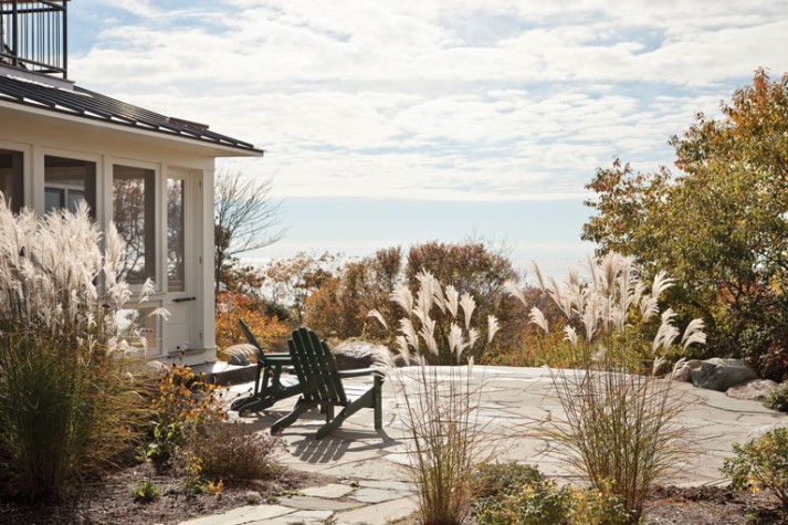
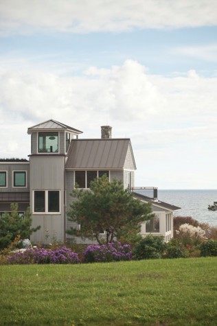
Some things were clear from the start, though. Renner says his clients asked for a house that would work well for two but also accommodate their large blended family. They were hoping to build a home that would be as environmentally friendly as possible. And they wanted to enjoy the ocean and fields around their house, in part by incorporating a tower with 360-degree views. These desires—coupled with some quirks of the building site and a wish for partially defined outdoor spaces—drove the decision to build a long house that reads, from the outside, as a series of discrete units with attendant porches, patios, and shallow balconies.
Landscape architect Todd Richardson of Richardson & Associates in Saco was involved on the front end of the project, working collaboratively with Renner to maximize views, light, and natural ventilation. The couple wanted an east-facing kitchen and a screened-in porch on the west side for watching sunsets. South was the best location for solar collectors and ocean views. Glass was necessary for solar gain, but it couldn’t be overused because glass isn’t as energy efficient as solid wall. To achieve the ideal balance, the architects sited the home on a windy ledge and then angled the living room portion of the house to true south. The builder—Peter Taggart of Taggart Construction in Freeport—began the construction by bolting a steel frame to the ledge. Later that frame would be hidden within thick, well-insulated exterior walls.
The main house connects to a garage and guesthouse by a glass bridge, beneath which sits a fern and shade garden. This design provided a visually interesting solution to the site’s drainage issues and added windows to the lower level. The main house is laid out in an east-west direction, perpendicular to the glass bridge, and anchored by two staircases. The “back stair” consists of a steel-and-wood spiral that rises from the basement to the kitchen to the second floor in a wood-paneled circular stairwell that suggests a well-appointed silo. The “main stair,” located in the foyer, turns into a spiral staircase on the second floor. This staircase leads to a glassed-in tower room, from which one can see the ocean, surrounding fields, and nearer at hand, a flat “green” roof that is planted with sedum.
The home’s basement level has three guest bedrooms, a room for potting plants, a sauna, a mechanical room, and a den and playroom. On the ground floor, there is a living room, office, and bright kitchen with an eating area and sitting room. The second floor has another office, an interior bridge that crosses above the foyer, and a master bedroom suite. The husband jokingly calls the master bath a “destination bathroom,” presumably for its size and elegance, but also because the tub is desirably located in a corner made of windows that gives bathers the sensation of being outdoors. Those desiring a wash don’t have to settle for a simulated experience, though: there is an outdoor shower on one of the upstairs porches.
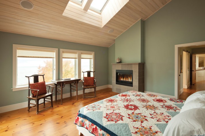
The owners didn’t want their house to feel overly decorated. They wanted a simple and clean look, so they avoided intricate moldings but picked a variety of wood—including bamboo, mahogany, and reclaimed oak and pine—to use on floors, stair treads, sloped ceilings, and elsewhere. They also opted for bold wall colors. Because the windows are triple-glazed for energy efficiency, the couple often didn’t know what the colors would look like until they were actually on the wall. Interior designer Margaret Morfit of South Freeport helped guide the color and interior choices. When Morfit suggested that the wife begin her decisions about the kitchen by starting with “one thing you love,” the wife selected backsplash tiles with a Tuscan yellow diamond and rustic green swirl pattern. The saturated yellow-ocher that dominates the kitchen soon followed.
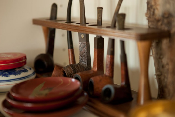
The property consists of two additional structures: a studio and garage with a north-facing dormer and a chicken shed, because the wife had always wanted chickens. Indeed, she likes the birds so much that they are also a decorative theme in the house. There’s a chicken sculpture at one entrance and another in the living room. Chickens aside, the wife attributes the whimsical aspects of the house—like nail brushes in the shape of teeth—to her physician-husband. He is also a collector—of gongs, bells, calligraphy brushes, and pipes, among other things—and these items are displayed throughout the house. A shelf in his office features old surgical equipment inherited from his father, who was also a doctor. There are 400 or 500 pounds of additional instruments being stored in the garage.
The wife is a former landscape designer, so she worked with the landscaper, Warren Baughman of Atlantic Landscape and Design in Scarborough, and the mason, George Libby Jr. of G.M. Libby & Sons Masonry in Yarmouth, to create a detailed outdoor plan, which includes a long curving driveway of Belgard Bergerac pavers. Native Rosa rugosa line one side of the drive, and a rock wall with a perennial garden lines the other.
Of the wife, Taggart says, “She spent quite a bit of time on the project and got to know the mason and the heating contractor and our carpenters. She solicited their ideas and invited everyone to participate and contribute.” Once she knew there would be a fireplace in the basement, the wife asked everyone who made a significant contribution to the project to design a tile of their own choosing, which then became part of the fireplace’s surround. One person painted a chicken; another a bike wheel. Other tiles are of a dog, a cupola, and a signature. Although the playful tiles were meant to reference the collaborative nature of the project, they also serve as metaphor for how well the disparate elements of this house—not to mention the different owners—came together.
